Redesigning Xamarin Field Service Sample with Crosslight – Part 1
Hi guys, Nicholas here. I’m back with another blog post, this time covering the Xamarin Field Service sample. Many of you have asked: “How can I transform the Xamarin Field Service sample using Crosslight?” And that tickled something in the back of our minds. This could be our next Crosslight reference sample! So we embarked on a quest to transform the Xamarin Field Service completely using Crosslight and see how much we can do about it.
Tablet-only Design?
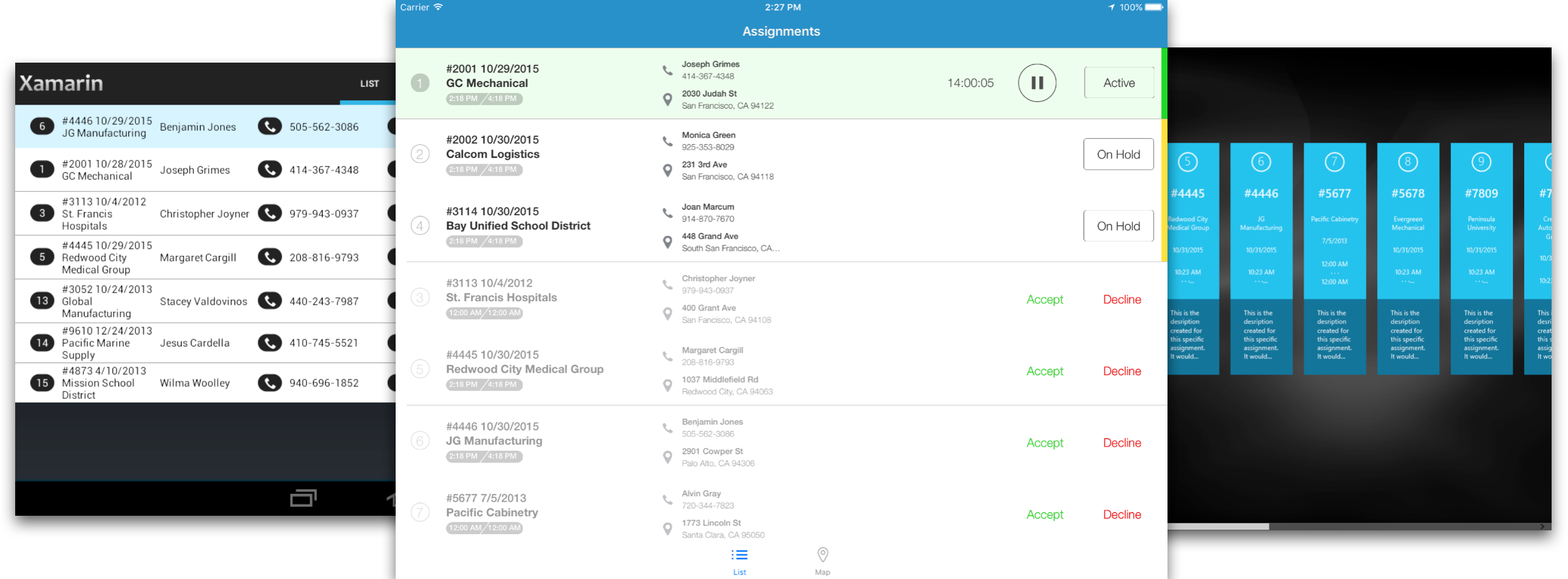
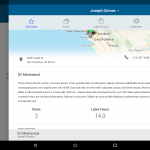
Xamarin Field Service on Android, iPad and Windows 8.1
Before delving further, we need to take a step back and have a good look on overall UI and UX design of this app. When talking about cross-platform, yes, it would be valid to say that this app works cross-platform. But it only works on tablets. Why can’t the design be brought to the phone as well?
Let me share with you some of the design quirks found in the app, and how we decided to transform the experience in overall. We’re not talking about any code stuff first in this post. Just pure, plain UX, then we’ll move on to code sharing aspects in the next post.
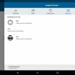
The Assignments Screen
The assignments screen. At a first glance, nothing seems to be wrong with it. So, we decided to add additional swipe gesture touches to it, to change statuses quickly. Overall, I’m totally fine with it.
The Assignment Detail
Until it pushes the entire screen to display the assignment detail. Let’s take a look at Xamarin’s Field Service push navigation.
Xamarin Field Service – iPad Push Navigation
The transition between the assignments list and the assignment detail screen. It’s quite rare to see an iPad app performs a push navigation in such manner, especially in a list navigation. Most mobile apps will present itself with a SplitView on iPad, in which the push navigation will be contained within itself, not navigating the entire view. This is apparent in several iPad’s default apps, such as Mail, Contacts, Messages and Notes. I’m not saying this design is incorrect. But what if there is a way to enhance the navigation experience, much like the Apple’s native experience?
Problem: User experiences abrupt changes when navigating to detail view, hindering the user experience.
Objective: Show the detail view without abrupt, major changes in screen presentation.
Considerations: Obviously, we can’t add a SplitView to do that.
Our solution: Crosslight Dialog Presenter.
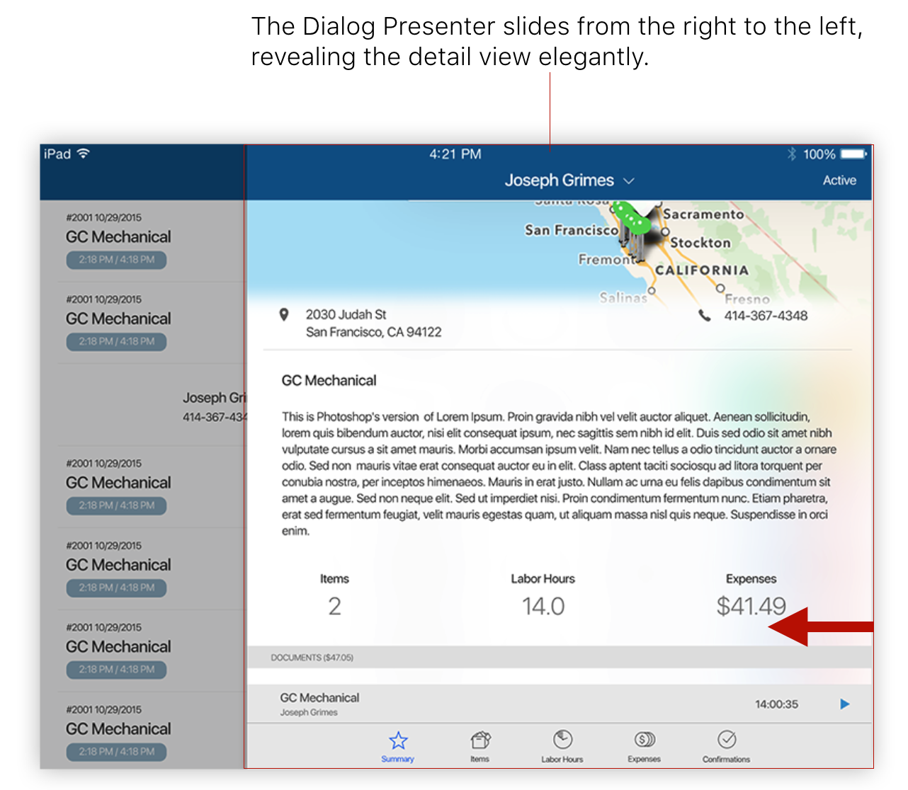
Crosslight Field Service – iPad Dialog Presenter
The Dialog Presenter is be a perfect candidate to replace the push navigation. By displaying a beautiful translucent modal panel from the right-hand side to the center that covers third-quarter of the screen, we managed to simulate the “content navigation” found in split view apps, enhancing the overall detail navigation experience. To close the dialog presenter, users can simply tap on the left hand side of the screen, outside the dialog presenter.
Have you managed to get started with the Dialog Presenter? If not, I’ve covered how to get started with the Dialog Presenter in another post.
Reusing the same view, the dialog presenter’s content can be easily adapted to iPhone’s more compact screen and uses simple push navigation, as follows.
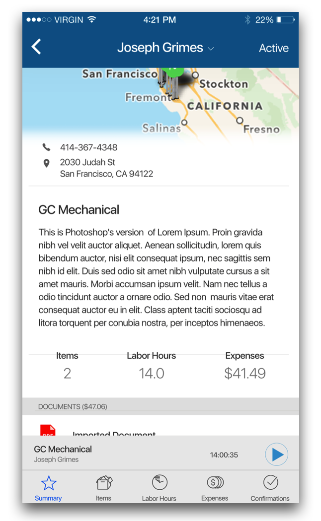
Crosslight Field Service – iPhone Push Navigation
Crosslight is all about reusability, efficiency and design pattern consistency. You can easily design views that work perfectly in either phone or tablets, thanks to its robust, thoughtfully engineered navigation service.
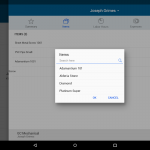
Displaying the Navigation Items
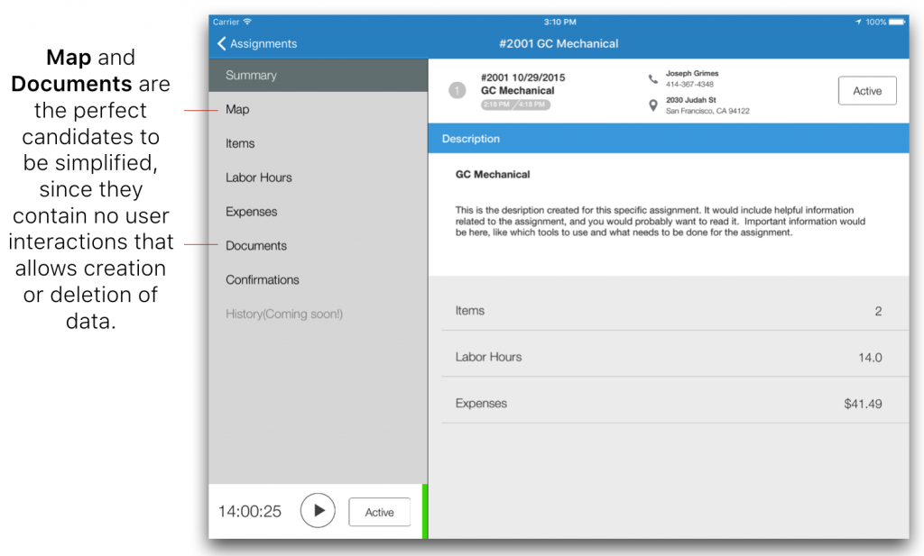
Okay, we’ve managed to solve the list navigation experience. But how about containing all those navigation items in the detail view of our dialog presenter? Currently, we have 7 items: Summary, Map, Items, Labor Hours, Expenses, Documents, Confirmations. I’m not including History since it’s not supported by Xamarin just yet.
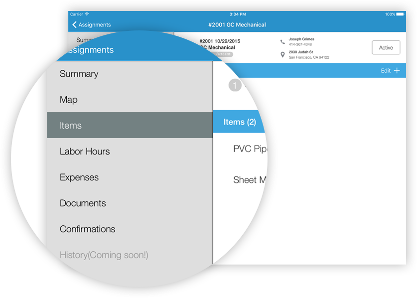
Xamarin Field Service – iPad Navigation List
Problem: The navigation items takes up too much space and exceeds the 5-items-limit for the tabs.
Objective: Display the navigation items inside the dialog presenter, while still maintaining a native and pleasant iPad UX.
Considerations: Can we simplify the navigation items even futher?
Our solution: Tabbed navigation.
Up to this point, you might have several objections in mind, such as: “What if Xamarin decided to bring that History menu back up and even adding more modules to the app? Your tabbed solution will not be able to solve that issue, no?” Yes. We admit it won’t be able fit more items inside it, as Apple has provided a maximum threshold of 5 items of the tab controllers.
However, we can improve the navigation item categorization to include lesser items and display them as needed. Remember, as a UI/UX designer, you have to keeps things simple for your users. And contextual. Imagine you’re designing the app for your mom, therefore, you have to keep it as simple as possible.
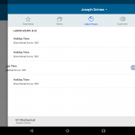
Crosslight Field Service – iPad Tabs
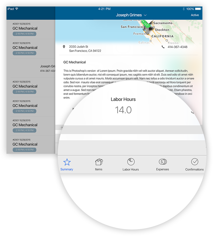
Our answer was to reduce the number of navigation items into maximum of 5 items: Summary, Items, Labor Hours, Expenses, and Confirmations. The Map and Documents can easily fit into the Summary tab. It all makes sense, considering that the Map and Documents do not contain any data entry capabilities and does not require any user interactions whatsoever. In other words, they’re designed to be read-only, which would fit the Summary tab. Why use 7 tabs if you can manage with just 5? And here’s how it looks on the iPhone.
Crosslight Field Service – iPhone Tabs
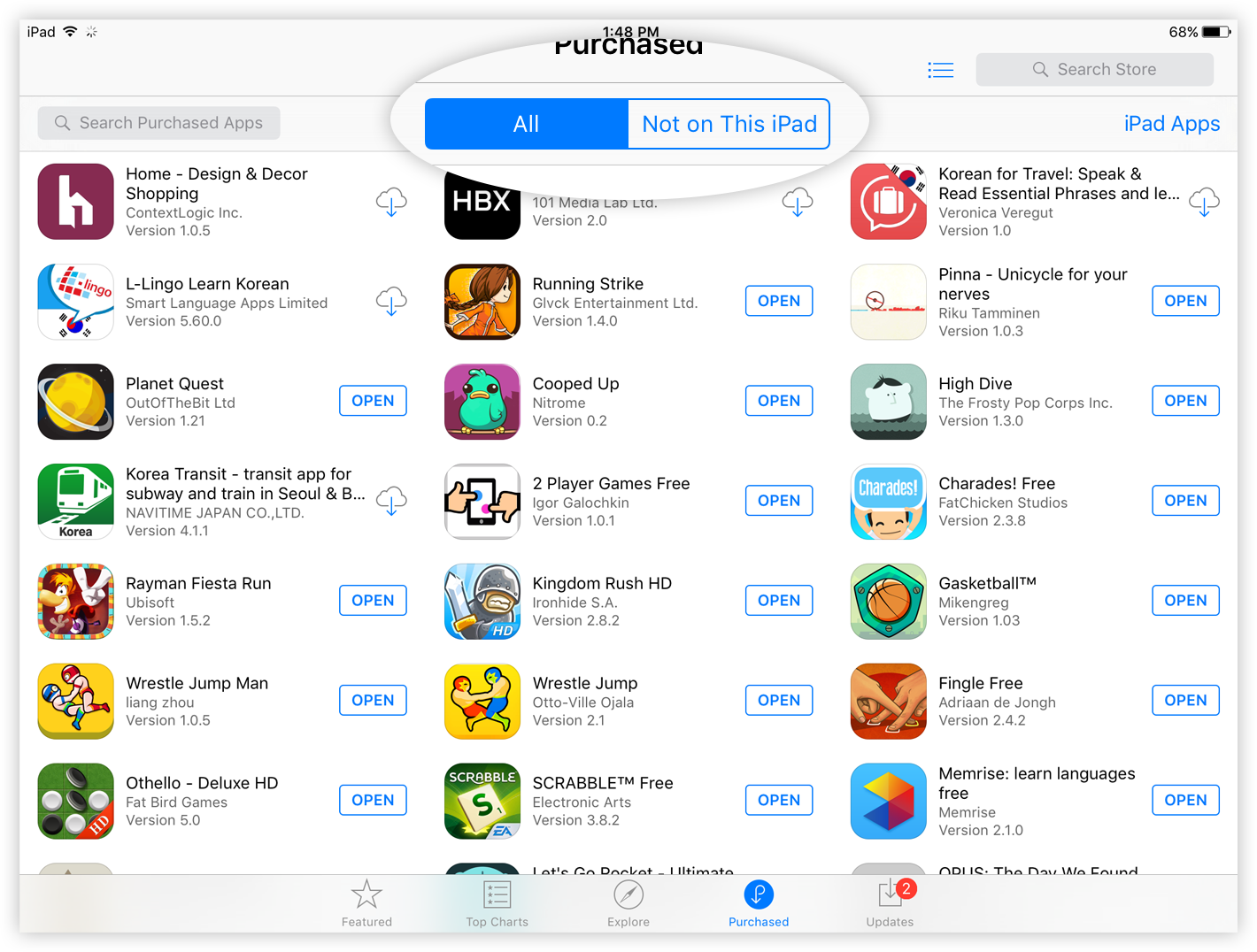
As for the History problem, since users can’t perform any data interaction with it, you can simply add a History icon button within the Summary tab that displays the previous records related with the assignment, or if you would like to separate each the list of Documents and list of History records, you can introduce a segmented button, like the one found in Apple’s App Store Purchased screen, especially the “All” and “Not on This iPad“.
App Store – iPad – Purchased
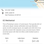
The Summary Screen
When I think of Summary, I always assume that the user expects the view to contain read-only information. For that same reason, the Summary screen is perfect to display static list of items, in which the user can perform only one action upon it.
Xamarin Field Service – iPad – Summary
Problem: The number of items to be included tab navigation can only contain max. 5 items.
Objective: Reduce the number of navigation items and display relevant information in a simpler manner.
Considerations: Decide which navigation menus that don’t need user interaction.
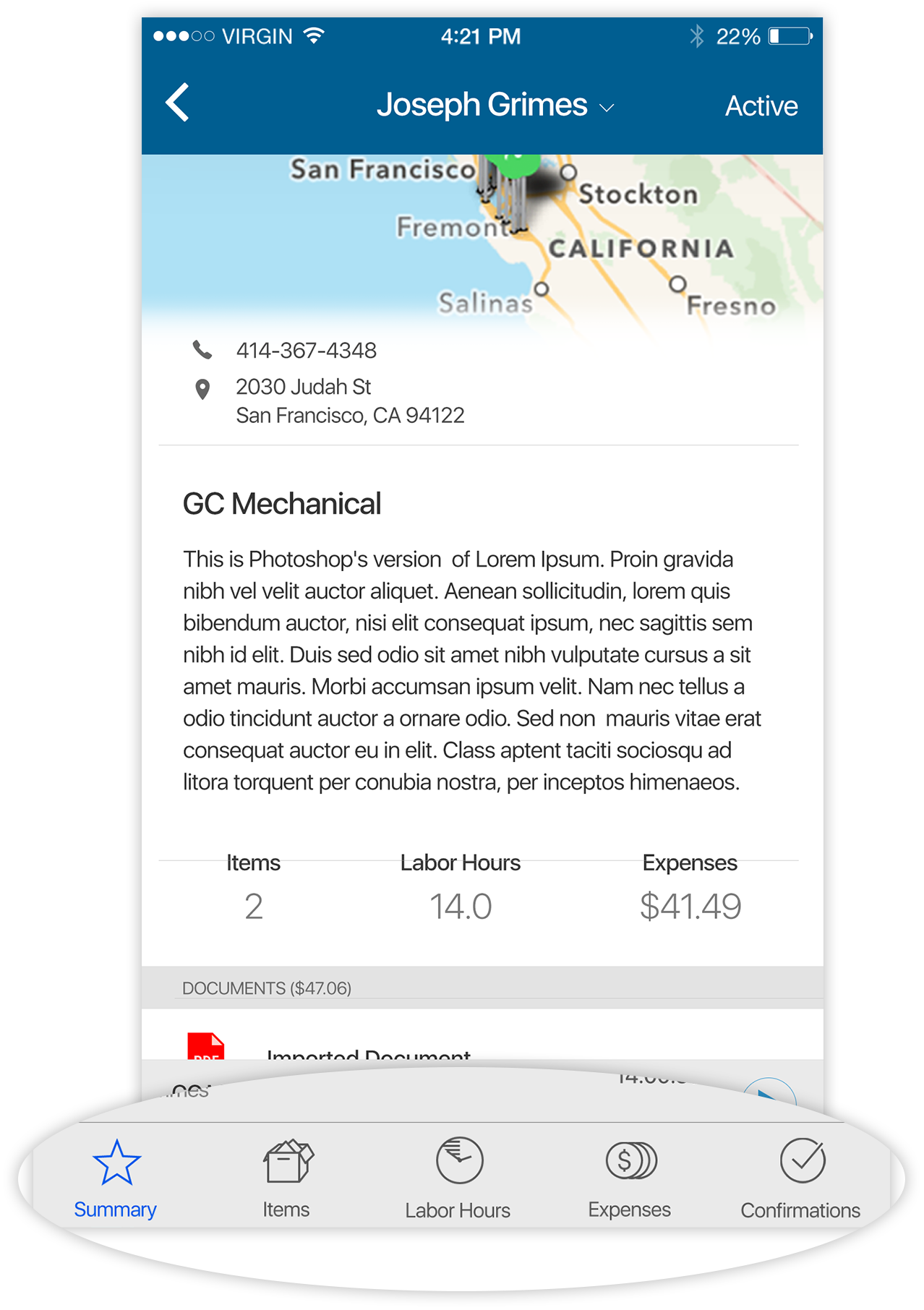
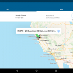
Our solution: Put Maps and Documents inside the Summary screen.
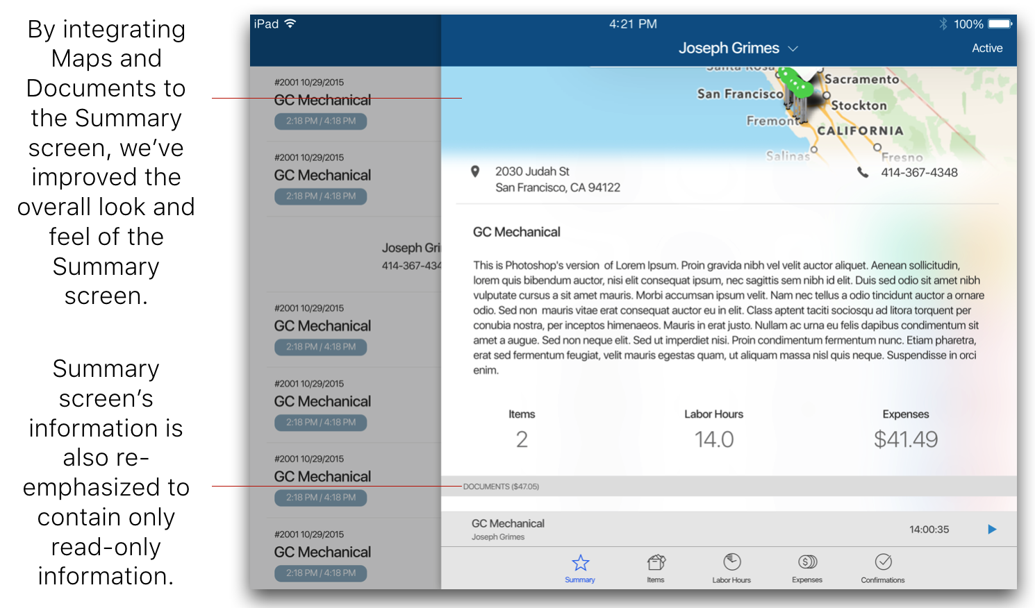
Crosslight Field Service – Maps and Documents in Summary
Therefore, we decide to inject Map and Documents inside the Summary screen. Including the Map was pretty simple. We display then Map on the top header, along with other relevant information about the customer. If users were to click on the map view, then Apple Maps will be fired up with a placemark showing more details about the location in the form of map annotations. As for the Documents, it is achievable simply by adding the documents list at the very bottom of the Summary page.
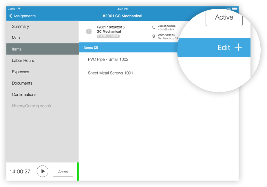
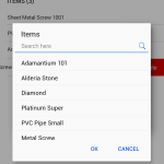
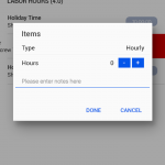
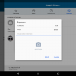
The Items Screen
How many times have you encountered an iPad app with adding and editing experience that is not located in the navigation bar? I’m sure, not much. For me, it’s my first time.
Xamarin Field Service – Items
And because of that, I’m pretty sure this is not Apple’s standard design.
Problem: The user actions are not part of the navigation bar and it’s confusing.
Objective: Provide a method for the user to display the relevant information as needed.
Considerations: What does the user usually expect when perform user actions?
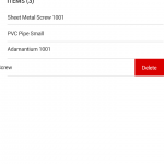
Our solution: By removing the sticky header altogether, we’ve managed to place the user actions where it truly belongs.
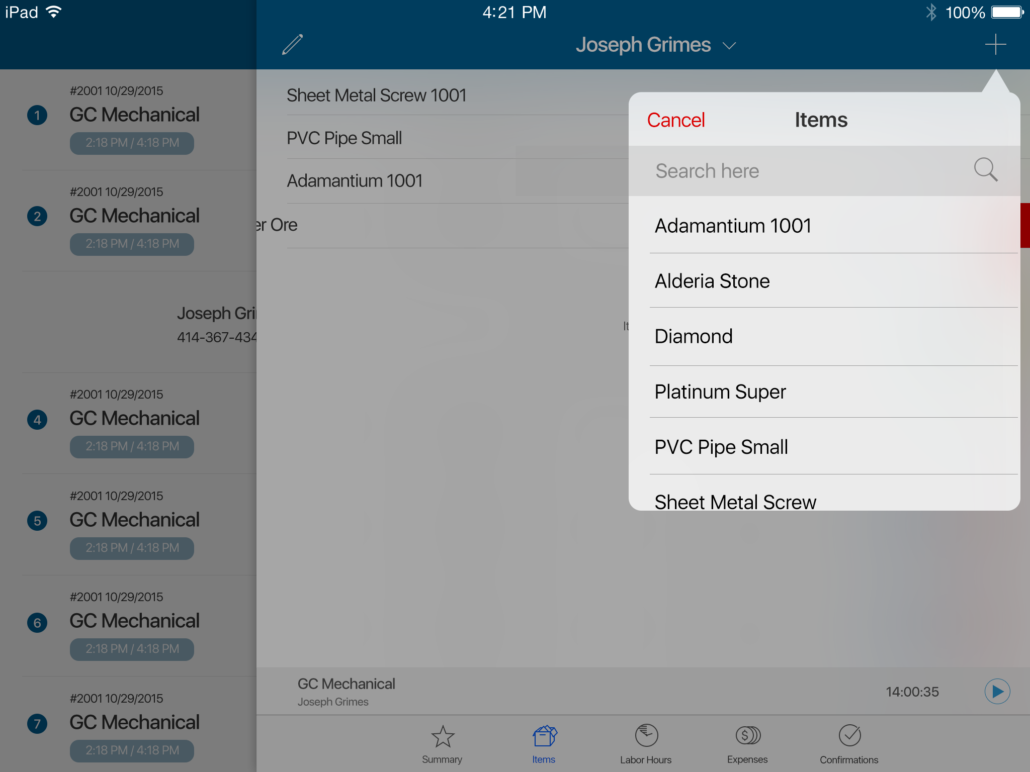
Crosslight Field Service – Items
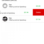
The addition and editing of items generally occurs from the navigation bar, in which we have done so with the dialog presenter approach. Since the Items screen is similar to the Labor Hours and Expenses screen, we’re taking the same approach to both of the screens.
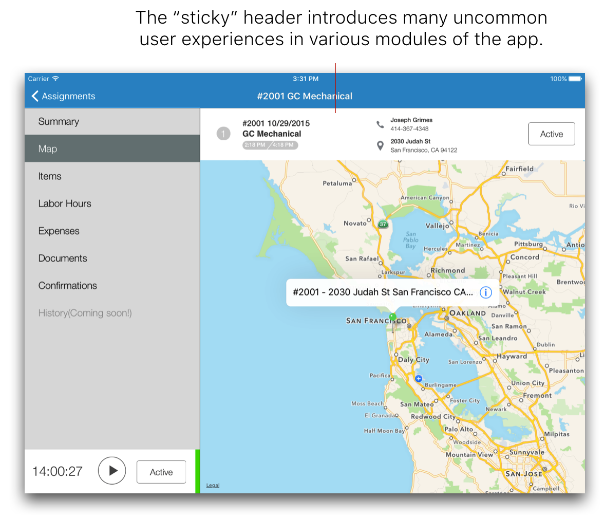
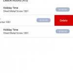
The Sticky Header
Xamarin Field Service – Sticky Header
Problem: With the sticky header gone, what is the best place to put it?
Objective: Find an alternative to place the sticky header with global accessibility.
Considerations: The information should be globally accessible, anytime, anywhere.
Our solution: Provide a header callout that displays the removed information.
In my personal opinion, it’s the “sticky header” in the content detail view is what breaks the overall iPad experience. This is why we have removed this view and opted to stick it in only the Summary view, the correct place where it belongs. Users also do not have to see this information the whole time.

Crosslight Field Service – iPad
However, if the user wants to see that quick information, he can just tap on the top header anytime and a callout will present the temporary information he needed.
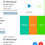
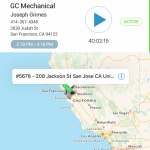
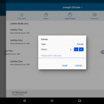
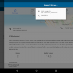
The “Active Work” Indicator/Player
Before we proceed, we might have forgotten one other thing. The “active work” indicator/player. If you notice, when the assignment is marked as Active, the player pops out from the bottom of the screen to let the user know that the current assignment is active and he can pause at any time. This will count automatically as a new entry in the Labor Hours screen.
Problem: Display globally-available information that shows the current work is active that adheres to Apple’s standard user experience.
Objective: Display the “active work” indicator/player in the dialog presenter content detail.
Considerations: It has to be global (user should be able to see it all the time). The dialog presenter content is already cramped up. Where would be the correct place to put the view?
Before I present you with our approach to the above problem, I want you to think how to solve this problem. Think of all the possible places and approaches to tackle this problem. And yes, Apple did have this exact same problem in one of their apps. Can you guess what the app is?
Did you come up with any solution to the above problem? If not, let me tell you what our solution is: Apple’s Music Player View.
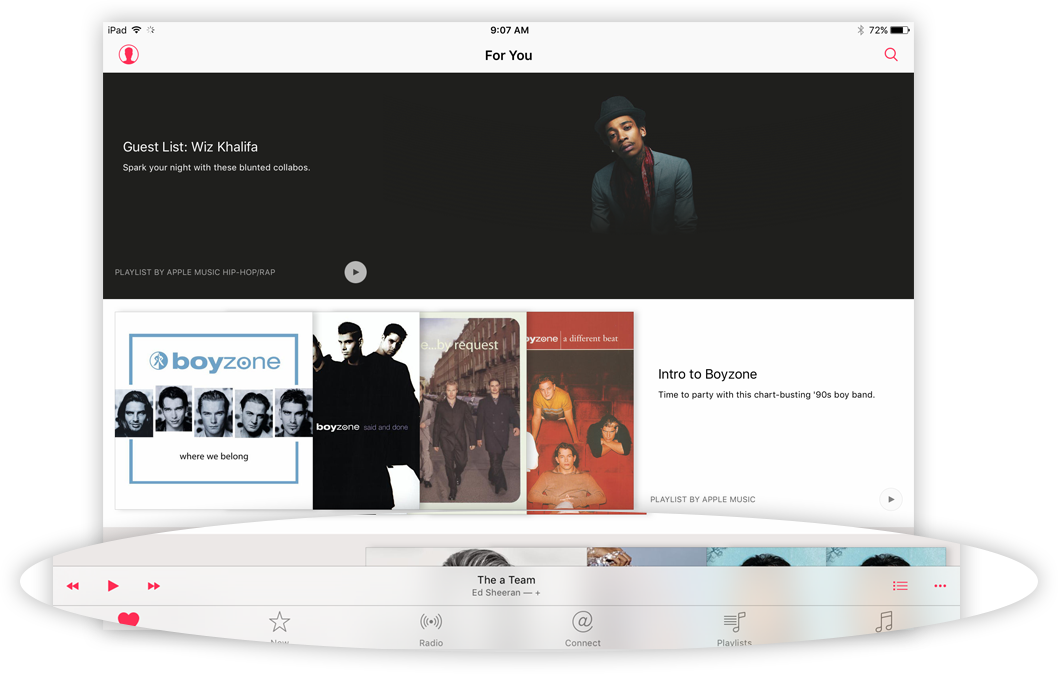
Apply Music – Player
Think about it. The Music app introduced in iOS 8.4 has this exact same problem. When the music is playing, how can Apple show the user on what music is playing, globally, and whether the user can perform any actions upon it?
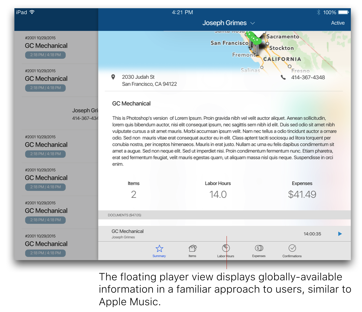
Crosslight Field Service – Active Work View
Yes, we dealt with the problem the same way. Both of the solutions are consistent in iPhone and iPad.
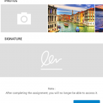
The Confirmation Screen
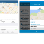
The last, but not the least view in the app: the confirmation screen. This screen also presents quite a challenge to be redesigned and optimized.
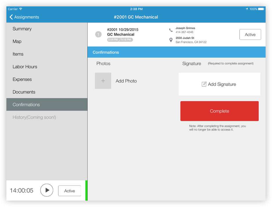
Xamarin Field Service – Confirmation
Take a look at the design above. And imagine running it on a phone.
The design is quite tricky to address, since it has one list and a signature pad.
Problem: The screen’s design cannot be adapted to phones.
Objective: Revamp the screen in such a way that will accommodate users running on tablets and phones.
Considerations: The vertical-scrolling list might be a problem.
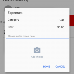
Our solution: Change the vertical-scrolling list into a horizontal-scrolling list and add the signature pad directly beneath it.

Crosslight Field Service – Confirmation Screen
Therefore, we’ve elegantly redefined how things work in the Confirmation screen by making the Photos section acts as a carousel view with Signature Pad placed directly underneath it. This way, it can work on smaller screens like phones.
How about Android?
Android fans, do not fret. Let’s take a look at the Android designs of the Field Service app.
Here’s a gallery of how it looks on the phone.
And here’s how it looks on Android tablets.
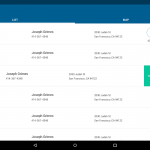
Umm, wait, the images above look very similar with iOS rather than Android, particularly the swipe-to-action screens. Could it be possibly that I attach wrong images, you might asked. Nope! We’ve great surprises for you, Android fans! Stay tuned for my answer in the next post.
Wrapping Up
I hope this post may give you meaningful insights on better design for cross-platform, especially one that works for both tablets and phones. By streamlining the design and user flow at the beginning, jumping into development becomes much an easier task with clearer goal in mind.
If you haven’t try out Crosslight, you can quickly jump start by requesting your free 30 day trial here. You will be guided by our consultant team during your evaluation period.
In the next post, we’ll see how can we use Crosslight to create this app and make it work across all platforms of different screen sizes and see how much code for this app can be optimized to work for multiple platforms.
Update
Read the part 2 here, which contains highlights of the finished sample along with snippet codes and detailed explanations.
Till next post,
Nicholas Lie

Hi Nicholas. Today, I read through your recent blog posts for the first time. The new way you present and explain Crosslight features is really great. Please, keep this direction.
This blog post I like most of all and I can’t wait for its sequel. To have all of this in working source code would be great and it would be a wonderful reference sample for Crosslight. The Android screens look very promissing as well. It appears you integrated the Material Design into Crosslight which is a long awaited feature from my side.
Keep up your great work and don’t let us wait to long for the next Crosslight version.
Hi Thomas, I’m glad you like this post. Yes, stay tuned for the real implementation for the Field Service app in Crosslight app. We’ll definitely let you know as soon as its available. You’ll be surprised with how easy it is to integrate Material Design interactions and behaviors to your Crosslight.Android apps. See you in the next post!
Hey Nick, has there been any progress with the implementation for the Field Service?
Hi Domingo, yep, we’ve almost finished the sample: it’s around 90% now. We’ll be releasing the Field Service along with Crosslight 5. Stay tuned!
Sounds good! Can’t wait.
Hi Nicholas, is the Field Service sample already finished? Thanks, for your feedback.
Hi. Been waiting on this sample. Any news yet?
Wow, looks like a lot of people are waiting for this one. Hopefully it will be available soon.