Redesigning Xamarin Field Service Sample with Crosslight – Part 2
Back in November 2015 I wrote a blog post on Redesigning Xamarin Field Service Sample – Part 1. Well, in that post I’ve discussed various design quirks and what improvements can be made to made the overall Xamarin Field Service sample better. First of all, we’re glad to receive many positive responses towards that post and very happy to see many Crosslight developers are taking UI and UX very seriously in designing their cross-platform apps.
Many of you have asked when will the blogpost see the light of day. Well, now it is. We’re very excited to announce that the sample is now available for you guys to check out and experiment for yourself. It is available here: http://git.intersoftsolutions.com/projects/CS/repos/app-fieldservice/browse. Before I can delve into the technical aspects of this sample, in this second part of the post, I would like to re-highlight what we’ve promised in the first post and see it in action, in the form of shots and videos, with codes if possible. We tried to retain the business logic as much as we can to adhere to the original sample.
Better Device Compatibility
When you try to run the original sample, you won’t be able to run the sample on phone devices, which is kind of disappointing. But not with Crosslight. You can definitely deploy the sample on phones and tablet devices.
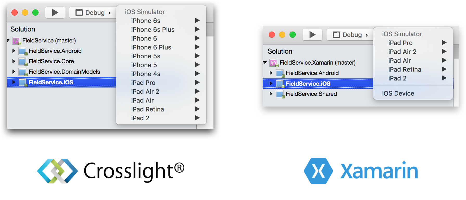
With this, you can easily target more devices as phone devices are greater in number when compared to tablets. One note: we’re discarding Windows-based platforms for now due to low market receptivity. Once it has gained more traction amongst cross-platform mobile developers, we’ll definitely revive the Windows lineup.
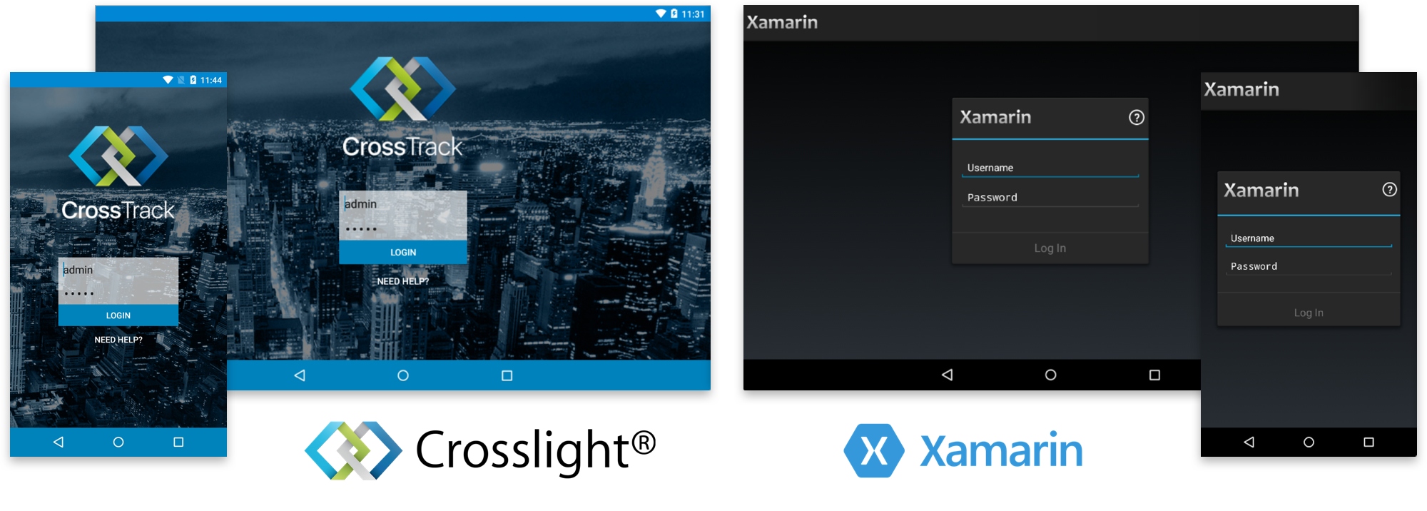
The Login Screen
First, let’s take a look at the original sample login screen experience.
One thing’s for sure: I can’t definitely use this screen on landscape orientation. When I try to focus on the username text box, the login box just flies away from the screen up to the point I can’t see where the text box is and input my username. You can still use this screen on portrait orientation though. Which is weird. Let’s take a look at Crosslight’s login screen.
No matter how you rotate it, it works consistently on both portrait and landscape orientation, on phones as well.
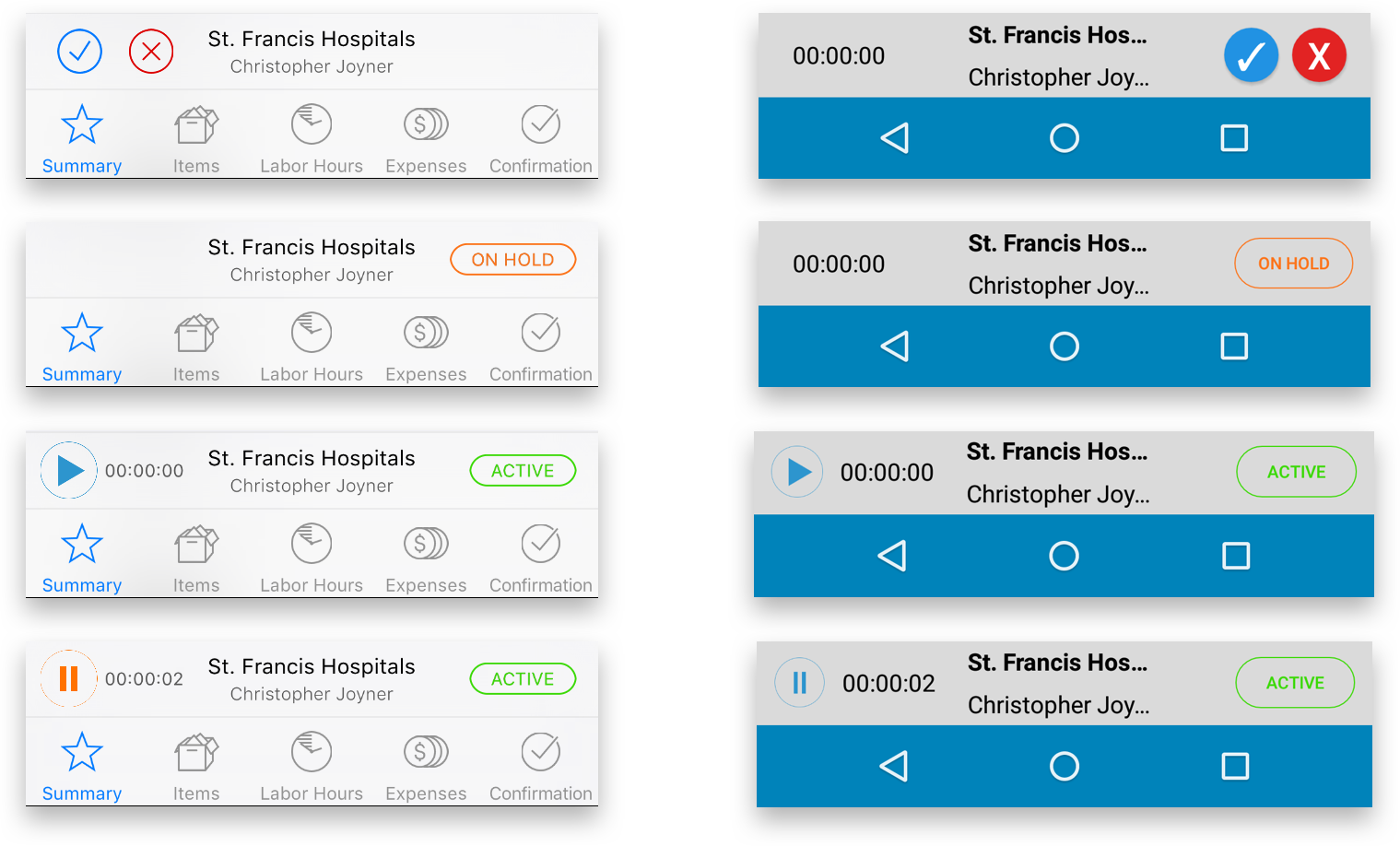
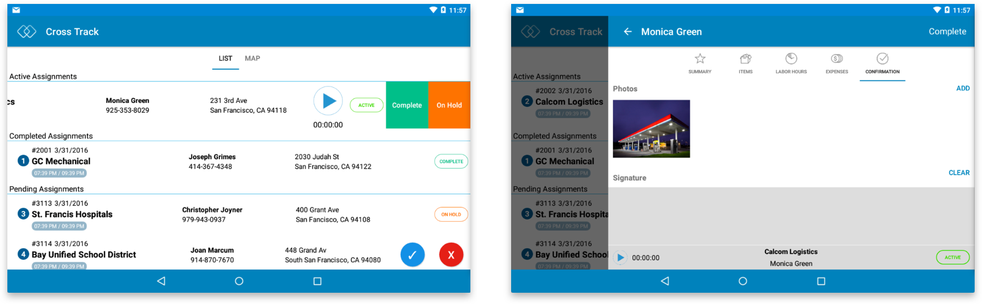
The Assignment List Screen
The assignment screen is pretty much the same, except for a few changes:
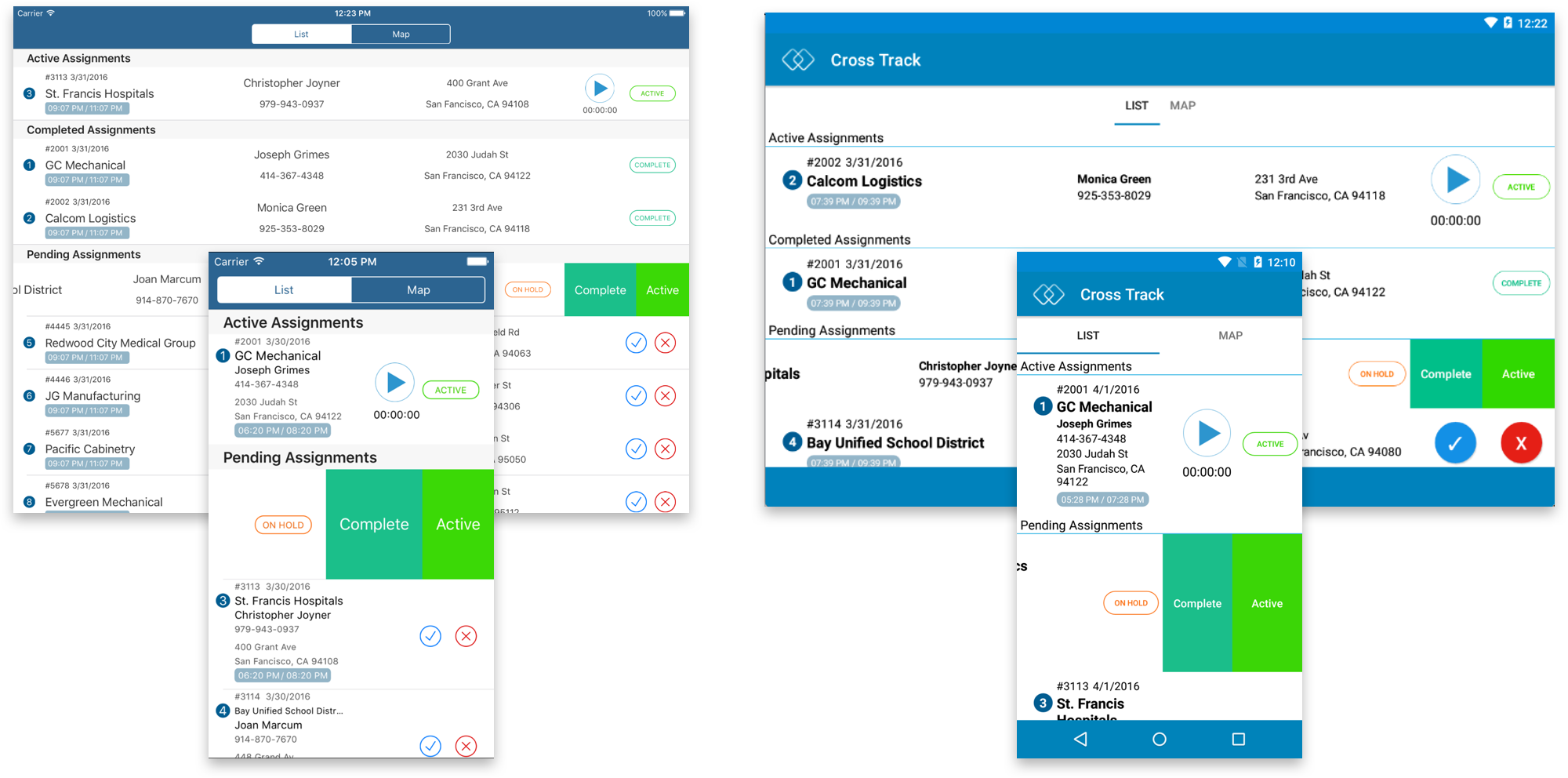
- We don’t feel that the “sticky” header feels common in modern mobile apps, therefore we opted for “grouped” assignments instead. Sticky headers tend to take too much space, obstructing the user’s view and may cause confusion. Active assignments are put on the top of the list, followed by Completed assignments and Pending assignments. On iOS, you can easily tap the status bar to get to the topmost part of the TableView (this is the default behavior of the TableView) to see the Active Assignment quickly.
- We removed the the button click behavior from the “assignment status”. Instead, we opted for swipe gesture, as this is more commonly used in mobile apps. If the assignment is On Hold, you can only see Active and Complete as options (as shown in the shot above). It feels counter-intuitive to have two clickable UI elements inside an assignment. The user might wonder if there’s any additional UI elements that can be clicked in addition to the “Play” button.
- Also notice that you can’t perform the swipe gesture if the assignment isn’t accepted yet, or is currently the running assignment. The secret lies in the AssignmentListViewModel.cs inside FieldService.Core/ViewModels folder. /// <summary>
/// Determines whether the edit command can be executed.
/// </summary>
/// <remarks>>
/// Allow users to perform swipe actions only when:
/// 1. The item status is Active or Pending
/// 2. The active assignment is not currently running.
/// </remarks>
protected override bool CanExecuteEdit(object parameter)
{
if (parameter is EditingParameter)
{
EditingParameter editingParameter = parameter as EditingParameter;
if (editingParameter.Item is Assignment)
{
Assignment item = editingParameter.Item as Assignment;
if (item == this.AssignmentViewModel.Item && this.AssignmentViewModel.IsStarted)
return false;
else
return (item.Status == “Active“ || item.Status == “Pending“);
}
} return false;
}
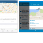
The Assignment Detail Screen
This is where things get pretty interesting.
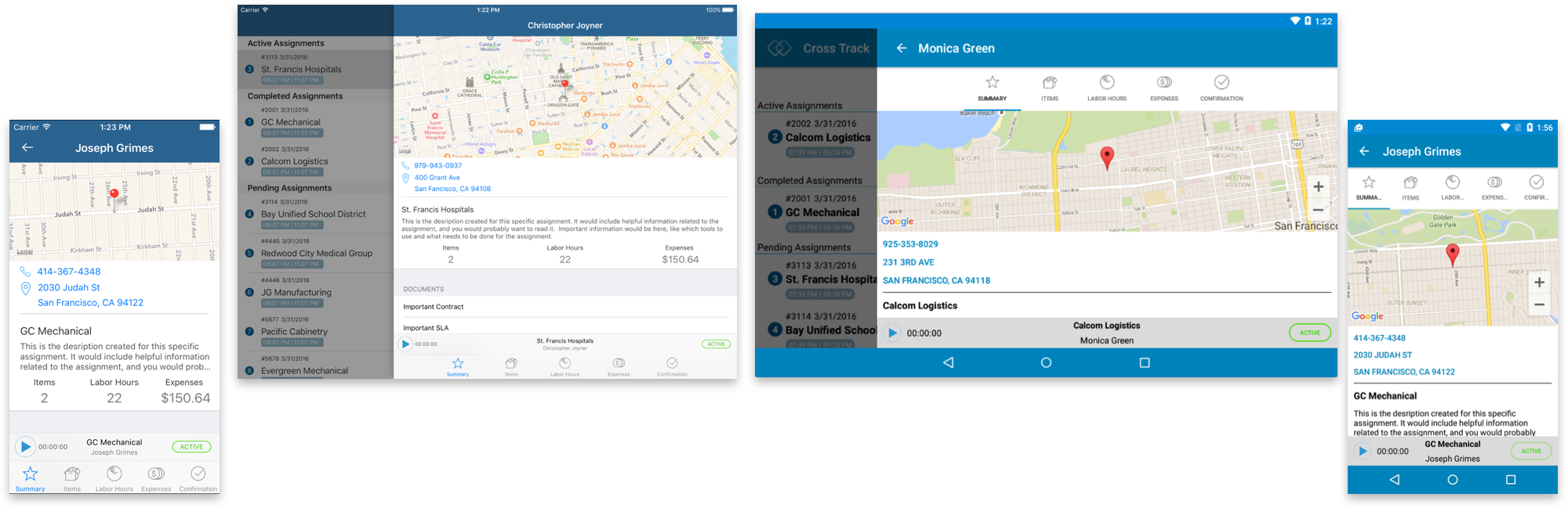
As promised, on tablets, we’ve used the new Dialog Presenter that will slide from the right hand side that will cover at least 3/4 of the screen. You can easily dismiss the detail by hitting the back button on Android or tapping on the area outside the dialog. On phones, normal push navigation is used. To use the Dialog Presenter on iPad, at the TabViewController’s constructor, simply use this code:
public AssignmentDetailTabViewController()
{
var isPad = UIDevice.CurrentDevice.UserInterfaceIdiom == UIUserInterfaceIdiom.Pad;
this.ConfigurePresenter(o =>
{
o.PreferredContentSize = new CGSize(640, 768);
o.PreferredContentSizeLandscape = new CGSize(704, 768);
o.DismissOnTap = true;
if (isPad)
{
o.PresentationStyle = ContentPresentationStyle.Edge;
o.EdgePresentationPosition = EdgePresentationPosition.Right;
o.EntryTransition = new SlideFromRightTransition()
{
FadeOutSource = false
};
o.ContentShadowRadius = 10;
}
});
}
And when navigating, you can do something similar as follows:
// on phone, perform standard navigation, while on tablet show the dialog presenter for better experience
if (this.GetService<IApplicationService>().GetContext().Device.Kind == DeviceKind.Phone)
{
this.ActiveViewModel.NavigationService.Navigate<AssignmentDetailTabViewModel>(new NavigationParameter(parameter));
}
else
{
this.ActiveViewModel.DialogPresenter.ShowAsync<AssignmentDetailTabViewModel>(
new NavigationParameter(parameter),
new DialogOptions()
{
HideButtons = true
});
}
You can see more detail on that inside the FieldService.Core/ViewModels/AssignmentViewModel.cs file.
Special and very important note for iOS: When using the TabViewController after push navigation, you must hide the root navigation controller in order for many correct UX to work properly, for example, the navigation controller transitions, search bar controller, and much more. This needs to be done because the TabViewController has its own NavigationController. It is simply done by calling the following code in the AssignmentDetailTabViewController.
protected override bool EnsureNavigationContext
{
get { return true; }
}
protected override void InitializeView()
{
base.InitializeView();
// Important: Hide the root navigation bar since the tab will have its own.
this.NavigationController.SetNavigationBarHidden(true, true);
}
We also added a little touch.
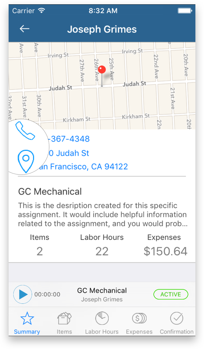
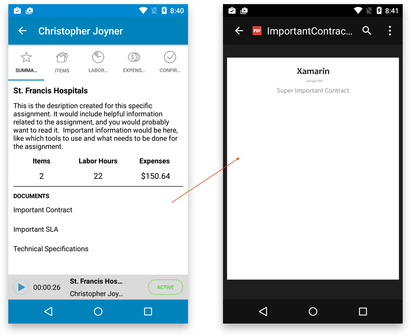
You can click the call button to immediately call the specified number, or click on the address to launch Maps with immediate directions to the specified location. If you try to click any of the documents below, the report will be displayed in a modal ViewController.
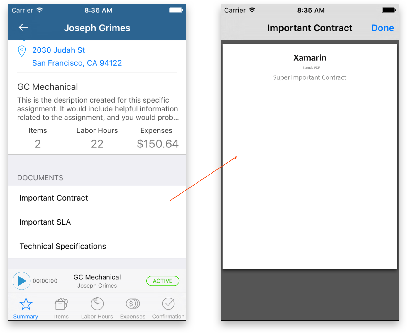
To launch the report on Android devices, you’ll need a PDF viewer installed to the emulator or device.
The Footer View Template
On iOS, notice that the new FooterViewTemplate is used, which resembles Apple-music style view template. On Android, since the tabs are placed on the top, the view template is used at the bottom of the screen.
The FooterViewTemplate is a new feature added in Crosslight 5.1. In iOS, to use thew new FotoerViewTemplate, simply override the property in the TabViewController and return the Nib file.
public override UIViewTemplate FooterViewTemplate
{
get { return new UIViewTemplate(AssignmentDetailTabFooter.Nib); }
}
If you’d like, you can also apply the translucent blur effect to the FooterViewTemplate by providing a Visual Effect View element using Xcode.
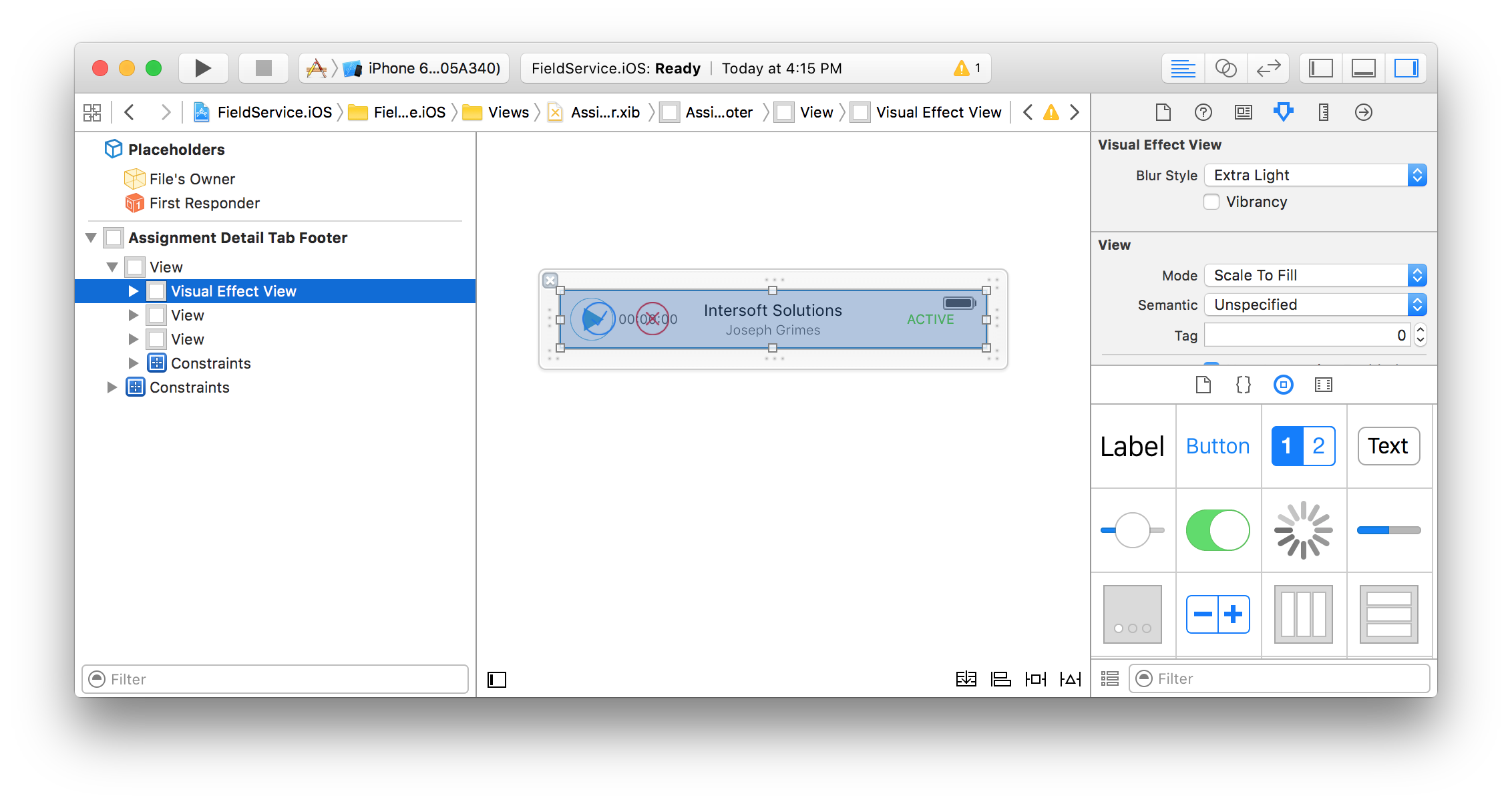
Here’s the result when applied.
Also note that when you use the FooterViewTemplate, Crosslight.iOS automatically calculates the height of the FooterViewTemplate and readjusts the content bounds above it, so that the contents not “overlayed” and obscured by the FooterViewTemplate. Very nifty.
On Android, you would simply override the ContentLayoutId of the AssignmentDetailTabFragment and return the layout you would like to use.
<?xml version=“1.0“ encoding=“utf–8“?>
<LinearLayout xmlns:android=“http://schemas.android.com/apk/res/android“
xmlns:app=“http://schemas.android.com/apk/res–auto“
android:layout_width=“match_parent“
android:layout_height=“match_parent“
android:orientation=“vertical“>
<android.support.design.widget.TabLayout
android:id=“@+id/tab_layout“
android:layout_width=“match_parent“
android:layout_height=“wrap_content“
app:tabTextAppearance=“@style/CustomTabText“ />
<FrameLayout
android:id=“@+id/fragment_container“
android:layout_width=“match_parent“
android:layout_height=“match_parent“
android:layout_weight=“1“ />
<LinearLayout
android:id=“@+id/FooterLayout“
android:layout_width=“match_parent“
android:layout_height=“50dp“
android:orientation=“horizontal“
android:paddingLeft=“10dp“
android:paddingRight=“10dp“
android:background=“#DADADA“>
<LinearLayout
android:orientation=“horizontal“
android:layout_weight=“1“
android:layout_width=“0dp“
android:layout_height=“50dp“>
<FrameLayout
android:id=“@+id/StartButtonLayout“
android:orientation=“horizontal“
android:layout_width=“30dp“
android:layout_height=“wrap_content“>
<ImageButton
android:id=“@+id/StartButton“
android:layout_gravity=“center“
android:scaleType=“fitCenter“
android:layout_width=“match_parent“
android:layout_height=“match_parent“
android:background=“#00000000“
android:src=“@drawable/Start“ />
</FrameLayout>
<TextView
android:id=“@+id/FooterElapsedTimeLabel“
android:layout_width=“wrap_content“
android:layout_height=“wrap_content“
android:layout_marginLeft=“10dp“
android:text=“ElapsedTime“
android:layout_gravity=“center_vertical“
android:textColor=“#000000“ />
</LinearLayout>
<LinearLayout
android:orientation=“vertical“
android:layout_weight=“1“
android:layout_width=“0dp“
android:gravity=“center_horizontal“
android:layout_height=“match_parent“>
<LinearLayout
android:orientation=“horizontal“
android:layout_weight=“1“
android:layout_width=“wrap_content“
android:layout_height=“0dp“>
<TextView
android:id=“@+id/FooterNameLabel“
android:layout_width=“wrap_content“
android:layout_height=“wrap_content“
android:text=“Name“
android:textStyle=“bold“
android:singleLine=“true“
android:layout_gravity=“center_vertical“
android:textColor=“#000000“ />
</LinearLayout>
<LinearLayout
android:orientation=“horizontal“
android:layout_weight=“1“
android:layout_width=“wrap_content“
android:layout_height=“0dp“>
<TextView
android:id=“@+id/FooterContactPersonLabel“
android:layout_width=“wrap_content“
android:layout_height=“wrap_content“
android:text=“ContactPerson“
android:singleLine=“true“
android:layout_gravity=“center_vertical“
android:textColor=“#000000“ />
</LinearLayout>
</LinearLayout>
<FrameLayout
android:orientation=“horizontal“
android:layout_weight=“1“
android:layout_width=“0dp“
android:layout_height=“match_parent“
android:gravity=“right“>
<LinearLayout
android:id=“@+id/ActivePendingLayout“
android:orientation=“horizontal“
android:layout_width=“70dp“
android:layout_gravity=“right|center_vertical“
android:layout_height=“30dp“>
<Button
android:id=“@+id/ActivePendingButton“
android:text=“ACTIVE“
android:textColor=“#3BD606“
android:textSize=“10sp“
android:layout_gravity=“right|center_vertical“
android:layout_width=“70dp“
android:layout_height=“30dp“
android:background=“@drawable/circularTextViewGreen“ />
</LinearLayout>
<LinearLayout
android:id=“@+id/AcceptRejectLayout“
android:orientation=“horizontal“
android:layout_width=“80dp“
android:layout_height=“match_parent“
android:layout_gravity=“right“>
<LinearLayout
android:orientation=“vertical“
android:layout_width=“0dp“
android:layout_height=“match_parent“
android:gravity=“center“
android:layout_weight=“1“>
<Button
android:text=“✓“
android:textColor=“#ffffff“
android:textSize=“22sp“
android:layout_width=“32dp“
android:layout_height=“32dp“
android:gravity=“center“
android:background=“@drawable/circularButtonBlue“
android:id=“@+id/AcceptButton“ />
</LinearLayout>
<LinearLayout
android:orientation=“vertical“
android:layout_width=“0dp“
android:layout_height=“match_parent“
android:layout_weight=“1“
android:gravity=“center“>
<Button
android:text=“X“
android:textColor=“#ffffff“
android:textSize=“22sp“
android:gravity=“center“
android:layout_width=“32dp“
android:layout_height=“32dp“
android:background=“@drawable/circularButtonRed“
android:id=“@+id/RejectButton“ />
</LinearLayout>
</LinearLayout>
</FrameLayout>
</LinearLayout>
</LinearLayout>
One thing to note is the middle FrameLayout with the ID fragment_container. You’ll need to provide this or the fragment transaction would not work properly.
Single-Responsibility Principle
Before we proceed, I want you to think about this problem for a second: since an assignment can be manipulated from so many places: the list screen, the detail screen and the map screen, what design approach is best used to “sync” the assignment state from any screens, but in an elegant way? For example, the user can start an assignment from the list screen, then from the detail screen, the user pauses, changes the assignment status, then go back to the map screen, plays the assignment once more, change the assignment status to Active, and so on.
We need to access the assignment from various ViewModels across the app, but we must ensure that the assignment states are correct whenever it is accessed anywhere. In this sample, we’ve used the Single-Responsibility Principle to address this problem, exhibited by AssignmentViewModel.cs located inside FieldService.Core/ViewModels folder. This single class holds a unified information for the Active Assignment as well as any other commands that can interact with the assignment, such as accepting, rejecting, starting, changing status, etc.
Crosslight provides an elegant solution to this problem with the IoC (Inversion of Control) pattern. By registering the ViewModel once in the Container class, you can easily resolve and use this ViewModel anywhere. To begin with, open the AppService.cs file inside FieldService.Core/Infrastructure folder where you’ll an entry that looks similar to the following.
// the assignment view model streamlines all assignment–related logics
// which is resolved in numerous ViewModels such as list, map, and detail
Container.Current.Register<AssignmentViewModel>(c => new AssignmentViewModel()).WithLifetimeManager(new ContainerLifetime());
To resolve the registered ViewModel anyhwere, all you need to do is create a getter-only property that resolves the ViewModel from the Container. For example, as follows.
public AssignmentViewModel AssignmentViewModel
{
get
{
return Container.Current.Resolve<AssignmentViewModel>();
}
}
Once this is done, you can easily use the object inside your BindingProvider and ensure that the data bindings work flawlessly across screens.
// Command bindings
this.AddBinding(“ActivePendingButton“, BindableProperties.CommandProperty, “AssignmentViewModel.ChangeStatusCommand“);
this.AddBinding(“ActivePendingButton“, BindableProperties.CommandParameterProperty, “Assignment“);
this.AddBinding(“RejectButton“, BindableProperties.CommandProperty, “AssignmentViewModel.RejectCommand“);
this.AddBinding(“RejectButton“, BindableProperties.CommandParameterProperty, “Assignment“);
this.AddBinding(“AcceptButton“, BindableProperties.CommandProperty, “AssignmentViewModel.AcceptCommand“);
this.AddBinding(“AcceptButton“, BindableProperties.CommandParameterProperty, “Assignment“);
this.AddBinding(“StartButton“, BindableProperties.CommandProperty, “AssignmentViewModel.StartCommand“);
Very simple and elegant.
The Items Screen
Let’s take a brief look at the Items screen.
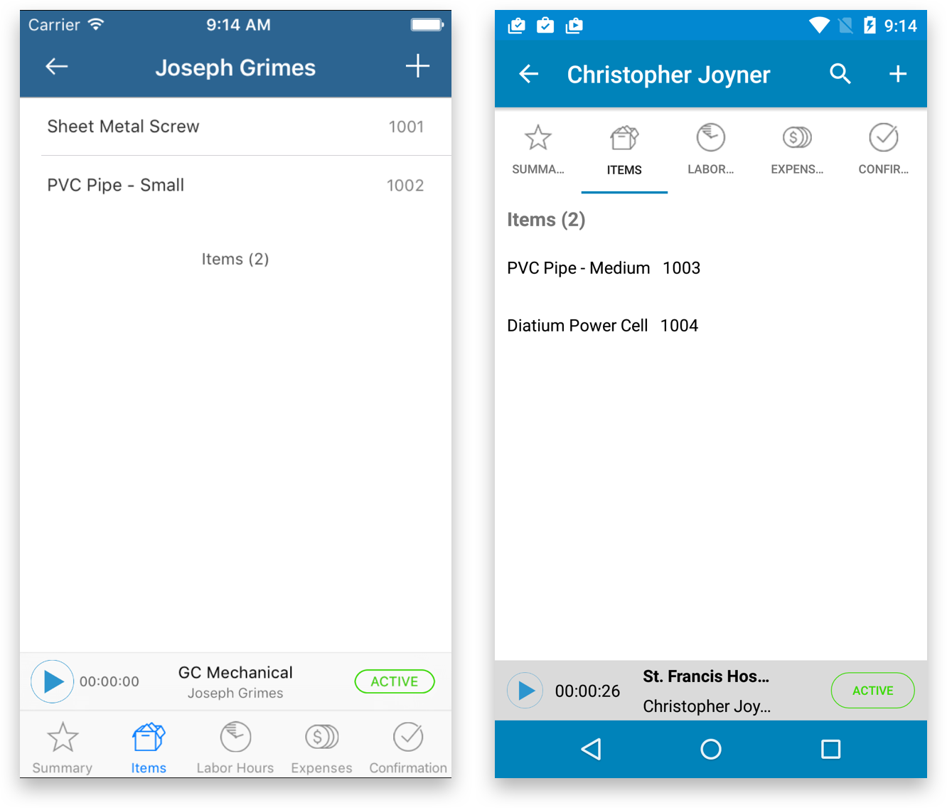
At a first glance, there’s nothing quite special in the Items screen. Until you try to swipe down.
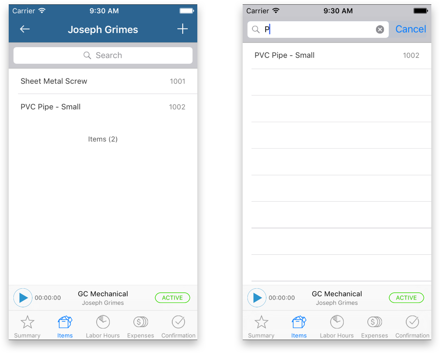
Notice that when you hit on the search bar, the status bar color changes according to the overridden PreferredStatusBarStyle.
public override UIStatusBarStyle PreferredStatusBarStyle()
{
if (this.SearchDisplayController != null && this.SearchDisplayController.Active)
return UIStatusBarStyle.Default;
else
return UIAppearanceSettings.StatusBarStyle;
}
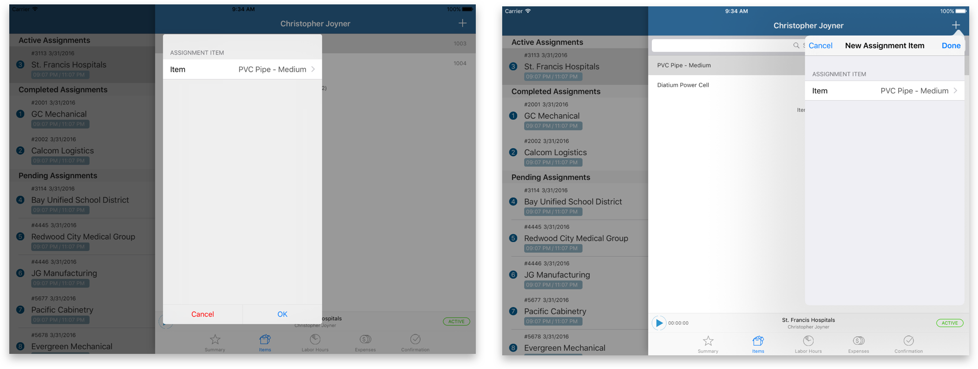
When you try to run this project on an iPad, you’ll get a popover controller when you try to add an item, and when you edit an item, you’ll get a nice modal ViewController that is displayed in the middle of the screen.
This corresponds to the BindingProvider defined for this view.
if (isTablet)
this.AddBinding(“TableView“, BindableProperties.SelectedCommandProperty, “NavigateToEditorCommand“);
else
this.AddBinding(“TableView“, BindableProperties.DetailNavigationTargetProperty, new NavigationTarget(typeof(AssignmentExpenseEditorViewModel)), true);
And in the ViewModel, the NavigateToEditorCommand invokes the following method.
public void ExecuteNavigateToEditor(object parameter)
{
this.DialogPresenter.ShowAsync<AssignmentItemsEditorViewModel>(
new NavigationParameter(parameter),
new DialogOptions()
{
NeutralButtonStyle = new DialogButtonStyle(Colors.Red)
});
}
When executing the Add command:
protected override void ExecuteAdd(object parameter)
{
this.NavigationService.Navigate<AssignmentItemsEditorViewModel>(
new NavigationParameter(this.TabViewModel.Assignment)
{
NavigationMode = NavigationMode.Modal,
EnsureNavigationContext = true,
ModalPresentationStyle = ModalPresentationStyle.FormSheet,
PreferPopover = true,
CommandId = “Add“
});
}
The Labor Hours Screen
In the Labor Hours screen, the experience is pretty similar when adding or editing an item.
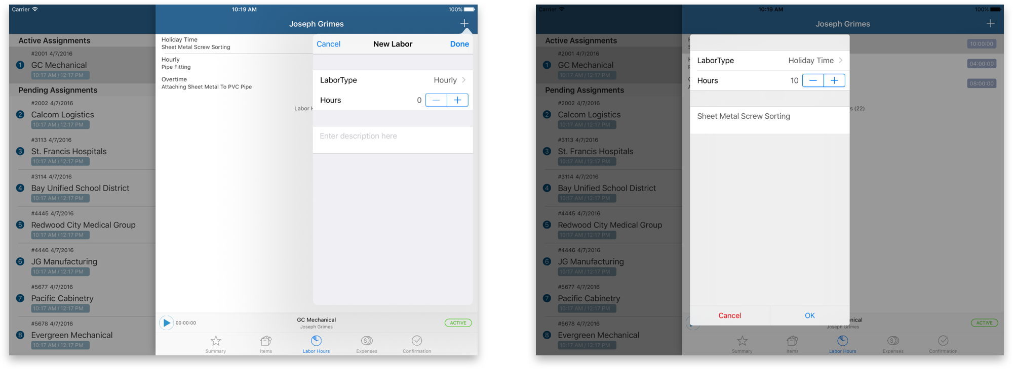
Perhaps one particular interesting technique is how to update the footer total Labor Hours at runtime. If you notice closely, when you edit any of the labor hours or add a new entry with a specified Labor Hours, the total labor hours sums up automatically.
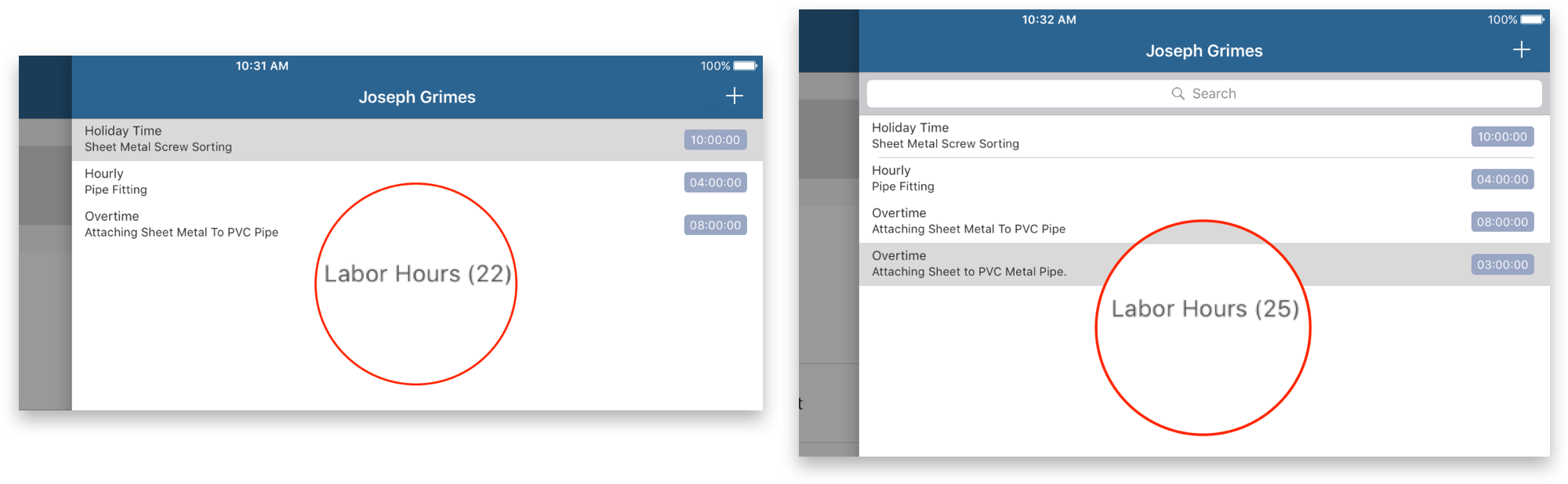
To achieve that effect, we provide the FooterViewTemplate for the Labor Hours screen.
public override UIViewTemplate FooterViewTemplate
{
get { return new UIViewTemplate(DetailFooterLayout.Nib); }
}
And here’s the DetailFooterLayout.
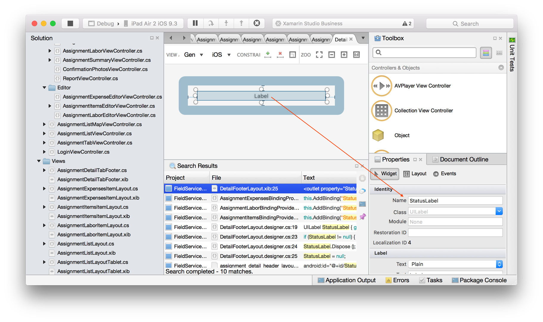
Then in the BindingProvider, we bind the label to.
this.AddBinding(“StatusLabel“, BindableProperties.TextProperty, new BindingDescription(“TabViewModel.Assignment.TotalLaborHours“) { StringFormat = “Labor Hours ({0:0.#})“ });
Which corresponds to the parent ViewModel (TabViewModel) property’s active Assignment with its TotalLaborHours property.
[IgnoreDataMember]
public double TotalLaborHours
{
get
{
return TimeSpan.FromTicks(this.Labors.Sum(o => o.Ticks)).TotalHours;
}
}
This way, we should be able to centralize the labor hours binding to the same property, eliminating unnecessary workarounds to elegantly achieve this effect.
Validating Input Using Form Validation Metadata
When you input a new labor hour entry, or edit an existing one. If you open the FieldServiceModel.Metadata.cs file inside FieldService.Core/DomainModels folder, you’ll see the following.
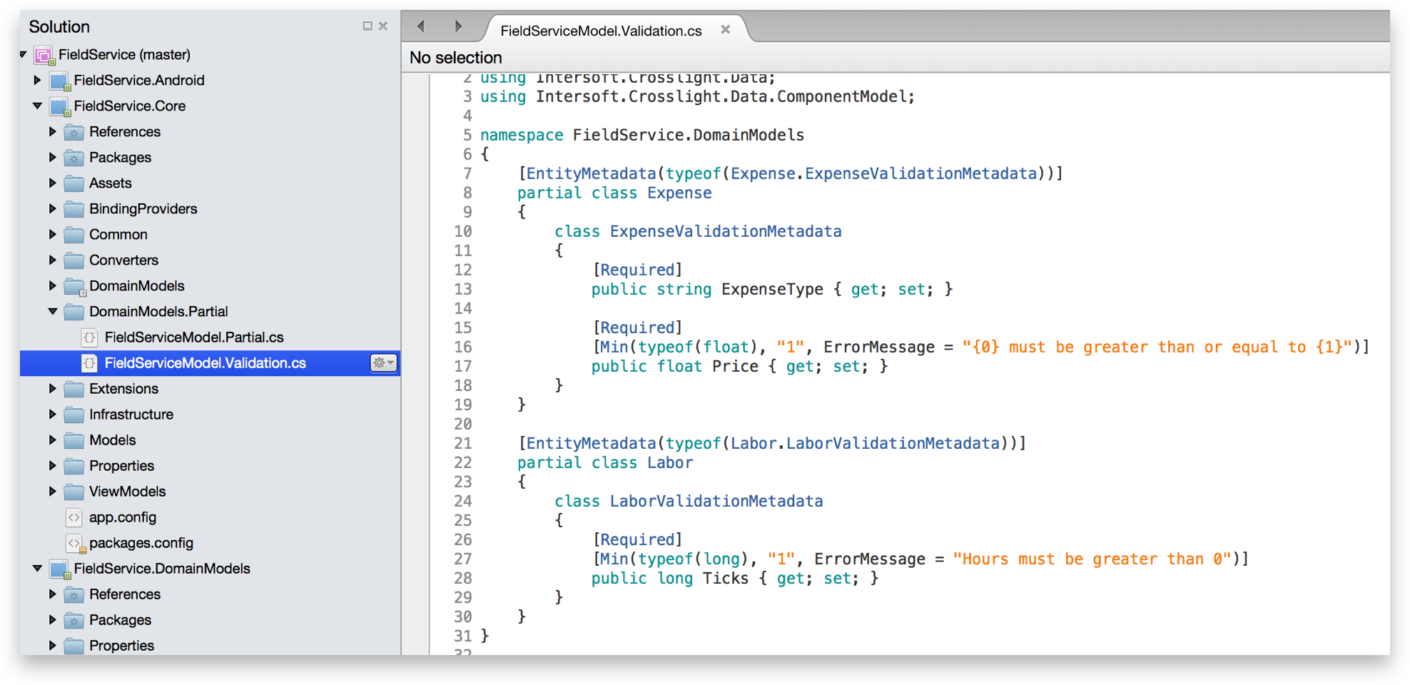
If you notice there, there are two validation metadata, one is for the Expense entry and one is for the Labor entry. In this example, we’ve ensured that the Ticks property is a Required Entry and the minimum number for the ticks is 1. Once these conditions are satisfied, then the form is considered a vaild entry and the changes will be saved. Similar to the Expense entry, we’ve enforced that the Price should be greater than 1.
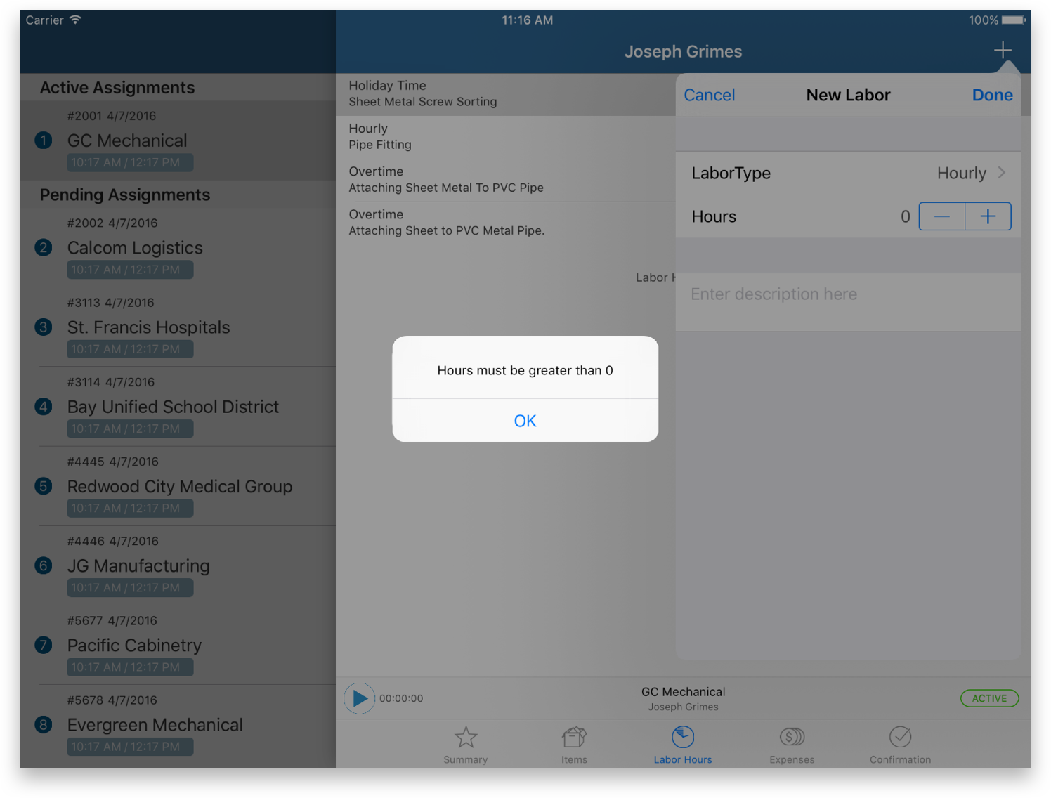
The important thing to ensure that the validation metadata works properly is that you create a partial class from the model that you want to validate, and decorate it with the EntityMetadataAttribute.
[EntityMetadata(typeof(Labor.LaborValidationMetadata))]
partial class Labor
{
class LaborValidationMetadata
{
[Required]
[Min(typeof(long), “1“, ErrorMessage = “Hours must be greater than 0“)]
public long Ticks { get; set; }
}
}
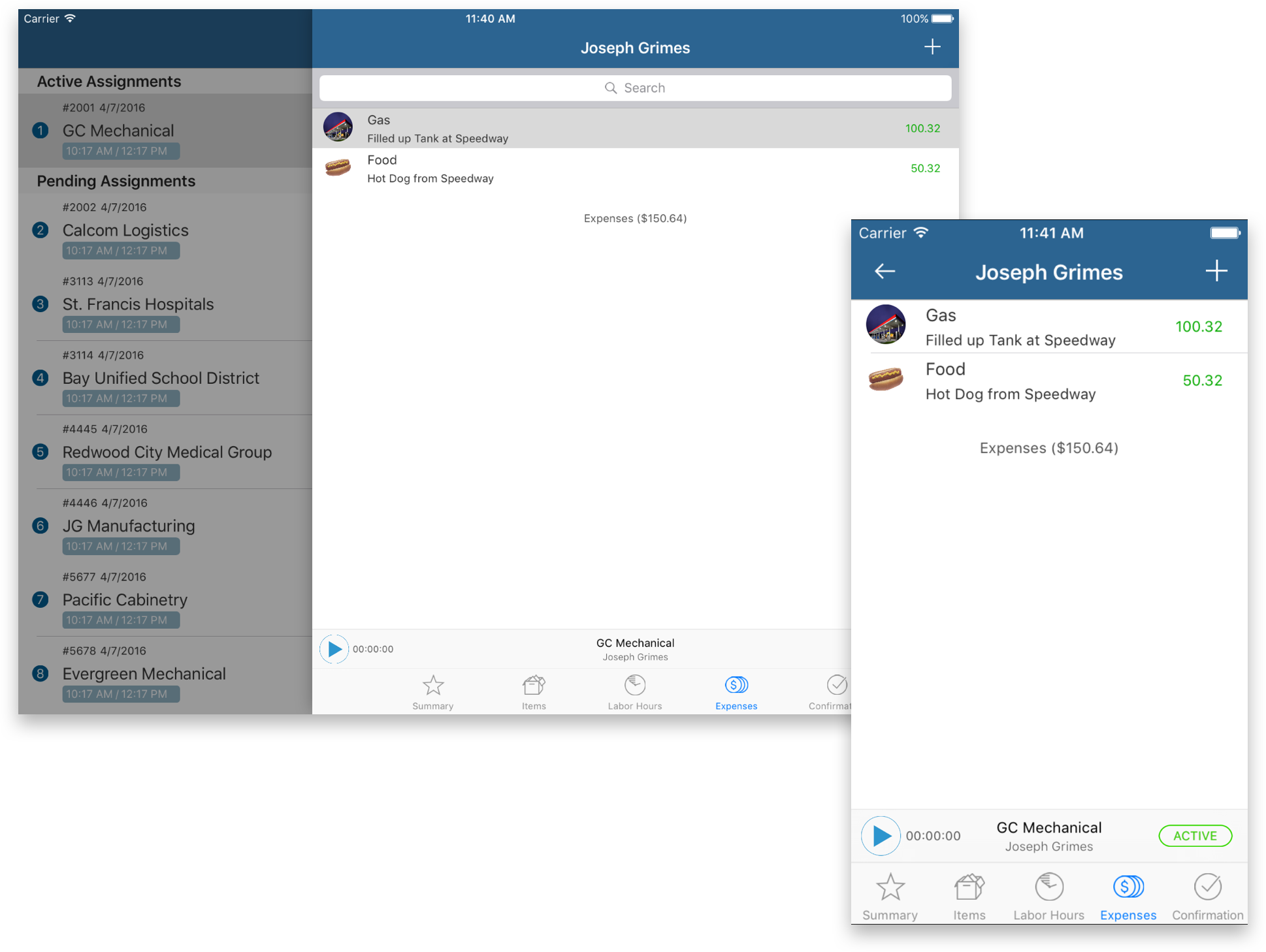
The Expense Screen
The Expense screen also uses pretty much the same technique with the Items and Labor Hours screen, which uses popover for adding new items and modal ViewController for the editing screen.
When you go to the editor screen, we improved on the Form Builder experience a bit to support the image editor detail scenario as follows.
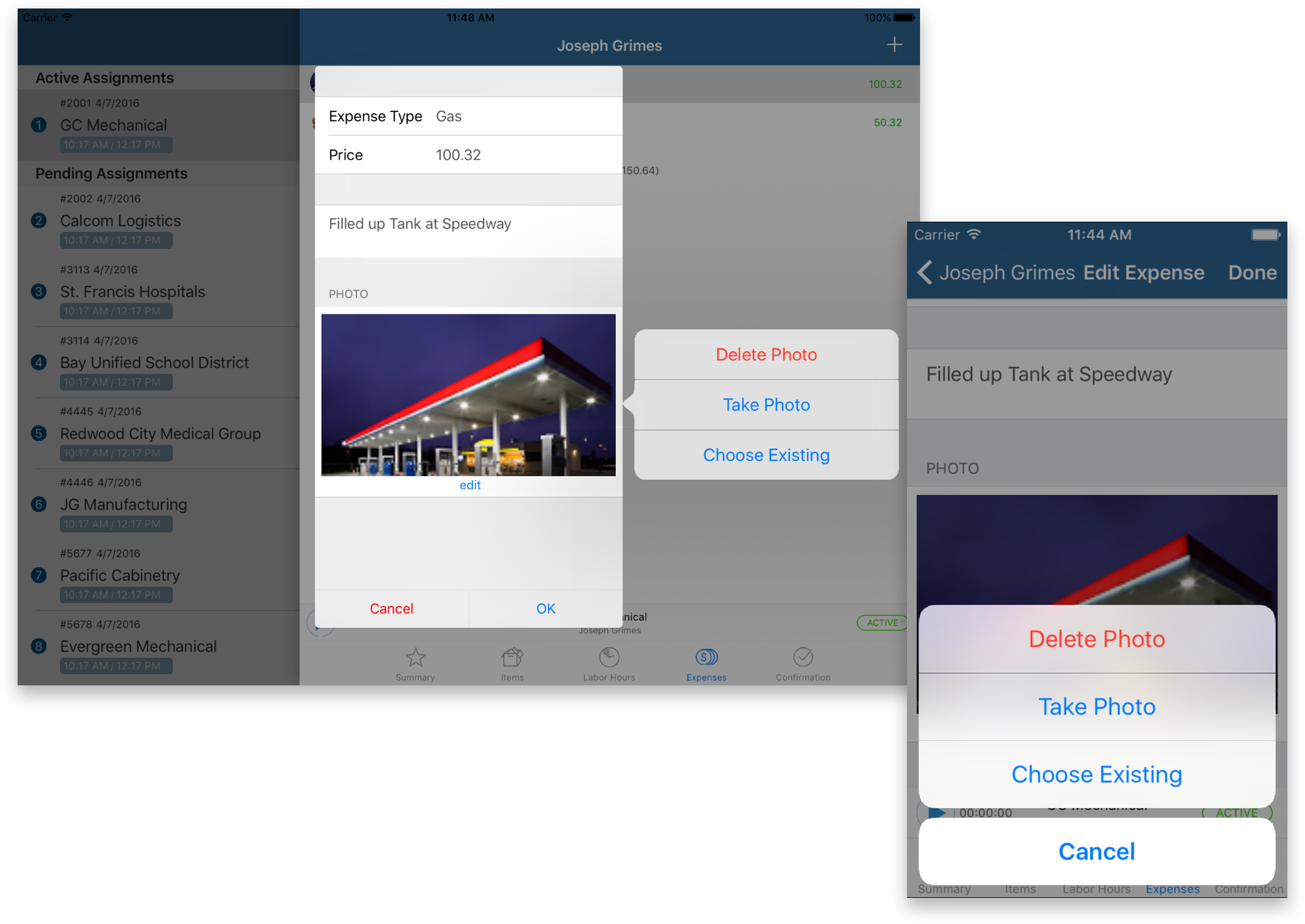
And in Android,
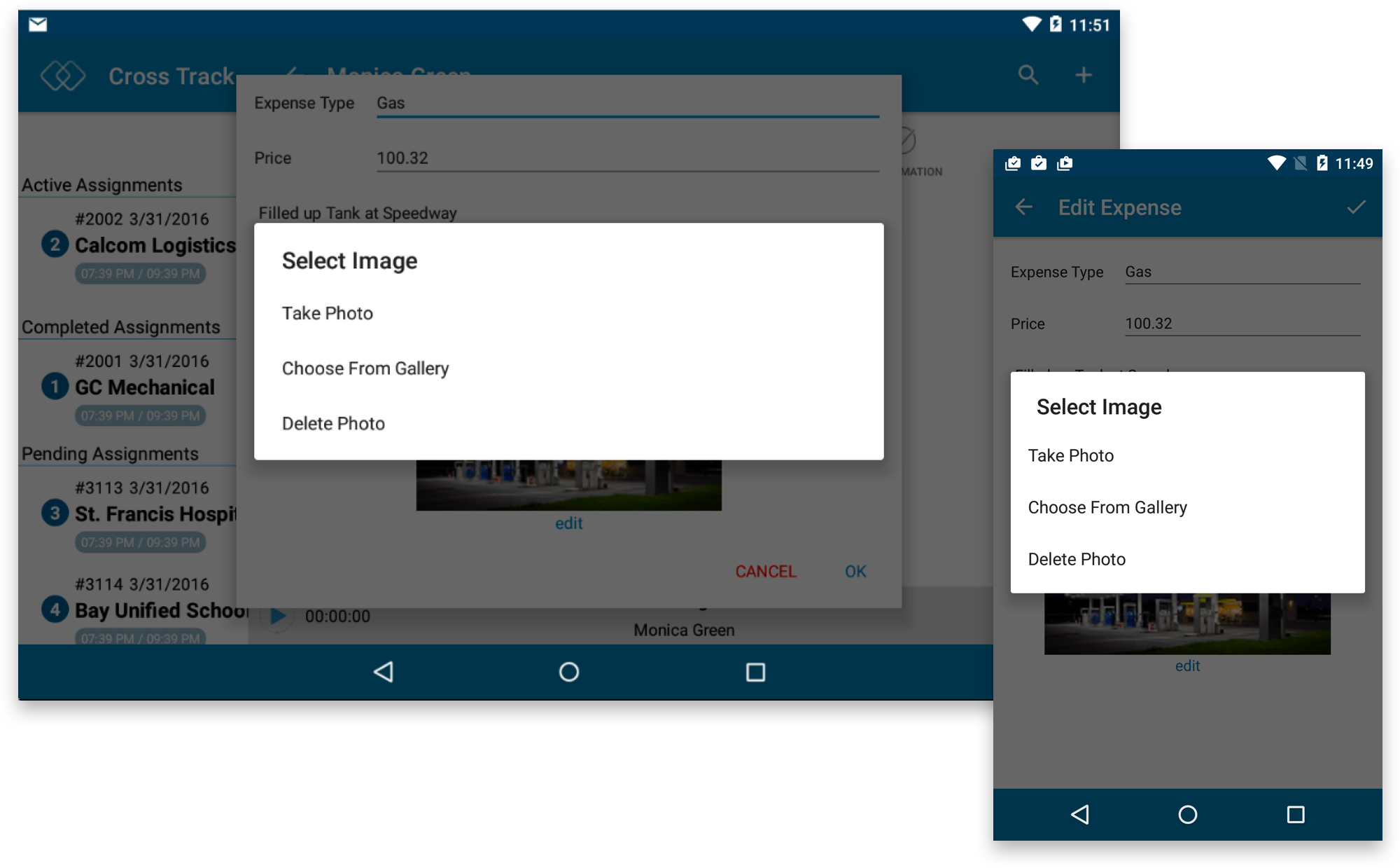
The FormMetadata is as simply as follows.
public class ImageSection
{
[Editor(EditorType.Image)]
[Layout(Style = LayoutStyle.DetailOnly)]
[Image(Height = 200, Placeholder = “photo.png“, Padding = 8, ScaleMode = ImageScaleMode.ScaleAspectFill)]
[ImagePicker(ImageResultMode = ImageResultMode.Both, UseThumbnailResult = false, PickerResultCommand = “FinishImagePickerCommand“)]
public static byte[] Image;
}
Jump to Complete Screen
Another interesting interaction in this app is how you can directly jump to the Complete screen when you decide Complete the assignment, either from the List screen, Map screen, or from the assignment detail.
Due to the Single Responsibility principle that we’ve used in this application, achieving this scenario is very easy. In the AssignmentViewModel, simply navigate to the Confirmation screen.
public void ExecuteComplete(object parameter, bool isFromConfirmationPage = false)
{
if (isFromConfirmationPage)
{
this.ExecutePendingOrComplete(parameter, “Complete“);
}
else
{
if (this.ActiveViewModel is AssignmentDetailTabViewModel)
{
// already in the detail view, focus to the confirmation screen
this.SetDetailSelectedIndex();
}
else
{
// we‘re in the main view, perform navigation to detail
this.AutoFocusToConfirmation = true;
this.ExecuteNavigateToDetail(parameter);
}
}
}
The Completion Screen
In the Completion screen, you’ll be greeted with two major UI elements: the Photos Grid/Collection View and a Signature Pad. If you try to complete the assignment immediately without entering any signature, you’ll get a toast message as follows.
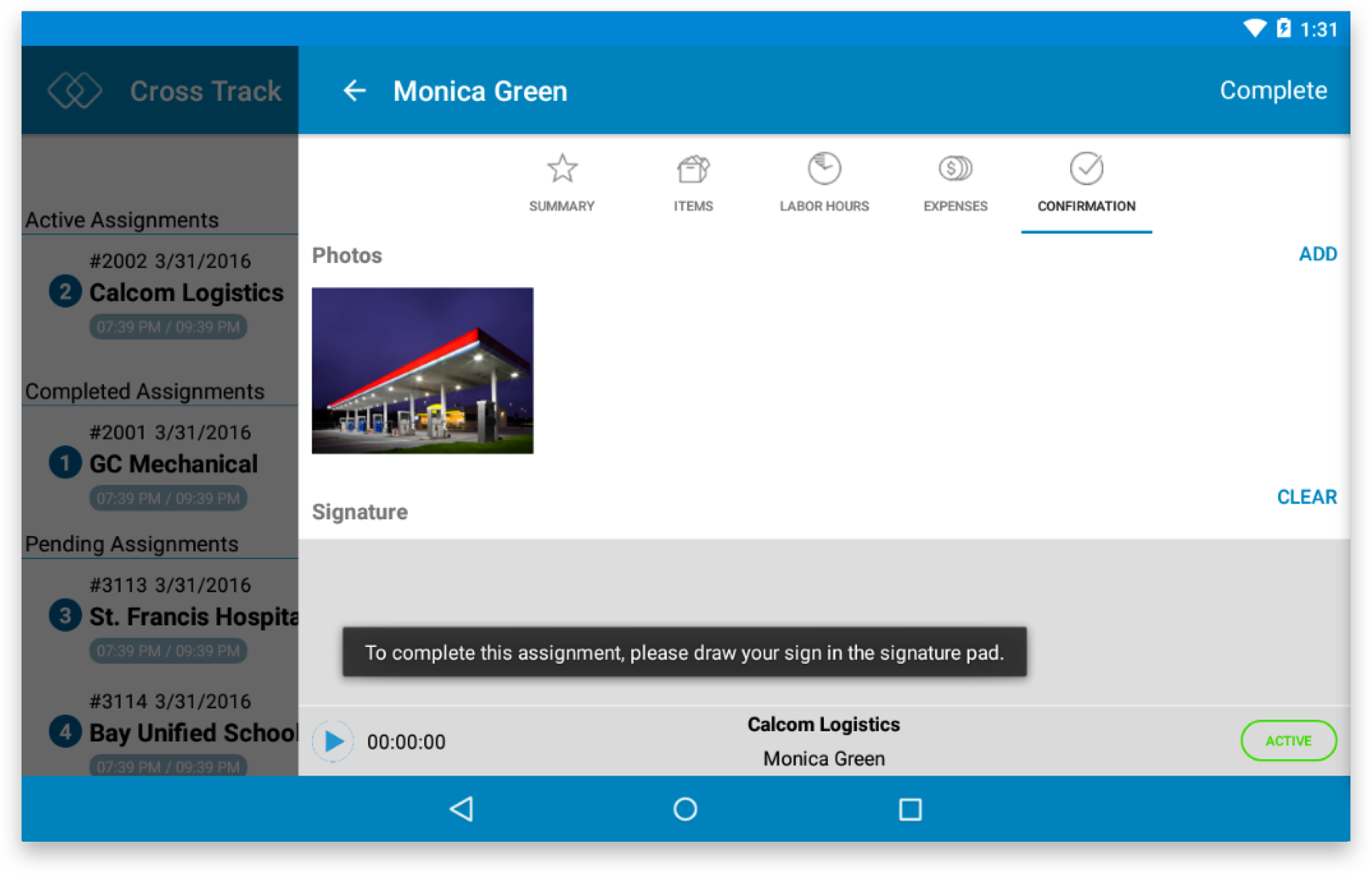
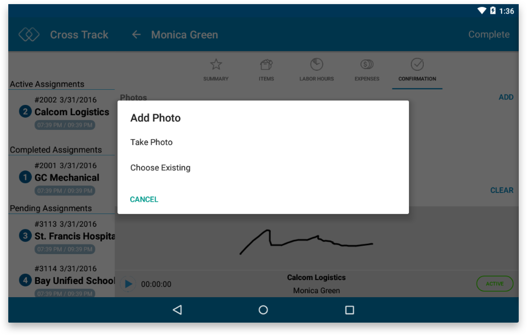
You can add additional photos when completing the assignment for extra information.
The code to execute the completion of an assignment is pretty straightforward.
public void ExecuteComplete(object parameter)
{
if (this.Assignment.Status == “Complete“)
{
this.ToastPresenter.Show(“This assignment already completed“);
}
else if (this.Assignment.Status == “Active“)
{
if (this.Signature == null)
{
this.ToastPresenter.Show(“To complete this assignment, please draw your sign in the signature pad.“);
return;
}
this.Assignment.Signature = this.Signature;
this.TabViewModel.AssignmentViewModel.ExecuteComplete(this.Assignment, true);
this.IsSignatureImageViewVisible = true;
this.IsSignatureCanvasVisible = false;
this.CompleteCommand.RaiseCanExecuteChanged();
this.AddPhotoCommand.RaiseCanExecuteChanged();
this.ClearSignatureCommand.RaiseCanExecuteChanged();
this.ToastPresenter.Show(“Assignment completed“);
}
else
{
this.ToastPresenter.Show(“You need to activate the assignment first“);
}
}
You can also clear the signature you’ve entered by hitting the Clear button above the Signature Pad.
Disable Editing After Completed
After you’ve completed an assignment, you won’t be able to make any changes to any of the items available in the Assignment Detail. This includes Items, Labor Hours, Expenses, Photos and Signature. This is possible because we simply need to check for the current Assignment’s Status and see if an operation can be completed.
[MaxLength(255)]
public string Status
{
get { return (string)this.GetValue(StatusPropertyMetadata); }
set { this.SetValue(StatusPropertyMetadata, value); }
}
In the ViewModel, you would simply override the CanExecute method and see if the assignment is completed before executing your method.
protected override bool CanExecuteSave(object parameter)
{
if (!this.IsNewItem && this.Item.Assignment.Status == “Complete“)
return false;
return base.CanExecuteSave(parameter);
}
This is done so elegantly that you don’t have to access any of the platform-specific views to accomplish this.
Wrapping Up
Hopefully this post provides you with even more insights on what’s happening behind the scenes with the new Crosslight Field Service sample. If you’d like to see more Xamarin samples to be converted to Crosslight, please do let us know in the comments section below.
Till next post,
Nicholas Lie

This is nice, but what happened to the Header Callout? Oh, and the searchable list of expenses and/or items when adding? These were all present on Part 1.
Imagine if you have a huge number of expense or items, and you need to Select from one of these items when adding it to your assignments… don’t you think it’s a good idea to enable filtering? This was featured on Part of this blog, when adding a new Item to your assignments… where the list of items available from the selection list can be filtered by using the search textbox.