Getting Started with Crosslight Dialog Presenter
Since the first release of Crosslight, developers have been enjoying the power of Crosslight presenters that allow them to present actions or display messages to the users, while sharing 100% of their business logic code in the ViewModel layer. Initially, there were only four presenters:
- Action Presenter: Shows relevant actions to the users. (i.e., take picture, choose from library, etc)
- Activity Presenter: Shows loading indicator for long-running process.
- Message Presenter: Shows message in the form of a popup dialog.
- Toast Presenter: Shows short-lived message in that dismisses automatically after a certain interval.
With the release of Crosslight 4, a new presenter is introduced: Dialog Presenter. This presenter allows developers to show any content, taking form of a modal popup-dialog.
Several features of the Dialog Presenter are:
- Gorgeous, dialog-style popup appearance
- Fully customizable content
- Customizable dialog options, such as buttons, title, etc
- Intuitive callback APIs
- Automatic rotation support
- Works consistently on iOS and Android
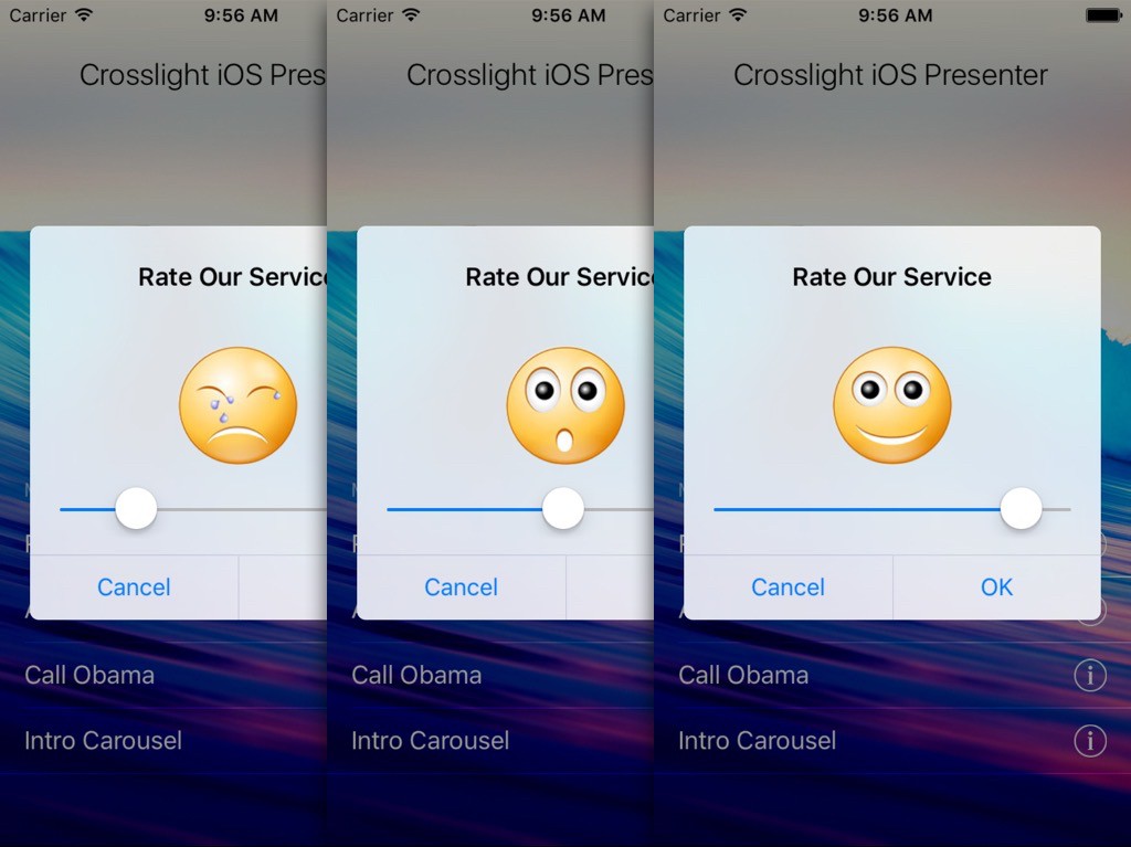
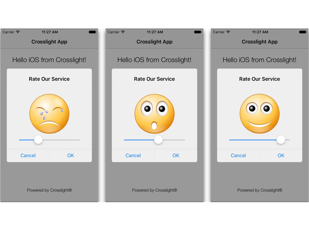
This post will help you get started with the new Dialog Presenter so you can take full advantage of its potential in Crosslight applications. The main idea is that we’re going to inject a new View inside the dialog presenter, and this can be ViewControllers or Fragments. Let’s try to create the above dialog presenter, complete with binding. We’re going to make a dialog presenter that shows different faces whenever the slider changes values to a certain value.
Preparing the Project
To start off, let’s use the Blank project created from Crosslight Project Wizard. Then, we’ll try to change the functionality of the “Update” button from the template to show our dialog presenter. I’ll call this project CrosslightDialogPresenter.
Preparing the Assets
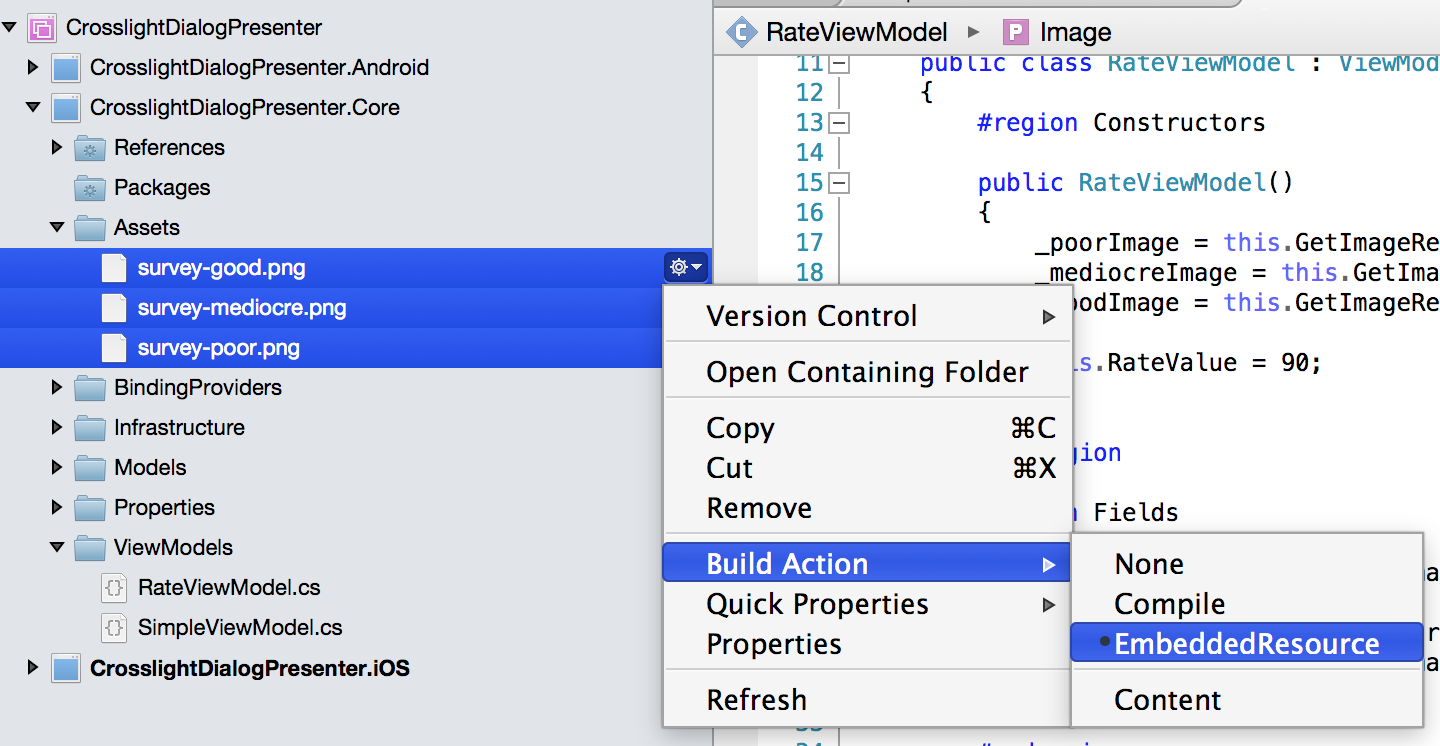
In our dialog presenter, we’re going to use three different images that changes within certain value when the slider value is changed. Simply copy these three images to your CrosslightDialogPresenter.Core/Assets folder. You may need to create the Assets folder first.

survey-good.png

survey-mediocre.png

survey-poor.png
After you’ve copied all these three images down to the folder, ensure that you have also set the images’ Build Action to Embedded Resource, as seen in the following image.
Preparing the ViewModel
After you’ve finished preparing the required assets, let’s create a new ViewModel class for the dialog presenter. I’m going to give it a name of RateViewModel. Let’s take a look at the class:
|
1 2 3 4 5 6 7 8 9 10 11 12 13 14 15 16 17 18 19 20 21 22 23 24 25 26 27 28 29 30 31 32 33 34 35 36 37 38 39 40 41 42 43 44 45 46 47 48 49 50 51 52 53 54 55 56 57 58 59 60 61 62 63 64 65 66 67 68 69 70 71 72 73 74 75 76 77 78 79 80 81 82 83 84 85 86 87 88 89 90 91 92 93 94 95 96 97 |
#region Usings using System.IO; using Intersoft.Crosslight; using Intersoft.Crosslight.ViewModels; #endregion namespace CrosslightDialogPresenter.Core { public class RateViewModel : ViewModelBase { #region Constructors public RateViewModel() { _poorImage = this.GetImageResource("survey-poor.png"); _mediocreImage = this.GetImageResource("survey-mediocre.png"); _goodImage = this.GetImageResource("survey-good.png"); this.RateValue = 90; } #endregion #region Fields private readonly byte[] _goodImage; private byte[] _image; private readonly byte[] _mediocreImage; private readonly byte[] _poorImage; private int _rateValue; #endregion #region Properties public byte[] Image { get { return _image; } set { if (_image != value) { _image = value; OnPropertyChanged("Image"); } } } public int RateValue { get { return _rateValue; } set { if (_rateValue != value) { _rateValue = value; OnPropertyChanged("RateValue"); if (_rateValue >= 0 && _rateValue < 40) this.Image = _poorImage; else if (_rateValue >= 40 && _rateValue < 80) this.Image = _mediocreImage; else this.Image = _goodImage; } } } #endregion #region Methods public byte[] GetBytes(Stream input) { using (MemoryStream ms = new MemoryStream()) { input.CopyTo(ms); return ms.ToArray(); } } public byte[] GetImageResource(string resourceName) { return this.GetBytes(this.GetType().Assembly.GetManifestResourceStream("CrosslightDialogPresenter.Core.Assets." + resourceName)); } #endregion } } |
As you can see, in the constructor of the ViewModel, we prepare the byte array for the images, as well as initialized the RateValue to 90. Taking a closer look at the setter for the RateValue property, we changed the image if the RateValue given is between 0-39 (poor image), 40-79 (mediocre image), and 80-100 (good image).
Prepearing the Binding Provider
Now that the ViewModel is ready, we need to create the “glue” for the ViewModel to the View, which is the Binding Provider. Let’s create the RateBindingProvider class in the CrosslightDialogPresenter.Core, in the BindingProviders folder. Here are the contents of the RateBindingProvider class.
|
1 2 3 4 5 6 7 8 9 10 11 12 13 14 15 16 17 |
using Intersoft.Crosslight; namespace CrosslightDialogPresenter { public class RateBindingProvider : BindingProvider { #region Constructors public RateBindingProvider() { this.AddBinding("RateSlider", BindableProperties.ValueProperty, "RateValue", BindingMode.TwoWay); this.AddBinding("RateImage", BindableProperties.ImageProperty, "Image"); } #endregion } } |
Taking a quick look at the class, we bind the RateValue property to the RateSlider as well as Image property to the RateImage control. Therefore, we need to prepare the ImageView with the ID of RateImage as well as a Slider with the ID of RateSlider. That’s our next direction.
Creating the iOS ViewController and Storyboard
Since you have the shared core ready (ViewModel and BindingProvider), all you have to do now is prepare the iOS view. To do this, we’ll need to prepare the ViewController and the Storyboard.
Preparing the ViewController
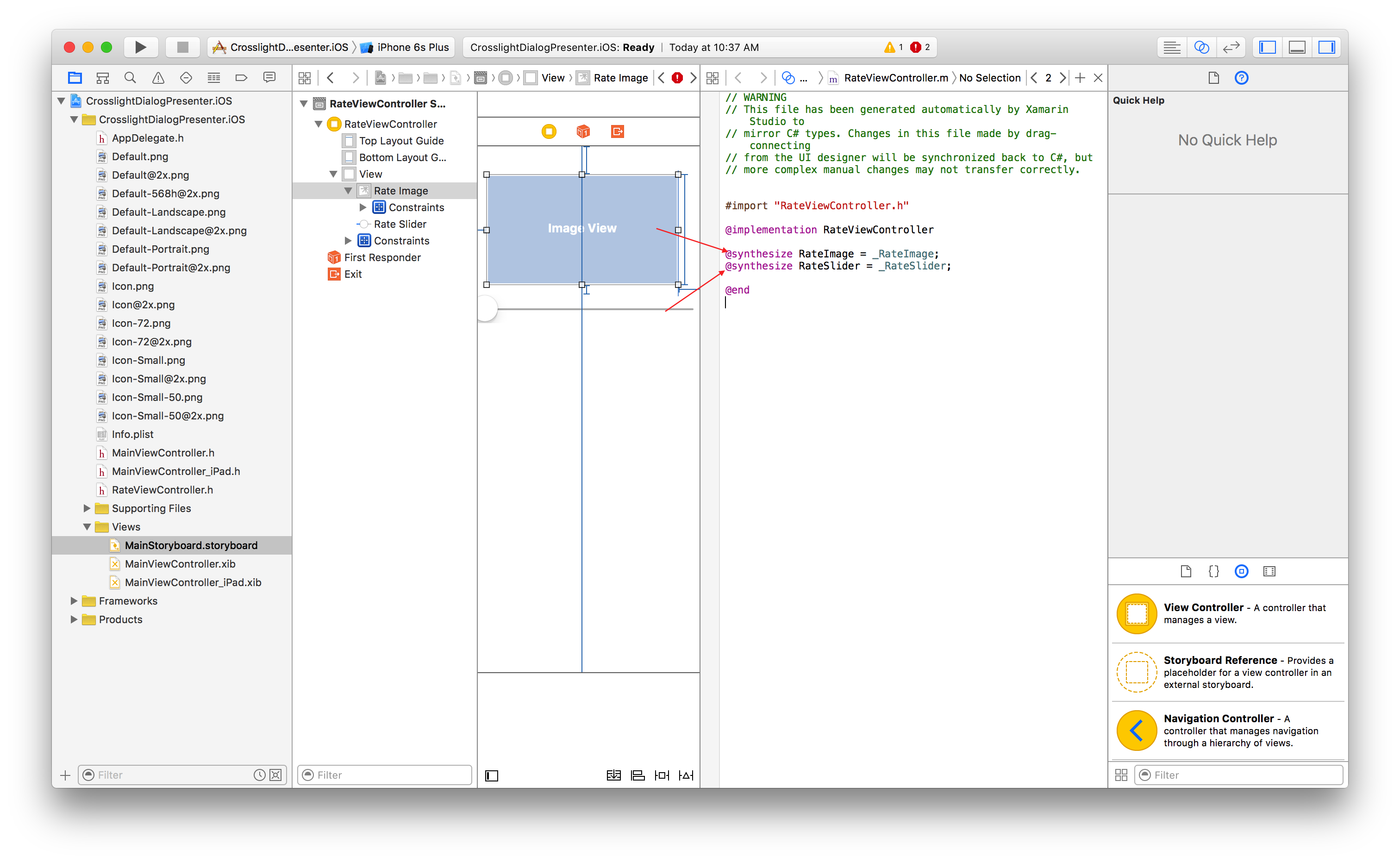
First, create a new ViewController called RateViewController, located under CrosslightDialogPresenter.iOS/ViewControllers folder.
The contents fo the RateViewController are as follows:
|
1 2 3 4 5 6 7 8 9 10 11 12 13 14 15 16 17 18 19 20 21 22 23 24 25 |
#region Usings using System; using CrosslightDialogPresenter.Core; using Intersoft.Crosslight; using Intersoft.Crosslight.iOS; #endregion namespace CrosslightDialogPresenter.iOS { [Storyboard("MainStoryboard")] [ImportBinding(typeof(RateBindingProvider))] public partial class RateViewController : UIViewController<RateViewModel> { #region Constructors public RateViewController(IntPtr handle) : base(handle) { } #endregion } } |
In the RateViewController, in addition to the usual ViewModel and BindingProvider definition, also notice we added a StoryboardAttribute on the top of the class. This tells the ViewController which Storyboard to use.
Preparing the Storyboard
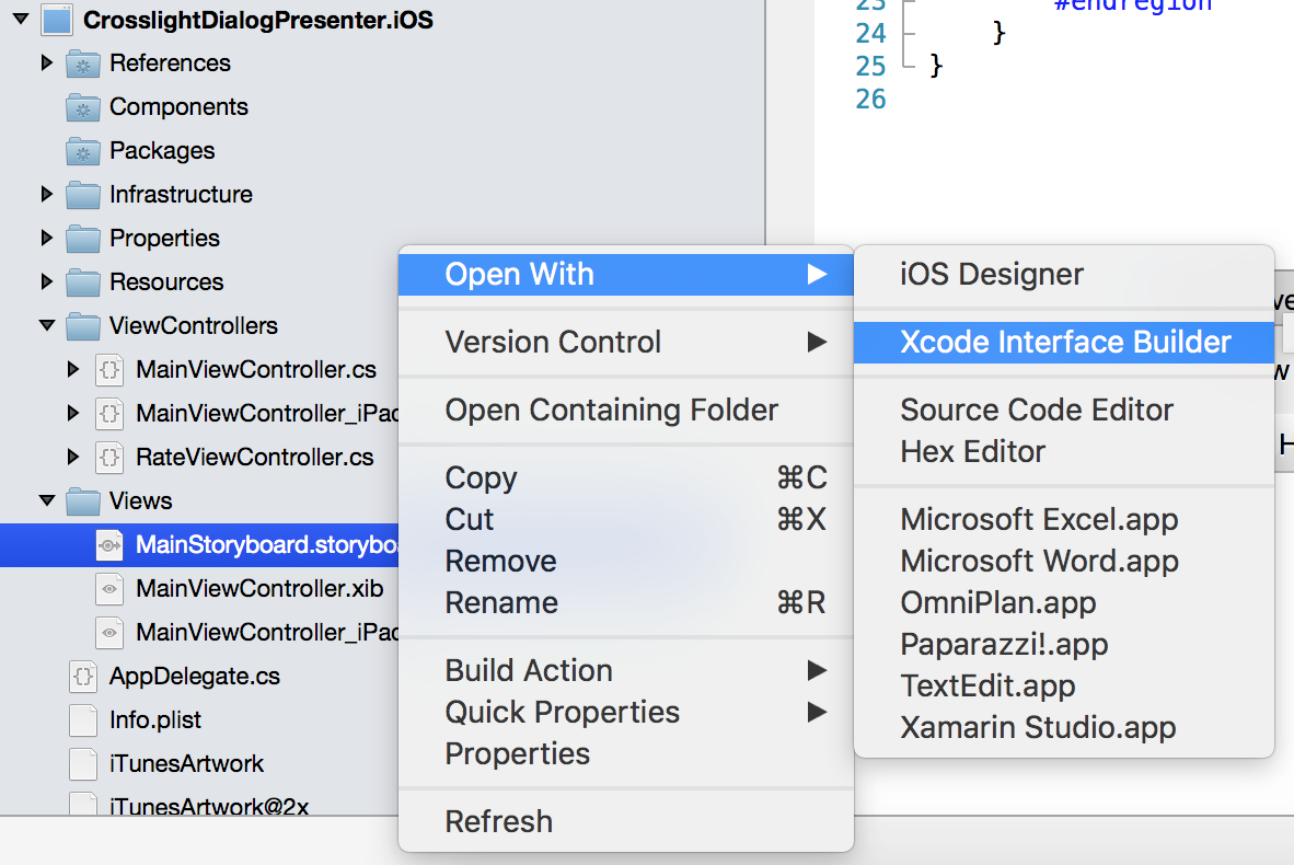
Since we have defined the MainStoryboard as the storyboard that’s going to be used with the ViewController, let’s create that now. Create a new Storyboard called MainStoryboard, located under CrosslightDialogPresenter.iOS/Views folder. It is recommended to use Xcode Interface Builder instead of Xamarin Studio’s built-in iOS designer as it may break sometimes if you use a newer layouts such as StackView.
Add an ImageView with and a slider with the constraints you desire. There are several things to ensure, though. Ensure that the ViewController’s custom class is set to RateViewController and the storyboard ID is set to RateViewController, as shown in the following image.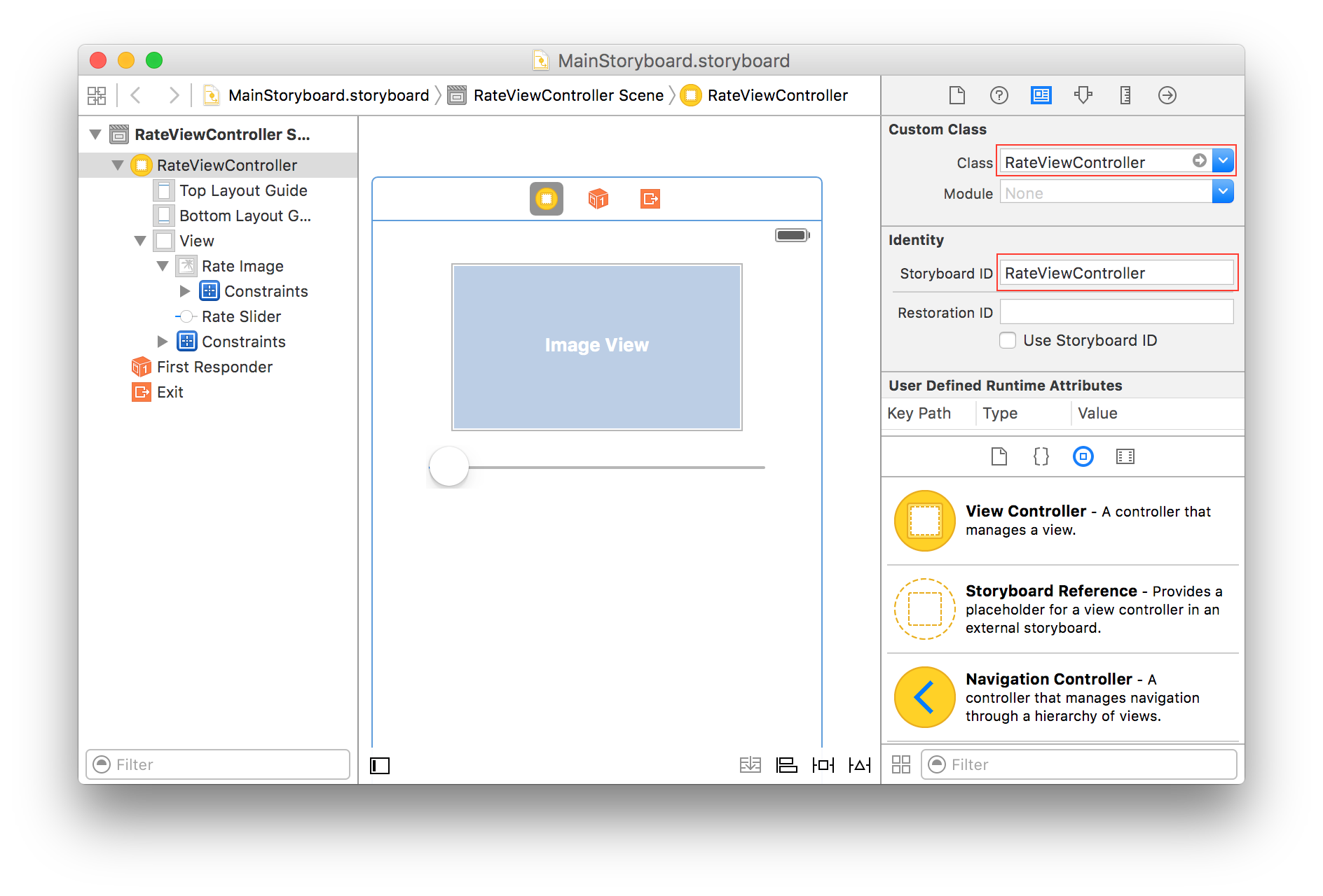
As for the ImageView itself, I would recommend setting the View mode to Center, so the image looks proportional.

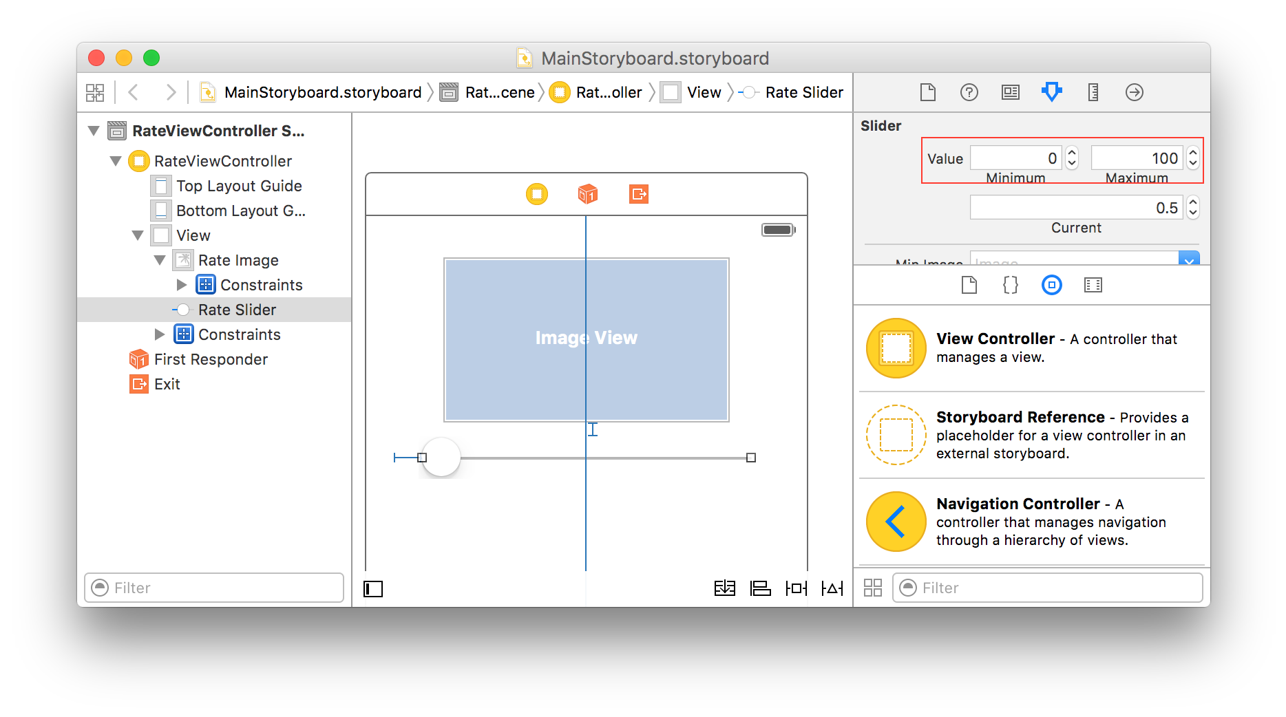
For the slider, set the range between 0 for Minimum and 100 for Maximum value.
In the header file, also make sure that you have set the correct outlets for the ImageView as well as the Slider.
- ImageView: RateImage
- Slider: RateSlider
Getting the Dialog Result of the Presenter
One last thing, you need to modify the ShowToast command from the SimpleViewModel to invoke our dialog presenter. To do this, open up SimpleViewModel in the CrosslightDialogPresenter.Core/ViewModels. Look at the following code.
|
1 2 3 4 5 6 7 8 9 10 |
private void ShowToast(object parameter) { this.DialogPresenter.Show<RateViewModel>(new DialogOptions("Rate Our Service"), (dialogResult) => { var viewModel = ((RateViewModel)dialogResult.ViewModel); this.ToastPresenter.Show("Button: " + dialogResult.Button.ToString() + ", Rating: " + viewModel.RateValue); }); } |
I want you to take a closer look at the code above. The code above invokes the DialogPresenter with the RateViewModel that we’ve just created, then Crosslight smartly returns the entire ViewModel to the original caller’s ViewModel, so you can do basically whatever you want inside the Dialog Presenter’s ViewModel, then have the result straight back and process any way you want it.
The Dialog Presenter is also compatible with the modern async-await programming. If you wish to do so, simply use the following code.
|
1 |
var result = await this.DialogPresenter.ShowAsync<RateViewModel>(); |
Running the iOS project
Now you’re ready to run the iOS project.
Preparing the Android project
You’ve sucecssfully completed the iOS version, but how about Android? Since you have everything ready, all you need to do is just create the View for Android. To do this, let’s create a new Android AXML layout, called RateLayout. I’ll create this inside the CrosslightDialogPresenter.Android/Resources/layout folder. The contents of the AXML are as follows.
|
1 2 3 4 5 6 7 8 9 10 11 12 13 14 15 16 17 18 |
<?xml version="1.0" encoding="utf-8"?> <LinearLayout xmlns:android="http://schemas.android.com/apk/res/android" android:orientation="vertical" android:layout_width="320dp" android:layout_height="wrap_content"> <ImageView android:id="@+id/RateImage" android:layout_width="132dp" android:layout_height="132dp" android:layout_gravity="center" /> <SeekBar android:id="@+id/RateSlider" android:layout_width="match_parent" android:layout_height="wrap_content" android:layout_gravity="center" android:layout_marginTop="16dp" android:layout_marginBottom="16dp" /> </LinearLayout> |
As you can see, it looks pretty much similar to iOS RateViewController that we’ve defined in the Storyboard, with the same IDs. Now that the Android layout file is ready, let’s create the Fragment. I’ll call this RateFragment and put it inside the CrosslightDialogPresenter.Android/Activities folder.
|
1 2 3 4 5 6 7 8 9 10 11 12 13 14 15 16 17 18 19 20 21 22 23 24 |
#region Usings using CrosslightDialogPresenter.Core; using Intersoft.Crosslight; using Intersoft.Crosslight.Android; #endregion namespace CrosslightDialogPresenter.Android { [Fragment] [ImportBinding(typeof(RateBindingProvider))] public class RateFragment : Fragment<RateViewModel> { #region Properties protected override int ContentLayoutId { get { return Resource.Layout.RateLayout; } } #endregion } } |
Same thing here, no fancy stuff, just simple Fragment with the ContentLayoutId set with the layout that we’ve just created. Let’s run the Android sample.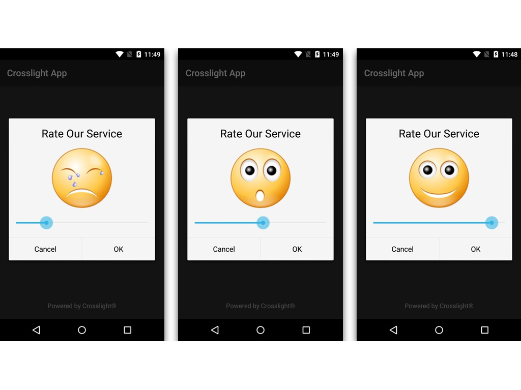
Wrapping Up
I hope that this simple write-up can be a good starting point for those of you who are just trying out the Crosslight Dialog Presenter. If you wish to learn more about the Dialog Presenter, check out this link.
You can also find the link to the sample code in our Git repository here.
Till next post,
Nicholas Lie