Crosslight Adds Stunning Drawer Navigation UI Components
It’s been really busy yet exciting time for all of us here at Intersoft. In just a few weeks time frame, we have recorded 9 new Crosslight video tutorials and publish all of them last week. At the same time, our engineering team is laser-focused in delivering new exciting updates across all product lineup. Today, we’re pleased to announce the first service pack of Premier Studio 2013 which is immediately available for download. Existing customers with active subscriptions can download the update from the account portal.
The service pack includes many important updates that you surely won’t miss. In particular, the new update includes full support for Visual Studio 2013. It also readies support for Microsoft’s latest browser, Internet Explorer 11. This is huge one – given that IE11 is completely redesigned for modern web standards and many proprietary API are no longer existed. The good news is we make it just in timely fashion. All 40+ ASP.NET components with over thousands of features have been enhanced and revived – each tested to work flawlessly in this latest browser. Go ahead and download the latest release to add IE11 support to your WebUI Studio-powered apps.
In addition to huge updates on ASP.NET, we also delivered significant improvements to our flagship cross-platform mobile toolset, Crosslight. There have been a lot of new features and addition to Crosslight since its update on iOS 7 support last month. Specifically, we’ve added a new, stunning drawer navigation for both iOS and Android platforms which lets you easily add Facebook or Path style navigation menu to your Crosslight apps. I’ll dedicate this blog post to discuss about this exciting component, share its key features and quickly brief what you can do with it.
Drawer Navigation Done Right
Many drawer navigation implementation I’ve seen were implemented in such a way where the view and content are tightly coupled, for instance, the drawer content should be a table controller in order for the drawer navigation component to work. Although the tight coupling between the view and interaction may sound common in this case, it creates a number of drawbacks and limitations to the way the component is used. Put simply, you cannot use any arbitrary content to the drawer which actually defeats the purpose of a content control.
When we designed our drawer navigation component from the ground up, we were strongly focused in the view architecture to make sure it is built right from the start. As the results, the Crosslight drawer navigation conforms to the industry-standards content control which allows developers to put any arbitrary content in the drawer while seamlessly automating all navigation processes to the view’s delegate. This is made possible thanks to the thoughtfully designed architecture that emphasize pure separation between the view and the user interaction. Crosslight was built right since the beginning, which enables future components (drawer navigation in this case as the proof) to leverage the same design pattern and get everything working seamlessly – without changes to the existing codebase.
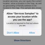
To show you how easy and straightforward it is to change a standard table view navigation into a drawer navigation, let’s take the original Data Samples that shipped with Crosslight and transform it to a stunning drawer navigation.
First, create a new ViewModel based on the DrawerViewModelBase class – new in this release. Let’s name it DrawerViewModel.
|
1 2 3 4 5 6 7 8 9 10 |
public class DrawerViewModel : DrawerViewModelBase { public DrawerViewModel() { this.LeftViewModel = new NavigationViewModel(); this.CenterViewModel = new SimpleListViewModel(); this.Open(DrawerSide.Left); } } |
Then change the root view model of the app to the drawer view model that we just created. Generally, you set the root view model in the OnStart method of the application service
|
1 2 3 4 5 6 |
public sealed class DataSamplesAppService : ApplicationServiceBase { <br> protected override void OnStart(StartParameter parameter) { base.OnStart(parameter); this.SetRootViewModel<DrawerViewWodel>(); } } |
Finally, on the iOS project, simply add a new view controller class that derives from UIDrawerNavigationController generic class which is new in this release. Unless you’re doing extra customization to the drawer, you can leave the class empty without any single code within.
|
1 2 3 4 |
[Register("DrawerNavigationController")] public class DrawerNavigationController : UIDrawerNavigationController<DrawerViewModel> { } |
Similarly, add a new class to the Android project which derives from the DrawerActivity class. Remember to specify the drawer view model that we’ve just added earlier as the generic type parameter of the class.
|
1 2 3 4 |
[Activity(Label = "Drawer Activity")] public class DrawerNavigationActivity : DrawerActivity<DrawerViewModel> { } |
Run the project – and you’ll see the classic table navigation now magically turn into a stunning drawer navigation interface – complete with the touch gestures, close on navigate, and automatic navigation bar synchronization, all done right.

Incredibly easy, isn’t it? More importantly, you can reuse existing ViewModel as the content for either left or right drawer by specifying them in the DrawerViewModel. In case you would like to change back to the previous table navigation, you simply change the root ViewModel back to NavigationViewModel – and everything on the UI side reflects automatically.
How’s that possible – you might asked. The answer lies in the architecture design that carefully separates the user interaction out from the view. In this scenario, the master and detail view are actually two separate objects which is controlled by user interaction logic, in this case, the navigation logic. Since the navigation logic is implemented in a different layer, this allows us to tear these views apart and put them side by side without requiring code changes on the application’s end. The following illustration gives you a better visualization to understand how we built Crosslight to be a truly extensible, future-proof framework.

All The Great Features You’ve Ever Wanted
So that now you’ve got a handsome drawer navigation UI ready to be plugged into your next-gen mobile apps, let’s explore what you can do to make it looks and feels the way you desire. Note that the drawer navigation component is available for both iOS and Android platforms – both designed with the native UI guidelines.
Flexible one or two-sided drawer
Crosslight drawer navigation supports various drawer interface found in many popular apps today. You can choose one-sided drawer – where the drawer is either at the left or right side of the content; or two-sided drawer which are trending in recent apps such as Path, Worthy, and more.
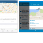
The following illustration shows the left-side and right-side drawer navigation in iOS.

And the Android counterpart below.

Keep in mind that although the drawer interface is designed according to the respective platform guidelines, the drawer view model and user interaction logic are entirely platform neutral which is defined in the shared application layer (portable project). As the results, when you modified the properties of drawer view model for example, the same app on both platforms will naturally reflect the changes.
Intuitive design based on platform’s native UI guidelines
In the iOS platform, the UIDrawerNavigationController class features dozens of drawer-related settings that you can easily customize through a single property set. One noteworthy feature is the status bar transition particularly useful in iOS 7 apps. We provided not only one status bar transition mode, but three. The first is the Facebook-style status bar transition where it smoothly fades from the original color to black. The second is the fading from any arbitrary custom color. The most interesting is perhaps the third one, translucent blur transition, where the status bar is smoothly faded with stunning translucent blur effect.

Another noteworthy feature is the panoramic background image feature which lets you easily add beautiful photo to the drawer navigation control. Amaze your users with the combination of iOS7-style frosted-blur visual effect in the content view – creating sense of depth and great user experiences to your apps.

Other drawer settings on iOS that you might want to explore are drawer width, various shadow settings, fading animation, flick velocity, navigation bar tint color, status bar colors, status bar content styles, landscape background image, and much more.
The Android version has fewer customizable settings compared to iOS, although certain essential settings are must-have such as the background color, drawer width, and more.
5 Drawer Samples Included
Along with the service pack release, we’ve also updated Mobile Studio installer for both Windows and Mac with the latest Crosslight assemblies. The installers also include five new drawer samples that you can refer to learn more about the drawer navigation features. Or better, use it to quickly jump start your next mobile apps.
The included drawer samples are: Drawer Data Samples, Simple Drawer Style, Facebook Drawer Style, Translucent Drawer Style, and Two-sided Drawer Style.
Login to your account, download the new bits and test drive the new drawer UI components today.
What’s Next
In this blog post, I’ve covered the basics of our new drawer navigation UI components, how it’s designed and what features you can bring to your apps. In this milestone, you can now easily create great mobile apps for your business featuring great user experiences such as those popular apps in the store.
But, we still have a lot more to cover. In the upcoming 2013 R2 release, we’re planning to ship Crosslight vNext which will include a multitude of new cross-platform components and data services that will forever change the way you build data-intensive, enterprise-grade mobile apps. Stay tuned for our next announcement!
Best,
Jimmy

Amazing news!
I was waiting for the Drawer Navigation since day one.
Can’t wait to test the samples…
Btw, one question. Does the drawer nav or entirely Crosslight for iOS, implements the well known feature of iOS 7 “swipe gestures”?
For example, swipe from the edge of the left screen to go back, and if there’s a drawer nav, show it?
Regards,
Dave
Dave, glad to hear you like our new drawer UI components.
Yes, the iOS drawer is designed exactly like that. Check out the DrawerDataSamples to see the features in action.
Wonderful! I’ll do that…
Dave, you might want to re-download the latest Mobile Studio which includes full PCL support for Xamarin and Visual Studio 2013.
Hi Jimmy,
Does it includes the Premier setup too?
Yes David, Premier setup has been updated as well.