Migrating to Crosslight Android Material
In this post, I’m going to guide you how to migrate your existing Crosslight Android apps to adopt Material Design with the new Crosslight Android Material Library. I’m going to use the Inventory Tracker sample contained in the old samples repository and convert the project to use the new Android Material. You can get the old sample here. This tutorial should work with Visual Studio as well. However, I’m using Xamarin Studio on Mac as it is my development preferences.
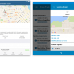
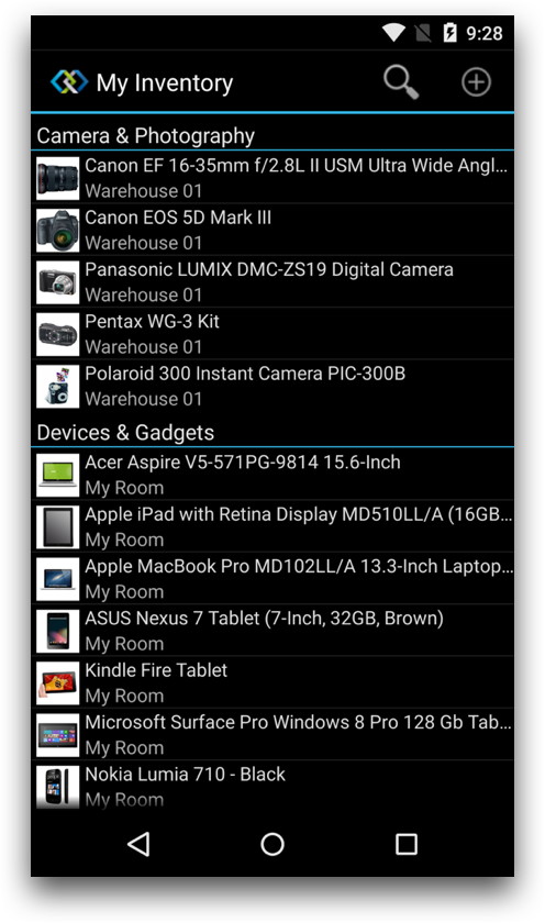
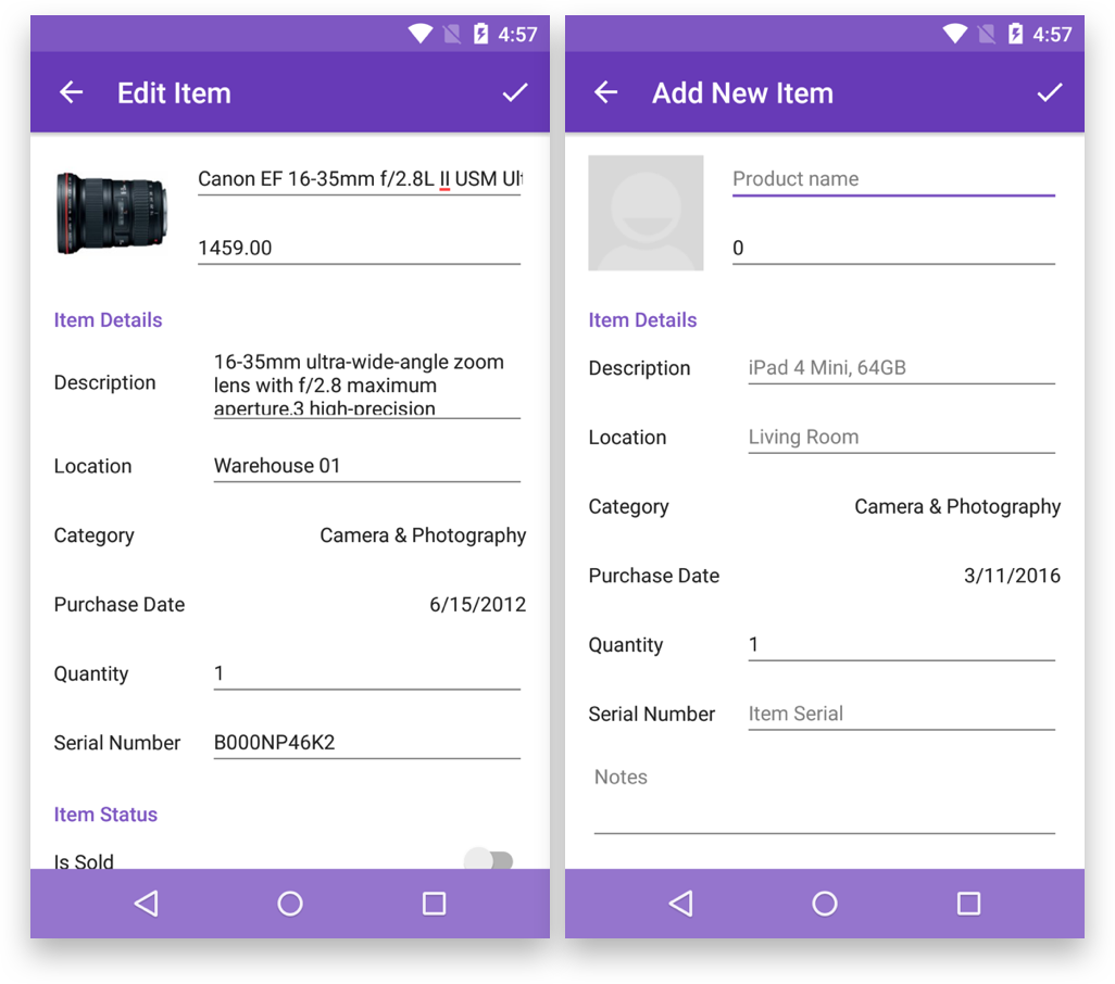
At the end of the post, you would be able to achieve the result such as shown in the right image below.
Running the Old Sample
Should you encounter this error when running the old sample: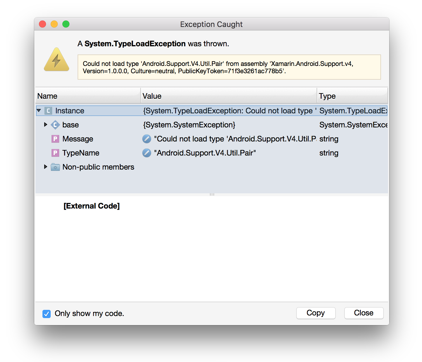
All you need to do is install the Crosslight.Xamarin.Android.Support.v4 NuGet package onto the MyInventory.Android.Fragments project.
Consult this documentation should you have difficulties in installing the NuGet package: Introduction to Crosslight NuGet Packages. If everything is okay, you should be able to run the old sample properly.
Preparing the Project
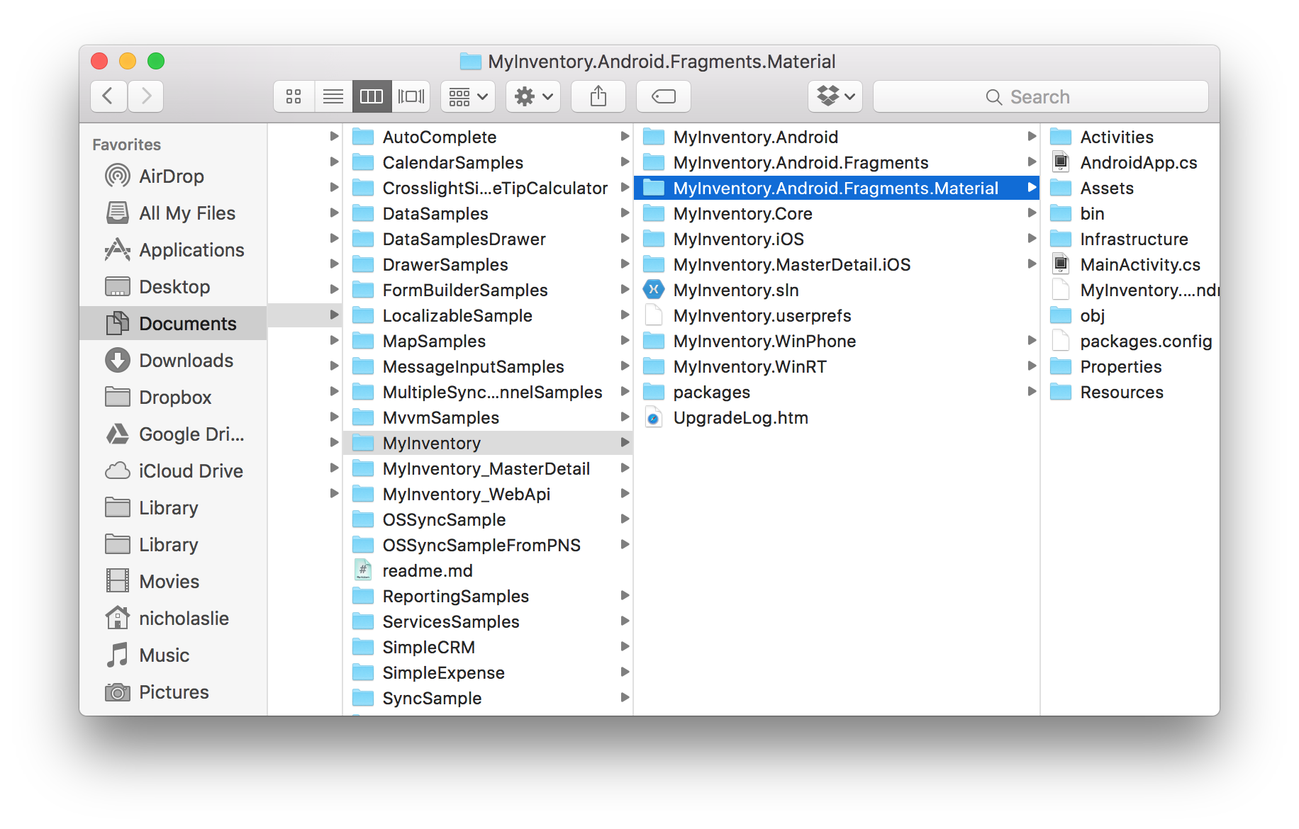
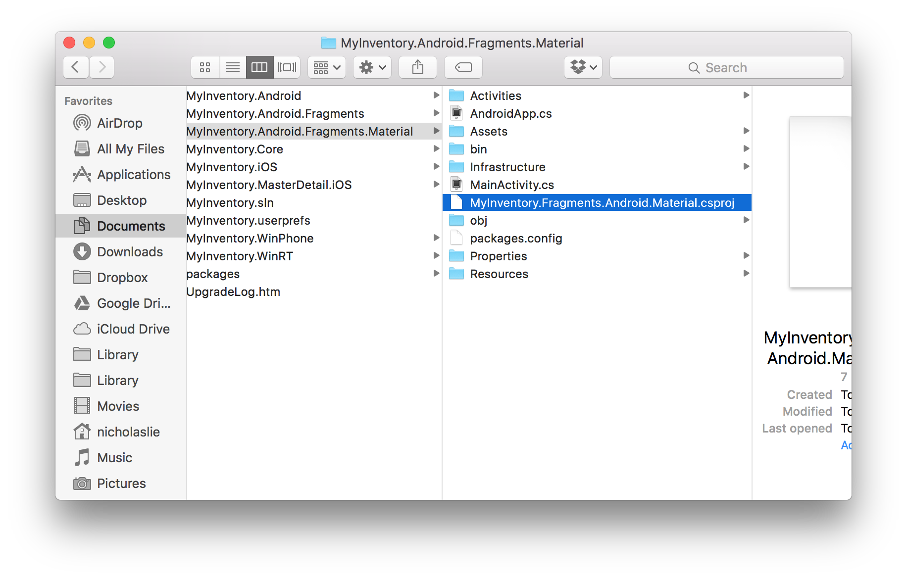
Now we’re ready to convert this project to use the new Crosslight Android Material library. First, let’s copy the MyInventory.Android.Fragments folder and give it a name of MyInventory.Android.Fragments.Material.
Rename the .csproj file to MyInventory.Android.Fragments.Material.csproj.
Open the .csproj file and edit the ProjectGuid, generate a new Guid somewhere or simply change any letter from the existing GUID.
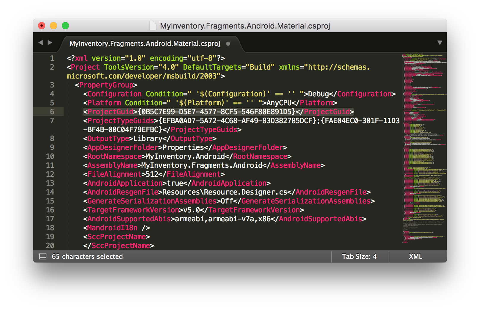
Save this .csproj file and import this new .csproj file into your solution.
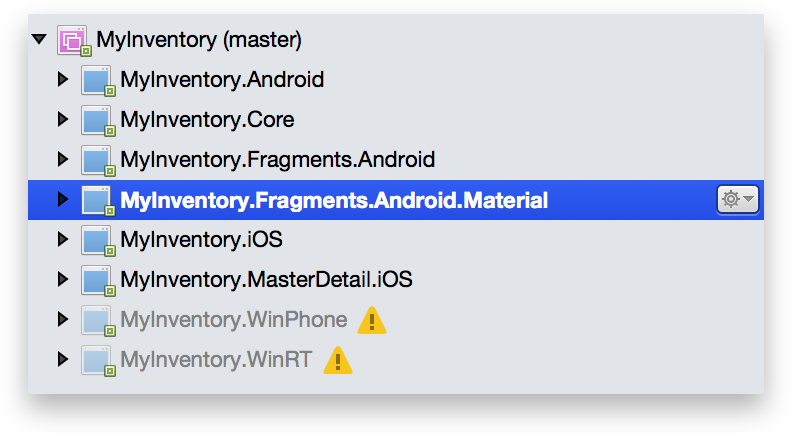
Now you’re ready to tinker with this project.
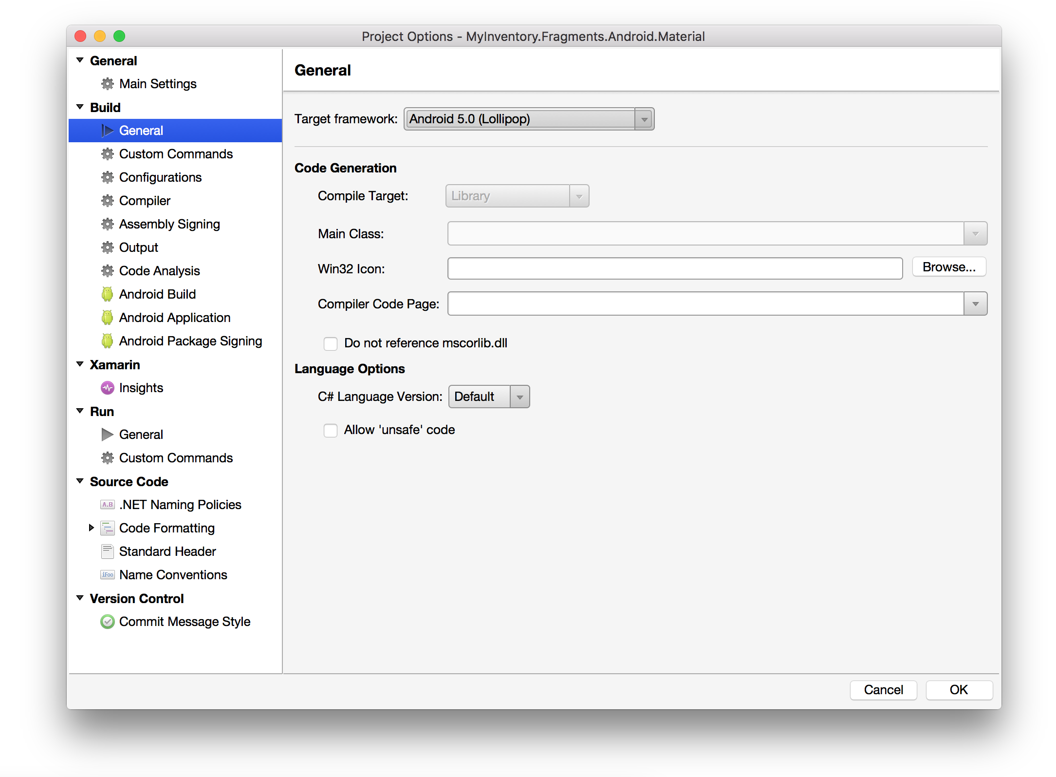
Configuring the Project Options
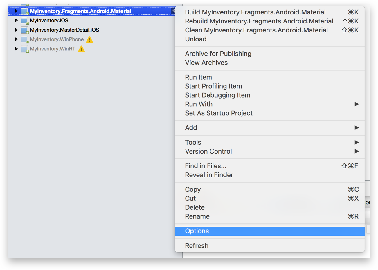
First, let’s configure the project options to comply with Material. To do this, right-click on the project and choose Options. Or you can simply double-click the project to go to the Project Options.
In the dialog that appears, choose the General tab and set the Target Framework to Android 5.0 (Lollipop).
Next, choose the Android Application tab and edit the Package name to MyInventory.Android.Material (add .Material suffix, just to differentiate from the classic Android project). Set the Minimum Android version to Android 4.0.3 (API Level 15) and the Target Android version to API 21. Note: if you don’t specify the Target Android version explicitly (set it as Automatic), the Material theme won’t apply perfectly. It looks like a bug either from Xamarin side or Android SDK side. So to be safe, specify the Target Android version explicitly for now.
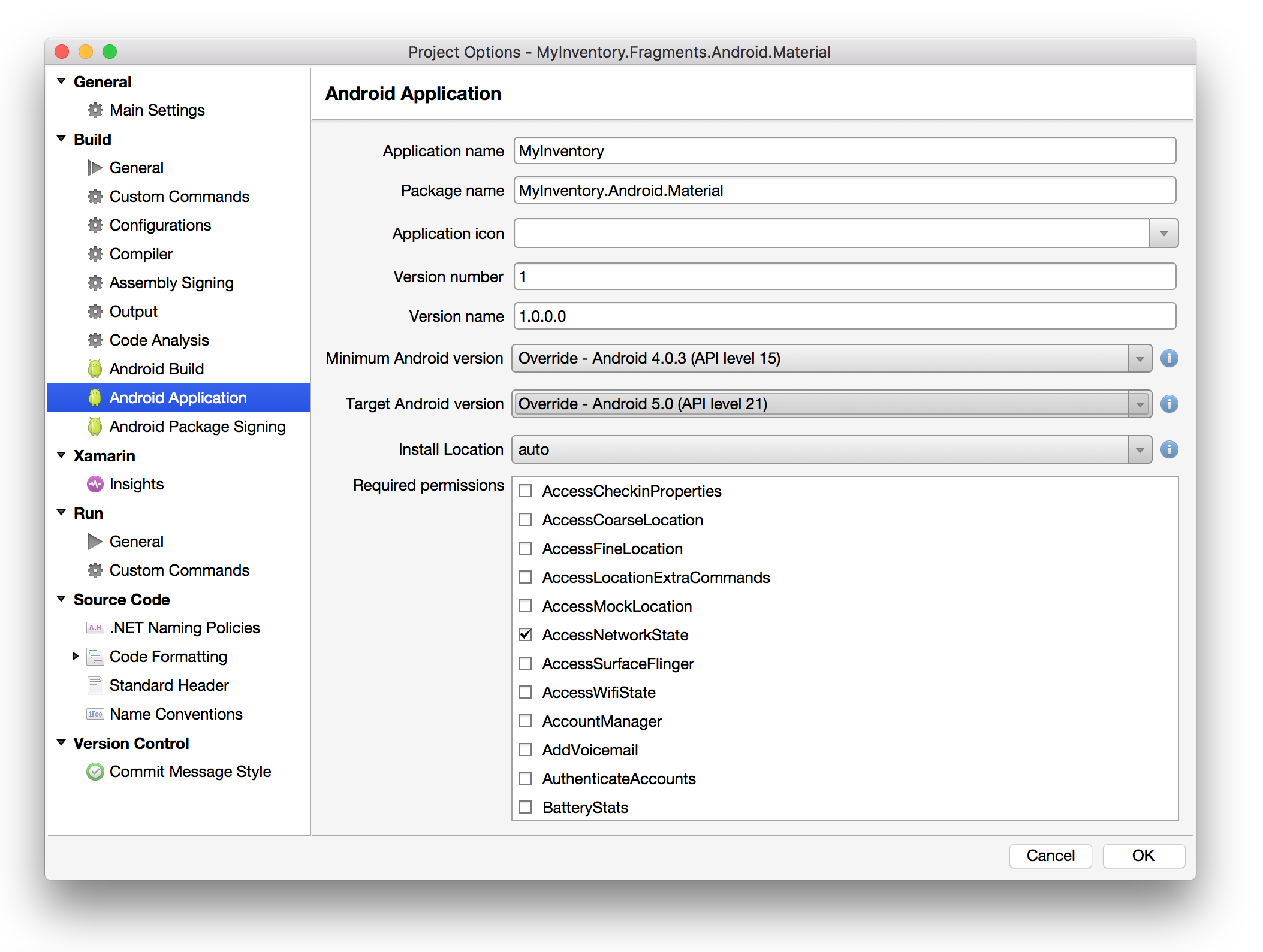
Later, we’re going to modify the Application icon to use the new mipmap folders. But now, we’re good to go.
Installing NuGet Packages
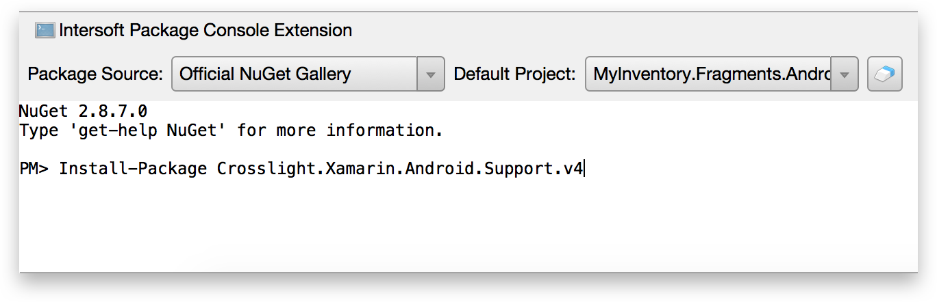
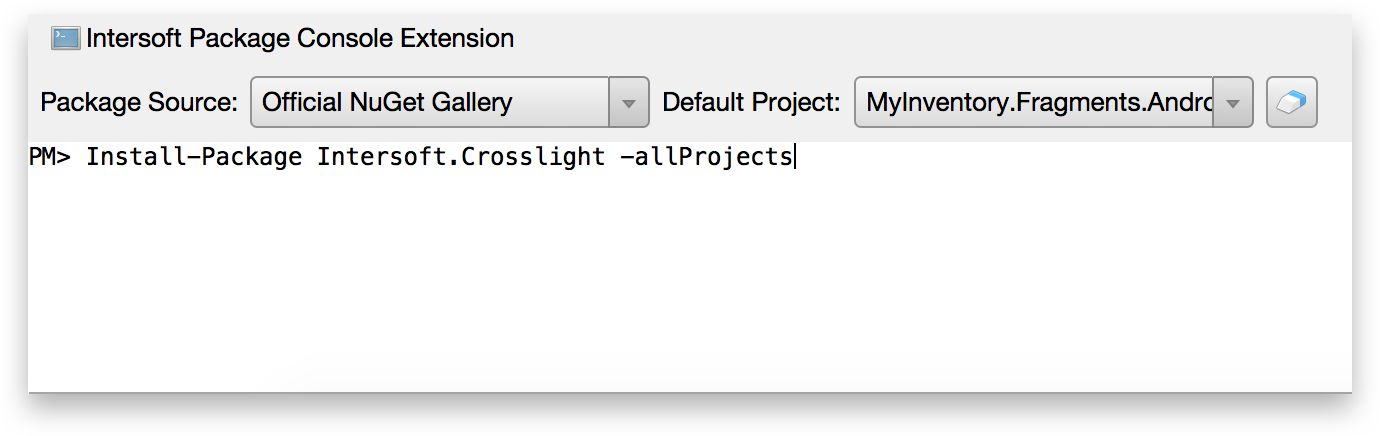
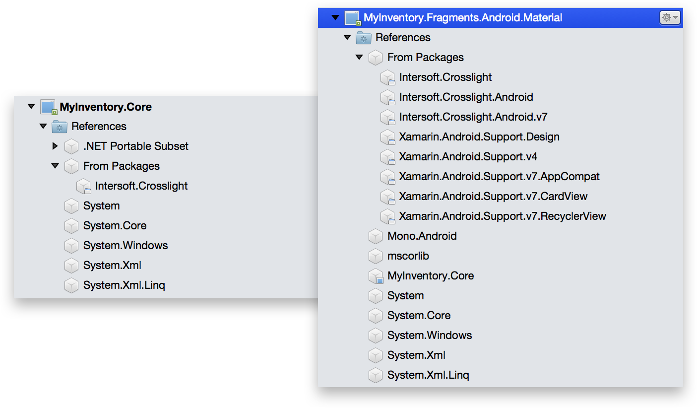
Next, we’re going to install the latest NuGet packages for this project. You’ll want to install Intersoft.Crosslight onto the all of your projects (including the Core project), then install Intersoft.Crosslight.Android.v7 package to your MyInventory.Android.Fragments.Material project. By now, I’ll assume that you’ve understood how to install these NuGet packages onto your existing projects. Should you find any troubles in installing the NuGet packages, consult the docs.
Here’s a shot when running the install Intersoft.Crosslight NuGet command. Note that this command only applies to Xamarin Studio on Mac. On Windows, you would simply use the Manage NuGet Packages for Solution menu from Visual Studio and search for the Intersoft.Crosslight package.
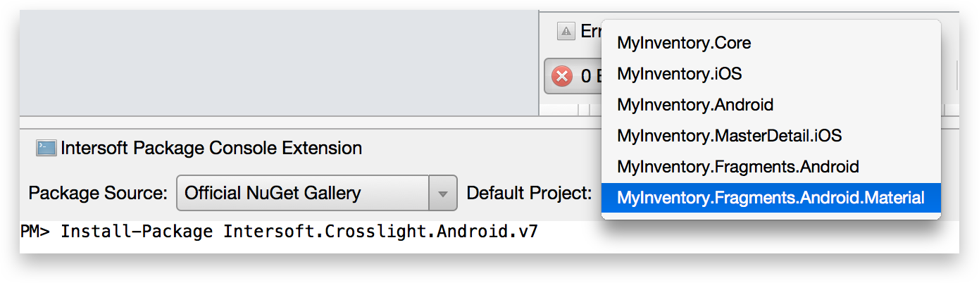
And here’s another shot when installing the v7 package.
When you have successfully installed the packages, your project references should change a bit. (if you’re using Xamarin Studio on Mac)
Refactoring the Classes
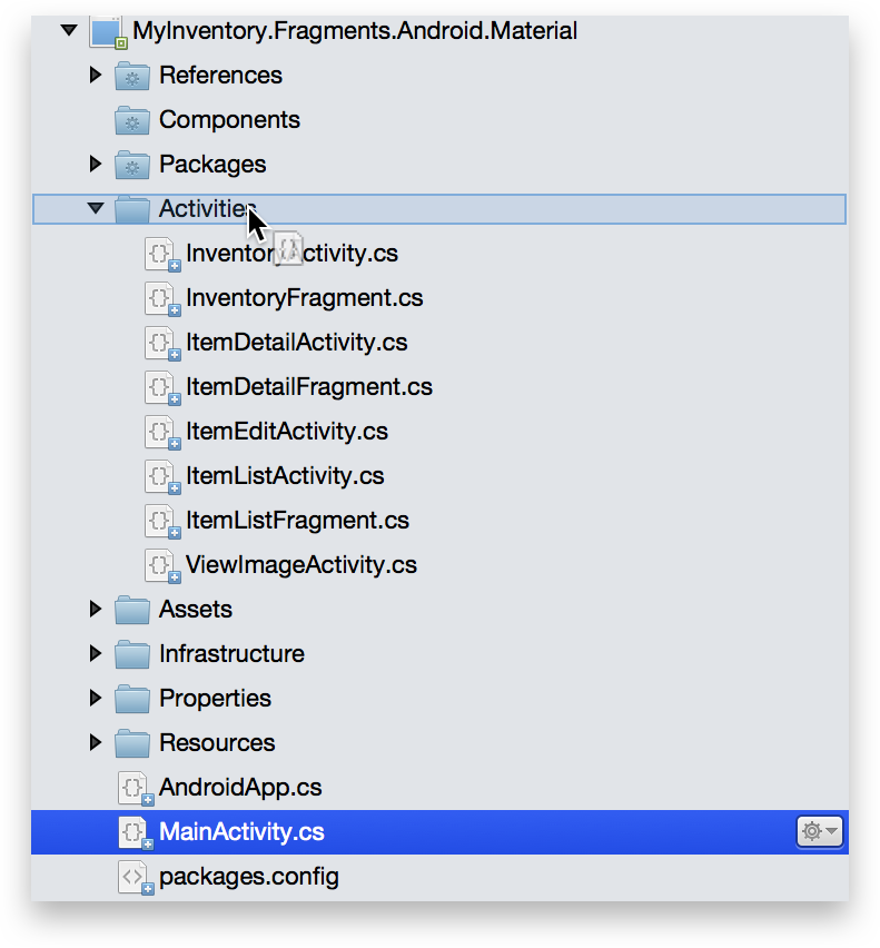
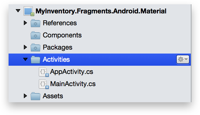
Let’s proceed by refactoring the classes. Move the MainActivity.cs inside the Activities folder.
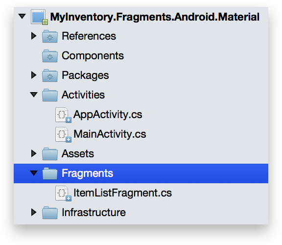
Create a new folder called Fragments in the root project.
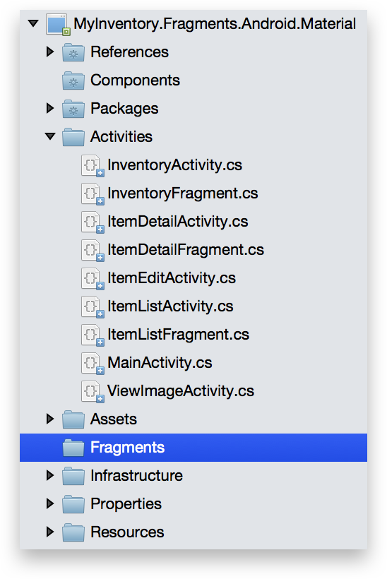
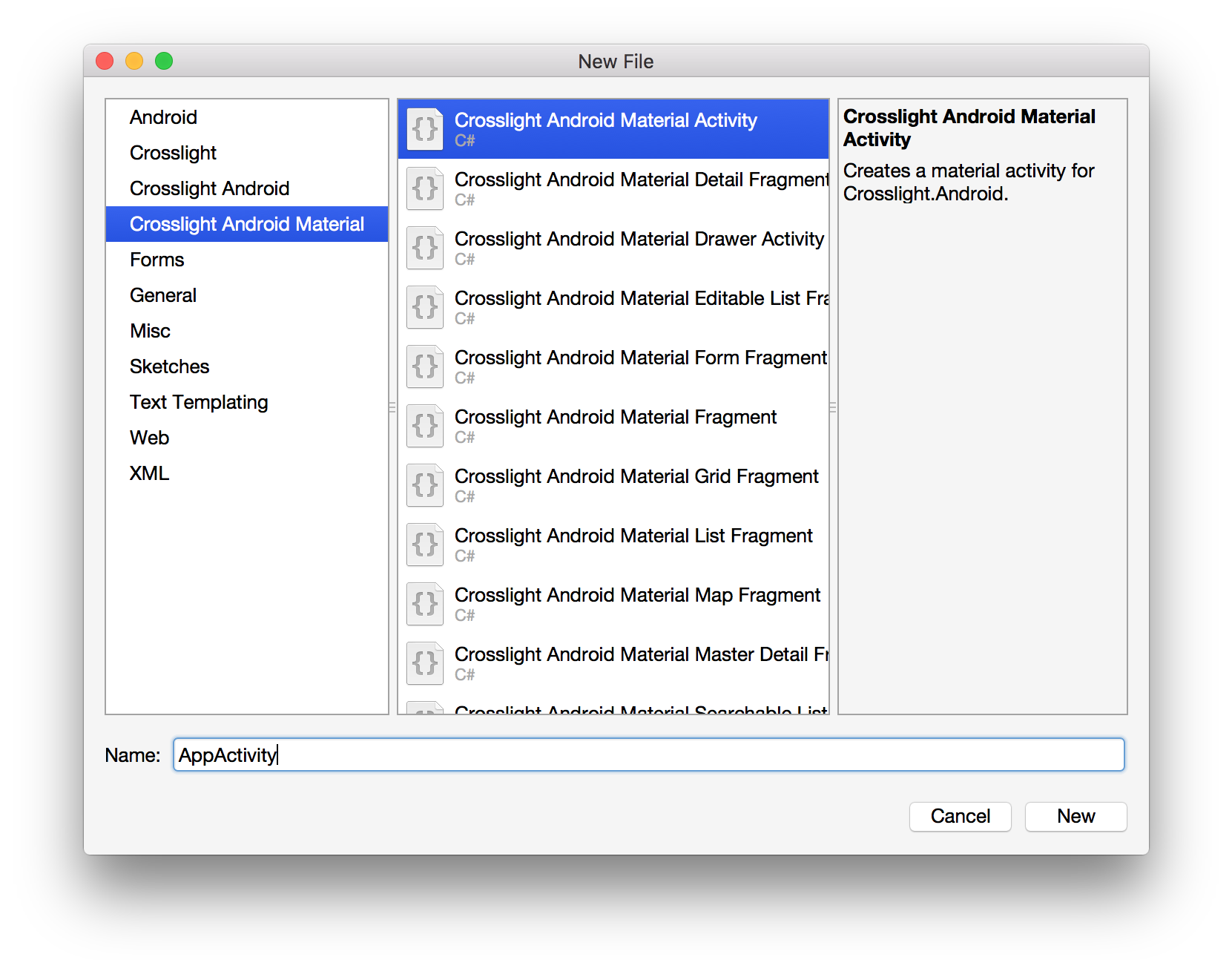
Move all existing fragments (InventoryFragment.cs, ItemDetailFragment.cs, ItemListFragment.cs) inside the folder. Next, create a new Crosslight Android Material Activity using the new item template, and give it a name of AppActivity.
Replace the contents of the AppActivity with the following code.
using System;
using Android.App;
using Android.Runtime;
using Intersoft.Crosslight;
using Intersoft.Crosslight.Android.v7;
using MyInventory.ViewModels;
namespace MyInventory.Android
{
[ImportBinding(typeof(ItemListBindingProvider))]
[Activity()]
public class AppActivity : AppCompatActivity<ItemListViewModel>
{
public AppActivity()
{
}
public AppActivity(IntPtr javaReference, JniHandleOwnership transfer)
: base(javaReference, transfer)
{
}
}
}
This will be a replacement for our ItemListActivity.cs. This is the main container Activity that will be launched after the splash screen is shown. Note that this class inherits from AppCompatActivity and takes in the ItemListViewModel, which corresponds to the AppService.cs specified in the MyInventory.Core/Infrastructure folder as the root ViewModel. It only contains two constructors, a default empty constructor and another constructor that takes in one IntPtr and JniHandleOwnership object. This is compulsory for every Activity and Fragment using the new Material library.
In the new Android Material library, developers now only need to focus on creating Fragments instead of Activity-Fragment pairs, as now the Activity will be automatically created as necessary upon screen navigation. Let’s create new Fragments and modify existing Fragments that will act as the counterpart for our current Activities.
Preparing ItemListFragment
First, let’s edit the ItemListFragment.cs inside the Fragments folder. Replace it with the following code.
using System;
using Android.Graphics;
using Android.Graphics.Drawables;
using Android.Runtime;
using Intersoft.Crosslight;
using Intersoft.Crosslight.Android;
using Intersoft.Crosslight.Android.v7;
using Intersoft.Crosslight.Android.v7.ComponentModels;
using MyInventory.ViewModels;
using EditAction = Intersoft.Crosslight.Android.v7.ComponentModels.EditAction;
namespace MyInventory.Android
{
[ImportBinding(typeof(ItemListBindingProvider))]
[RegisterNavigation(DeviceKind.Phone)]
public class ItemListFragment : SearchableRecyclerViewFragment<ItemListViewModel>
{
#region Constructors
public ItemListFragment()
{
}
public ItemListFragment(IntPtr javaReference, JniHandleOwnership transfer)
: base(javaReference, transfer)
{
}
#endregion
#region Properties
protected override int ItemLayoutId
{
get { return Resource.Layout.item_layout; }
}
#endregion
#region Methods
protected override void Initialize()
{
base.Initialize();
this.ImageLoaderSettings.AnimateOnLoad = true;
this.Appearance.Background = new ColorDrawable(Color.WhiteSmoke);
this.ShowGroupSeparator = false;
// Defines floating action button.
this.FloatingActionButtons.Add(new FloatingActionButton(“AddButton“)
{
Position = FloatingActionButtonPosition.BottomRight,
CommandItemType = CommandItemType.Add,
Direction = FloatingActionButtonDirection.Up,
HideOnScrollUp = true
});
// Defines contextual action.
ListContextualToolbarSettings settings = this.ContextualToolbarSettings as ListContextualToolbarSettings;
if (settings != null)
{
settings.Mode = ContextualMode.Default;
settings.CheckAllEnabled = true;
settings.CheckAllMargin = 4;
settings.BarItems.Add(new BarItem(“DeleteButton“, “Delete“));
settings.BarItems.Add(new BarItem(“MarkSoldButton“, “Mark As Sold“));
}
// Defines editing action from swipe gesture.
this.EditActions.Add(new EditAction(“Sold“));
this.EditActions.Add(new EditAction(“Delete“, true));
// Recycler View configuration
this.InteractionMode = ListViewInteraction.Navigation;
this.EditingOptions = EditingOptions.AllowEditing | EditingOptions.AllowMultipleSelection;
// Defines shared elements
this.SourceSharedElementIds.Add(Resource.Id.Icon);
this.AddBarItem(new BarItem(“SearchButton“, CommandItemType.Search));
this.FilterScope = “Name“;
this.IconId = Resource.Drawable.ic_toolbar;
}
#endregion
}
}
In the code above, we have our 2 constructors as explained earlier, then the ItemLayoutId, which we’ll create in just a moment, then we specify all the behaviors for that particular Fragment by overriding the Initialize method. Here, we specified several things. Let’s take it from the top.
We specified that the ImageLoader component should animate on load for a nice fading effect. We’ve also set the background of this Fragment by setting it through this.Appearance.Background property. The group separator is hidden. We’ve also specified a Floating Action Button with the identifier of AddButton and several options such as its position, CommandItemType, Direction and HideOnScrollUp behavior. We’ve also specified the contextual actions, which will be triggered when users long-presses an item. The new swipe gesture is also enabled by specifying the EditActions.
The RecyclerView configuration comes next, we’ve specified how the item should interact when user clicks/presses on an item. The EditingOptions is also specified here to allow contextual actions. Then comes the Shared Element Transition that will define which view IDs should be animated upon navigation. The new Fragment also allows to add Toolbar items programmatically by using the this.AddBarItem method. The FilterScope is specified for the item searching scope, so when user performs search on this Fragment, it will search for the item Name. Lastly, we specified which icon should be placed in the upper left hand corner of the Toolbar.
Also take note that ItemListFragment inherits the SearchableRecyclerViewFragment that uses RecyclerView and allows for searching of items. To learn more about the power of Material Fragment and all of its customizable properties, consult this documentation: Using Material Fragment.
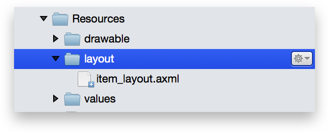
If you try to run the project now, you’ll get two errors saying that the item_layout.axml is not available and the ic_toolbar.png drawable is not available. Let’s sort this out. Create a new item_layout.axml file inside the Resources/Layout folder and use the following code.
<?xml version=“1.0“ encoding=“utf–8“?>
<intersoft.crosslight.android.v7.CardView xmlns:app=“http://schemas.android.com/apk/res–auto“
xmlns:android=“http://schemas.android.com/apk/res/android“
android:layout_width=“match_parent“
android:layout_height=“wrap_content“
android:foreground=“?android:attr/selectableItemBackground“
android:layout_marginLeft=“8dp“
android:layout_marginRight=“8dp“
android:layout_marginBottom=“8dp“
app:cardElevation=“2dp“>
<RelativeLayout
android:layout_width=“match_parent“
android:layout_height=“80dp“>
<ImageView
android:layout_width=“72dp“
android:layout_height=“72dp“
android:id=“@+id/Icon“
android:layout_margin=“4dp“
android:gravity=“center_vertical“
android:layout_centerVertical=“true“ />
<LinearLayout
android:layout_width=“match_parent“
android:layout_height=“wrap_content“
android:layout_toRightOf=“@id/Icon“
android:gravity=“center_vertical“
android:layout_centerVertical=“true“
android:orientation=“vertical“>
<TextView
android:textAppearance=“?android:attr/textAppearanceMedium“
android:id=“@+id/TextLabel“
android:layout_width=“match_parent“
android:layout_height=“wrap_content“
android:ellipsize=“end“
android:singleLine=“true“ />
<TextView
android:textAppearance=“?android:attr/textAppearanceSmall“
android:id=“@+id/Text2“
android:layout_width=“match_parent“
android:layout_height=“wrap_content“
android:singleLine=“true“ />
</LinearLayout>
</RelativeLayout>
</intersoft.crosslight.android.v7.CardView>
In the item layout, we’re going to use the CardView as our item layout. Next, use this new icon (it’s white) for the Toolbar icon.
Save this file inside the Resources/drawable folder and give it a name of ic_toolbar.png. A design tip: Since the new Material Design emphasizes on bold colors, it is better and preferred to use a thin icon design for a more beautiful outlook. In this case, the White color is chosen since it blends perfectly with Material colors.
Cleaning Up Unnecessary Files
Before we proceed, let’s delete some unnecessary files. In the Activities folder, leave only AppActivity.cs and MainActivity.cs, and delete all other Activity files as we’ll recreate the counterpart for these files as we go on.
In the Fragments folder, delete InventoryFragment.cs, leaving only ItemListFragment.cs.
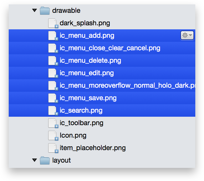
In the Resources folder, delete these folders: color, layout-large, values-large. And also delete all other layouts inside the layout folder, leaving only item_layout.axml.
In the drawable folder, delete these highlighted files.
Also, delete unused styles inside the styles.xml so your styles look like this.
<?xml version=“1.0“ encoding=“utf–8“ ?>
<resources>
<style name=“Theme.Splash“ parent=“android:Theme“>
<item name=“android:windowBackground“>@drawable/dark_splash</item>
<item name=“android:windowNoTitle“>true</item>
</style>
</resources>
Using the Material Theme
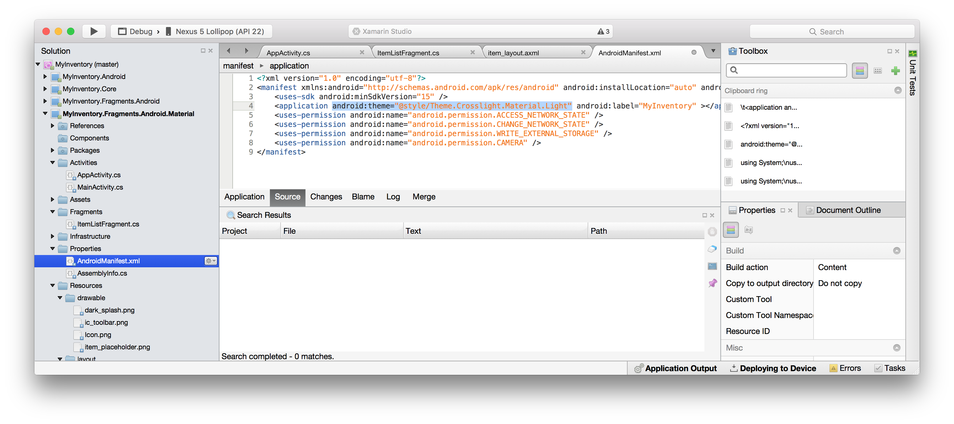
To use the Material Theme, open AndroidManifest.xml located inside the Properties folder and change android:theme to use android:theme=”@style/Theme.Crosslight.Material.Light”.
Running the Project
Let’s run the project and check out what will happen.
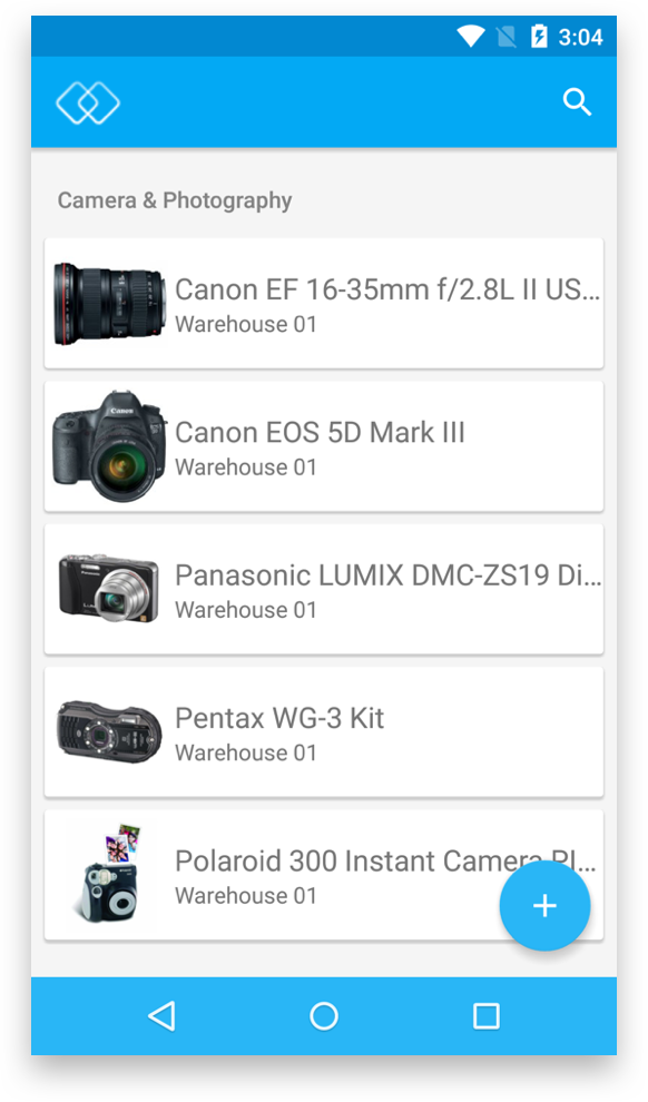
At a first glance, it looks fine. The Floating Action Button is showing, the Toolbar now uses the new Material Toolbar. However, this screen is still missing the title in the Toolbar. Let’s apply the Title for the Toolbar.
Applying Title in the ViewModel
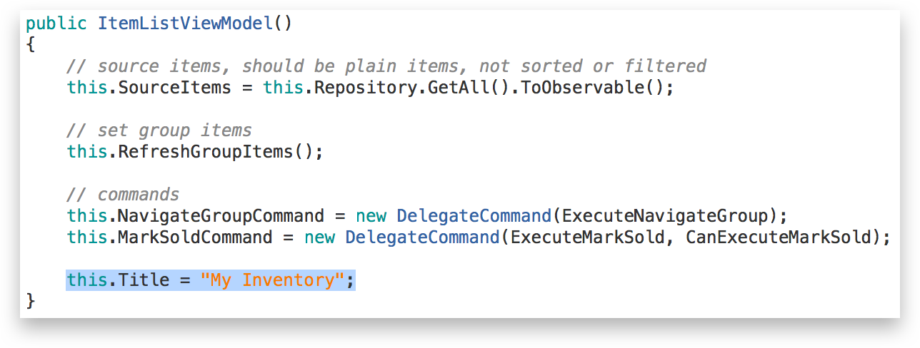
In Crosslight 5, we’ve provided a simpler API to set the Title for a View that works across iOS and Android. To do this, simply open up ItemListViewModel.cs located inside the MyInventory.Core/ViewModels folder. Simply add this.Title = “My Inventory” in the ViewModel’s constructor.
Customizing Material Colors
By default, Crosslight Android Material uses the Blue theme color for the Material Design color palette. You can easily customize each UI element color by overriding the key values for the Material colors, as defined in the Android Training docs. For example, let’s replace the Blue color palette with the Deep Purple palette. Replace colors.xml with the following code.
<?xml version=“1.0“ encoding=“utf–8“ ?>
<resources>
<color name=“primary“>#673AB7</color>
<color name=“accent“>#7E57C2</color>
<color name=“navigation_bar“>#9575CD</color>
<color name=“primary_dark“>#7E57C2</color>
<color name=“window_background“>#eaeaea</color>
<color name=“action_menu_background“>#673AB7</color>
<color name=“window_dark_background“>#000000</color>
<color name=“window_light_background“>#ffffff</color>
<color name=“action_menu_foreground“>#ffffff</color>
<color name=“button_foreground“>#ffffff</color>
<color name=“nav_end_background“>#4527A0</color>
<color name=“nav_center_background“>#673AB7</color>
<color name=“nav_start_background“>#7E57C2</color>
<color name=“nav_header_title_foreground“>#ffffff</color>
<color name=“nav_header_subtitle_foreground“>#ffffff</color>
<color name=“progress_dialog_background“>#673AB7</color>
<color name=“progress_text_color“>#ffffff</color>
<color name=“progress_bar_color“>#ffffff</color>
<color name=“progress_text_color_inverse“>#7E57C2</color>
<color name=“progress_bar_color_inverse“>#7E57C2</color>
</resources>
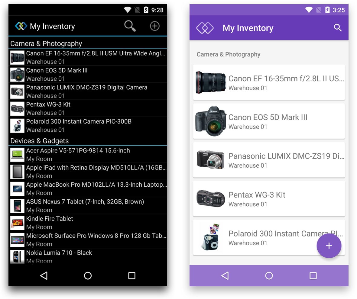
By default, we’ve followed the Material Color guidelines from Google as defined in the Google documentation. Clean and rebuild your project, then re-run the project. If you skip rebuilding, sometimes your resources will still be cached and the colors will not apply properly. Your project now should look like the following illustration.
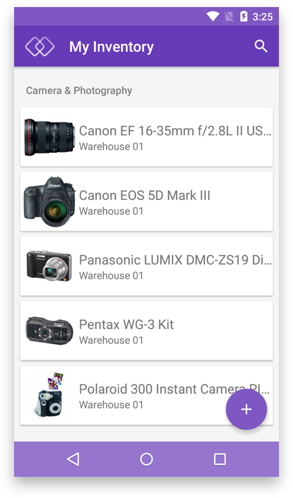
It seems our item list screen is roughly finished for now.
As you can see in the video, the EditActions for Sold and Delete swipe gesture still don’t work properly for now. Let’s make it work by modifying the ItemListViewModel.
Enabling Swipe Gestures
As you’ve seen previously, to enable the swipe gesture for the RecyclerView can be simply done by overriding the Initialize method and adding the EditActions for the Fragment.
// Defines editing action from swipe gesture.
this.EditActions.Add(new EditAction(“Sold“));
this.EditActions.Add(new EditAction(“Delete“, true));
Modify the ItemListViewModel inside the MyInventory.Core/ViewModels folder and override the ExecuteEditAction method.
protected override void ExecuteEditAction(object parameter)
{
EditingParameter editingParameter = parameter as EditingParameter;
if (editingParameter != null)
{
Item item = editingParameter.Item as Item;
if (item != null)
{
string editAction = editingParameter.CustomAction.ToLowerInvariant();
switch (editAction)
{
case “sold“:
this.ExecuteMarkSold(item);
break;
case “delete“:
this.ExecuteDelete(item);
break;
}
}
editingParameter.ShouldEndEditing = true;
}
}
When user performs swipe gesture on the cell, the EditAction command will be automatically called on every edit action defined in the Fragment. So in the above case, the EditAction command will be called twice, one for the Sold action and another for the Delete action.
One thing to note is that if you return the CanExecuteEditAction in the ViewModel to false, the button for the designated action will not be presented to the user. It’s also worth mentioning that when executing the swipe gesture, you can try to debug the EditingParameter as it contains useful information, such as the Action, CustomAction, Item, RowIndex, SectionIndex and ShouldEndEditing properties.
And modify the ExecuteMarkSold method as follows.
private void ExecuteMarkSold(object parameter)
{
if (parameter is IEnumerable<Item>)
{
IEnumerable<Item> items = parameter as IEnumerable<Item>;
if (items != null)
{
foreach (Item item in items)
{
item.IsSold = true;
item.SoldDate = DateTime.Today;
this.OnDataChanged(item);
}
}
}
else if (parameter is Item)
{
var item = parameter as Item;
item.IsSold = true;
item.SoldDate = DateTime.Today;
this.OnDataChanged(item);
}
if (this.SelectedItems != null)
this.SelectedItems.Clear();
}
Then, modify the ItemListBindingProvider.cs inside the MyInventory.Core/BindingProviders folder and add the following line.
this.AddBinding(“TableView“, BindableProperties.EditActionCommandProperty, “EditActionCommand“, BindingMode.TwoWay);
Now the swipe gesture should work properly.
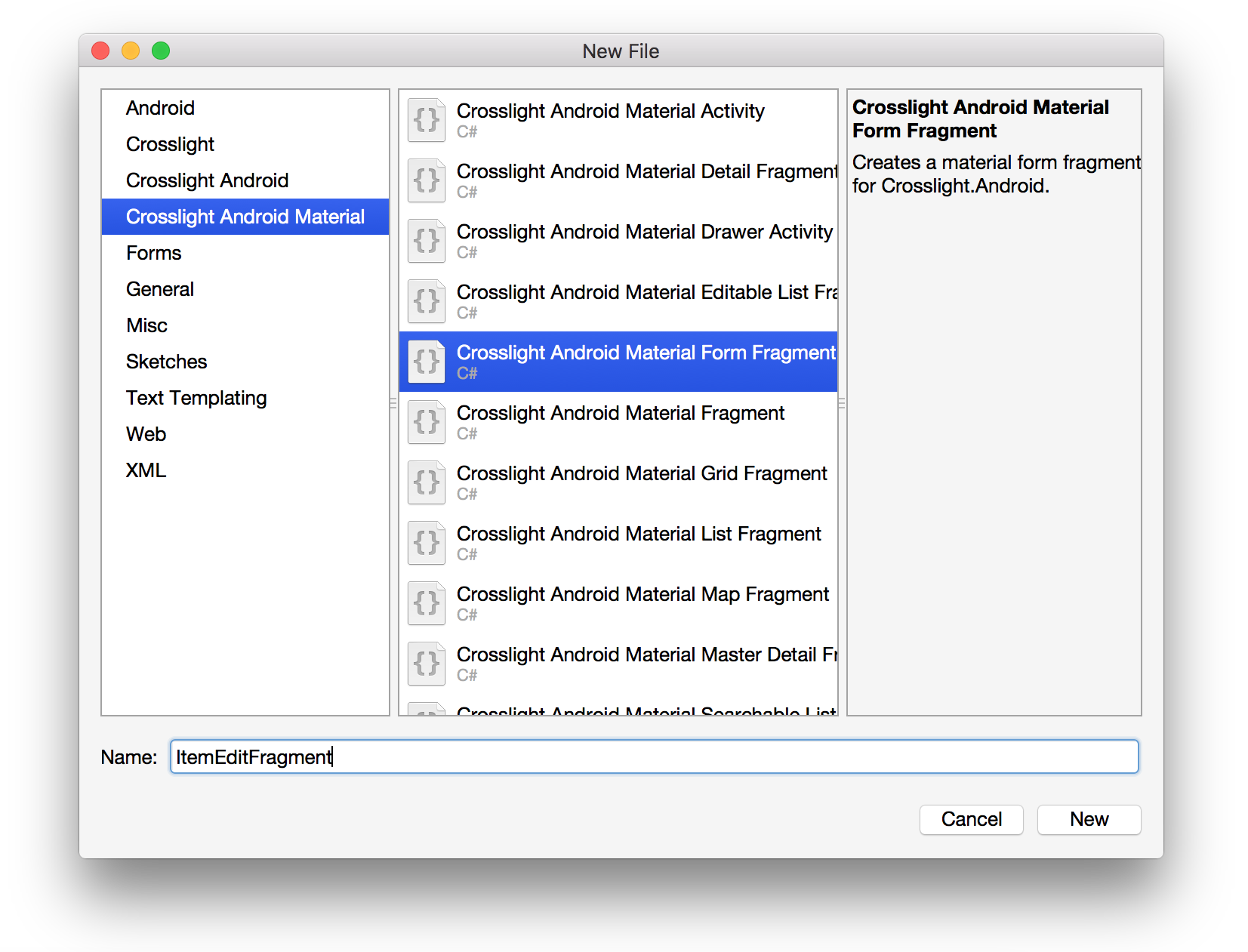
Preparing ItemEditFragment
Now that we have our item list screen ready, let’s include the new FormFragment to edit and add new items to the list. Right-click on the Fragments folder and choose Crosslight Android Material Form Fragment and give it a name of ItemEditFragment.
Replace the contents with the following code.
using System;
using Android.Runtime;
using Intersoft.Crosslight;
using Intersoft.Crosslight.Android.v7;
using MyInventory.ViewModels;
namespace MyInventory.Android
{
[ImportBinding(typeof(ItemListBindingProvider))]
public class ItemEditFragment : FormFragment<ItemEditorViewModel>
{
#region Constructors
public ItemEditFragment()
{
}
public ItemEditFragment(IntPtr javaReference, JniHandleOwnership transfer)
: base(javaReference, transfer)
{
}
#endregion
#region Methods
protected override void Initialize()
{
base.Initialize();
this.AddBarItem(new BarItem(“SaveButton“, CommandItemType.Done));
}
#endregion
}
}
Let’s take it from the top. This class inherits the new FormFragment class, which is used to display Crosslight Form Builder and takes in the ItemEditViewModel. We have two default constructors as usual, then the Initialize method is overridden to add toolbar items programmatically. The SaveButton indicates the view identifier used for the toolbar item. This convenient method lets Android developers add common commands to the Toolbar without touching any .axml files and inflate the menu. As a side note, if you wish to use the old way of inflating .axml files for the menu, it is still supported. Now when you run the project, you should be able to navigate to the form to Edit and Add new items.
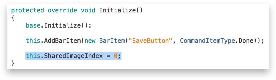
Configuring Shared Element Transitions
As you can see, your current app can now navigate to the item editor screen using modal transitions. However, it won’t as look as good with shared element transitions. Let’s enable the shared element transitions to the form editor view. If you remember, we’ve defined the SourceSharedElementIds from the ItemListFragment.
this.SourceSharedElementIds.Add(Resource.Id.Icon);
To enable shared transitions, modify ItemEditFragment and add this line inside the Initialize method: this.SharedImageIndex = 0;
Let’s re-run the project.
Now you should get a nice shared element transition when navigating to the FormFragment.
View Image Fragment
We still need to prepare the a final Fragment, which is the ViewImageFragment, which is needed when you click on the image in the FormFragment.
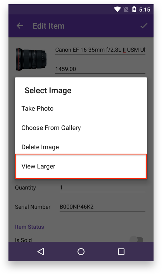
Let’s prepare this view. Create a new Fragment inside the Fragments folder and give it a name of ViewImageFragment.
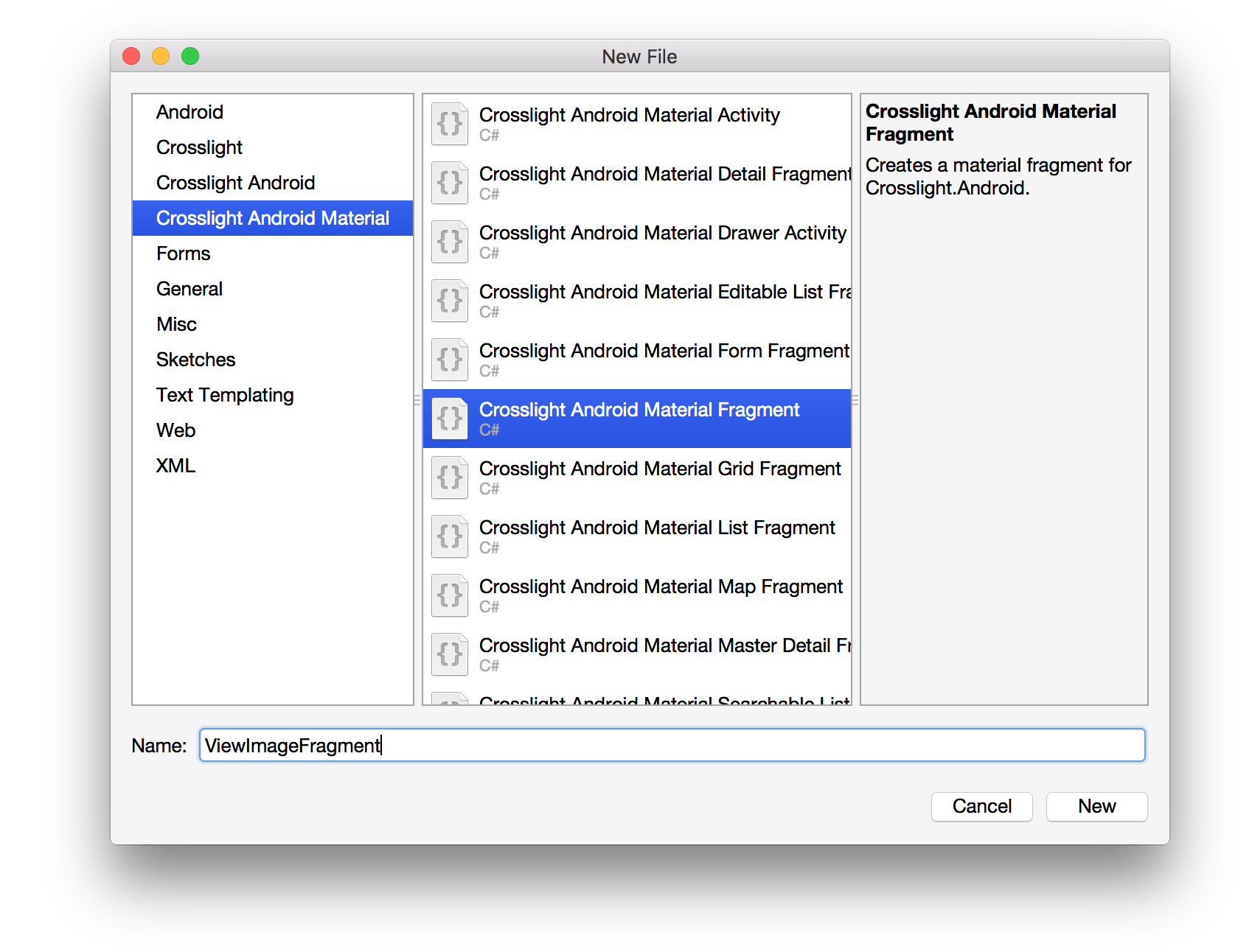
Replace the contents of the file with the following.
using System;
using Android.Runtime;
using Intersoft.Crosslight;
using Intersoft.Crosslight.Android.v7;
using MyInventory.ViewModels;
namespace MyInventory.Android
{
[ImportBinding(typeof(ItemDetailBindingProvider))]
[RegisterNavigation(“PhotoDetail“)]
public class ViewImageFragment : Fragment<ItemDetailViewModel>
{
#region Constructors
public ViewImageFragment()
{
}
public ViewImageFragment(IntPtr javaReference, JniHandleOwnership transfer)
: base(javaReference, transfer)
{
}
#endregion
#region Properties
protected override int ContentLayoutId
{
get { return Resource.Layout.view_image_layout; }
}
#endregion
}
}
Then, create the layout for view_image_layout.axml file inside the Resources/layout folder. Replace the contents of the AXML with the following.
<?xml version=“1.0“ encoding=“utf–8“?>
<LinearLayout xmlns:android=“http://schemas.android.com/apk/res/android“
android:orientation=“vertical“
android:layout_width=“match_parent“
android:layout_height=“match_parent“>
<TextView
android:id=“@+id/NameLabel“
android:gravity=“center“
android:layout_width=“match_parent“
android:layout_height=“wrap_content“ />
<ImageView
android:id=“@+id/ImageView“
android:layout_width=“match_parent“
android:layout_height=“match_parent“ />
</LinearLayout>
This app should be pretty much complete. There’s one last thing might want to apply, but this step is completely optional.
Using mipmap Icons
Did you notice that the app icon is not crisp and high-res enough?
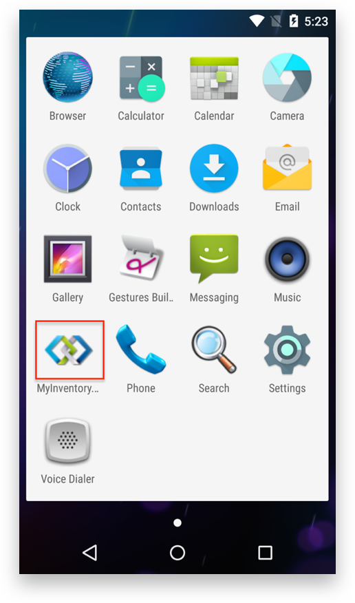
To overcome this, you can take advantage of mipmap folders so that the icons become more crisp. Quoting from the Android developers blog:
It’s best practice to place your app icons in mipmap- folders (not the drawable- folders) because they are used at resolutions different from the device’s current density.
What this means, if your device falls under ldpi, it can use mdpi icons to show a more high-res launcher icon.
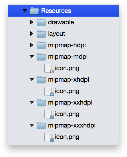
Let’s try to see if this is true. Download and extract this mipmap zip file and put it under the Resource folder, same level as drawable, layouts and values.
Then modify MainActivity.cs inside the Activities folder to use the new mipmap icon.
Replace Icon property of the ActivityAttribute with “@mipmap/icon”, rebuild and re-run your project.
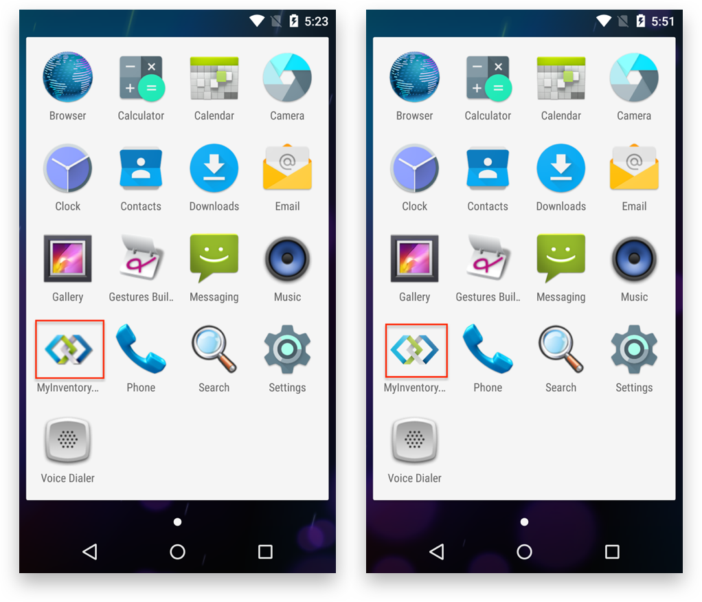 As you can see, with the new mipmap technique, your app icon should be very sharp. Small, but noticable improvement. You should only use mipmap folders for launcher icon purposes. Your app is now finished.
Learn More
What you’ve just did is just a glimpse of the full power of the Material Fragment. I highly suggest you to visit the improved docs for Material design. Start from this article and move your way to its children nodes: Crosslight Android Material Development.
Samples
You can obtain the finished sample here.
Conclusion
I hope you’ve enjoyed this post as much as I’m writing it. Hopefully you can follow this tutorial without any hassles and start migrating your existing classic Android apps to Material in no time. Should you have any questions, feel free to initiate a live chat with us, as always.
Till next post,
Nicholas Lie