Crosslight 5 RC Is Now Available
Good news to y’all. Today, we’re releasing Crosslight 5 Release Candidate to public ahead of the RTM release scheduled later this month. As mentioned in my previous blog, you can now test drive Crosslight 5 along with over 40 revamped Crosslight samples.
Crosslight 5 RC is currently published to NuGet with version 5.0.5000.535. Note that Crosslight 5 availability in NuGet provides only runtime libraries — sufficient to test drive the accompanying new samples and all shiny features introduced in Crosslight 5. The development experience such as IDE integration and project wizard are not available yet in this RC release. They will be available from installers in official RTM release later this month.
Now, let’s check out some cool new stuff.
Introducing Crosslight’s New Samples Repository
Crosslight 5 release isn’t just about great new tools and amazing features. Our team is hard at work to create dozens of new samples that have been optimized for cross-platform best practices and support for latest mobile platforms. That includes the new Material project for Android, and Universal Storyboard for iOS. To provide a clear migration path and to avoid confusion with previous techniques, we decided to start a new Git project to host the new samples which you can access here: http://git.intersoftsolutions.com/projects/cs
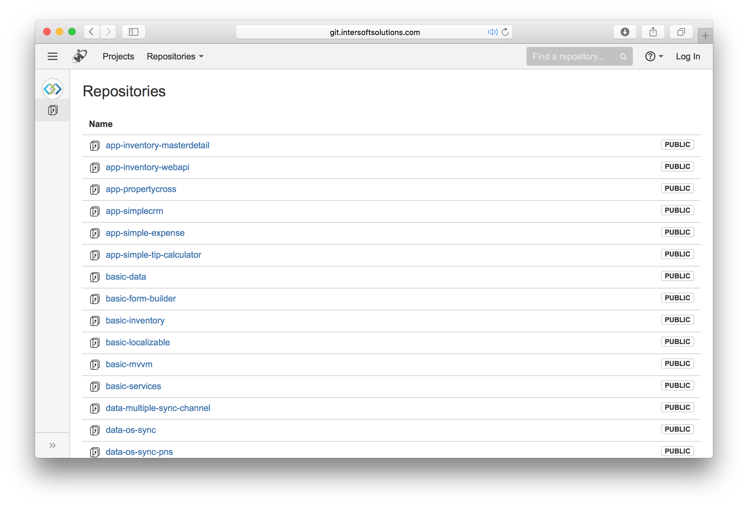
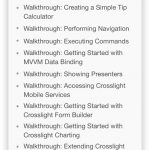
Unlike the previous Crosslight samples, each Crosslight sample is now hosted in its own repository. This means you no longer need to download a huge 600MB file only to get a specific sample you’re interested in. As seen above, we’ve also categorized the samples so you can quickly decide which samples to pick up based on your needs.
For instance, If you’re just starting out, check out the “basic”-labeled samples, i.e., basic-mvvm, basic-data, and so on. If you’d like to check out a full app reference, jump ahead to the “app”-labeled samples. The rest should be self-explanatory, “data” for data-related, “ui” and “services” for UI components and services respectively.
Here’s a quick recap of major changes in the new Crosslight samples:
- Added Android.Material project — building on the new Crosslight.Android.v7 library.
- Dropped classic Android project.
- iOS project is now redesigned with universal storyboard instead of XIB.
- Core project has been much improved to comply with best practices and API introduced in Crosslight 5. For instance, setting Title can be simply done in ViewModel. The associated view in iOS and Android will automatically take that. This means less code to concern in the view.
- Core project now uses Profile78 as our new PCL standards. This will allow you to consume most BCL packages from Microsoft.
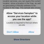
- Crosslight samples that use WebAPI can now run directly — no Windows required. By default, all WebAPI samples are now pointing to Intersoft’s public WebAPI endpoint. If you wish to change it to your local WebAPI, that’s just one property value to set.
How about the existing Crosslight Samples repo? It’s retired and will no longer receive new commits. However, we decided to leave it as is to provide sample references for classic Android.
Download. Run. It Just Works.
Get started with Crosslight is now easier than ever. No more tedious or additional configuration required to run the sample. In this release, we’ve worked hard to bring a better development experience for Crosslight. Whether you’re an advanced Crosslight developer or a newbie just starting to look into cross-platform mobile development, you’ll find Crosslight easy and fun to work with.
Here’s a 2-minute video demo to show the new sample experience.
Top 10 Samples to Check Out
To help you make the most out of Crosslight 5 release, I’m pleased to share the top 10 samples I fav’ed the most, ordered from the least to the most. I hope you’ll like them too!
For testing the Android Material samples below, I highly recommend to use Xamarin Android Player with API 22 (Lollipop) which is generally faster and more stable than Google’s emulators.
Property Cross
Url: http://git.intersoftsolutions.com/projects/CS/repos/app-propertycross/browse
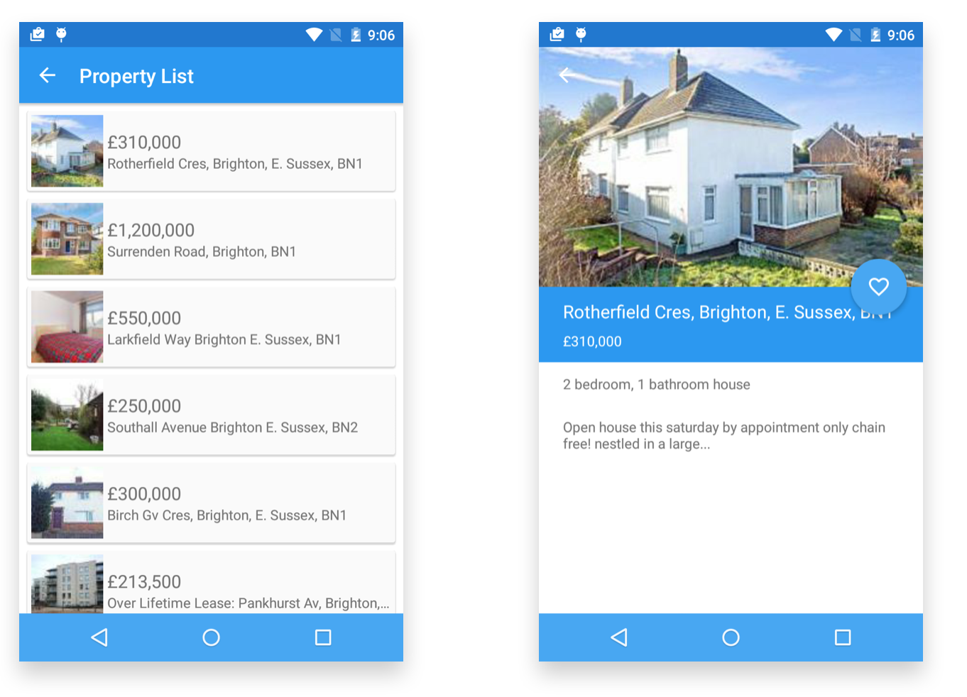
Our implementation of the open-source PropertyCross has been well recognized as the best cross-platform implementation with 100% UI logic sharing. PropertyCross v2 now includes the new Android Material project, featuring stunning shared element transition, list view with card style, and new bar items.
Interesting points to check out:
- PropertyDetailFragment: See how easy it is to implement a Favorite floating action button with toggle behavior. A single line of code is what it takes.
- PropertyListFragment: Notice that the list view binds to the thumbnail URL which is used for shared element transition. When it navigates to detail, the large image will be asynchronously loaded — smoothly fading into the parallax image. This beautiful UX commonly needs hundreds line-of-code to get it done right, but Crosslight saves you with only one line-of-code.
Form Builder
Url: http://git.intersoftsolutions.com/projects/CS/repos/basic-form-builder/browse
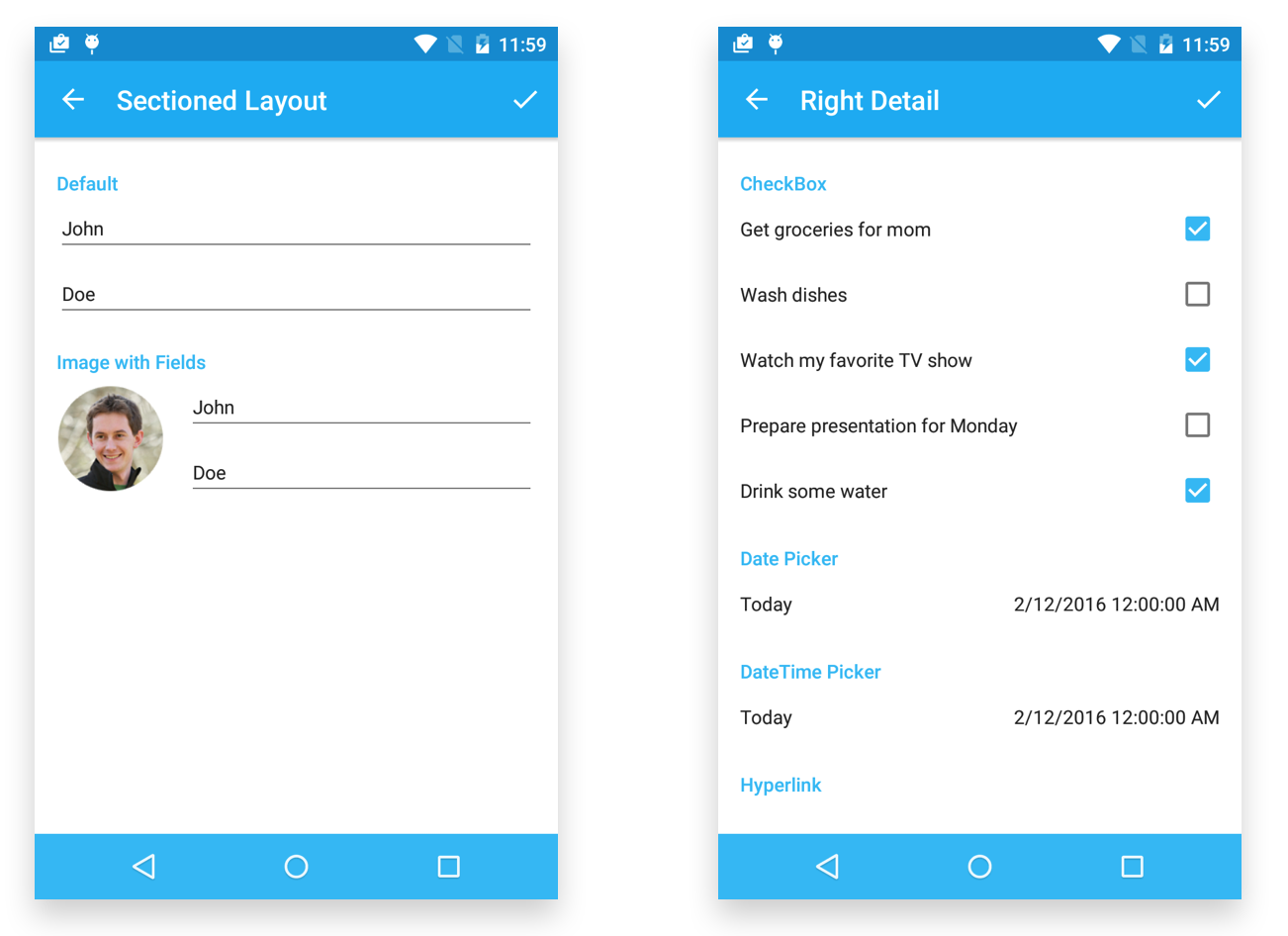
The new Crosslight Android Material library isn’t just an incremental improvement to existing Android library. It’s a revolutionary milestone. We re-created every single editor for Form Builder to match the latest Material UX and design pattern. This includes the spacing between elements, margin to parent, typography, font size, and colors.
Check out each editor sample to see how Form Builder looks like in Material design pattern.
Dialog Presenter
Url: http://git.intersoftsolutions.com/projects/CS/repos/services-dialog-presenter/browse
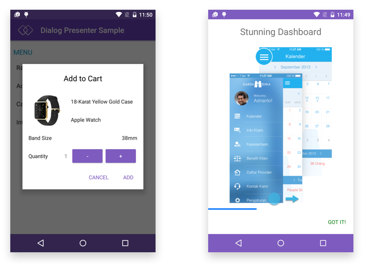
Along with the introduction of Crosslight Android Material library, we also introduced a redesigned Dialog Presenter component for Android Material.
Interesting points to check out:
- AddCartFragment: The dialog fragment works in harmony with the hosted Form Builder controls according to the defined theme.
- CallFragment: The full screen presentation style with accelerated slide down animation works beautifully with Material theme.
Expenses
Url: http://git.intersoftsolutions.com/projects/CS/repos/app-simple-expense/browse
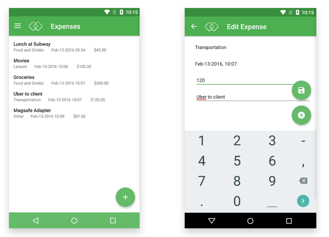
The lightweight yet useful expenses sample have got a major facelift. Redesigned with Material experience, you’ll be greeted with the new navigation drawer. Try to add a category and some expenses to get a feeling of it.
Interesting points to check out:
- ExpenseListFragment: See how straightforward it is to define floating action buttons, enable multiple selection, and enable contextual toolbar.
- ExpenseEditFragment: Need two or more floating action buttons in your fragment? No problems — just use the same FloatingActionButtons.Add API. Pay attention to CommandItemType, Position and Direction which lets you logically define where you want the button to be positioned, what icon it should display, and in case of multiple buttons, where should it put the siblings.
Calendar
Url: http://git.intersoftsolutions.com/projects/CS/repos/ui-calendar/browse
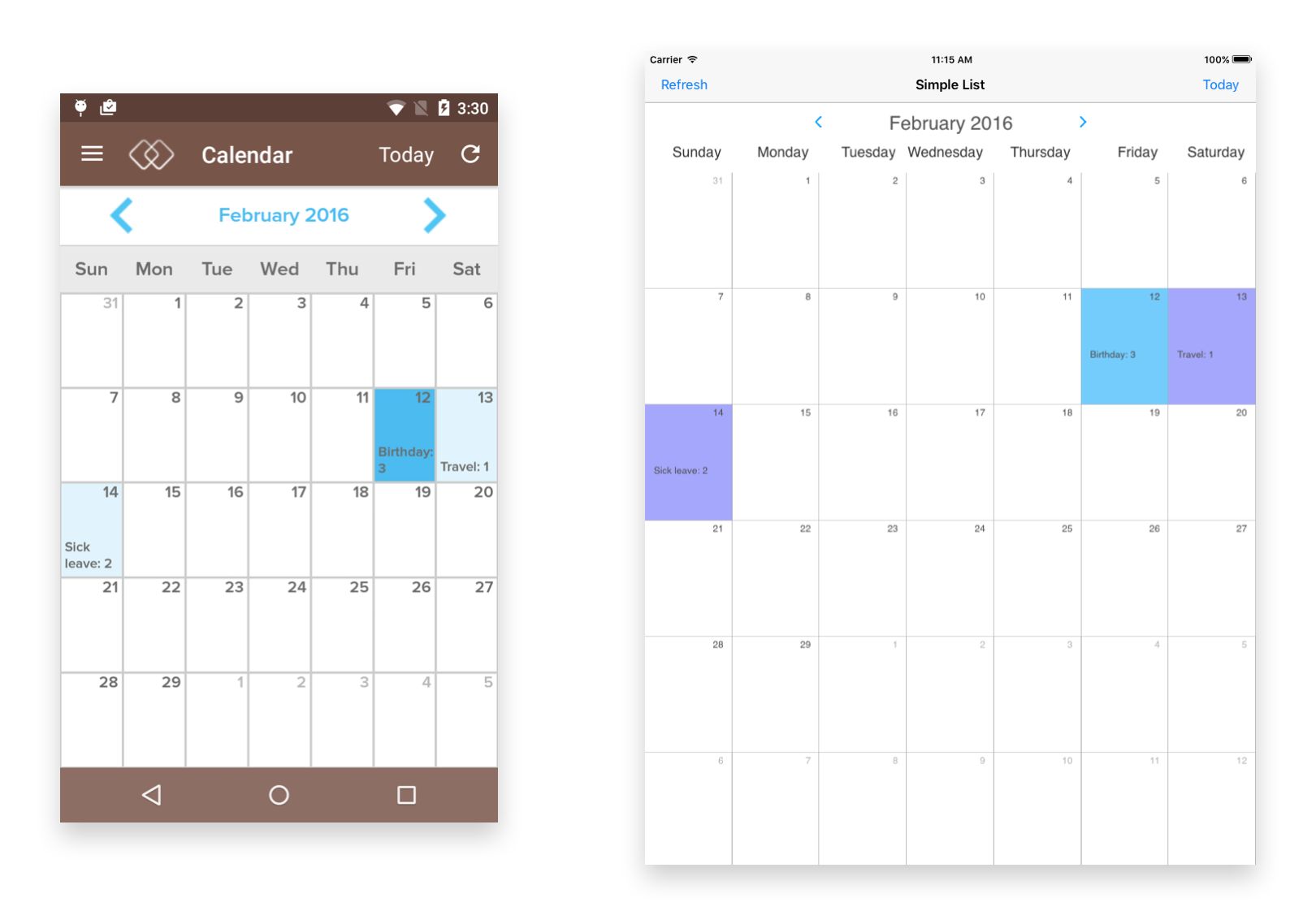
The calendar samples have been updated to reflect the improved Calendar control shipped in Crosslight 5. The Calendar control in iOS now joined the latest control framework which offers the following advantages:
- Support Universal Storyboard
- Support Xamarin Studio iOS Designer
- Support rotation, both iPhone and iPad
Interesting points to check out:
- iOS – CalendarViewController: Notice there are no more code that creates UICalendar. That’s because everything is now defined in MainStoryboard. If you open the MainStoryboard in Xamarin Studio, you can see the new Calendar is rendering beautifully in the designer surface.
- Android: Optimized for Crosslight Android Material library.
Signature Pad
Url: http://git.intersoftsolutions.com/projects/CS/repos/ui-signature-pad/browse

This is a new sample that demonstrates the SignaturePad control introduced in Crosslight 5. The SignaturePad control comes with two flavors. The first is the platform-specific control as usual. The other is the brand-new SignaturePad Widget for Form Builder. SignaturePad is our first UI control that ships with a widget extension for Form Builder.
Moving forward, all our UI controls will have the Form Builder Widget counterpart, so you can use them in your form metadata in just a single line of code.
Interesting points to check out:
- Models\FormMetadata: See the new metadata format for the SignaturePad widget extension.
- BindingProviders\SignaturePadViewResultBindingProvide r: The SignaturePad supports binding to ImageSource property. With the byte array stored to your model after a signing input is detected, you can easily display the byte array to an ImageView by simply binding to the ImageSource property.
Gauge
Url: http://git.intersoftsolutions.com/projects/CS/repos/ui-gauge/browse
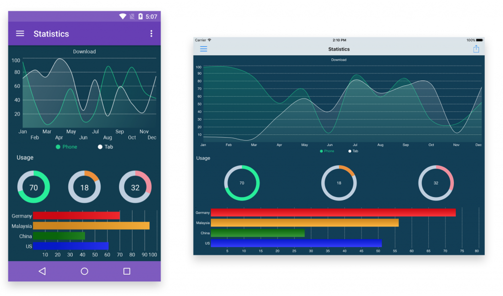
This is a new sample demonstrating the Gauge data visualization control introduced in Crosslight 5. Unlike traditional gauges, Crosslight Gauge is designed with sleek modern styles right from the start, so you can create some stunning dashboards in matter of minutes.
Crosslight Gauge offers industry-standard gauge and a circular gauge similar to those used in Apple’s Health and Watch apps. There are 25 individual examples that show each feature in detail, and every customizable aspects. I highly recommend you to check them all to get insights what you can do with it.
Master Detail
Url: http://git.intersoftsolutions.com/projects/CS/repos/app-inventory-masterdetail/browse
Master Detail pattern is arguably one of the most essential navigation patterns in today’s ubiquitous modern apps, particularly if your app needs to support both phone and tablet. Modeled upon the industry standard apps such as Facebook, the new MasterDetailFragment contains a master view and a detail view — both shared a single toolbar. In most cases, the bar items that are contextual to the master items will be presented, such as Add, Edit, Delete, etc. However, with the introduction of floating action buttons, that could provide better solution as you can add them to each view individually — which is demonstrated in this sample.
This specialized MasterDetailFragment features a number of different navigation scenarios designed for business/enterprise apps. It’s also worth to mention that this fragment plays well with navigation drawer and optimized for Material experience.
Interesting points to check out:
- InventoryFragment: Shows a list of inventory in the master view and the item details in the detail view.
- CategoryContainerFragment: Shows a nested navigation scenarion in master view and item details in the detail view.
- SettingsFragment: Demonstrates the flexibility to navigate to any content in detail view.
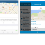
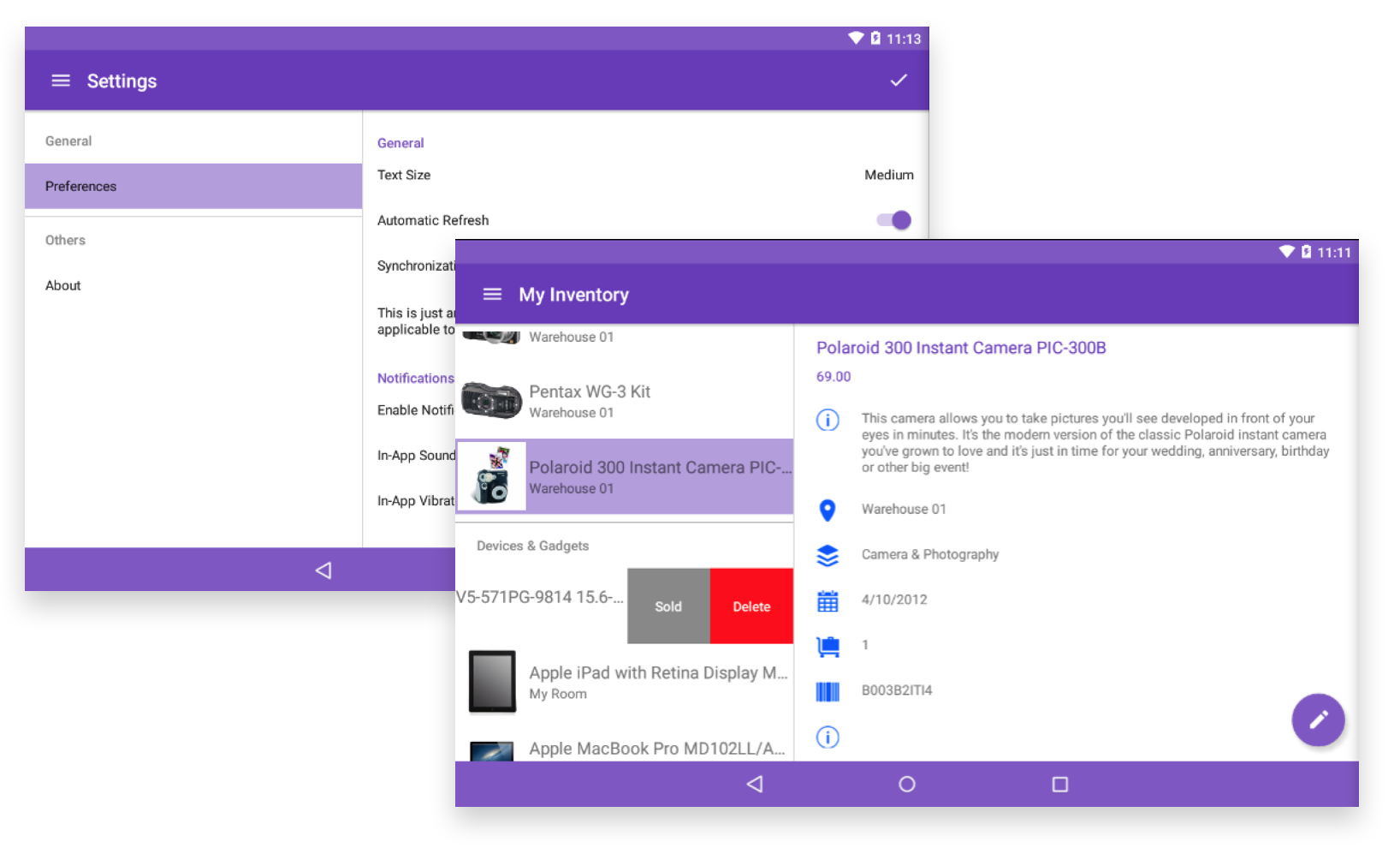
Inventory
Url: http://git.intersoftsolutions.com/projects/CS/repos/basic-inventory/browse
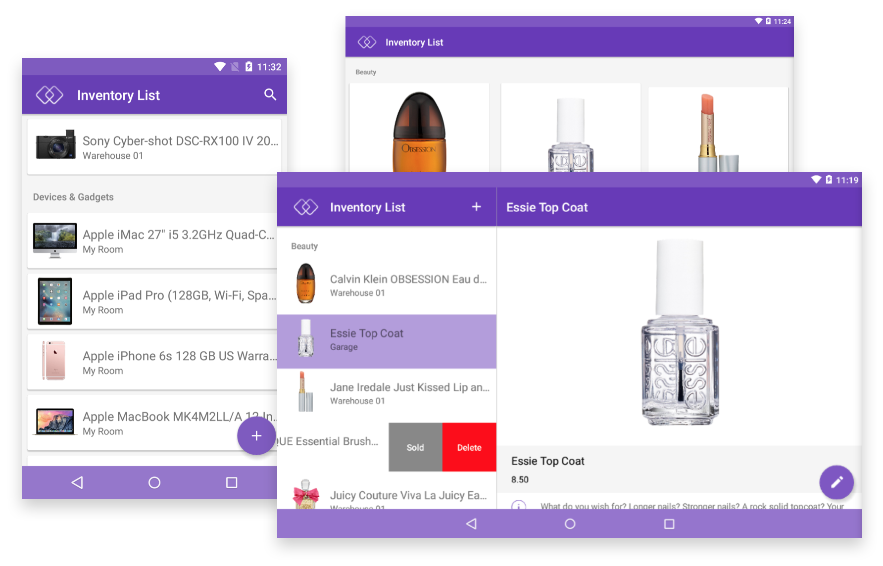
As Crosslight’s flagship reference sample, the Inventory has been significantly revamped and shaped to comply with the latest and greatest APIs available in Crosslight 5. The new Inventory for Android Material provides best practices how a typical Android app should be built, including data listing with RecycleView, adding bar items, enabling shared transition, defining floating actions and contextual toolbar.
One more thing, you can now have swipe-for-action gesture in the RecycleView, a nice UX feature that has been exclusive to iOS developers. We designed swipe actions to support commands, so you can have a single UI logic in ViewModel that responding to the swipe gesture in both iOS and Android. Pretty cool, right?
While you’re at the Inventory.Android.Material project, try to run the sample again in an Android tablet simulator, you’ll be welcomed with a GridView with neatly arranged layout. This is another important feature parity with iOS (CollectionView) which wasn’t available previously. Notice that the long press (contextual toolbar) and multiple selection works equally great as in iOS.
More interestingly, the Inventory sample also introduces a master-detail pattern that is designed after iOS SplitView. Introducing the new SplitFragment for Android Material, it’s now possible to create a beautiful master-detail experience in Android platform. With SplitFragment, the master and detail view can have its own title and bar items individually which are controlled by the contained fragment, makes it on-par with iOS SplitView concept and capability. For us, SplitFragment is one of the most important Android building blocks in this release as it brings many functionalities not possible before, and more importantly, brings developers one step closer to the iOS parity. Run the Inventory.MasterDetail.Android.Material sample in an Android tablet simulator to see it in action.
And the best part is, all the view variations you seen above are actually done with the same UI logic and codebase. That’s what makes Crosslight truly standout from the crowd.
That’s not all. On iOS platform, we’ve done many improvements and re-engineering to table view, particularly related to performance and animation. For instance, try to swipe and delete (or Mark as Sold), or edit and delete multiple items, notice that row animations are now super-smooth. We’ve streamlined this experience on all editing scenarios, whether it’s on single or grouped list, or on master-detail.
Interesting points to check out:
- ItemListFragment: Learn how easy it is to enable searchable list by simply deriving from the new SearchableRecyclerViewFragment. Also see the API simplicity to enable swipe actions, shared element transition, and floating action buttons.
- ItemGridFragment: The new GridViewFragment makes it easy to present items list in collection view. Inspired by iOS, you can simply define the orientation, number of rows or columns.
- MasterDetailFragment: The new SplitFragment lets you implement a beautiful master-detail experience with just a few line of code. The control does all the heavy lifting, from navigation logic, rotation handling, fragment instantiation and everything.
- ItemListViewModel: Notice the use of new ActionToastPresenter, supported in both iOS and Android Material, allows you to easily present “snack bar” style interface. At runtime, try to enter edit mode (Edit in iOS, long-press in Android), select one or more items, then perform Mark Sold. In this sample, you’ll see an “Undo” action in the toast, perfect for users to easily perform certain actions contextual to the last action.
Material
Url: http://git.intersoftsolutions.com/projects/CS/repos/ui-material/browse
Last but not least, here’s the #1 sample you won’t want to miss out. The Material sample unleashes all powerful features introduced in the new Crosslight Android Material library. You can find a wide variety of Material UX features hosted in some 30+ individual samples.
From collapsing toolbar to parallax and shared element and snack bar, you’ll find everything you need to build great Material experience here. I highly recommend you to spend some time playing with every sample and try interacting with the UI elements.
Wrapping Up
So, which samples you liked the most? We’d love to hear from you. If you prefer to browse all samples, jump ahead to http://git.intersoftsolutions.com/projects/cs.
While trying out the samples, please be noted that the documentation links found in the sample’s readme will not work as they’re still in progress. Rest assured that the new documentation will be very comprehensive in this release — and will be completely available upon the official release later this month.
Enjoy, and happy sampling!
Disclaimer: Do not apply Crosslight 5 RC in your production apps yet as it will require you to update the Crosslight license key which haven’t been released.
Best,
Jimmy