Adding Header and Footer for iOS TableView and Android ListView
Hi guys, I’m back with another blog post, this time covering how to use the a custom view for header and footer to be used alongside iOS TableView / Android TableView. You’ll see how you can easily create custom views and use them as headers and footers in your Crosslight apps.
After this project has completed, you’ll end up with a custom header and footer in your ListView/TableView. When you click on the Add Item button on the top, new item will be added to the list, and you can see how the header and footer is correctly persisted when the items collection is updated.
To complete this project, there are several steps need to be completed:
- Preparing the project
- Creating custom views for iOS
- Preparing the BIndingProvider
- Preparing the ViewModel
- Modify iOS ViewController and running the project
- Creating custom views for Android
- Modifying Android ListActivity and running the project
Without further ado, let’s get started.
Preparing the project
For this sample, I’ll keep it nice and simple. This time, I’ll start from the Navigation template created using Crosslight Project Wizard. I’ll name this project: HeaderAndFooter.
Creating custom views for iOS
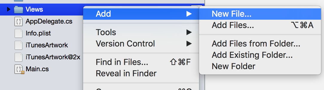
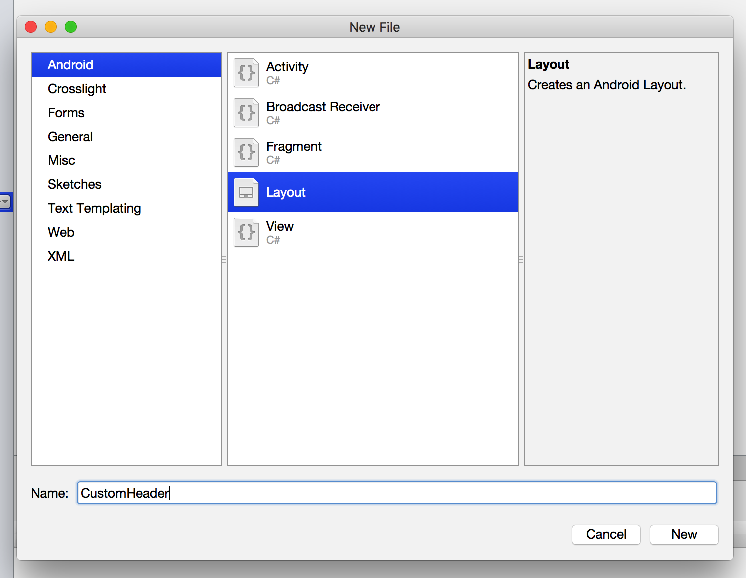
Let’s begin by creating a new custom header view for iOS, by right-clicking on the VIews folder in HeaderAndFooter.iOS/Views folder and choose Add, New File.
Then choose Crosslight, Crosslight iOS View for iPhone.

Give it a name of CustomHeader. This will generate two files, CustomHeader.xib and CustomHeader.cs for the designer files.
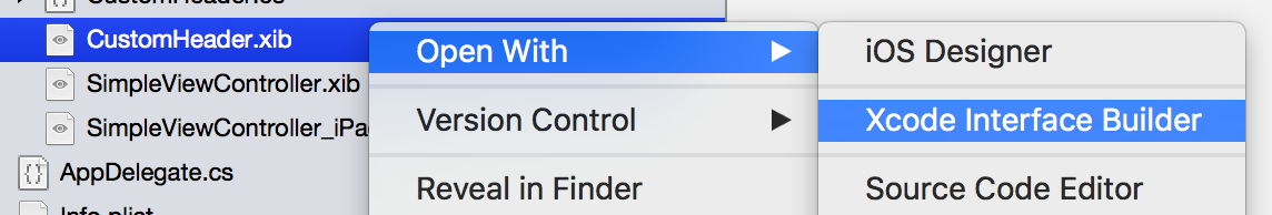
Then open the CustomHeader.xib using Xcode Interface Builder.
In Xcode Interface Builder, drag a Label and a button.
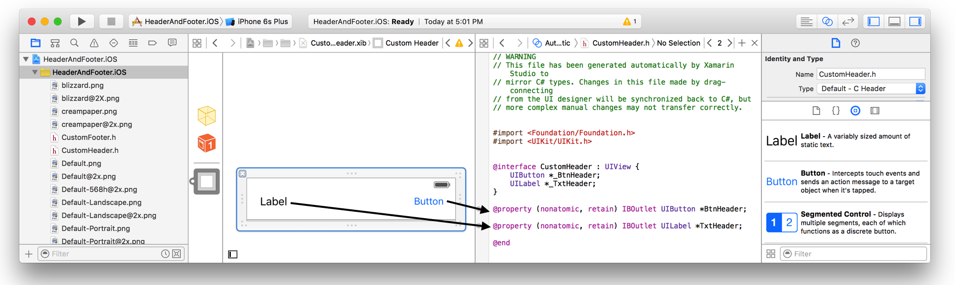
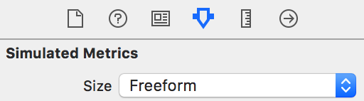
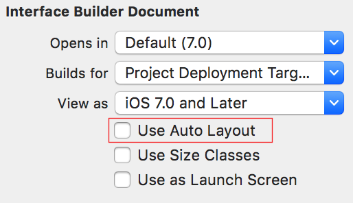
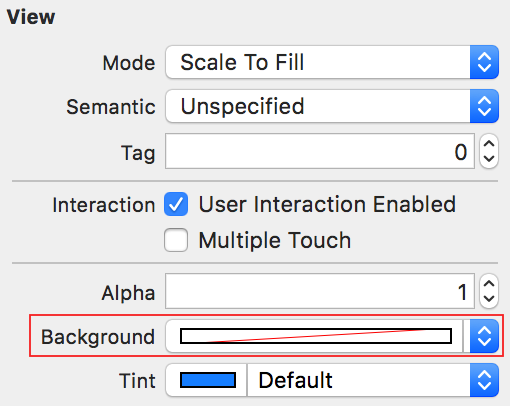
Set the label outlet as TxtHeader and the button as BtnHeader. I won’t go too much on the layouting details, but you can ensure the followings are set:
- Set the View size as Freeform, so you can adjust the view size freely.
- Turn off Auto Layout.
- Ensure that the View background is set to Default (no fill), this will avoid clipping issues when placed as the header view.
Your custom header is now ready. Let’s move on to custom footer.
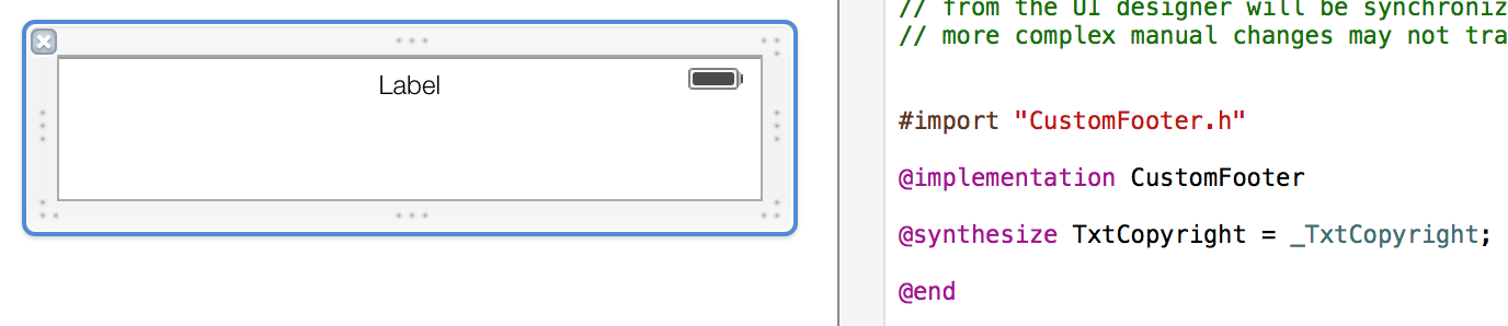
Basically, you’re going to perform the same tasks as adding a custom header, but the difference is that you’re going to give it a file name of CustomFooter, then provide a label with the outlet of TxtCopyright.
Preparing the BindingProvider
Since you’ve successfully created the custom views, let’s prepare the BindingProvider first to prepare the properties and commands you wish to bind to the View. Open up NavigationBindingProvider (I renamed this file to MainBindingProvider to avoid confusion) and add the highlighted lines.
|
1 2 3 4 5 6 7 8 9 10 11 12 13 14 15 16 17 18 19 20 21 22 23 24 25 26 27 28 29 |
using Intersoft.Crosslight; namespace HeaderAndFooter { public class MainBindingProvider : BindingProvider { #region Constructors public MainBindingProvider() { ItemBindingDescription itemBinding = new ItemBindingDescription() { DisplayMemberPath = "Title", NavigateMemberPath = "Target" }; this.AddBinding("TableView", BindableProperties.ItemsSourceProperty, "Items"); this.AddBinding("TableView", BindableProperties.ItemTemplateBindingProperty, itemBinding, true); this.AddBinding("TableView", BindableProperties.SelectedItemProperty, "SelectedItem", BindingMode.TwoWay); this.AddBinding("BtnHeader", BindableProperties.TextProperty, "ButtonText"); this.AddBinding("BtnHeader", BindableProperties.CommandProperty, "AddCommand"); this.AddBinding("TxtCopyright", BindableProperties.TextProperty, "CopyrightText"); this.AddBinding("TxtHeader", BindableProperties.TextProperty, "HeaderText"); } #endregion } } |
From the added lines, notice that we’re going to do the following:
- Bind ButtonText property in the ViewModel to the BtnHeader button.
- Bind the ViewModel’s built-in AddCommand to the BtnHeader button. This is available in the EditableListViewModel shipped in Crosslight.
- Bind the HeaderText property in the ViewModel to the TxtHeader label.
- Bind the CopyrightText property in the ViewModel to TxtCopyright label. This is for the footer.
Since you’ve prepared everything in the BindingProvider, let’s modify the ViewModel.
Modifying the ViewModel
The NavigationViewModel now looks like the following. It’s located inside the HeaderAndFooter.Core/ViewModels folder.
|
1 2 3 4 5 6 7 8 9 10 11 12 13 14 15 16 17 18 19 20 21 22 23 24 25 26 27 28 29 30 31 32 33 34 35 36 37 38 39 40 41 42 43 44 45 46 47 48 49 50 51 52 53 54 55 56 57 58 59 60 61 62 63 64 65 66 67 68 69 70 71 72 73 74 75 76 77 78 79 80 81 82 83 84 85 86 87 88 89 90 91 92 93 94 95 96 97 98 99 100 101 102 103 104 105 106 107 108 109 110 111 112 113 114 115 |
using System.Collections.ObjectModel; using System.Collections.Specialized; using System.Linq; using Intersoft.Crosslight; namespace HeaderAndFooter.ViewModels { public class NavigationViewModel : SampleListViewModelBase<NavigationItem> { #region Constructors public NavigationViewModel() { ObservableCollection<NavigationItem> items = new ObservableCollection<NavigationItem>(); items.Add(new NavigationItem("Simple Page", "About", typeof(SimpleViewModel))); items.Add(new NavigationItem("About This App", "About", typeof(AboutNavigationViewModel))); this.SourceItems = items; this.ButtonText = "Add Item"; this.CopyrightText = "Copyright © Intersoft Solutions"; } #endregion #region Properties private string _aboutText { get; set; } private string _buttonText { get; set; } private string _copyrightText { get; set; } private string _headerText { get; set; } public string AboutText { get { return _aboutText; } set { if (_aboutText != value) { _aboutText = value; OnPropertyChanged("AboutText"); } } } public string ButtonText { get { return _buttonText; } set { if (_buttonText != value) { _buttonText = value; OnPropertyChanged("ButtonText"); } } } public string CopyrightText { get { return _copyrightText; } set { if (_copyrightText != value) { _copyrightText = value; OnPropertyChanged("CopyrightText"); } } } public string HeaderText { get { _headerText = this.Items.Count() + " items."; return _headerText; } set { if (_headerText != value) { _headerText = value; OnPropertyChanged("HeaderText"); } } } #endregion #region Methods protected override bool CanExecuteAdd(object parameter) { return true; } protected override void ExecuteAdd(object parameter) { base.ExecuteAdd(parameter); NavigationItem newItem = new NavigationItem("Simple Page", "About", typeof(SimpleViewModel)); var items = this.SourceItems.ToObservable(); items.Add(newItem); } protected override void OnCollectionChanged(NotifyCollectionChangedEventArgs e) { this.OnPropertyChanged("HeaderText"); } #endregion } } |
Let’s take a deeper look at this class, starting from the top. In the constructor, we’ve prepared our SourceItems with ObservableCollection. We then initialize the ButtonText property and the CopyrightText property. The ButtonText and CopyrightText property are all MVVM-ready properties. The HeaderText is also an MVVM-ready property, but in the property getter, the text is always updated according to the number of items which exists in the list.
Right after the properties, we then override the built-in CanExecuteAdd method to return true so that the AddCommand can be executed, as well as overriding the actions for the ExecuteAdd method. Here, we simply add a new NavigationItem to the list. Just right after the method, Crosslight has provided an elegant way to perform any additional changes to other properties or any other implementation by overriding the OnCollectionChanged method. In the method, we trigger the OnPropertyChanged of the HeaderText, so that the number of items is always updated in our custom header.
Modify iOS ViewController and running the project
Now that you got the Core project covered, let’s modify the MainViewController (located inside HeaderAndFooter.iOS/ViewControllers) a bit.
|
1 2 3 4 5 6 7 8 9 10 11 12 13 14 15 16 17 18 19 20 21 22 23 24 25 26 27 28 29 30 31 32 33 34 35 36 37 38 39 40 41 42 43 44 45 46 47 48 49 50 51 52 53 54 55 |
using CoreGraphics; using Foundation; using HeaderAndFooter.ViewModels; using Intersoft.Crosslight; using Intersoft.Crosslight.iOS; using UIKit; namespace HeaderAndFooter.iOS.ViewControllers { [Register("MainViewController")] [ImportBinding(typeof(MainBindingProvider))] public class MainViewController : UITableViewController<NavigationViewModel> { #region Properties public override UIViewTemplate HeaderViewTemplate { get { return new UIViewTemplate(CustomHeader.Nib); } } public override UIViewTemplate FooterViewTemplate { get { return new UIViewTemplate(CustomFooter.Nib); } } public override TableViewInteraction InteractionMode { get { return TableViewInteraction.Navigation; } } public override bool ShowGroupHeader { get { return false; } } public override UITableViewStyle TableViewStyle { get { return UITableViewStyle.Plain; } } #endregion #region Methods protected override void InitializeView() { base.InitializeView(); // set navigation title this.NavigationItem.Title = "Crosslight App"; } #endregion } } |
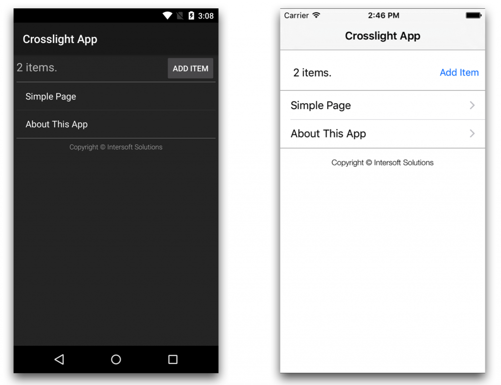
In the MainViewController, we’ve overridden the HeaderViewTemplate as well as FooterViewTemplate to return the Nib for each custom header and footer view that we’ve just defined. We also made things simpler by not showing the group header as wellas ensuring that the used TableViewStyle is Plain. Run the project. You should get the following result.
If you’re curious about the separator that exists between the header with the table view, as well as the footer with the table view, it’s because I’ve added an additional view in the custom header and footer layout, with the height of 1 unit and giving it a light gray background, to show the boundaries of the custom header and custom footer view. We’re going to do the same with Android layout later. You’ve completed the iOS version. Let’s move on to the Android.
Creating custom views for Android
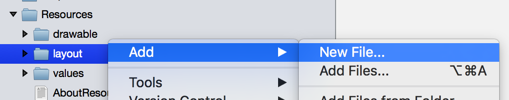
Similar to iOS, you’ll need to create a custom header view first for Android. To do this, simply right click on the Resources/layout folder in the HeaderAndFooter.Android/Views folder, then choose Add, New Item.
From the dialog that appears, choose Android, Layout, and give it a name of CustomHeader.
And here’s the contents of the CustomHeader.axml file.
|
1 2 3 4 5 6 7 8 9 10 11 12 13 14 15 16 17 18 19 20 21 22 23 24 25 26 27 28 29 30 31 |
<?xml version="1.0" encoding="utf-8"?> <LinearLayout xmlns:android="http://schemas.android.com/apk/res/android" android:orientation="vertical" android:layout_width="fill_parent" android:layout_height="wrap_content" > <LinearLayout android:orientation="horizontal" android:layout_width="fill_parent" android:layout_height="wrap_content" > <TextView android:id="@+id/TxtHeader" android:layout_width="fill_parent" android:layout_height="30dp" android:textSize="20sp" android:gravity="left" android:layout_weight="1" /> <Button android:id="@+id/BtnHeader" android:layout_width="wrap_content" android:layout_height="wrap_content" /> </LinearLayout> <LinearLayout android:layout_width="fill_parent" android:layout_height="1px" android:background="#f2f2f2" /> </LinearLayout> |
This layout simply contains a pretty much similar layout with iOS, that contains a label, a button, and a gray separator at the bottom. Repeat the same procedure for the custom footer layout. Here’s the contents of the CustomFooter.axml file.
|
1 2 3 4 5 6 7 8 9 10 11 12 13 14 15 16 17 18 19 20 |
<?xml version="1.0" encoding="utf-8"?> <LinearLayout xmlns:android="http://schemas.android.com/apk/res/android" android:orientation="vertical" android:layout_width="fill_parent" android:layout_height="wrap_content" > <LinearLayout android:layout_width="fill_parent" android:layout_height="1px" android:background="#f2f2f2" /> <TextView android:id="@+id/TxtCopyright" android:layout_width="fill_parent" android:layout_height="30dp" android:textSize="12sp" android:gravity="center" android:fontFamily="sans-serif-light" /> </LinearLayout> |
Modifying Android ListActivity and running the project
Since you’ve prepared the custom views let’s modify the Android ListActivity to display our custom header and footer. Open up MainActivity in the HeaderAndFooter.Android/Activities folder and take note of the following changes.
|
1 2 3 4 5 6 7 8 9 10 11 12 13 14 15 16 17 18 19 20 21 22 23 24 25 26 27 28 29 30 31 32 33 34 35 36 37 38 39 40 41 42 43 44 45 46 47 |
using Android.App; using HeaderAndFooter.ViewModels; using Intersoft.Crosslight; using Intersoft.Crosslight.Android; namespace HeaderAndFooter.Android { [Activity(Label = "Crosslight App", Icon = "@drawable/icon")] [ImportBinding(typeof(MainBindingProvider))] public class MainActivity : ListActivity<NavigationViewModel> { #region Methods protected override void InitializeView() { base.InitializeView(); this.RegisterViewIdentifier("TableView", this.ListView); } #endregion #region Properties protected override int ContentLayoutId { get { return Intersoft.Crosslight.Android.Resource.Layout.listgroupsectionlayout; } } protected override int FooterLayoutId { get { return Resource.Layout.CustomFooter; } } protected override int HeaderLayoutId { get { return Resource.Layout.CustomHeader; } } public override ListViewInteraction InteractionMode { get { return ListViewInteraction.Navigation; } } #endregion } } |
All you need to do is just override the FooterLayoutId as well HeaderLayoutId and provide the layout you’ve just created. If you notice in the template, right in the InitializeView method, we’re registering the ListView with the TableView identifier at runtime. This is how you would register a view at runtime. For more information in registering view at runtime, check out this document in the Developer Center.
You’re now ready to run the project. You should get the result similar to the following.
Wrapping Up
You’ve seen how easy it is to set up a custom header and footer view to use with iOS TableView and Android ListView. With Crosslight, the custom views are automatically compatible with data binding and Crosslight takes care of the magic, so you can focus on building your app instead of having to worry about wiring behind the scenes. Hopefully this gives you a good insight on how Crosslight accomplishes business scenarios elegantly, without compromising any of the MVVM-design pattern enforced throughout the app.
As always, you can find the source code to this post here: http://git.intersoftsolutions.com/projects/CT/repos/crosslightheaderandfooter/browse.
See you in the next post,
Nicholas Lie