WebUI Studio Designer Reimagined
Last week, Microsoft has finally released its long awaited Visual Studio 2012 to the MSDN subscribers. As VSIP partners, we had the RTM bits several weeks earlier and started testing our component designer features for the new Visual Studio.
Just in timely fashion, we’ve recently completed the development and testing milestones for our new component designer – rebuilt entirely from the scratch to provide the best support for Visual Studio 2012. In this blog post, I’ll share some of the design experiences while remaking our component designer. Read on.
The Visual Studio 2012 UX Guidelines
Since the invention of “Metro” design language, Microsoft has been redesigning all its software products toward the modern UI design, including the recently released Visual Studio 2012. As a result of the redesign, Microsoft has now introduced the so-called “Visual Studio 2012 UX Guidelines” which has to be adhered by its development ecosystem partners. We’re thrilled to be among the first who have adhered to the UX guidelines, and will release our new version at the same time of the official Visual Studio 2012 launch.
To adhere to the UX guidelines, our designer team have redesigned nearly 200+ toolbox icons to the Metro style. Furthermore, we decided to remake the component designer to support the new look and feel of Visual Studio 2012, and more importantly, to support the philosophy of the user experiences which essentially emphasizes on content with reduced decorators.
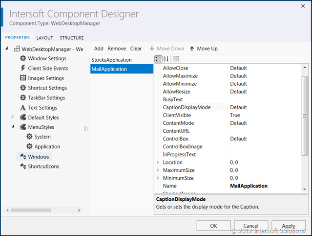
Meet the new Component Designer for Visual Studio 2012. It’s rebuilt entirely from the scratch to resemble the Visual Studio 2012 interface. The all-new designer is now built on the WPF 4 platform and leveraging our own ClientUI for WPF controls – thanks to the comprehensive and easily style-able controls, we managed to remake the component designer ahead of the expected schedule.
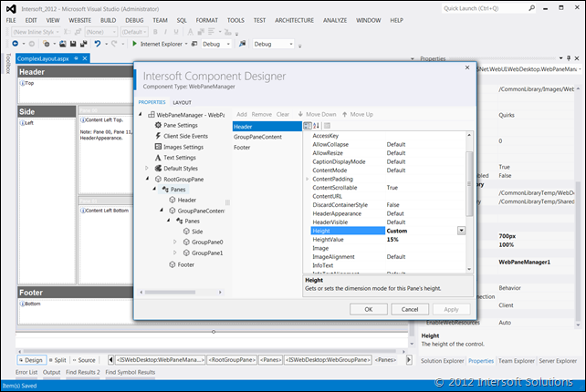
The following screenshot shows the new WebUI Studio component designer with much cleaner design and Metro’s iconography.
It’s important to note that previous version of Visual Studio will continue to be supported. The WebUI Studio component designer launches the new WPF-based designer only when it’s running inside Visual Studio 2012. This is made possible thanks to the loosely-coupled architecture in the component designer framework.
So, when you’re working with WebUI Studio components in Visual Studio 2008 or 2010, you’ll get the old, clunky component designer with sea of colors. And when you’re in Visual Studio 2012, it automatically launches the new modern-styled component designer. Keep in mind that the control assemblies are identical regardless of the Visual Studio version.
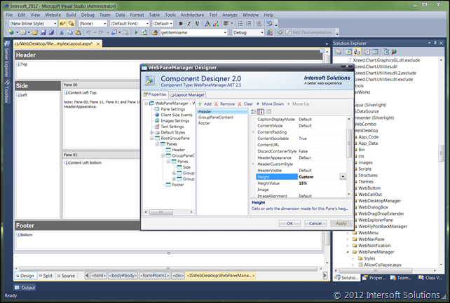
The shots below show the designer comparison between the Visual Studio 2010 and 2012.
One of the most useful benefits with the migration to WPF is that you get automatic support for the screen resolution and font scaling. This means that if your Windows is set to use 125% larger font, the component designer will automatically reflect the control and layout to fit to the desired scale. The WinForms layout didn’t have that luxury, and it’s extremely difficult to manage the auto scaling settings. This is why you’ll find many inappropriately truncated text and graphics in the old designer when using larger font scaling.
Furthermore, the WPF designer has much better performance compared to WinForms in terms of initial loading, rendering, animation and navigation. This allows us to achieve the “fast and fluid” user experiences.
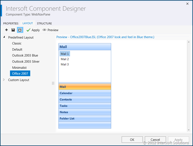
Back to the main subject, we actually reimagine all aspects of the designer – whether it’s the functionality or the design. For examples, compared to the previous version, the new Layout Manager has much cleaner surface, and eventually makes it more intuitive and easier-to-use at a glance. The art of this design language is that it focuses on the content and brings the functionality back to where it supposed to be. Take a look at the screenshot below.
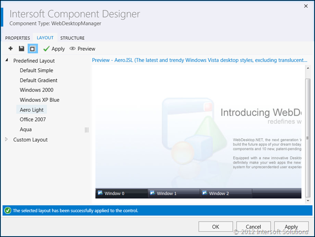
We also pay attention on the user experience details where message boxes should be avoided whenever possible. In this remake, we’re now displaying important messages in the accented status bar.
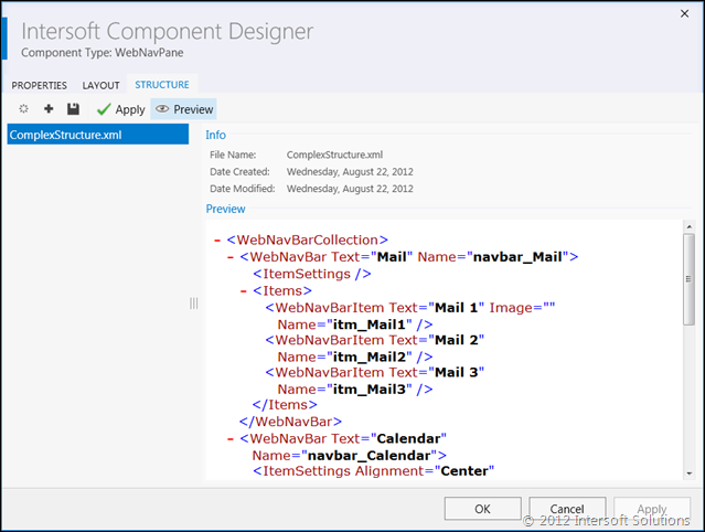
Meanwhile, the Structure Manager is also redesigned with the identical aesthetic and consistent layout, enabling users to understand the user interface with less learning curves.
Simplified and Smarter User Experiences
One thing that we learnt about Metro design language is that it’s not only about the user interface, i.e., the colors, themes or shapes. The true essences behind the philosophy is the simplified user experiences. But, the “simplified” here doesn’t necessary mean removing features, it’s more to making user experiences smarter which allows users to perform a task or function in less time, and more efficiently.
We have a number of interesting stories about making user experiences simpler yet smarter while remaking the component designer for WebGrid.
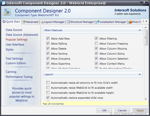
With hundreds of features, it’s quite challenging to find a particular setting or feature in the property window. So we introduced a component designer to address this challenge that looks like the following shot.
I personally think that the idea and purpose of such designer is good, although the existing design may now look cluttered. At a glance, the settings are spreading everywhere. Notice that we have numerous in the left-side navigation vertically, and also some tabs in the top arranged horizontally.
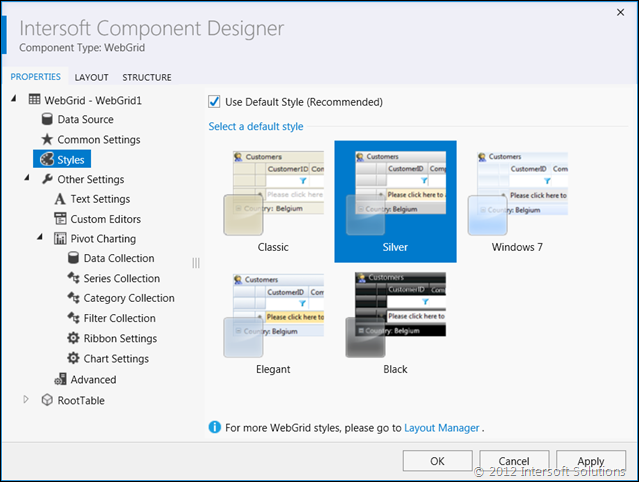
In the WebGrid designer remake, we managed to put everything back to where it should through a deep category rearrange that is based on content and function similarity. Tabs such as Advanced, Localization Manager and Pivot Charting are now removed from the top since they are now part of the Properties. Redundant navigation items are merged into a content that makes more sense. See the shots below to get a closer look.
With the designs shown above, you’re no longer served with massive user interface elements that present the same function. So the Properties tab basically means that “come here for all settings-related tasks”. This allows us to keep the design ideal with balanced functionality. Lessons learned.
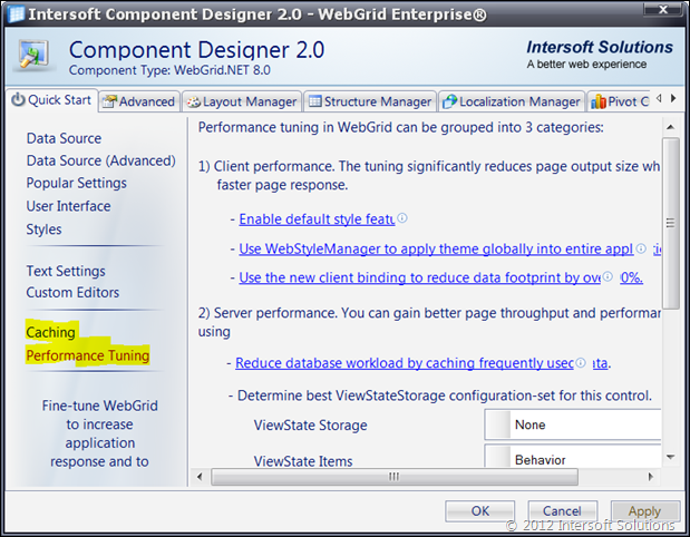
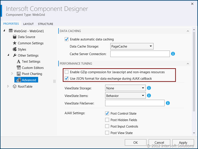
Similarly, we simplify the Caching and Performance Tuning tabs such as shown below…
… into just a single Advanced tab shown below.
We designed smarter user experiences by categorizing them into expandable groups styled with lightly-shaded accent and Metro colors.
Furthermore, the new designer is not simply a remaking effort, we actually added a number of new options that makes performance tuning a breeze. Notice the red highlighted area in the shot above, you can now enable the built-in resources compression with a single click. This feature actually existed since the 2009 release, but not easily discoverable as you need to manually make changes to the web.config file.
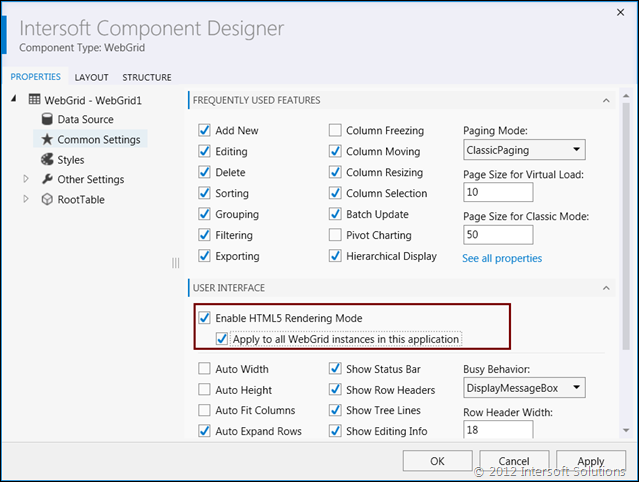
More options are now added to the Common Settings view which includes the new features introduced in the recent releases. For instances, enabling HTML5 rendering mode across the application is simply a tick away.
All 40+ Component Designer Redesigned
In this blog post, I’ve only scratched the surface of our new component designer for Visual Studio 2012. In addition to flagship products such as WebGrid, we also update the designer of entire WebUI Studio family, including WebCombo, WebInput, WebScheduler, WebTextEditor and the rest of components resembled in WebDesktop and WebEssentials.
As far as I can say, we’re making WebUI Studio the first-class citizen of Visual Studio 2012 which enables both products to work best together for the ultimate application development experiences.
We’re expecting to deliver all these new exciting features in the upcoming WebUI Studio service pack release by next week – and hopefully faster. The service pack will also include many new enhancements for Windows 8 and Internet Explorer 10, all-new project templates for Visual Studio 2012, as well as reliability improvements to all Silverlight and WPF components. Stay tuned for the release announcement!
Best,
Jimmy
