New Line-of-Business Samples in ClientUI 7
Introducing the new data controls lineups such as UXPageableComboBox UXMultipleSelectionComboBox and UXTreeList, developers can now build large-scale data entry applications with blazing fast performance. UXGridView also adds with several enhancements and advanced features such as columns collection binding, column header binding and batch items validation. Click here to find out more about the new controls in ClientUI 7.
In this blog post, I will share some of the new samples demonstrating the new products, as well as reviewing the key features.
Below are some of the top new samples that goes to my favorite list.
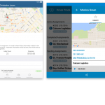
- Cabin Front Reservation
UXPageableComboBox is an enhanced UXDataComboBox control featuring highly efficient server paging mechanism. The control addresses performance issues in large data scenario by retrieving only the required data on demand, and perform incremental data retrieval when the total item count exceeds the specified page size.
In this sample, you are able to perform Multiple columns layout with built-in column type such as Text, Images and Templates. You can perform sorting and description text feature using this control. With description text, you can show additional information related to the selected item in the right edge of the control. It is used to allow you easily understand the meaning of the input value at a glance. Explore the sample.

- Customer Order
In this sample, you will see the tight integration between UXGridView and UXPageableComboBox. You can edit a column in UXGridView and bind it with UXPageableComboBox. With this feature, you can fully use all features available in UXPageableComboBox inside UXGridView, such as Multiple columns layout, Auto-complete behavior, advanced data grouping and sorting capability and many more. Explore the sample.
- Mail Application
UXMultipleSelectionComboBox is an advanced queryable ComboBox control specially designed to support multiple selection. It provides an intuitive data entry mode that allows users to quickly select multiple items through type-and-tab gesture. It supports both Editable and Readonly mode. This control has every features that are available in UXPageableComboBox.In this sample, editable mode is used. It means that you can directly update the selection through the text input element. The control filters the data instantaneously as you type ahead, and the selection will be added with a single Tab key. Also, the built-in smart filter feature automatically prevents any items that you have selected to appear on the list for the next selection. Explore the sample.


- Project Milestone
UXTreeList is a unique data control used to display self-referencing hierarchical data. You can use the HierarchicalCollectionView to transform your self-reference table into a hierarchical self-reference data.
UXTreeList combines all UXGrid features such as data editing, grouping and paging with UXTreeView’s expand/collapse functionality to perfectly present any hierarchical data.In this sample, some features demonstrated are variety of columns type, common data manipulation and data editing that includes drag and drop to re-arrange your data. Explore the sample.

- Chart of Account
UXTreeList supports load on demand scenario using MVVM pattern where only the root items are loaded initially. The children will be loaded on demand as users expanded the item for the first time. This feature is particularly useful to improve the overall performance when the assigned data source is relatively large.
In this sample, IsLoadOnDemand property is set to True in order to activate the load-on-demand feature. In this mode, a busy indicator will be automatically displayed in each expanded item during the loading progress. Explore the sample.

- Empty Row Visibility
UXGridView lets you easily create beautiful data presentation with look and feel similar to popular desktop-based apps such as iTunes, Quick Books, or other business apps alike. With the new innovative rendering feature, UXGridView automatically fills the entire view port with alternating rows instead of leaving a large white empty space.
This sample demonstrates the empty rows visibility feature in UXGridView. When this featuere is enabled the UXGridView will render all the empty rows within the view port. You can also insert a new row from bottom when NewRowPosition is set to Bottom and CanUserAddRows is set to True. Explore the sample.
- Bottom New Row Position
This new feature brings flexibility to the way users interact with the grid. Users can now rapidly add new items by clicking the bottom part of the grid, just like they would do in Excel. Activate this feature in your apps with a simple property set.In this sample, you can see there are new row position indicator on the last row in UXGridView. To go to the new row you can click the empty rows or use keyboard down on the last item. Explore the sample.

- Sequence Column
Introducing the new UXGridViewSequenceColumn, you can now effortlessly display a column that automatically display sequential number to your data grid.
In this sample, we have UXGridViewSequenceColumn which is used to show the row index of the current display. Note that the sequence column can not be sorted and will always show the row index regardless of the sorting or filtering state. Explore the sample.


For more information about ClientUI, you can explore our Live Samples or read through our Online Documentation.
Feel free to download your copy here. And while waiting for the download, be sure to check out the complete what’s new list here. Existing customers with valid subscription can obtain the latest WebUI Studio from Developer Network, under My Components shortcut.
If you have any questions regarding sales or licensing, you can directly email me at martin@intersoftpt.com. Any comments or feedbacks are welcome.
Thank you and have a nice day.
Regards,
Martin

Nice but you really need to introduce some themes. The controls look so Win XP. How about doing a Metro Theme for your controls
Thank you for your feedback. Yes, we’re currently preparing the metro theme for our ClientUI controls. Soon it will be included in our controls for sure.