ClientUI Preview Part 3: Pageable and Multi-column ComboBox, Enhanced GridView, Items Grouping and more
In the last two posts, I’ve covered many of the new framework features that provide architectural guidelines for building highly extensible and maintainable business applications on Silverlight and WPF. You can check out the first post here which explains dependency injection and IoC containers, and the second post here which unveils the new ClientUI region manager library to implement view extensibility.
Recently, we’ve been working with a number of large clients in migrating their apps to the Silverlight platform. As I’ve mentioned in my previous posts, we can see the increasing demand of Silverlight in enterprises as it provides a true rapid solution for building visually engaging and highly scalable business apps. Check out our recently published Silverlight case study here.
That said, we’re focusing on creating tools that enable companies to succeed in achieving their business objectives with rock-solid and mature solutions today – one that enables them to complete their IT projects on time and on budget. And we’re incredibly pleased to be the part of the succession through the increasing adoption of our toolset in enterprises.
In this post, I’ll share some of the upcoming new exciting tools that were thoughtfully designed to address many challenges that you often find while building business apps.
The very best of ASP.NET WebCombo, now on Silverlight and WPF
Flashing back to a decade ago, Intersoft was founded with only a handful of products, one of them is the WebCombo control for ASP.NET. At that time, web pages are slow and unresponsive due to large view state and postback. There were no AJAX yet – so we invented the very first AJAX-enabled ComboBox with highly efficient data retrieval and blazing fast response which makes it the most popular ComboBox in the industry – till today. Of course, it has evolved over the years and you can try it online here.
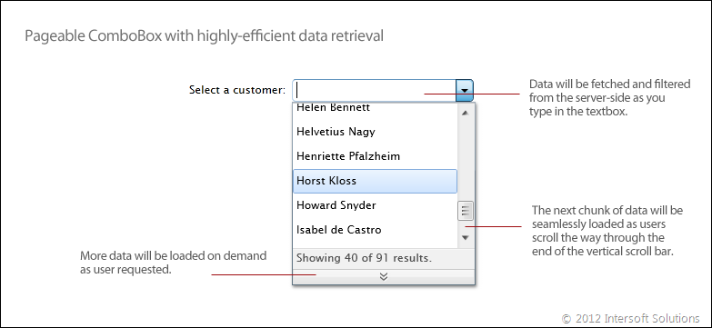
Today, I’m very excited to announce that the highly-efficient and advanced WebCombo-like control is now available on the developers’ most loved platform: Silverlight. Meet the brand-new UXPageableComboBox.
The pageable ComboBox includes all the features available in the classic ASP.NET WebCombo, while sports a much appealing user interface, thanks to the rich graphics in Silverlight. Let’s start with the first sneak preview below.
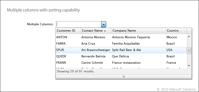
Say welcome back to multiple columns, a favorite feature many of us have missed for a while… And we’ve got a bonus feature for you as well, sortable columns. Note that the multiple columns is a built-in feature now, and is not a workaround that requires heavy re-templating.
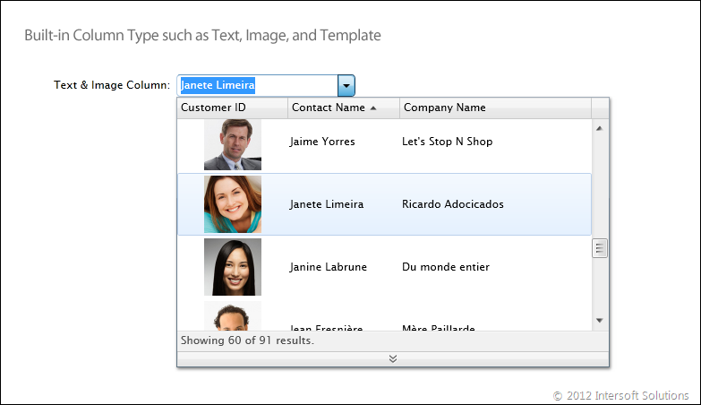
And not to forget the image and templated columns as well.
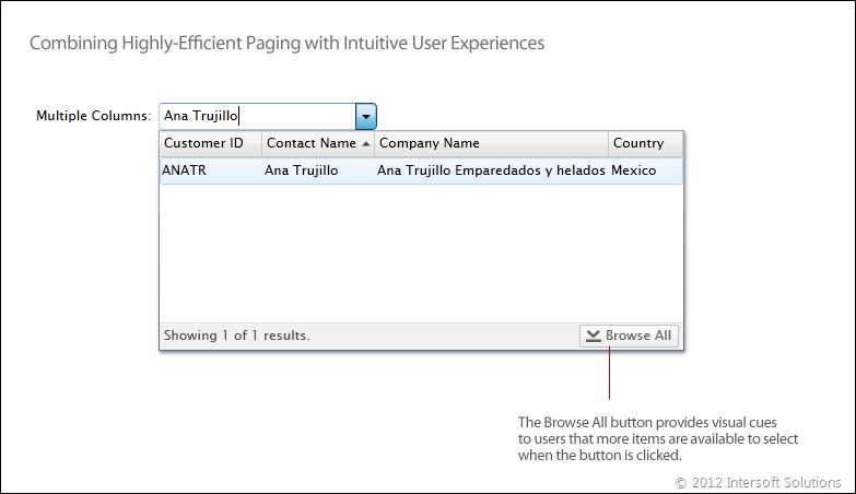
The pageable ComboBox includes a more sophisticated user experiences than the ASP.NET version of WebCombo in the way users make selection and navigate the items. For example, by default only the matched item is displayed when the selected item is set initially. A ‘Browse All’ button will appear providing a visual hint to users indicating they can choose other items by clicking that button, or by simply clearing the text.
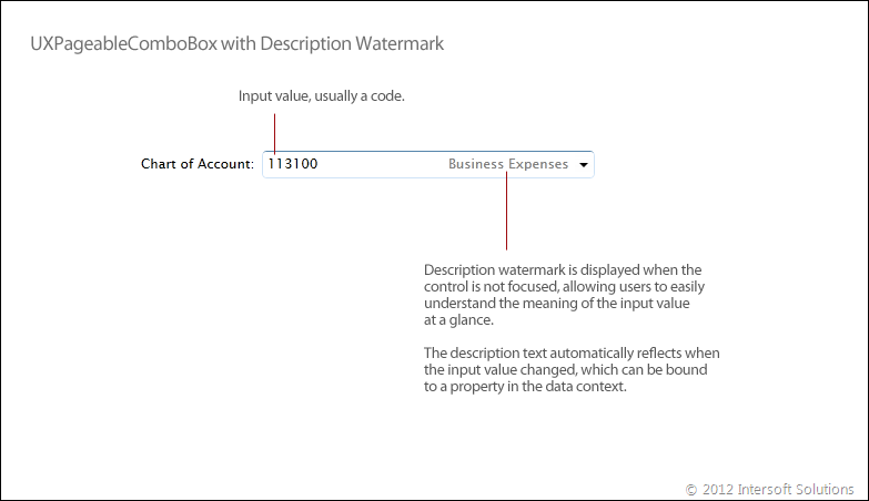
Another nice feature that we manage to put in this release is the watermark description in the text box. This is one of the most requested features in business apps particularly for the code-value pair input scenario. Think of chart-of-account code input where accountant can input the account code, but still wish to be able to see the account name at the same time. This is now possible in the new Pageable ComboBox, and the best of all – it’s a built-in feature so you don’t have to make any customizations.
New Powerful LoB-centric Features
The upcoming new version is strongly focused on new features that were driven by real-world business scenarios and usage. One of the data components that receives major new features is UXGridView. It introduces advanced features such as columns collection binding, column header binding, and batch items validation.
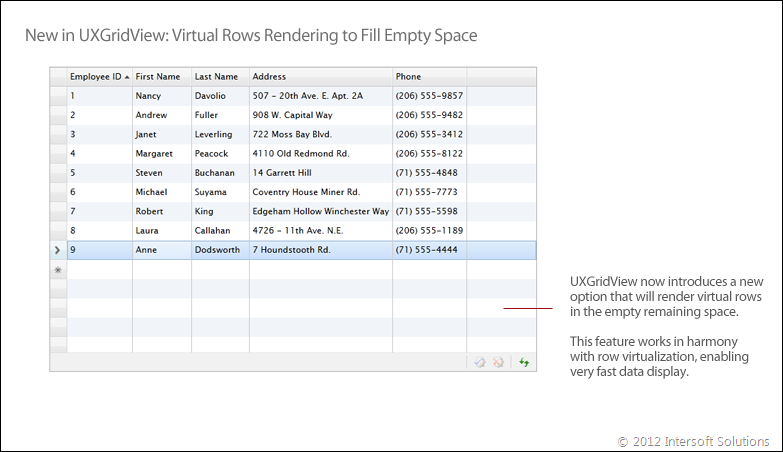
In addition, we’ve also added a new rendering mode in UXGridView that allows the empty space to be filled with virtual rows. This new mode is particularly ideal when the Grid is used to display line details such as transactions. If you’ve used apps such as Quick Book, or any Mac apps, you should be already familiar with this feature.
As seen in the above illustration, the grid fills the remaining empty space with virtual rows instead of a blank white space. The virtual rows will grow or shrink automatically as the viewport is resized, and better yet, it works perfectly with row virtualization so you don’t have to sacrifice the rendering performance.
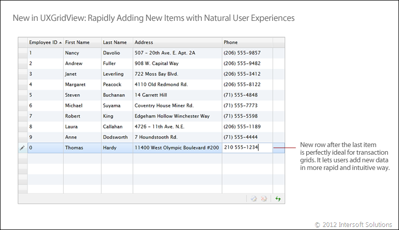
And with the empty space virtual rows, we took the grid further by introducing natural inline editing experiences when adding a new item. This feature activates a new row after the last item of the grid for rapid data addition. Users can simply click on the any remaining space, input the data and cycle through the last cell, and then tab out to the next new row and so forth. Activate this feature in your apps with a simple property set, guaranteed your users will thank you a million!
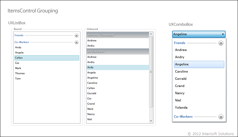
Furthermore, the items control architecture has been revamped to introduce new capability such as grouping and style-able group container. This means that most of the common controls that derives from items controls such as combo box and list box now supports grouping out-of-the-box!
Imagine the possibilities that you can do with the grouping capability: displaying contact list grouped by type in a list box, or displaying expandable/collapsible groups within the resultbox of a combo box. Thankfully, you can now achieve all those possibilities without any major efforts.
Download the Developer Preview Bits
I hope you enjoy reading my blog post through the detailed feature coverage. And to complete your pleasure, we’ve made the ClientUI Developer Preview available along with the technical samples. Download the developer preview bits today. Explore the technical samples that demonstrate the new controls and features explained above, and test drive it in your apps within minutes.
And by the way, I’ve just received fresh builds from our development labs as I wrapped up this post. I can tell that there are many more new exciting stuff coming down the pipeline, so watch out this spot closely.
Best,
Jimmy Petrus
Chief Software Architect



Comments