ClientUI 7 Preview Part 4: Multiple Selection ComboBox with Auto Filter and Checkbox Input Support
Earlier this month, I’ve blogged about some of the exciting new controls that we will release in the next few weeks, which include a brand-new combobox with server paging multi-column support, enhanced GridView and new ItemsControl grouping capability. Many of these new controls are aimed for business application development that target Silverlight and WPF platforms – and soon WinRT. You can check out the full coverage here.
These days, web applications are getting more attractive with much better user experiences than in couple years ago. Numerous innovative UI controls are popping up as new design patterns are discovered. One of the most demanded controls that requested by our enterprise customers is the Facebook or Dropbox-like multi-selection combobox.
With proper design, multi-selection combobox can help improve user experiences in overall. Instead of using listbox that occupy larger screen real estate, multi-selection combobox allows a more intuitive and efficient way to capture multiple input through type-ahead and automatic list filtering. Considering its compact size and input efficiency, multi-selection combobox is an ideal input pattern for numerous LoB scenarios like capturing multiple roles for a user group, multiple contacts for mailing, multiple items for activation, and so forth.
The upcoming release of ClientUI will include the new UXMultipleSelectionComboBox – joining the advanced ClientUI data-aware component lineups. It doesn’t only come with industrial standards design, but also equipped with powerful architecture such as MVVM binding to the multiple selected items. I’ll unveil the new control entirely in this blog post. Read on.
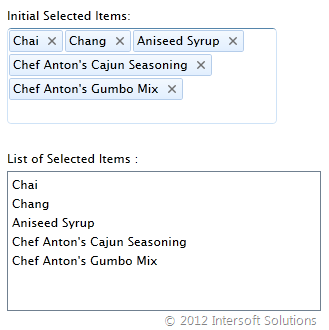
Editable Multiple Selection
As with every combobox, the multi-selection combobox supports two fundamental input mode: Editable and Non-editable. Editing support with multi-selection is one of the greatest challenges in both control architecture and user experiences design.
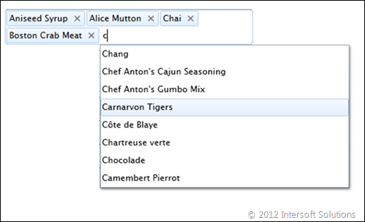
First, the control needs to display the selected items and the textbox seamlessly together, while at the same time automatically enlarge the control as new items are selected. And of course, users can delete any of the selected items and the control should adapt its size back to the content.
Second, the multi-selection combobox with editing support does make sense only when the results are filtered as you type ahead. Thanks to the comprehensive ClientUI’s data framework, the server paging is supported through QueryDescriptor.
Many of UX aspects have also been thoughtfully put on the control, mostly the editing experiences such as the Backspace or Delete key should perform different action based on the current selection (whether it’s on the textbox, on the selected item, or in an empty area).
Another nice feature is the smart results filtering feature where the selected items are automatically removed from the result list. This makes sense in most LoB scenarios as users don’t need to see the items already in the selection. See the image below.
Non-editable Multiple Selection
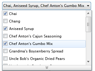
When the IsEditable property of the multi-selection control is set to false, it will automatically show checkboxes in the result list which appears to be the most convenience way for users to capture multiple input in such non-editing mode.
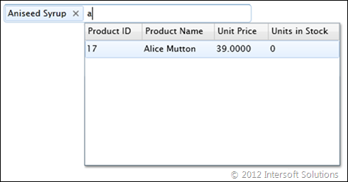
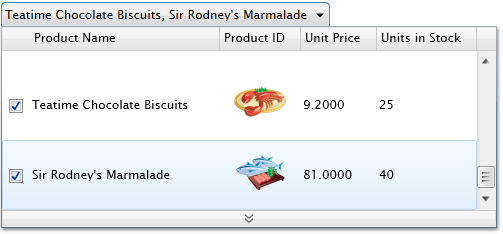
And better yet, you can combine all the new features available in the data combobox lineups along with the multiple selection feature. For instances, you can enable multiple columns, paging and sorting, while continue to work perfectly with the checkbox input.
Full MVVM Support
As you read up at this point, it looks like the multi-selection control has everything you need, from the appearance to the functionality. But wait, how are you going to use it in databound scenarios since the list is paged and retrieved on demand?
Thankfully, UXMultipleSelectionComboBox is built from the ground up to fully support implementation with MVVM pattern. This means that every items that added to the selection via user interface will synchronize to the SelectedItems property. And in the same way, inserting or removing the items from the ViewModel will also automatically update the user interface.
With MVVM support, you can easily bind the SelectedItems property of the control to a collection property in the ViewModel using two-way binding mode. This also allows you to set the initial selected items such as in form editing scenario. See the example code below.
|
1 2 3 4 5 6 7 8 9 10 11 12 |
<Intersoft:UXMultipleSelectionComboBox IsEditable="True" DisplayMemberPath="ProductName" SearchResult="{Binding Items}" FilterDescriptors="{Binding QueryDescriptor.FilterDescriptors, Mode=TwoWay}" SortDescriptors="{Binding QueryDescriptor.SortDescriptors, Mode=TwoWay}" PageDescriptor="{Binding QueryDescriptor.PageDescriptor}" CanUserPage="True" CanUserSort="True" AutoFilterSelectedItems="True" <strong> SelectedItems="{Binding SelectedItems, Mode=TwoWay}" </strong> SelectedValuePath="ProductID"> ... </Intersoft:UXMultipleSelectionComboBox.Columns></Intersoft:UXMultipleSelectionComboBox> |
And the results will look like the following.
Download ClientUI Developer Preview
In this post, I’ve just scratched the surface of the new multi-selection combobox that we are going to release soon – hopefully in the next couple weeks. For now, I highly recommend you to download the latest Developer Preview to try out many of the UX aspects that I couldn’t express with words. The Developer Preview has been updated to include this new bits along with the new samples. Click here to download the developer preview and experience it for yourself. Enjoy and happy combo-boxing!
Best,
Jimmy Petrus



Great continuing series on upcoming new features. Many software companies bring out new versions and you ask yourself why it was necessary. Intersoft makes the customer eager to get new versions because of all the great new features and controls they add each releases. Like a customer at a movie preview, I eagerly await each new release as the new features added seem to make my job easier as a developer to create top notch applications for my clients.
I wonder if Lightswitch is still somewhere in your roadmap.
My company is doing a serious investment in this platform and we think your suite (or at least part of it) could help us a lot.
Thanks
@Bill: I’m glad you liked the new controls that we’re going to release in 2012 R1. We’re committed to bring real tools that developers need to quickly solve real challenges in real-world projects. There are more exciting LoB controls coming up. Stay tuned.
@George: Unfortunately, we haven’t received enough demands on Lightswitch so far. You can still use our Silverlight controls in LightSwitch projects through custom control type. Check out the walkthrough video at http://www.intersoftpt.com/Support/ClientUI/Tutorial/Video/Programmatically-Using-ClientUI-Controls-in-Microsoft-Visual-Studio-LightSwitch-Application/