Coming in ClientUI 5: Versatile Resizable Control for Silverlight & WPF
In addition to many new data-centric controls that we will deliver in the upcoming 2011 volume release, ClientUI 5 will also pack-in a handful of new user interface controls. One of the most important additions to the UI lineups is a versatile resizable layout control, powerful enough to cover a range of common layout scenarios.
A resizable layout control is an essential user interface in today’s modern applications, allowing users to resize a certain section of the interface, or even collapse it entirely to increase screen real estate. Whether you realized it or not, most of the applications you used everyday incorporate a resizable layout, from Windows Explorer, Outlook, to Visual Studio and iTunes. The importance of such fundamental interface motivates us to add a resizable layout control in the next major release of ClientUI, which is also used in a number of upcoming high-end controls such as scheduler, document viewer and more.
Although seems simple, a resizable layout control can be hard-to-use if not thoughtfully architected. In this blog post, I will detail some of the key features of our upcoming UXResizablePane control and its architectural design.
Plug-n-play Resizable Control
There aren’t so many resizable layout control designed for the Silverlight/WPF platform. Some that I found require a layout manager for the resizing to work. This means that you need to revamp your entire layout even if you want to apply the resizing behavior only to one section of the layout. I found this architecture design to be less-than-ideal as it requires extra learning curves and a major overhaul to the existing layout.
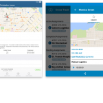
Our resizable control is designed to be completely manager-less, which is probably one of its key strengths. Say that you have an existing page that uses a DockPanel layout similar to the following screenshot, and you would like to make the navigation pane resizable. How easy could that be done, you might ask.

In the above scenario, making the left-side navigation resizable is as easy as wrapping it into a UXResizablePane control, no need for a complete layout revamp. See the code example and the results below.
|
1 2 3 4 5 6 7 8 9 10 11 12 13 14 15 16 17 18 19 20 21 22 23 24 25 26 27 28 29 30 31 32 33 34 35 |
<strong>Existing Layout:</strong> <Intersoft:DockPanel> <Border Background="{StaticResource NavBackground}" BorderBrush="Gray" BorderThickness="1"> <Grid> <Intersoft:UXItemsControl x:Name="NavigationItemsContainer" ItemContainerStyle="{StaticResource NavigationButtonStyle}"> ... </Intersoft:UXItemsControl> </Grid> </Border> ... </Intersoft:DockPanel> <strong>Resizable Layout:</strong> <Intersoft:DockPanel> <<strong>Intersoft:UXResizablePane</strong> Background="{StaticResource NavBackground}" BorderBrush="Gray" BorderThickness="1"> <Grid> <Intersoft:UXItemsControl x:Name="NavigationItemsContainer" ItemContainerStyle="{StaticResource NavigationButtonStyle}"> ... </Intersoft:UXItemsControl> </Grid> </<strong>Intersoft:UXResizablePane</strong>> ... </Intersoft:DockPanel> |

As seen in the above illustration, the left-side navigation pane is now resizable through the provided thumb in the right-edge of the control. As in common desktop applications, users simply drag the resize thumb (indicated by the resize cursor) to start resizing.
Since the UXResizablePane manages the layout by its own, it doesn’t require a specific external controller to know its existence. One of the benefits of such design is that the UXResizablePane can work flawlessly with any built-in Silverlight/WPF panels, whether it’s a StackPanel, WrapPanel, or a Grid.
Another benefit of “manager-less” layout architecture is that developers can use the control without extra learning curves. You can use the same layout properties that you’ve accustomed to, such as applying MinWidth and MaxWidth to the control. When MaxWidth is set, users cannot resize the control larger than the specified MaxWidth value.
Expandable/Collapsible Layout
In addition to the resizing feature, UXResizablePane also sports a built-in expand/collapse user interface located in the header section of the control. Derived from the headered content model, you can completely customize the header element of the control through style or template.

When collapsed, only the Expand button element of the control is visible, which can be customized through the MinWidth property. The appearance of both the header and button element are fully customizable.

Flexible 4-Edge Resize Docking
Another great feature of the UXResizablePane is its flexibility to support resize docking in either vertical or horizontal direction. You can actually place the resize thumb in any of the four-edge of the layout: Left, Top, Bottom or Right. For example, if you wish to make the details content vertically resizable, then you set the ResizeDock property to Top.
In the following illustration, the UXResizablePane is applied to the details content of the Products page. Notice that the expand and collapse button will automatically adjust itself to the appropriate direction based on the ResizeDock property.

Bi-directional Resizing Mode
When we say versatile, we really meant it. Not only it can be used with any inline panels like DockPanel, StackPanel, or Grid; UXResizablePane can also be used to resize non-inline panels such as floating popup, or the dropdown list of a combo box.
The following code example shows how to customize the dropdown list of UXComboBox, which turns a static popup into a resizable popup. Thanks to the loosely-coupled UI design in all ClientUI controls, customization has never been this easy!
|
1 2 3 4 5 6 7 8 9 10 11 12 13 |
<Intersoft:UXPopup x:Name="PopupElement" BoundaryOffset="{TemplateBinding BoundaryOffset}" ...> <<strong>Intersoft:UXResizablePane</strong> AllowExpandCollapse="False" HeaderVisibility="Collapsed" ResizeThumbVisibility="Collapsed" CornerThumbVisibility="Visible" CornerThumbResizeMode="VerticalAndHorizontal"> <Intersoft:UXScrollViewer x:Name="ScrollElement" Padding="2"> <ItemsPresenter x:Name="ItemsPresenter"/> </Intersoft:UXScrollViewer> </<strong>Intersoft:UXResizablePane</strong>> </Intersoft:UXPopup> |
The results look like the following.

With the CornerThumbResizeMode property set to VerticalAndHorizontal, users can drag the corner thumb to resize the popup in both vertical and horizontal direction.
There are still a lot possibilities that you can do with UXResizablePane, hopefully this blog post gives you some cool ideas and insight. The next blog posts would be focused on new exciting tools that we’ll ship in 2011 R1. Stay tuned!
Best,
Jimmy