New in ClientUI 4: Intuitive Slider Bar Control
ClientUI 4 is the latest version of our flagship development suite for the Silverlight and WPF platform. To learn more about ClientUI, you can read this post or visit ClientUI product information here. To see what’s new in ClientUI 4, see this article.
Introducing UXSliderBar
UXSliderBar is one of the new controls included in ClientUI 4. UXSliderBar is mainly used to select a value from a range of values by moving the thumb along the slider bar track area.
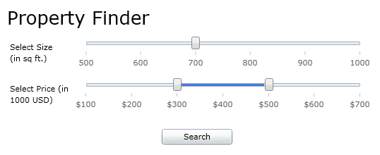
For example: in the following property finder scenario, users can select a property size starts from 500 to 1000 square feet. Surely, you can use textbox to input the property size that you want. However, there are at least two advantages for using UXSliderBar. First, users will automatically know the range of property size available and easily select a value by moving the thumb. Second, you, as developer, can prevent users from inputting the wrong value in the textbox and thus, eliminate the needs to implement input type validation, should textbox is used instead.
|
1 2 3 4 5 6 7 8 9 10 11 12 13 14 15 16 17 18 19 20 21 22 23 24 25 26 27 28 29 30 31 32 33 34 35 36 |
<StackPanel> <TextBlock FontSize="26">Property Finder</TextBlock> <Intersoft:FieldLabel> <Intersoft:FieldLabel.Header> <TextBlock Width="100" TextWrapping="Wrap" Text="Select Size (in sq ft.)"></TextBlock> </Intersoft:FieldLabel.Header> <Intersoft:UXSliderBar Width="400" TickPlacement="BottomRight" Minimum="500" Maximum="1000" LargeChange="100" SmallChange="10" IsMoveToPointEnabled="True" Value="{Binding PropertyFinder.PropertySize, Mode=TwoWay, ValidatesOnDataErrors=True, ValidatesOnExceptions=True}"/> </Intersoft:FieldLabel> <Intersoft:FieldLabel> <Intersoft:FieldLabel.Header> <TextBlock Width="100" TextWrapping="Wrap" Text="Select Price (in 1000 USD)"></TextBlock> </Intersoft:FieldLabel.Header> <Intersoft:UXRangeSliderBar Width="400" TickPlacement="BottomRight" TickFormat="C0" Minimum="100" Maximum="700" LargeChange="100" SmallChange="10" SelectionStart="{Binding PropertyFinder.StartPrice, Mode=TwoWay, ValidatesOnDataErrors=True, ValidatesOnExceptions=True}" SelectionEnd="{Binding PropertyFinder.EndPrice, Mode=TwoWay, ValidatesOnDataErrors=True, ValidatesOnExceptions=True}"/> </Intersoft:FieldLabel> <Button Content="Search" Width="100" Margin="0, 20, 0, 0"></Button> </StackPanel> |
You might note that UXRangeSliderBar is used in this scenario, but we’ll discuss about that in the next post 
I’ve mentioned that you can easily select a value in UXSliderBar by moving the thumb along the slider bar track area. Besides that, you can use a variation of keyboard keys registered to UXSliderBar commands or click the slider bar track area and handle buttons. These user interactions will use the value of LargeChange and SmallChange properties specified in UXSliderBar.
- Use keyboard keys.
Some key gestures are already registered to UXSliderBar commands. When you press Up, Down, Left, or Right keys, the value of UXSliderBar will be added or subtracted with the value of SmallChange property. For example: in the above scenario, the value of UXSliderBar is 700.When you press the Right key, the value of UXSliderBar will be added with the value of SmallChange property, which is 10. So, the value of UXSliderBar now is 710.When you press PageUp or PageDown keys, the value of UXSliderBar will be added or subtracted with the value of LargeChange property. So, if the value of UXSliderBar is 710 and you press the PageDown key, the value of UXSliderBar will be subtracted with the value of LargeChange property, 100. So, the value of UXSliderBar now is 610.
When you press Home or End key, the value of UXSliderBar will be set to the Minimum or Maximum property respectively. If you press End key, the value of UXSliderBar will be set to 1000 and the thumb will move to the end of the slider bar.
- Click the slider bar track area.
You can also click the track area at the left or right side of the thumb. When you click the blue area, known as DecreaseButton, the value of UXSliderBar will be subtracted with the value of LargeChange property. When you click the purple area, known as IncreaseButton, the value of UXSliderBar will be added with the value of LargeChange property. - Click the handle buttons.
By default the handle buttons are not displayed in UXSliderBar. To display the handle buttons, you can set HandlesVisibility to Visible. Two arrow-shaped buttons will be displayed at the left and right side of UXSliderBar.When you click the handle buttons, the value of UXSliderBar will be added or subtracted with the value of SmallChange property.
Enabling Snap to Tick Behavior
When moving thumb to select a value, it is possible that you select a fractional value, such as: 700.346, which is rather uncommon for a property size. I think you would want a rounded value for that, right? In this case, you can enable IsSnapToTickEnabled property.
|
1 2 3 4 5 |
<Intersoft:UXSliderBar Width="400" TickPlacement="BottomRight" Minimum="500" Maximum="1000" LargeChange="100" SmallChange="10" IsSnapToTickEnabled="True" Value="{Binding PropertyFinder.PropertySize, Mode=TwoWay, ValidatesOnDataErrors=True, ValidatesOnExceptions=True}"/> |
When this property is enabled, the thumb will move to the closest tickbar item. So, as you move the thumb to the right, it will snap to 600, 700, 800, and so on.
When snap to tick behavior is enabled, you can still enable precision selection by pressing Ctrl key. Try to move the thumb while pressing the Ctrl key. The thumb will not snap to the closest tickbar item, but moves along with the cursor position, as if this behavior is not enabled.
Enabling Move to Point Behavior
Now, what if I want to select 900 as the property size? This might be what you think; either moves the thumb, press Up key several times, or click the track area continuously. Well, let me save your time a bit by introducing IsMoveToPointEnabled property.
|
1 2 3 4 5 |
<Intersoft:UXSliderBar Width="400" TickPlacement="BottomRight" Minimum="500" Maximum="1000" LargeChange="100" SmallChange="10" IsMoveToPointEnabled="True" Value="{Binding PropertyFinder.PropertySize, Mode=TwoWay, ValidatesOnDataErrors=True, ValidatesOnExceptions=True}"/> |
When this property is enabled, you can click on any position in the slider bar track area and the thumb will move immediately to the location of the click. You can click on 900 tickbar item and the thumb will move immediately there.
Well, I understand clicking right on the tickbar item will not be that easy and I probably would need a couple of try for that. That is the reason why you should enable both snap to tick and move to point behavior. When these properties are enabled, you can click near the tickbar item and the thumb will snap to it.
Enabling Auto Tooltip
While moving the thumb along the slider bar track area, you might find it difficult to determine what value you are hovering. You can display a tooltip near the thumb that contains the value of the hovered position using AutoTooltipVisibility property. You can specify AutoTooltipPosition, AutoTooltipFormat, AutoTooltipHorizontalDirection, and AutoTooltipVerticalDirection for additional configuration.
Let’s say you want to select a discount value using UXSliderBar. You can display the percentage value you’re selecting in the tooltip.
|
1 2 3 4 |
<Intersoft:UXSliderBar TickPlacement="BottomRight" TickFormat="P0" Maximum="1" LargeChange="0.2" AutoTooltipVisibility="Visible" AutoTooltipFormat="P0"/> |
Displaying Value Range Track
In the discount slider bar, it can be useful to display the active selection track. You can see how much discount applied to a product simply by seeing the value range track. In UXSliderBar, the value range track is indicated by a blue-colored track that starts from the value of Minimum property to the selected value of UXSliderBar. You can display the value range track using ValueRangeVisibility property.
|
1 2 3 4 |
<Intersoft:UXSliderBar TickPlacement="BottomRight" TickFormat="P0" Maximum="1" LargeChange="0.2" ValueRangeVisibility="Visible" Value="0.5"/> |
Conclusion
In this post, you have learned the various ways to change the value of UXSliderBar, the behaviors related to it, the auto tooltip, and the value range track.
To try it out yourself, feel free to browse through the samples here. To see all available features in UXSliderBar, see UXSliderBar Overview. If you have questions or feedback about UXSliderBar, feel free to post them to our community forum.
Cheers,
Erika


Comments