ClientUI 4 for Silverlight and WPF is here!
It was just around 1.5 months since we published our 2010 R2 roadmap, and today we’re already set for the new release. We’re pleased, for the first time, to introduce ClientUI 4, and at the same time announcing its official release as part of WebUI Studio 2010 R2 volume release.
Here are some useful links for you to quickly getting started with the new release.
- Download ClientUI 4 RTM
- Watch the Video Tour (HD available)
- Read 2010 R2 Press Release
- Discover What’s New in 2010 R2
- Learn More About ClientUI
What’s New
ClientUI 4 adds 60 new controls for Silverlight and WPF, summing up to a total of 240 controls for the entire suite in just a few months time frame. That is incredible, isn’t it?
The new release is strongly focused in three areas: rich content and UI controls, advanced input controls, and fundamental navigation controls.

Let’s start from the content and UI controls. We’re throwing-in a modern, AJAX-style spinning busy indicator (surprised that no one doing it yet!). There are also a number of new button lineup such as flat button, repeat button as well as a highly reusable thumb control (and yes, it supports routed events for both Silverlight and WPF). Then, we heard you said that ClientUI has a sleek tool bar, menu bar, command bar and other type of bars, yet there’s no status bar? So here it is, as you asked.
In the navigation controls, we added an impressive, pixel-perfect tab control. It supports most of the tabbing features you expected. It also supports tabstrip placement to any four-side of dock, but with 1/3 smaller XAML size compared to Silverlight Toolkit or other solutions! Best of all, it also supports built-in transition and loading source from external XAML. This allows you to create any kind of amazing UI designs, what about Metro UI style tabbing interface, one that smoothly slide to the left or right based on the navigation direction? Yep, the new tab control allows you to achieve this in just flick of fingers. And what’s really cool in this release is about to reveal next.
Nearly 80% of the new controls in this release are all about data input. We have all sort of editors essential to build line-of-business applications, from masked input, currency editor, date time editor, to numeric up-down and rating control. There are also more advanced input controls such as a multi-range slider bar, versatile calendar supporting multiple months view (with modern design and stunning animations, of course!), and a memory-efficient file upload control that conforms to RFC 1867 form-based upload specification.
We also deliver a number of innovative input controls, expertly designed by our UX architects – an analog clock control with editing mode and a date time picker that offers more intuitive ways to input date and time values.
In addition, we also made significant enhancements to the existing lineup, including dock panel, content transition, navigation framework, and much more.
Learn more about these new controls and enhancements here.
New Showcases
As in our good tradition, every release comes with fresh and exciting business-inspiring samples. Here are some of my favorite new samples to share with you.
My CloudBox
Do you like DropBox? If so, you might also like our new CloudBox sample! Featuring the new UXFileUpload control, this sample shows how to build a sleek file upload interface supporting multiple files upload, batch or individual cancelation, file type filtering, drag and drop from Windows Explorer (or Finder in Mac), and more.
Few things that really outstanding in UXFileUpload is its RFC 1867 compliance architecture and smart file chunking capability. Its “multiple upload worker processes” feature is second to none, seriously. If you looked at the browser process (and your IIS web server if you’ve grabbed the bits and installed it in your machine), notice that the memory consumed by the client and the server are at a constant minimum level. This allows you to upload very large files (up to GBs or TBs of data) without crashing the browser or the web server.
And the best of all, it’s the industry first upload control that supports “true” MVVM design pattern. It’s extremely powerful, and if we had more time, we could have created a real CloudBox. Click here to try the online demo.

Photo Uploader
UXFileUpload is a powerful file upload control for Silverlight and WPF that combines state-of-the-art user interface with great architecture. From the high-end user interface such as shown in the CloudBox sample above, you can transform the upload interface into a compact yet elegant single photo uploader such as demonstrated in the Employee Form sample – thanks to the commanding and the new MultiBinding in ClientUI Framework.
One of the key features demonstrated in the sample is the MVVM binding capability. Consider that you have an Employee entity with a Photo property and an EmployeeViewModel. How can you easily bind the uploaded photo to the Photo property using MVVM pattern? And without writing any plumbing code? Find the answer in this example, and try it online here.

My Agenda
My Agenda sample features the new UXCalendar, demonstrating its multiple selection and data binding capability using the best practice of MVVM design pattern.
You can play around with many of the user experiences features built into the control, such as using keyboard to navigate, press Ctrl+Up key to switch up to year and decade selection, Ctrl+Left to go to the previous view and so on. Interestingly, we don’t hardcode all these key gestures, you can redefine them with your own gestures through KeyBinding, thanks to the solid UI engineering that based on commanding pattern.
You can try the online demo here.

World Clock
This sample features the new analog clock control, one of my favorite controls in this new release. Not only because it looks sleek and stunning, but more importantly due to its great editing capabilities with new kind of user experiences.

This nice clock control is not only a widget such as the one you see in Windows 7. We designed it with full editing capabilities, introducing more intuitive ways to input time values.
We invented this so called visual analog time editing, our patent-pending editing experiences, allowing users to visually set time in just a flick of fingers. You can use virtually any input devices to interact with the clock through its “hands” such as the hour, minutes and seconds. Use the keyboard Tab key to navigate between hands, and use navigational keys to increase or decrease. Or use mouse to drag the hands to the desired angle, or even easier, wheel your mouse to fine tuning them.
See the illustration below.

Need even faster way to set time? Press Ctrl then click anywhere in the clock to set the hour, then add the Shift key and click the desired value to set the minute. It’s that simple!
Too good to be true? Try it yourself here. Or read more about the impressive clock user experiences here.
New Expenses
The Expenses sample demonstrates a number of our new editors, such as the currency editor and date editor.
Typing numbers into the currency editor feels smooth and crispy, thanks to the smart currency handling built into the control. Digits are automatically grouped, currency symbol appears where they supposed to be according to specified culture, typing period (dot) key sets the cursor right to the decimal position.
Entering date values couldn’t be any easier, seriously. Just type in the desired date, the date editor could never do it wrong. It automatically advances the caret as you fill-in each section.
Try the online demo here.

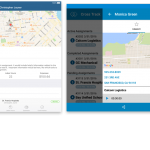
Meeting Room Booking
This sample leverages the new date time picker in ClientUI 4. It combines the best of date time editor, an up-down control, calendar and our ISO-compliance popup.
This control is definitely in my favorite control list. I’m pretty much excited with the new kind of date and time editing experiences that it brings, by integrating the visually-stunning calendar and clock into the editor.
Many developers are struggling with the best way to provide a solid time input. Most of the traditional date time pickers show a list of time in certain intervals, such as, 15 minutes interval or 30 minutes interval. The interval approaches would not work in real-world business applications since it can’t show precise time outside the intervals, such as 11:42 AM.
ClientUI’s new date time picker provides a new, more intuitive approach to input time value, through the use of UXClock control. In editing mode, UXClock shows an elegant, realistically looking AM/PM designator that you can slide with the device of your choice, keyboard or mouse. And as I described above, you can interact with the “hands” of the clock through a number of supported gestures.

Try the online demo here.
We also have another example that use similar scenario, but using a multi-range slider bar instead of date time picker to capture the time input. The choice of the input controls depends on the nature of your business requirements. If you require an exact input with intervals, and the options are within a certain range (i.e, less than ten), then slider would be a good choice.
See below for the illustration, and click here for the online demo.

Employee Form with Tabbed UI
This user-friendly employee form sample leverages the new, pixel-perfect tabbing control. Several new editor controls are demonstrated, as well as the new status bar.
You will love the built-in transitions and ability to load content from external XAML. You can also customize the tab strip placement to the left, right or bottom. And better yet, the control offers incredible features yet so lightweight in the size, so that it won’t size up your package like the other tab controls.
Always remember that all these new controls are built with MVVM design pattern, so the samples you’re seeing here aren’t just screen mockups.
Try the online demo here.

Movie Gallery
Rating control is one of the must-have in today’s applications, whether you’re building a personal photo gallery, or a social community site. This sample features the new rating control available in ClientUI 4.
Its precision selection mode is one of its unique features, allowing users to input a rating in pixel-level details. Try the online demo here.

And certainly, there are dozens more samples that aren’t listed here. You can explore all them here.
With the R2 release, we have remarkably achieved the milestones set for the 2010 roadmap. We initially deliver fundamental frameworks, unified development model and rich controls that leverage the best architectural design pattern, and recently the full complete set of advanced input controls targeting line-of-business application development.
For evaluation, please head to our request trial page. Existing customers with valid subscriptions can download the latest bits from Intersoft Developer Network.
Last but not least, I hope you enjoy ClientUI 4 as much as we enjoy building it!
All the best,
Jimmy Petrus

Dear Jimmy,
Congratulations with the newly added controls, very nice done.
I see that the planned new Grid (UxGridview) didn’t made it in this release.
Have you any idea when the grid will be available ?
Thanks & kind regards,
JohnV
Hi John,
Thank you. Hopefully you liked what we offered in this R2 release.
Good question with the UXGridView, I’m just about to blog about it. The thing with UXGridView is that it has more milestones than any other controls as we want to make it really perfect. So we will still make it available as promised, but in a separate download instead. This allows developers to easily grab the bits, test it, and provide feedback. I will post more details about the milestones and what to expect in each milestone, as well as the ETA.
At the meantime, let me know if you have any questions or feedback on the R2. Thanks!
Regards,
Jimmy