New Intersoft Support Center Goes Live
Just two days ago, we released the first service pack of WebUI Studio 2010, the most significant updates since its release few months ago. Today, we are pleased to announce the launch of our brand-new support site. Read the official press release here.
If you haven’t heard the buzz, we’ve just opened our first dedicated European office yesterday. Based in England, the European office is our long-term investment to better serve our European customers with more – and more responsive – services. And yes, we are already operating since the day one. Read the official press release here – you’re welcome to contact our European office for sales, marketing, corporate presentation, and even technical inquiries.
Today’s launching of our new support center resembles our continuous commitment in providing the most excellent product support on the top of our renowned quality toolset. We’ve put an enormous effort and detailed attention in this support area to bring a variety of resources and fresh content to the table, including video tutorials, text walkthroughs, knowledge base and blogs – all neatly organized into a centralized interface. Let’s tour some of the new features and fresh content available in the new support center.
Adding Over 1.5GB Worth of Fresh Content
Despite of the complete facelift of the user interface, what makes the new support center so significant is the huge amount of content we made available over months – topping off 1.5GB for all the new and updated content.
So what does this all mean to you? It could be many things, but one thing for sure is that you got the peace of mind developing your applications with WebUI Studio. We’ve got everything covered – from get started videos for first-timer and beginners, to comprehensive multi-series videos walkthrough for intermediate and advanced developers, to hundreds of text-based tutorials and how-to topics, and much more.
See the following screenshot for an example, a comprehensive ClientUI video tutorial fresh from the oven!

There are dozens of exciting features that we bring together in this release which are about to be discussed in the following. However, if you would like to play around with the new support center now, please head straight to intersoftpt.com/support.
Support Center Highlights
One of the goals that we want to achieve in this new support center is the tight integration to the main web site, making it seamlessly blended with the experiences that users already accustomed to. In our previous support center, the site was a completely different module and can be only accessed through separate browser instance. Not only it is difficult to locate a content, the experience was also somewhat unpleasant.
New Home. More Intuitive Layout.
The new support home welcomes you with a clean, unobtrusive design. Sophisticatedly designed to fit into the main corporate branding, you can now easily navigate from one page to another without leaving the browser instance you currently work with.

The improved home page layout lets you scan the fresh and features content at a quick glance. It also aggregates a variety of information from the community sites, blogs, and knowledge base into the front page – allowing you to swiftly locate the information you are looking for.
For first-timers and beginners, you would definitely love the new Solution Center that we added in this new release. These hand-picked topics are ranging from installation and licensing guides, to get started walkthroughs to deployment. See the screenshot below.


Modern Navigation Interface
It has always been a great challenge for user interface and web designers when it comes to designing navigation interface. How would you design a navigation interface that is both efficient and intuitive? Some would probably use tabbing, some possibly use accordion or even a dropdown menu.
At Intersoft, we always wanted to do something new and unique, particularly on the user interface and navigation experience. In this new support site, we ended up creating something what we called dynamic modern navigation where products are listed vertically on the left and having a callout pointing on the selection. See below.

The navigation interface was modeled upon an extensive usability research. You would mostly navigate to the Home or Featured (notice these two are grouped differently), or either the Suite products or the top 3 flagship products – which are all show up by default. This allows you to quickly locate the help content of a particular product based on the platform of interest.

Want to see all the available controls in a single page? Then the Browse All is your best bet. You can also bookmark it and load from it, or navigate directly from the browser’s address bar.

Product Page
Every product has its own unique content, including get started, walkthroughs and blogs that related to that particular product. The new product page adopts a modern layout that nicely arranges the common tasks in the main area, then followed with the detailed items such as features topics, blogs and so on.
The product page itself contains five major sections: Home, Tutorial, Knowledge Base, Blog and Version History, which are located in the top right section of the page for easy discoverability.

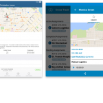
One thing that I really like in this product page is the new knowledge base presentation that employs a kind of compelling UX concept. The real challenge here is how we can reuse the screen real estate for showing both the list and the item details. Popping up a non-blocking callout doesn’t seem ideal, or even worse for popping up a new browser window.
Our solution is to use sliding menu UX, where we combine data extensive operation – such as sorting and paging – with content that loaded on demand. The result is stunning enough, users can click an item to slide the list and see the content coming in, then click back to do go back to the list. See below.

We have eventually packaged every details of the UX into Sliding Menu component that we included in WebUI Studio 2010. This means that you can also add the same rich experience to your web apps – easily and quickly!
Click here to experience this compelling UX concept for yourself.
Friendly URLs
Another feature that I think worthwhile to mention is the user-friendly URLs mechanism that we implemented consistently across the corporate website – from the product information, to community forums, and to support center.
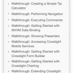
Instead of remembering the long unique ID of a video tutorial, you can now simply remember the title of the video and type it in the address bar to watch it. For example, most of our resources have the title patterned using certain prefix. The getting started videos, for instance, mostly patterned with “Getting started with [control name]”. By just remembering that, you can swiftly locate a WebCalendar video by simply typing “/Video/Getting-started-with-WebCalendar” directly in the address bar.
See the following screenshot for details.

The same mechanism is also applicable for walkthroughs, how-to topics, knowledge base, blog posts and any navigable content in the support center.
There are still a lot of new stuff that I couldn’t describe here due to space constraint. In the next post, I will blog on more technical resources and outlines some of helpful content particularly for Silverlight development. For now, I suggest you to visit intersoftpt.com/support and see the new support center for yourself.
Last but not least, enjoy our new support center experience!
All the best,
Jimmy