ClientUI Part 4 – Rich UI Meets ISO-Standards
Last month, I’ve published three posts that touched the surface of our upcoming ClientUI 2010, the next-generation development toolset for Silverlight and WPF platform. I highly recommend you to read my first three posts if you haven’t, which is important to get a clear understanding on ClientUI’s overall architectures and key concepts, its presentation model and how it elegantly supports MVVM pattern in Silverlight and WPF app development.
As promised, this fourth series of my blog post will highlight on the user interface and usability aspects of our ClientUI family components.
Being used extensively mostly in the software industry, the UX (User eXperience) has became one of the most popular buzzword in the past few years. As an application developer or a designer, it’s critically important to have a solid understanding on UX before you’re able to produce an efficient, highly usable application. The coverage on UX definition is beyond the scope of this post as UX alone incorporates a wide range of disciplines such as usability, contextual user analysis, user-centric design, card scoring and more. One thing for sure is that UX is not equal to UI, Vibor Cipan shares his thought. To learn more about UX in general, check out several good resources in this blog post for your starting point.
To keep our subject relevant, this post will be primarily focusing on the relation between Silverlight and UX, and their usage pattern in line-of-business application.
The UX in Silverlight
In general, Silverlight is a modern web application framework that enables you to build RIAs with richer graphics and stunning animations and hence resulting in a better user experience. In the scope of key business scenarios, unfortunately, Silverlight is seriously lacking numerous fundamentals which dramatically limiting developers and designers to create applications that are both rich and usable. The context of usable here refers to the implementation of usability standards required to deliver effective and intuitive user experiences.
Rich UI doesn’t always mean it’s usable. Think about a glossy button-look-alike shape that doesn’t behave like a button. For instances, it doesn’t initiate an action, doesn’t have pressed visual or can’t be accessible through keyboard. Or a shiny window-look-alike panel that can’t be moved nor resized. Many of the cases like these can be found in today’s web applications which merely geared toward “richness” and often overlooked the key goals of the UX itself, the usability. Silverlight, unfortunately, is no exception.
Unlike in WPF, Silverlight doesn’t support keyboard focus visual (distinct it with logical focus) and accesskey shortcut even in its latest release. Although seems simple, this accessibility issue alone already introduces numerous limitations that reduce the usability of the produced application. Silverlight application developers often ended up spending more time and effort to find the workaround and write more codes to achieve basic usability features.
When trying out a new business sample solution that shipped with Silverlight 4, I found a more realistic example that illustrates the lacking of dialog usability standards in Silverlight. See the following.
Does the above dialog look rich? Considerably yes – compared to traditional HTML. Does the above dialog meet usability standards? No. Here’s why: (refer the point below to the red-marker above)
- Users should be able to interact with a Combobox (or a dropdown list) through keyboard, for example, opening the selection list by pressing Alt+Down or F4 key. After the list is opened, user should be able to use keyboard arrows to navigate between items and then press Enter or Tab to commit the changes. None of these interactions are supported in Silverlight.
- Default command/action should be highlighted to give visual feedback to users which command will be initiated when Enter key is pressed. The highlight visual hint and default command are not supported as well.
- Cancel command should be easily initiated through a standard interaction manner such as when users pressed the Escape key. Silverlight doesn’t respond to the Escape key in either the button or the dialog.
- The dialog doesn’t support basic features that a standard GUI dialog control should have, for example, you can’t close the dialog box by pressing Escape or a combination of shortcut key – such as Ctrl/Alt+F4 as in standard Windows GUI.
At this point, you might be raising questions like these: Does the above seem-too-simple UX issues really matter? Does my users really care about that? The answer is obvious as the multi-part ISO standard 9241 part 4, 15, 20 and 171 suggested. Some industry’s UX research such as Norman Group has published hundreds of usability reports that emphasizes the importance of good user experiences design in business RIA apps.
Great UX Design Made Easy
In the beginning of this post, I’ve mentioned that UX is not identical to UI (or UI controls) – which many developers and software vendors mistakenly mixed them up. UI simply provides a mean or a medium for users to interact with the system, particularly your application, while UX encompasses all experiences as a whole – it’s all about how users feel before, during and after using your application, product or service.
As a third party vendor specializing in UI component for Microsoft platform, we put the best of every effort to implement the standards and best UX practice and guidelines in our products – this is what sets us apart from other solutions. In fact, we’ve been heavily investing on good UX guidelines since our last year’s volume release.
To achieve great UX, designer team require advanced tools to enable them achieving their key objectives in dramatically less time with less effort. ClientUI is built from the ground-up to meet the most demanding UX requirements which includes numerous implementation of usability features based on platform standards hence delivering good UX design in the form of ready-to-use components. In short, we provide solutions and tools that empower UX designers to accomplish their projects faster in a consistent and efficient way.
The following section highlights the key UX guidelines that we’ve implemented in our ClientUI according to the ISO Standards 9241 which is concreted in several implementations that we can easily find today such as in Windows GUI or in Macintosh GUI. These implementations are especially important for the Silverlight counterpart of ClientUI as they were not natively available in Silverlight.
Keyboard and Focus Visual Support
The input controls and button family in ClientUI implement keyboard focus identical to the platform standards such as in Windows and WPF. The keyboard focus is one of the most fundamental UX required to help users easily recognize and understand the focus of primary input device during data entry process. Silverlight 3 introduces logical focus support, but not keyboard focus.
The following image summarizes the keyboard focus support in ClientUI’s input and button controls.
As noticed in the image above, the dotted rectangle represents the visual hint for the keyboard focus. It’s also important here to distinct between logical and keyboard focus. The keyboard focus visual will appear only when users navigate using keyboard, such as using Tab or arrow keys.
To make keyboard focus works in consistent manner, we provide the Keyboard and FocusManager architecture similar to WPF. This enables you to build interoperable Silverlight and WPF applications with consistent user experiences using the same codebase.
Note that the keyboard focus is automatically enabled by default and doesn’t require any further configuration.
In addition to the keyboard focus, certain input controls – such as radio button and toggle button – also support special grouping behavior that based on a focus scope. This grouping behavior enables radio button to automatically deselect the other radio buttons in the same scope thus enabling intuitive input process as suggested in HIG platform standards. Refer to the following image.
The self-explanatory image above shows the focus scope implementation in ClientUI which is essential to appropriately manage the input and grouped selection. ClientUI will ship with several containers with built-in focus scope such as GroupBox and ExpandableGroupBox.
Keyboard Navigation Support
Since version 3, Silverlight includes basic support for keyboard navigation, that is tabbing between controls using Tab key is now possible. However, the Silverlight implementation limited only at the logical focus surface. ClientUI takes the keyboard navigation further by implementing keyboard focus that doesn’t interfere with the logical focus to comply with usability standards.
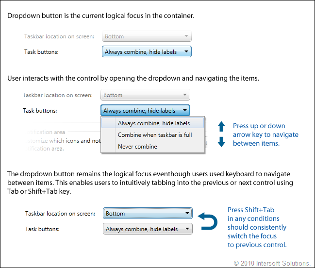
One of the most remarkable implementation of keyboard navigation support is related to controls that support menu and popup such as dropdown button (or also known as menu button), split button, toolbar button, menu bar, context menu, and more. Let’s pick dropdown button for example, the dropdown button should remain the logical focus in the main container scope regardless of how users interact with the items in the dropdown (i.e, either through keyboard navigation or mouse).
The correct implementation of logical and keyboard focus produces consistent navigation experiences either when using keyboard, mouse, or other input devices. The following image illustrates how logical focus and keyboard navigation works in a dropdown button control.
Achieving the implementation such as shown in the image above is not as simple as it seems due to the limitation and lacking of architectural support in Silverlight. Thanks to the comprehensive architecture in ClientUI that provides complete routed event, keyboard and focus manager implementation – it enables many key challenges in the UX to be elegantly implemented.
Moving a step further is how we deal with menu navigation specifically in menu bar. A menu bar UI that complies to usability standards should support not only a basic keyboard navigation, but also how it deals with the submenu and event bubbling mechanism. The following illustration shows you a complete picture of comprehensive keyboard navigation implementation in ClientUI’s menu bar.
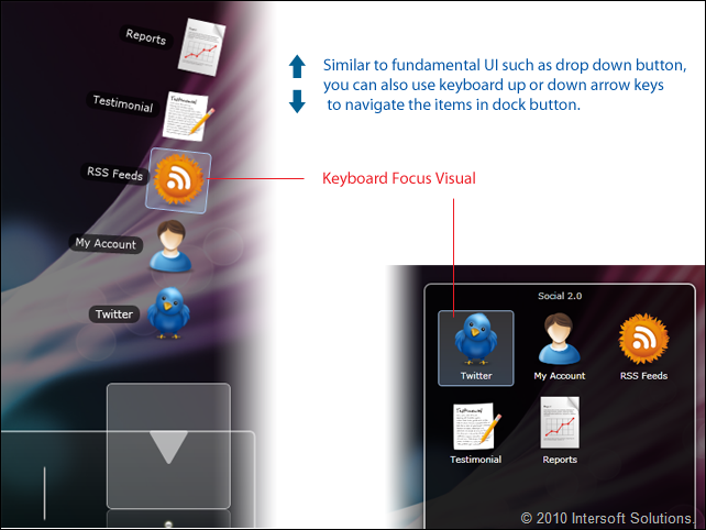
In addition to the fundamental controls such as shown above, more advanced ClientUI controls such as stack button and dock button are implementing identical usability guidelines as well, thus creating elegant and consistent user experiences across your applications.
The following image captures the stack and dock button with keyboard navigation and focus visual.
Rebuilt from the ground-up, UXDock (formerly WebFishEye) now incorporates the same usability standards that we applied in the other fundamental UIs such as dropdown button or menu discussed earlier. We even take the UX for particular flagship components such as UXDock and UXFlow to the next level by implementing some extent of UX guidelines according to Apple Human Interface Guidelines, specifically when it comes to drag and drop, animation and UX consistency. ClientUI is designed to meet both Windows and Apply HIG by default. I’ll dedicate a special post covering the similarity and difference between the both – and how we built ClientUI to elegantly support both HIG.
A bit off topic – while we’re at dropdown buttons and menu subject, it’s noteworthy to briefly mention how developers or designers actually use them in the design/development process. One thing that I really liked about ClientUI – apart of many exciting design and runtime features discussed above – is how we built the object model to take advantage of semantics pattern. Using such pattern truly reduces learning curves and makes development much easier and more intuitive, for example, think about menu item semantic regardless of the visual presentation you wish to use.
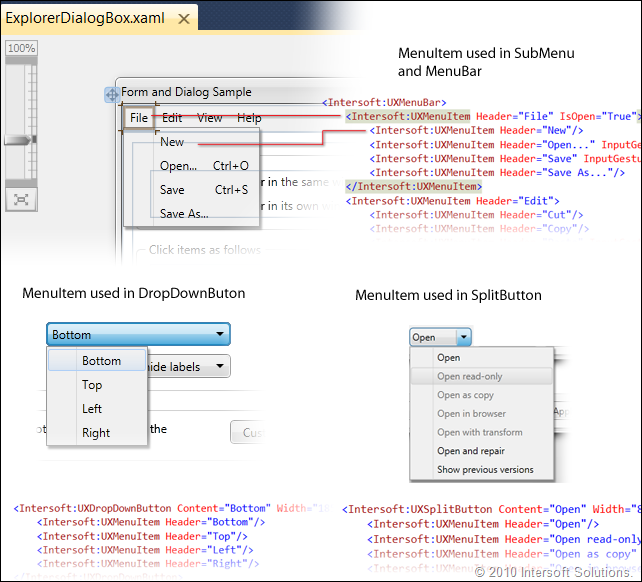
A menu item – the way we see it – is a fundamental object that represents a visual that either initiates an action when clicked, or displays sub menu when it has items. That said, menu item can be used more generally and should support arbitrary visual hosts. Based on this concept, we specifically design the menu item to be highly adaptable and transformable based on the host – this allows various menu containers to use the same menu item semantic in its implementation. The following image shows how the menu item semantic is elegantly consumed in various visual hosts.
That’s cool, isn’t it?
In addition to MenuBar, DropDownButton and SplitButton, the same MenuItem semantic is also used in ToolBar, ToolBarButton, StackButton and ContextMenu. I’ll discuss more about StackButton and ContextMenu later.
Access Key Support
Access key is also one of the most crucial requirements in platform-standards user experiences that designed for users to quickly perform an action by pressing a shortcut or also known as access key. Unlike WPF, Silverlight completely miss the support for access key. Hence you won’t be able to easily do something like pressing Ctrl+O to show a dialog box or Alt+F to open File menu – which again, is a must-have requirements particularly in line-of-business and productivity applications.
ClientUI pushes the standards beyond Silverlight by making available access key in its various UI components. The following highlights some of the ClientUI components that implement access key.
Input Gestures Support in Routed Command
In my previous post, I’ve discussed about routed command support in ClientUI and how it can be applied to MVVM pattern using CommandReference. In this post, I’ll cover the UI part of the routed command and its relation to access key.
The following diagram illustrates the relationship between command, command bindings and input bindings.
As seen in above illustration, you can think a command as a logical unit that identifies an action, such as Open, Save, or Close action. This modern routed command concept which originally introduced in WPF doesn’t include implementation by default – so it’s an arbitrary identifier of an action which can be easily reused across your application. The real implementation that handles the command is done at the command binding level. To learn more about routed command, see Four Main Concepts in Routed Command.
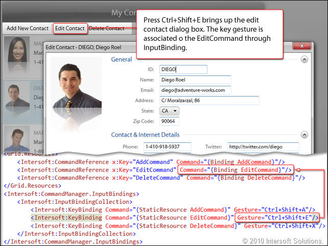
Presuming that you now have a couple of commands with proper bindings in your UI, you can easily associate a key gesture to each command. Keep that simplicity in mind, when you run your page in the browser, pressing the key gesture will automatically execute the associated command – without any single line of codes. This is how the access key for command shortcut becomes possible in ClientUI for Silverlight.
With all its power, the routed command however won’t be so much useful without consumers that can take advantage of it. Since Silverlight doesn’t support routed command infrastructure, sadly none of its controls can take advantage of the routed command that we brought into Silverlight. Conversely, ClientUI will ship with more advanced UI fundamentals – such as buttons, dropdowns, menus, tool command, and bars – that fully support routed command. As such, ClientUI controls can enjoy the power of input bindings as well – enables you to achieve consistent access key support across your application.
The above picture demonstrates the usage of routed command and input binding in Contacts sample application that I showcased in my previous post.
Access Key Support in MenuBar and ContextMenu
In addition to the shortcut key support available in buttons, dropdowns and menus – ClientUI also implements special access key support required in certain UI components such as in MenuBar and ContextMenu.
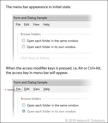
Starting from Windows Vista, Microsoft added to their UX guidelines a new way to discover the access key (also known as mnemonic key in Winform and WPF). For instance, the earlier version of Windows will show an underline to the access key of a command or menu item such as File, Edit, etc. The last two versions of Windows will show the access key only when you pressed the access modifier keys which is the Alt key in Windows. ClientUI’s menu bar supports both mechanism.
The following screenshot pictures a menu bar that used automatic access key visibility.
As seen in above image, ClientUI’s menu bar satisfies the comprehensive menu access key requirements in platform-standards UX which stated that the first menu item should be selected if the access modifiers is pressed without the access key (see the marked red point above). In this context, the menu bar should already enter modal mode (see Input Modality in latter section) which allow users to press “v” to access the View menu, “h” to access the Help menu and so on.
In addition to the visual part, the most important aspect is the real implementation of the access key. Thanks to the solid focus scope implementation as discussed earlier, the access key in menu bar could be consistently processed when the current focus is within the same focus scope as the menu bar.
The following image illustrates how access key works in menu bar.
Please note that the Alt key can’t be used as access modifiers when a Silverlight application is running in browser. In this case, you can configure the access modifiers through AccesskeyModifiers property and set it to Control+Alt or other possible combinations.
Identifying a character as the access key is as easy as adding an underscore (_) character in the front of the designated access key, for example, _Edit will automatically identify the “e” character as the access key for that particular menu item. The use of underscore semantic is compatible with the WPF counterpart of menu implementation.
Access Key Support in CommandBar
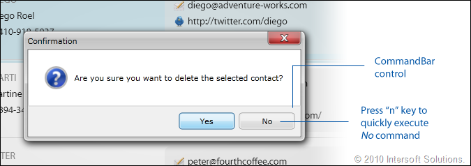
Another ClientUI component that also implements access key support is the CommandBar control. The command bar is commonly used in dialog box, message box or a window that hosts a set of command buttons.
The image above shows a message box with predefined YesNo commands. Users can quickly access a command by pressing the first character of the command, i.e, “o” in OK, or “c” in Cancel. The same behavior is also consistently implemented in platform standards such as Windows or Macintosh.
Default Command and Visual Feedback
To create rich and consistent user experiences that follow standards-compliance design discipline, simply having aesthetic dialogs and form controls aren’t enough. We also make available several exciting features related to commanding such as default focus and visual feedback to the Silverlight platform.
A default command, when correctly implemented, should be the default action to be initiated when users pressed Enter key anywhere in the form, particularly within the input controls. Furthermore, a default command, according to platform-standards guidelines, should have unique visual presentation to distinct itself from other commands. This allows users to intuitively recognize the default action when they committed the changes. The following shows how Windows and Mac implemented the default command mechanism.
Similarly, ClientUI implements the default command mechanism in all its button family. The following illustration describes ClientUI’s default command implementation in more details.
As seen in above illustration, a default command implementation that follows platform-standard UX guidelines isn’t as simple as it seems to be. That’s because the implementation involves a lot of details related to logical and keyboard focus and primarily the user interaction. Built upon its bare-metal architecture, ClientUI satisfies all these comprehensive implementations required in such a default command pattern.
Input Modality
Input modality is one of the most fundamental UI architectures that has been long adopted by popular platforms such as Windows and Mac. Unfortunately, I found out that today’s RIAs typically overlooked this architecture thus delivers impoverished applications that fail to provide consistent user experiences.
Despite the various theoretical definition of input modality, the simplest way to understand input modality is to see and experience it yourself. The most common implementation of input modality can be often found in dialog boxes, menu, and popup. When the UI requires a sole user focus, the UI routes all input events to that particular UI elements allowing users to easily focus on a specific single task, for example, when selecting a command from a menu, the user input is modal to the menu element. The following image illustrates the input modality example in Windows, Mac and ClientUI for Silverlight.
The input modality mechanism becomes more complicated when there are multiple UIs that require user focus. In this case, the precedence of modality should be applied to determine which input should be first processed. This scenario can be often found in multiple window interface applications where a window should be less modal than the taskbar UI, and the taskbar UI should be less modal than menu or popup. The picture below shows how the precedence in input modality is consistently implemented in platform standards such as Windows and Mac. And yes ClientUI – too.
As mentioned in the self-describing illustration above, rich user experiences emphasize on look and feel that behaves consistently throughout the applications – the one that users feel comfortable and intuitive to work with – before, during and after the use of the application.
Ultimately, input modality increasingly becomes a popular subject as modern UI platforms such as WPF and Silverlight are gaining converts from traditional line-of-business application developers. While Silverlight completely overlooked many usability implementations required in modern business apps, ClientUI comes to rescue by offering a wide range of ready-to-use tools that already meet the strict usability requirements of platform standards – which includes keyboard support, navigation, access key, default focus, input modality and much more.
Summary
User experiences, particularly in the scope of software applications, is a wide subject that can’t be learnt overnight. In this already-long post alone, I’ve cut-down three other sections and only managed to detail the first four sections of the key UX aspects that we implemented in the forthcoming ClientUI 2010. However, at least I hope you’ve got a clearer picture on UX in general, the benefits and the reasons why you should care about it.
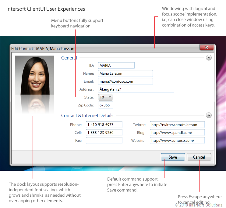
To wrap up this post, I’d like to show the ClientUI version of dialog box and form controls implementation, as opposed to the Silverlight version that I described in the beginning of this post. ClientUI truly takes Silverlight apps to a whole new level with multitude of UIs that aren’t just rich, but also strictly complies to the usability and guidelines according to human interface’s ISO standards. The following is a edit dialog that you’d found in common LoB apps – but this one with 100% compliance to Windows 7 Human Interface Guidelines (HIG).
As I’ve revealed in the first four series of my blog, you may already discover the key potential of ClientUI particularly for Silverlight development. True, ClientUI 2010 will include tons of exciting features that seriously help you get into business – whether you’re a software architect, application developer or a senior UX designer.
There are still a lot of exciting aspects of ClientUI that yet to be revealed which I’m planning to write in the next couple posts before ClientUI goes official sometimes next month. If you have any feedback or questions regarding UX, usability or anything related to this post, please feel free to submit your comment.
Last but not least, I hoped you enjoyed reading this post. Thank you for your time and stay tuned for the next series!
All the best,
Jimmy.
Chief Software & UX Architect.









Please release the beta I can’t wait
It looks great!!!!
Thank you for your continuous interest in our ClientUI technology.
Due to the tight schedule, we’re skipping the RC phase so we can release the final bits faster. I’ll contact you shortly when we have the ClientUI bits available to download.
Feel free to let me know any questions, feedback or comments. Have a nice day!
The new enrichments and embellishments are stunning.
I always told people that slapping some saturation on an image will never make up for real imagery enrichment. Keep up the excellent work!
Thanks for your feedback. I hope you liked what we’re doing for the UX and Silverlight development.
Any news on RTM Release
Yiannis, you can expect something between this week and next. Thanks for your patience and continuous interest.
Hey, very nice site. I came across this on Google, and I am stoked that I did. I will definately be coming back here more often. Wish I could add to the conversation and bring a bit more to the table, but am just taking in as much info as I can at the moment.
iso 9000