A Closer Look at Premier Studio 2016
In this first post of the year, I’d like to share something fresh and exciting for all of you. As you might have aware, we’ve been working hard on a big release since the past few months. It’s in deed our biggest release yet so far — with major upgrades to all flagship products across all 7 platforms which include WebUI, ClientUI, and obviously, Crosslight. So what does that mean to you, and what you can expect in the upcoming release? Read on.
Whether you have a Premier subscription, or individual platform subscription, you’re getting the most out of your investment, and more importantly, get ready to kick off the new year with new goodies we’ve prepared for you.
As we’re reaching the RTM milestone, most of the product bits are ready. That said, here are some latest previews, fresh from the kitchen.
A Whole New Level of Crosslight Development Experience
Crosslight developers, rejoice! Gone are the days of assembly references nightmare. In the new release, we’re strongly focused in creating a better development experience in addition to new tools and features. Our goal is to make getting started with Crosslight as easy as 1-2-3, where you can start from a blank Xamarin project or downloading a Crosslight sample, add Crosslight package, and start writing some code.
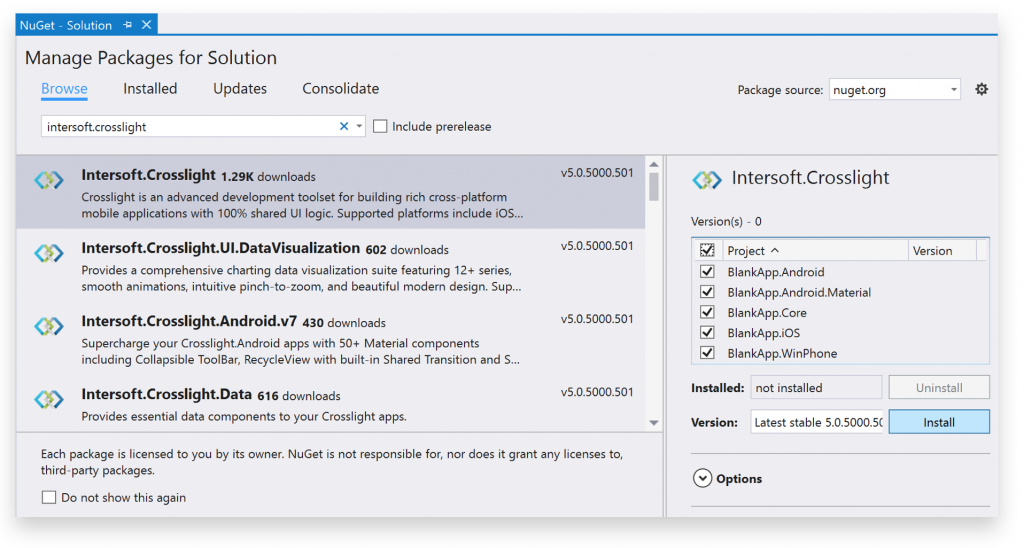
To make that happen, we’ve created over 60 NuGet packages that you can consume with a simple click. We designed our packages to be atomic which align with the Crosslight nature: highly extensible and modular.
Unlike typical packages, Crosslight NuGet packages are designed for cross-platform targeting, allowing you to simply add a single package which automatically install to multiple projects in the solutions, including Core, iOS, Android, Windows Phone and Windows 8 projects. In addition, we also made available special packages for Xamarin Support and Google Play Services which have been strongly signed. The end result is clear, a much streamlined, hassle-free development experience.
More importantly, Crosslight’s packages implemented auto dependencies which greatly improve developer experince. Let’s say you want to add logging with Azure integration, you just need to add the Crosslight Logging Azure Insights package. It automatically adds required dependencies such as Crosslight Logging and Azure Service packages to all client and server projects.
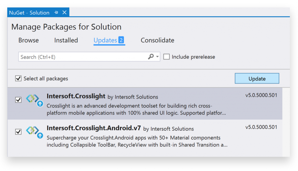
This makes building cross-platform apps with Crosslight ultimately simple and easy. Not to mention you can now perform updates in a single click as new Crosslight updates are available. No more frustrating, error-prone manual updates.
But wait, does it work in Xamarin Studio on the Mac? Yep, absolutely. The entire goal of adopting NuGet is due to cross-platform nature of Crosslight where developers typically work with the project across different operating systems and IDEs. Using NuGet is the perfect strategy for such cross-platform development since all references are stored locally in each solution folder.
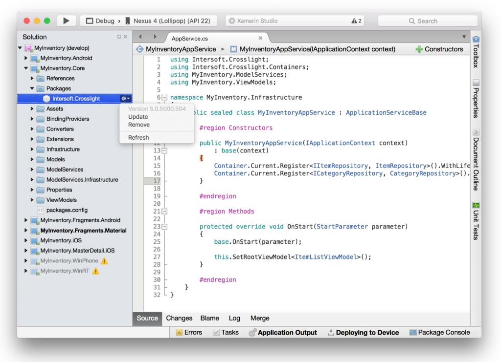
To make NuGet works the way we desire, we shipped a special package manager console add-in for Xamarin Studio. This allows you to simply type a command, and have the specified package added to all projects in the solution.
Here’s an example result of a Crosslight solution with NuGet in Xamarin Studio.
Note that although Crosslight 5 pre-release packages have been made available to NuGet for a while, they are published particularly for testing purpose. The latest submission is a near-final build which is feature-complete and stable. Surely you can give it an early look, although we recommend you to wait for a little while, at least until we released the accompanying samples next week.
Introducing Crosslight Android Material
Crosslight Android Material is arguably the most anticipated features in Crosslight 5. The new release ships thousands of new features and resolved backlogs. But what excites me the most in this release is the all-new, shiny Crosslight for Android Material, which is a result of many months of intensive engineering and meticulous UX design.
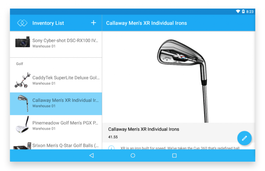
We’ve made it super easy for you to create beautiful Android Material experience. It’s all started with the new Crosslight Fragment component which provides a wealth of APIs and built-in features. Let’s take a quick look at the Material version of our popular Inventory sample.
Unlike the native Android development, creating Material experience with Crosslight is simple yet elegant. Here are some code snippets to give you some ideas how Crosslight Material APIs look like.
Want to add bar items? It’s easy.
|
1 2 3 4 5 6 7 |
protected override void Initialize() { base.Initialize(); this.AddBarItem(new BarItem("SaveButton", CommandItemType.Save) { ShowAsAction = ShowAsAction.Always }); this.AddBarItem(new BarItem("CancelButton", CommandItemType.Cancel) { ShowAsAction = ShowAsAction.Always }); } |
Adding a floating action button? Just a single API to call.
|
1 2 3 4 5 6 7 8 9 10 11 12 |
protected override void Initialize() { base.Initialize(); this.FloatingActionButtons.Add(new FloatingActionButton("EditItem") { Position = FloatingActionButtonPosition.BottomRight, IconId = Resource.Drawable.edit, Direction = FloatingActionButtonDirection.Up, HideOnScrollUp = true }); } |
Presenting a parallax image with collapsible toolbar? Piece of cake.
|
1 2 3 4 5 6 7 8 |
protected override void Initialize() { base.Initialize(); this.ToolbarSettings.Mode = ToolbarMode.Collapsing; this.ToolbarSettings.CollapsingToolbarSettings.EnableParallaxImage = true; this.ToolbarSettings.CollapsingToolbarSettings.ExpandedHeight = 240; } |
iOS-style swipe-to-action? That’s built-in.
|
1 2 3 4 5 6 7 |
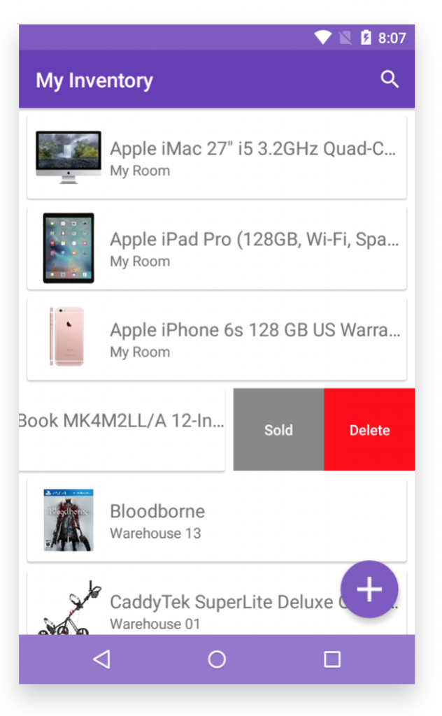
protected override void Initialize() { base.Initialize(); this.EditActions.Add(new EditAction("Sold")); this.EditActions.Add(new EditAction("Delete", true)); } |
The result of the edit actions can be seen below.
As seen in several examples above, we’ve redesigned the entire Android development experience so you can define behaviors and features with simple API, minimizing the needs on AXML layout. That saves countless of hours, we’ve experienced that ourselves.
The Crosslight Android Material ships with 50+ components exclusively engineered for Material user experience. This includes a brand-new navigation view, card view, recycle view, collection view, and iOS-style split view complete with editing mode, multiple selection and all data-related functionality you would expect.
The following image shows the all-powerful SplitViewFragment.
To let you quickly learn and explore the new Crosslight for Android Material, we’re re-creating over 40 Crosslight samples to support the latest platforms and best practices. All Crosslight samples are also NuGet-enabled now, so you can now get started by simply downloading them and restore the packages. We’ll be publishing out these new samples ahead of the release so you can give it a try early. Stay tuned for our next announcement.
Big WebUI Revolution.
It’s unlike any WebUI you’ve seen before. All 40+ WebUI components are redesigned from the ground-up to leverage the latest technologies and trends in web development. In the previous post, Nicholas has shown you a preview of the upcoming WebUI redesign. But that’s only a fraction of what we’re working on. We introduced hundreds of new styles which are meticulousy designed for every component, every feature, and every little interaction detail.
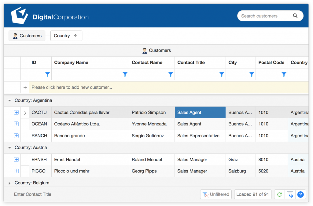
In this post, I’m thrilled to show you WebGrid Enterprise 10, with its all-new, wonderful user interface design. It marries the best of both worlds — the most advanced data grid functionality and a modern user interface. Here’s how WebGrid 10 looks like at a glance.
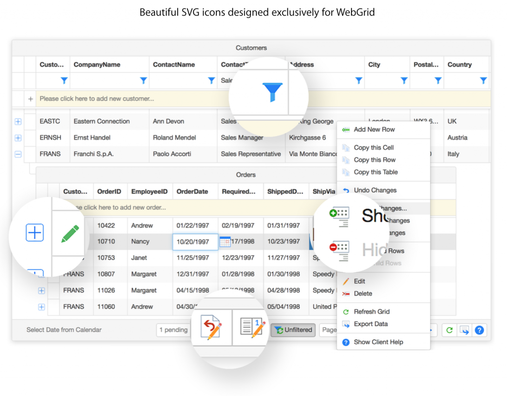
The new WebGrid theme is designed to be timeless, incorporating SVG for all icons and glyphs, allowing your WebUI apps to look great in any screen display, from standard resolutions to iMac 5K display. To make that dream a reality, our designers have been busy creating some 500+ icons exclusively designed for WebUI, then engineered to perfection with our latest Unified Theming framework.
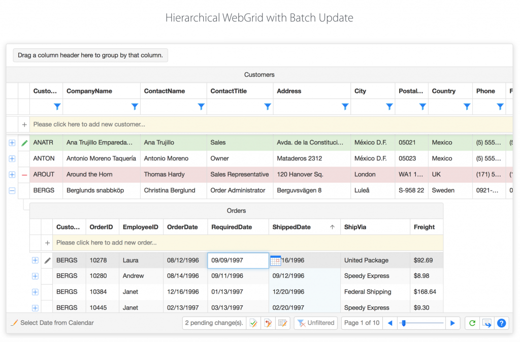
The redesign for hierarchical and batch update UI have been one of the most challenging tasks as they are unique features in WebGrid. You won’t find any design references on jQuery or Bootstrap-based grids which are mostly a plain table. So we invented one for you.
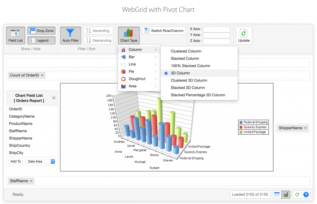
Pivot chart, one of the flagship features in WebGrid, has been completely redesigned along with the ribbon, pivot area, drag-drop interaction, data filter experience and more.
And even to every little details, such as sort indicator, filter elements, and context menu. Everything is new in WebGrid 10.
How about other WebUI components? Definitely you won’t be able to build a full-fledged web app with only a single WebGrid component. We’ve a lot of new and interesting UI goodies to offer. For instance, WebPaneManager now allows you to create various modern layout such as those found in Apple Mail app, OneDrive, or iCloud. The entire lineup of WebDesktop, WebEssentials, and WebScheduler are joining force this big WebUI revolution.
We can’t wait to deliver these exciting major WebUI release to you soon. Stay tuned for our next announcement when our new demo is published.
Stunning Charts for Enterprise Reporting.
As if it weren’t enough, the 2016 release also ships a major upgrade to ClientUI, the enterprise developer’s choice of toolset. We’re strongly focused in creating new features that make enterprise desktop apps development even easier.
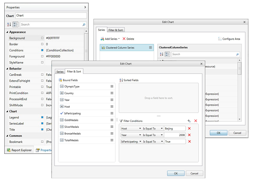
You can now add professional-looking charts right in your reports. It works the way you expect it to be — drag the chart to the designer surface, bind it to a data source, and choose a chart type from the intuitive Chart Designer. Voila! Here you go.
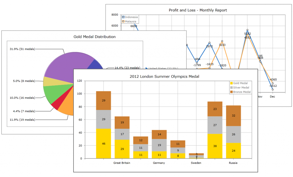
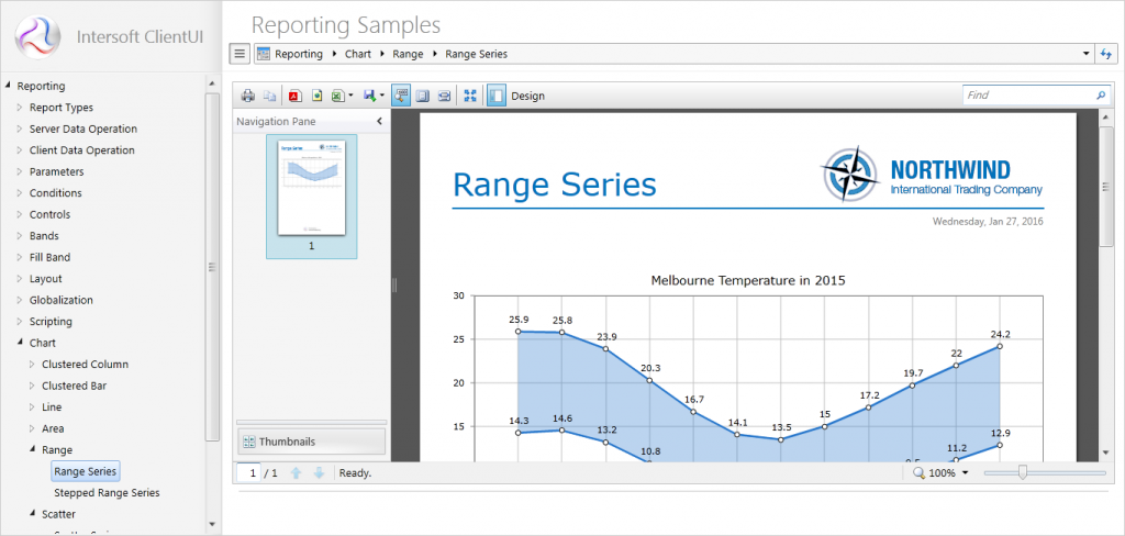
The following images show the chart designer and the report viewer respectively.
We offer dozens of chart types commonly used in financial and enterprise reports, including bar, column, pie, doughnut, bubble, scatter, range and much more.
That’s not all. The new chart feature will be also available and fully supported in WPF platform. In the previous release, the reporting suite are only partially available in WPF. And starting in this release, we’re pleased to announce that all ClientUI components and features in Silverlight have been made available in WPF. Our WPF team has been working hard to optimize every control and features so they run with best performance and flawlessly in WPF as well as in the latest Windows 10 release.
And as a bonus, ClientUI 12 will include a report conversion tool for Crystal Report files. So if you’re tasked to migrate a bunch of CR reports, you’ll love this small yet time-saving tool.
Coming Soon
Premier Studio 2016 is slated for a public release on mid February 2016. Our team is currently making final touch to the products and preparing an even better development experience to everyone. Last but not least, we’re also working on a new series of getting started guide and improvements to over hundreds of documentation pages.
Last but not least, we’re giving out a free 3 month extension for all expiring subscriptions between Nov 2015 and Jan 2016. We’d love to have you joining us to celebrate our biggest release yet.
At the meantime, we want to hear from you what new tools/features in the upcoming release that you anticipated the most. We’ll also welcome any feedback!
Best,
Jimmy
