The next WebUI. Redesigned for the future.
The web development trend recently revolves around providing great look and feel for the users of World Wide Web. Nowadays, we see lots of beautifully-designed web components along with the rise of CSS frameworks such as Bootstrap and even Material Design. These frameworks provide a way for developers to universally theme their web apps, making it consistent and beautiful for their users, across the entire site.
WebUI Studio. Undoubtedly, this is our best-selling suite ever. With impressive range of versatile, ready-to-use components, WebUI Studio has become the industry’s benchmark for suite of web components. More than just simple controls, WebUI components are designed to be functionality-rich, making developers’ lives much easier whilst bringing high-performance web components to their ASP.NET web applications.
Just, what if, you can incorporate these beautifully-designed elements to WebUI? At Intersoft Solutions, we take pride in our meticulously-designed user experiences. In our next biggest release ever, we’re going to bring a whole new look and feel of your web apps. Embrace the next evolution of web apps with WebUI. First-class web components meets first-class design.
Advanced Functionality Meets Beautiful Design
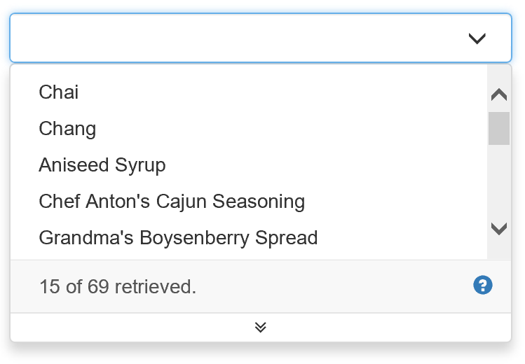
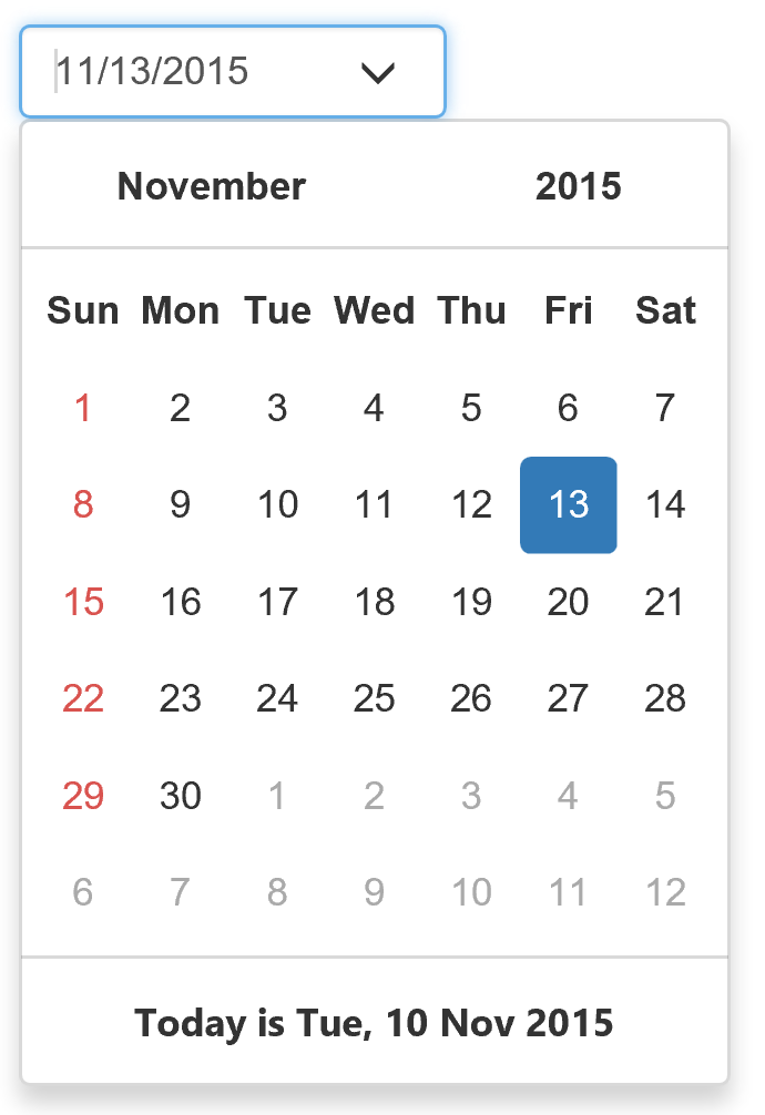
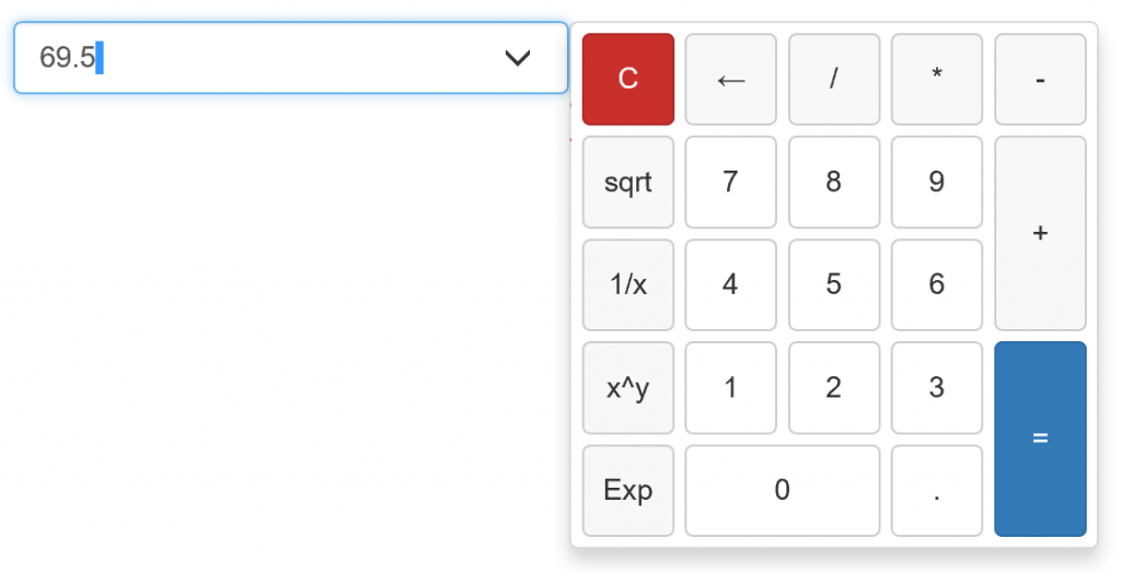
Before diving further, can you take a guess at some of these WebUI controls below?
From the top: WebCombo, WebInput with DateTime Picker, WebToolBar, and WebInput with Calculator Editor. Gorgeous, aren’t they? And this is just the tip of the iceberg. Goodbye old-fashioned looking web applications. It’s all thanks to the new technology we’re building for the next release, called Unified Theming.
Introducing WebUI Unified Theming
In the current release, you can already style WebUI controls through Layout Manager or via API at runtime. However, you need to do the styling on each WebUI control individually which could be tedious and repetitive for dozens of controls. This is going to change in WebUI vNext. Meet our brand-new Unified Theming framework.
The new Unified Theming allows you to apply consistent look and feel across your entire web applications just by using a single theme definition, similar to the ones found in popular CSS frameworks. Bigger buttons, more rounded buttons, gradient-styled buttons, flat buttons, anything. You now have total control over your app’s look and feel.
For example, you wish to change the corner radius of a popup panel. Just configure it once, and all of the WebUI controls in your application that use the popup element will automatically apply the same look and feel. To achieve this, it requires delicate, yet rigorous engineering to ensure all 30+ components work as expected using the new unified theming feature. Not only that, the combination of settings provided with each control makes it even tougher to achieve a consistent look with whatever settings you throw at it. And yes, there’s that cross-browser support as well.
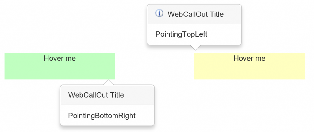
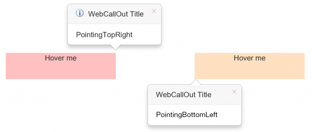
When we designed the unified theme, we make sure that each control works in concert with native features and behaviors of the control itself. For example, here’s how it looks when the WebCallOut Bootstrap theme is applied with various types of settings. Here’s a shot with WebCallOut’s PointingPosition set to PointingBottomRight and PointingTopLeft.
And here’s another with PointingPosition set to PointingTopRight and PointingBottomLeft.
And the best of all, the Unified Theming framework leverages the industry’s most popular CSS extension language today, SASS. Written entirely in SCSS syntax, we’re able to streamline all styles across 30 components, creating variables and mixin that you can easily customize. This also means that you don’t have to learn a new language to customize the styles. Instead, you can use any SASS compatible editors such as Visual Studio 2015 or Sublime.
Bootstrap-themed WebUI
Along with the unified theming framework, we will also ship a new Bootstrap theme for the entire WebUI components. Let’s take a look at some of the WebUI controls restyled with Bootstrap theme.
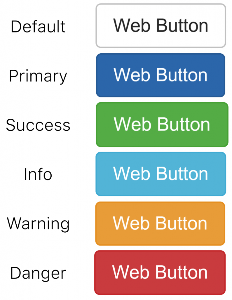
WebButton
The rounded corners and vibrant pastel colors for the WebButtons are inspired from Bootstrap. All color schemes from mouse-over, default, disabled, and selected states are taken from Bootstrap.
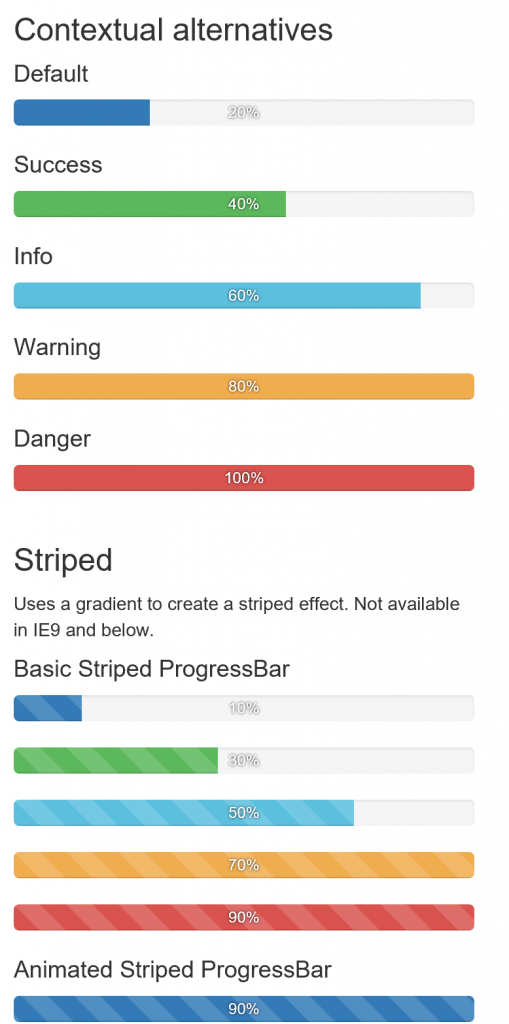
WebProgressBar
These Bootstrap-themed WebProgressBar have arrived to captivate your users with vibrant, animated colors. The wide range of colors are also taken from Bootstrap. Also pay attention to the nicely shaped rounded corners of the progress bars.
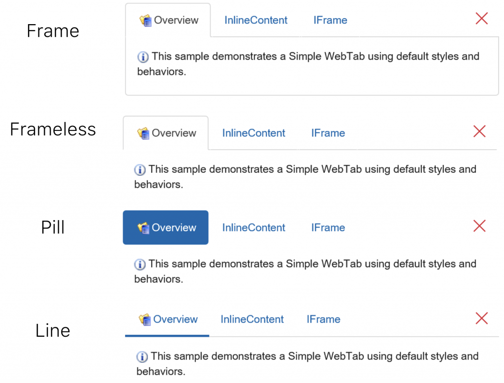
WebTab
Each tab in WebTab is now more spacious with generous padding on all its sides. We’ve also added various Bootstrap styles such as Frame, Frameless, Pill and Line tabs. And to make everything look really great even in hi-res display, we’ve replaced all common icons with font-based icons, all comes pre-built in the WebUI Bootstrap theme.
Coming in 2015 R2
What you see in this post is just a small glimpse of what’s next to come. We can’t wait to show it live to you in the next 2015 R2 release. It’s going to be the biggest release ever! Refreshing the entire WebUI lineup, a major release for Crosslight, and the launch for ClientUI Reporting for WPF with charting will be the main dish for this release. Stay tuned for more exciting updates!
Cheers,
Nicholas Lie
