Getting Started with Crosslight Collection Views and Grid Views
Hi guys, Arief here from the Intersoft Consultant team. Today I will talk about how to use iOS Collection View and Android Grid View in order to create a beautiful cross-platform navigation menu. At the end of this tutorial, you’ll learn how to use the collection view in your Crosslight applications, which looks similar to the following illustration.

Introduction
Collection View / Grid View (will be referred as Collection View from now on) is a very versatile user interface. As a matter fact, both iOS and Android have always been using it as a native pattern for Springboard (iOS home) as well as lots of other Android launchers. Nowadays those trends start to spread throughout business apps considering how user-friendly and eye-pleasing when compared to the plain old list view.
If you are interested in creating a gorgeous and cool business apps, using collection view is a must! In this tutorial, I will guide you step by step how you can create collection view using the Crosslight style.
Here are the steps that you need to follow:
- Core Preparation
- Assets Preparation
- Designing Android Grid View
- Designing iOS Collection View
- Capturing Selection
Without further ado, let’s get started!
Preparing the Project
The first thing you’ll need is, of course, the project itself. Start by creating a new project using Crosslight Project Wizard and choose the Blank template. To do this, from Visual Studio 2012 and upwards, choose New, Project. From the dialog that appears, choose Crosslight and choose to create a new Crosslight application with the Blank template. For the purposes of this tutorial, we’ll name this project: CollectionView. Now that you have your project ready, let’s move on.
Core Preparation
Here are several things you need to prepare at the project Core level:
- Prepare the ViewModel
- Prepare the BindingProvider
Prepare the ViewModel
Begin by creating a new ViewModel in CollectionView.Core/ViewModels folder. Simply right-click on the ViewModels folder and choose Add, New Item. We will be repeating this method several times in later sections to add new items to our project, so keep this in mind.

Crosslight also ships with built-in item templates that are integrated with Visual Studio, so you can quickly create Crosslight classes right within Visual Studio or Xamarin Studio. In the next dialog that appears, choose Visual C#, Crosslight, then choose Crosslight List View Model. Name this ViewModel as CollectionViewModel.

Copy-paste these codes to the newly-created CollectionViewModel.cs:
|
1 2 3 4 5 6 7 8 9 10 11 12 13 14 15 16 17 18 19 20 21 22 23 24 25 |
using Intersoft.Crosslight; using Intersoft.Crosslight.ViewModels; using System.Collections.Generic; namespace CollectionView.Core.ViewModels { public class CollectionViewModel : ListViewModelBase { #region Constructors public CollectionViewModel() { List items = new List(); items.Add(new NavigationItem("Ride", typeof(SimpleViewModel)) { Image = "CrosstransRide.png" }); items.Add(new NavigationItem("Delivery", typeof(SimpleViewModel)) { Image = "CrosstransDeliver.png" }); items.Add(new NavigationItem("Food", typeof(SimpleViewModel)) { Image = "CrosstransFood.png" }); items.Add(new NavigationItem("Shop", typeof(SimpleViewModel)) { Image = "CrosstransShop.png" }); this.SourceItems = items; } #endregion } } |
Let’s take a quick look at the above code. In the constructor of the CollectionViewModel, we initialize a list of NavigationItems that holds the navigation menus. NavigationItem is a very useful class provided by Crosslight that you can utilize to create a menu, as it holds all the common properties you need to create a navigation item. All you have to do is simply populate it with the menu title, image/icon name, and the target ViewModel as navigation target.
Preparing the BindingProvider
Next step would be adding a new Crosslight List Binding Provider under your CollectionView.Core/BindingProviders folder. Give it a name of CollectionBindingProvider.cs.

And change the code to the following:
|
1 2 3 4 5 6 7 8 9 10 11 12 13 14 15 16 17 18 19 20 21 22 23 24 25 26 27 28 29 30 31 32 33 34 35 36 37 38 39 |
using Intersoft.Crosslight; namespace CollectionView.Core.BindingProviders { public class CollectionViewBindingProvider : BindingProvider { #region Constructors public CollectionViewBindingProvider() { ItemBindingDescription itemBinding = new ItemBindingDescription { DisplayMemberPath = "Title", ImageMemberPath = "Image", NavigateMemberPath = "Target" }; this.AddBinding("GridView", BindableProperties.ItemsSourceProperty, "Items"); this.AddBinding("GridView", BindableProperties.ItemTemplateBindingProperty, itemBinding, true); this.AddBinding("GridView", BindableProperties.IsBatchUpdatingProperty, "IsBatchUpdating"); this.AddBinding("GridView", BindableProperties.SelectedItemProperty, "SelectedItem", BindingMode.TwoWay); this.AddBinding("GridView", BindableProperties.SelectedItemsProperty, "SelectedItems", BindingMode.TwoWay); this.AddBinding("GridView", BindableProperties.IsEditingProperty, "IsEditing", BindingMode.TwoWay); this.AddBinding("RefreshButton", BindableProperties.RefreshCommandProperty, "RefreshCommand"); // navigation //this.AddBinding("TableView", BindableProperties.DetailNavigationTargetProperty, new NavigationTarget(typeof(TViewModel)), true); // edit commands this.AddBinding("AddButton", BindableProperties.CommandProperty, "AddCommand"); this.AddBinding("DeleteButton", BindableProperties.CommandProperty, "DeleteCommand"); this.AddBinding("DeleteButton", BindableProperties.CommandParameterProperty, "SelectedItems"); } #endregion } } |
In the above code, we simply comment out the DetailNavigationTargetProperty, as it won’t be needed because our goal is only to create a navigation menu. It will be needed if you want to create Master-Detail Navigation. We also assign the MemberPaths with the properties from NavigationItem, such as ImageMemberPath for the icon, DisplayMemberPath for displaying the title, and NavigateMemberPath for the target ViewModel menu. To learn more about Crosslight Binding Provider, check out this link.

Your Core is up and ready. Let’s prepare our assets next.
Assets Preparation
Previously in the Binding Provider, you have already specified the Image property in NavigationItem from ViewModel which contains the filename for the .png file that we will use. When you bind it to the BindableProperties.ImageProperty or ImageMemberPath, it will find the appropriate files to use in CollectionView.Android/Resources/drawable or in CollectionView.iOS/Resources. So you need to put these files inside both folders because we will be using it for our app’s interface.
Tip: Make sure to optimize the size of your image files. In some phones, images with humongous file size will be ignored and they won’t show. Okay, since you have finished preparing the assets, let’s continue to Android GridView!
Designing Android GridView
Designing a view for Android is relatively easy and simple. In overall, we’ll be doing these tasks:
- Create an Activity for CollectionActivity.
- Create the view layout.
- Define the ContentLayoutId and ItemLayoutId.
To start, simply add a new item and use Crosslight Android Activity to get started. Put it inside the CollectionView.Android/Activities folder and name it CollectionActivity.cs.

After your CollectionActivity is created, change the contents of the class to the following code.
|
1 2 3 4 5 6 7 8 9 10 11 12 13 14 15 16 17 18 19 20 21 22 23 24 25 26 27 28 29 30 31 32 |
using Android.App; using Intersoft.Crosslight; using Intersoft.Crosslight.Android; namespace CollectionView.Android.Activities { [Activity(Label = "Menu")] [ImportBinding(typeof(CollectionBindingProvider))] public class CollectionActivity : GridActivity { public override ListViewInteraction InteractionMode { get{ return ListViewInteraction.Navigation; } } protected override int ContentLayoutId { get{ return Resource.Layout.CollectionLayout;} } protected override int GridItemLayoutId { get{ return Resource.Layout.ItemLayout; } } protected override void InitializeView() { base.InitializeView(); this.GridView.NumColumns = 2; } } } |
We need to replace the Activity with GridActivity, in which then you have more properties to override: ListViewInteraction. By overriding the ListViewInteraction into ListViewInteraction.Navigation, it allows the user to use the grid as a navigation button when an item is tapped.
ContentLayoutId is also overridden since we want to customize the appearance of our GridView, which we will do in just a moment. The ItemLayoutId is overridden to customize the item layout to be used with the GridView. Both ContentLayoutId and ItemLayoutId refers to Android layout files which exist in the CollectionView.Android/Resources folder.
Since we only have two columns for this scenario, we can simply provide the number of columns to show in the overridden InitializeView method by setting this.GridView.NumColumns to 2. The advantage of using this method is: you actually don’t need to specify the width of the Grid. The GridActivity automatically adjusts the optimal number of items by taking account the viewport width.
Earlier, we’ve specified the ContentLayoutId and ItemLayoutId in our Activity. Now let’s create those layouts. You will need to create two layouts inside CollectionView.Android/Resources/layout folder using Android Layout item template. We will name it CollectionLayout.axml & ItemLayout.axml.
Here’s the code for CollectionLayout.axml and ItemLayout.axml respectively.
|
1 2 3 4 5 6 7 8 9 10 11 12 13 14 15 16 17 18 19 20 21 22 23 24 25 26 27 28 29 30 31 32 |
<?xml version="1.0" encoding="utf-8"?> <LinearLayout xmlns:android="http://schemas.android.com/apk/res/android" android:orientation="vertical" android:layout_width="fill_parent" android:layout_height="fill_parent" android:background="@drawable/CrosstransBg" android:minWidth="25px" android:minHeight="25px"> <LinearLayout android:orientation="horizontal" android:layout_marginBottom="25dp" android:layout_marginTop="50dp" android:layout_width="match_parent" android:layout_height="wrap_content" android:id="@+id/linearLayout1" android:gravity="center_horizontal"> <ImageView android:src="@drawable/CrosstransLogo" android:layout_width="wrap_content" android:layout_height="100dp" android:id="@+id/imageView1" /> </LinearLayout> <GridView android:minWidth="25px" android:minHeight="25px" android:layout_margin="20dp" android:layout_width="match_parent" android:layout_height="wrap_content" android:verticalSpacing="20dp" android:horizontalSpacing="20dp" android:id="@+id/GridView" /> </LinearLayout> |
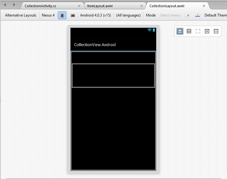
From the designer’s view, the CollectionLayout looks like the following:
and here’s the contents for ItemLayout.axml:
|
1 2 3 4 5 6 7 8 9 10 11 12 13 14 15 16 17 18 19 20 21 22 23 24 25 26 27 28 29 30 31 32 |
<?xml version="1.0" encoding="utf-8"?> <LinearLayout xmlns:android="http://schemas.android.com/apk/res/android" android:orientation="vertical" android:layout_width="fill_parent" android:layout_height="fill_parent" android:minWidth="25px" android:minHeight="25px" android:background="#CC2368C0" android:gravity="center_horizontal"> <LinearLayout android:orientation="vertical" android:layout_width="100dp" android:layout_height="100dp" android:id="@+id/linearLayout1" android:gravity="center_horizontal|center_vertical"> <ImageView android:src="@android:drawable/ic_menu_gallery" android:scaleType="centerCrop" android:adjustViewBounds="true" android:layout_width="wrap_content" android:layout_height="50dp" android:id="@+id/ImageView" /> </LinearLayout> <TextView android:text="Medium Text" android:textAppearance="?android:attr/textAppearanceMedium" android:layout_width="match_parent" android:layout_height="wrap_content" android:layout_marginBottom="20dp" android:id="@+id/TextLabel" android:gravity="center_horizontal" /> </LinearLayout> |
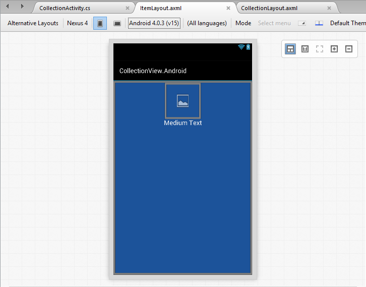
From the designer’s view, it looks like this:
In summary, what I do in CollectionLayout.axml is setting the background for the page, add a header, and provide enough spacing between GridView items. The most important things to note is I’ve defined the GridView id, @+id/GridView. The will be the reference that we defined in BindingProvider to the property in ViewModel, so make sure the id name is right!
We will be doing a similar task with ItemLayout.axml, where we assign both ImageView to the Image Property in ViewModel and TextView to Title Property in ViewModel. By default, Crosslight provides two built-in ids for showing an image and a text for item template, which has the name ImageView and TextLabel respectively. But if you want to add additional view elements to the item template, then you can simply add a new binding definition in the binding provider like this which must be done in BindingProvider:
|
1 |
itemBinding.AddBinding ("CustomView", BindableProperties.TextProperty, "Title"); |
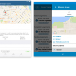
Run the project. You should get a result similar to the following:
Next, let’s create the iOS version.
Designing iOS CollectionView
Similar to Android, building CollectionView on iOS follows a pretty similar path:
- Create a ViewController for MainCollectionView.
- Create the cell and the header.
- Set the outlets.
Let’s start from the ViewController. Add a new item using Crosslight iOS Collection View Controller template and put it inside your CollectionView.iOS/ViewControllers folder and name it MainCollectionView.cs.
This is the code for the ViewController.
|
1 2 3 4 5 6 7 8 9 10 11 12 13 14 15 16 17 18 19 20 21 22 23 24 25 26 27 28 29 30 31 32 33 34 35 36 37 38 39 40 41 42 43 44 45 46 47 48 49 50 51 52 53 54 55 56 57 58 59 |
using CollectionView.ViewModels; using CollectionView; using Intersoft.Crosslight; using Intersoft.Crosslight.iOS; using Foundation; using UIKit; namespace CollectionView.iOS { [Register ("MainCollectionView")] [ImportBinding (typeof(CollectionBindingProvider))] public class MainCollectionView : UICollectionViewController { #region Constructors public MainCollectionView () : base ("MainCollectionView", null) { } #endregion #region Properties public override UIViewTemplate CellTemplate { get { return new UIViewTemplate (CollectionViewCell.Nib); } } public override CollectionViewInteraction InteractionMode { get { return CollectionViewInteraction.Navigation; } } public override bool ShowSectionHeader { get { return true; } } public override UIViewTemplate SectionHeaderTemplate { get { return new UIViewTemplate(CollectionHeader.Nib); } } #endregion #region Methods protected override void InitializeView () { base.InitializeView (); this.NavigationItem.Title = "Home"; UIImageView backView = new UIImageView(UIImage.FromFile ("CrosstransBg.png")); backView.ContentMode = UIViewContentMode.ScaleAspectFill; this.CollectionView.BackgroundView = backView; // Register Views this.RegisterViewIdentifier ("GridView", this.CollectionView); } #endregion } } |
Let’s take a look at some of the overridden methods and properties.
- CellTemplate: This property is the equivalent of Android’s ItemLayoutID, which will define the view to be used as navigation item inside the Collection View.
- InteractionMode: This method is the equivalent of Android’s ListViewInteraction, that defines the interaction when users tap on the navigation item.
- SectionHeader & SectionHeaderTemplate: It will be used to specify the header for the Collection View.
- InitializeView: This method is called when the view is initialized. Here, we set the background view of the Collection View. Afterward, this.RegisterViewIdentifier (“GridView”, this.CollectionView); is used to associate the Collection View with the GridView view identifier to be used by the Binding Provider.
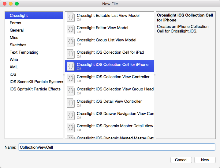
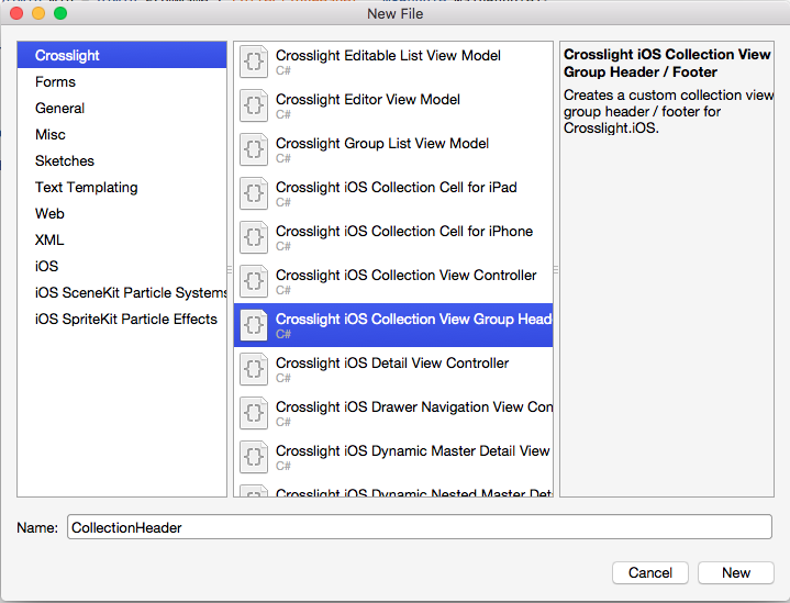
Now your view controller is done! Next, we’ll create the CollectionView Header and Cells. Inside your CollectionView.iOS/Views, add 2 new items: Crosslight iOS Collection Cell, we will name it CollectionViewCell.cs (feel free to choose between iPhone or iPad) and Crosslight iOS Collection View Group Header which we will name it CollectionHeader.cs.
If you check back your MainCollectionView.cs, you can see that both CollectionViewCell.Nib & CollectionHeader.Nib are now detected. The Nib represents both .cs files that we’ve created before. However, we won’t touch any codes, instead we will play around with the layout using iOS XCode.
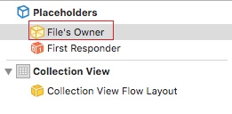
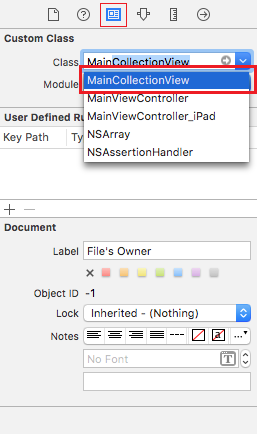
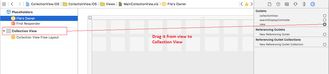
Let’s first open the MainCollectionView.xib inside your CollectionView.iOS/Views using Apple XCode. Inside the Document Outline, you can select File’s Owner, then the Identity Inspector will change according to what you selected. Specify the Custom Class as MainCollectionView.
Using the Connections Inspector, control + drag the view from Outlets to the Collection View to set the outlet, as shown in the following illustration.
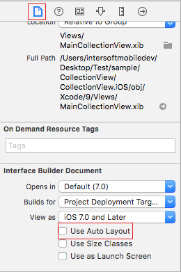
Then, in the File Inspector, turn off Auto Layout.
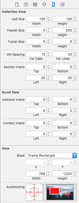
In the Size Inspector, specify the cell’s width and height, also adjusting the auto-resizing behaviors so that it will layout nicely when the device is rotated.
Now you are done configuring your MainCollectionView.xib.
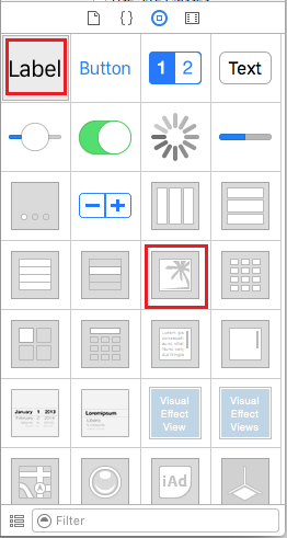
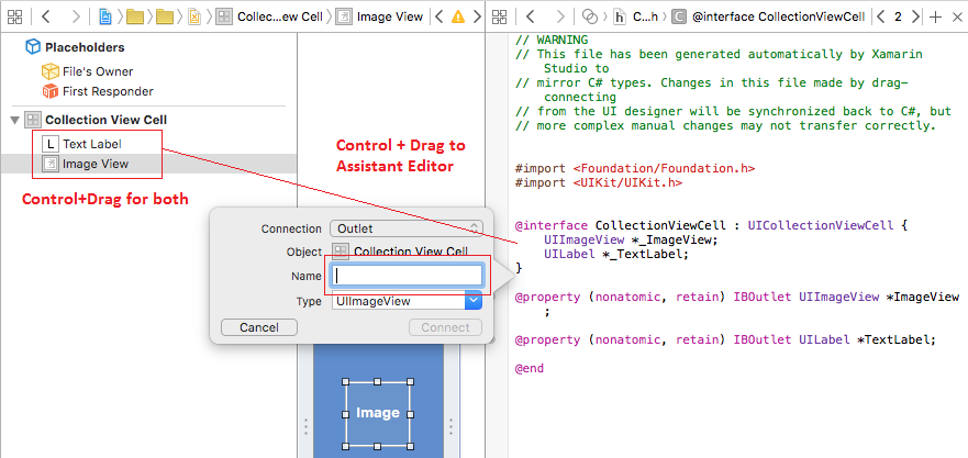
Let’s continue to CollectionViewCell.xib, in this case, you don’t need to worry about your File’s Owner, Simply drag and drop a Label and ImageView from the Object Library to the view.
Select your Label (or anything in your designer interface), Press the conjoined circle button on the right top. A panel with codes will appear, this is the Assistant Editor which will help you create Binding without having you to code anything.
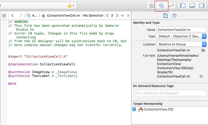
Next, let’s set the outlets using the Assistant Editor. Select your CollectionViewCell.m and change it to CollectionViewCell.h, control + drag your Label into the panel and give it TextLabel as a name, then set the ImageView outlet with the name of ImageView.
You need to turn off the auto layout from both image, label, and their parent to use auto resizing. Here’s what I’ve done to each of them:
- View: Change the background color, turn on the horizontal and vertical scaling so that it won’t grow or shrink when the display rotates.
- TextLabel: Change the alignment to the middle, Pin it to the bottom using auto resizing and change the width to 120 and height to 50
- ImageView: Change the view mode to Aspect fit, turn on the horizontal and vertical arrow inside auto-resizing, and changes the width and height to 60
In CollectionHeader.xib, what we do is just drag and drop an ImageView. Here are the settings for ImageView:
- Change the image with CrosstransLogo.png,
- View Mode to Aspect Fit,
- Width = 150,
- Turn on the horizontal and vertical arrow inside auto resizing
Here is the result:
Your app is pretty much done, but we still ned to capture what user has selected.
Capturing Selection
In this section, we’ll learn how to capture selection made when the user taps on any of the navigation items.
If you recall earlier, we’ve defined how our CollectionView should navigate, which is done in our BindingProvider in the NavigateMemberPath inside using ItemBindingDescription.
|
1 2 3 4 5 6 |
ItemBindingDescription itemBinding = new ItemBindingDescription { DisplayMemberPath = "Title", ImageMemberPath = "Image", NavigateMemberPath = "Target" }; |
As you are aware, each MemberPath represents the component of our menu. In fact, it also contains the whole data associated with the specific Item you choose from the list that you have created in your ViewModel back then.
|
1 2 3 4 5 6 7 8 9 10 11 |
public CollectionViewModel() { List items = new List(); items.Add(new NavigationItem("Ride", typeof(SimpleViewModel)) { Image = "CrosstransRide.png" }); items.Add(new NavigationItem("Delivery", typeof(SimpleViewModel)) { Image = "CrosstransDeliver.png" }); items.Add(new NavigationItem("Food", typeof(SimpleViewModel)) { Image = "CrosstransFood.png" }); items.Add(new NavigationItem("Shop", typeof(SimpleViewModel)) { Image = "CrosstransShop.png" }); this.SourceItems = items; } |
BindingProvider will obtain the target of your navigation, represented by typeof(SimpleViewModel)). However even though we already successfully navigate, in our case each of our Item have the same Navigation target. What if we want to know which item/menu is selected? Here is how:
When you navigate to a new ViewModel, the Navigated method is called in the target ViewModel, and it contains the sender value which holds the information of the caller ViewModel. For the simplicity of this tutorial, we’ll change the SimpleViewModel to handle user input. Let’s change our SimpleViewModel.cs (CollectionView.Core/ViewModels folder):
|
1 2 3 4 5 6 7 8 9 10 11 12 13 14 15 16 17 18 19 20 21 22 23 24 25 26 27 28 29 30 31 32 33 34 35 36 37 38 39 40 41 42 43 44 45 46 47 48 49 50 51 52 53 54 55 56 57 58 59 60 61 62 63 64 65 66 67 68 69 70 71 72 73 74 75 76 77 78 79 80 81 82 83 84 85 86 87 88 89 90 91 92 93 94 95 96 97 98 99 100 |
using Intersoft.Crosslight; using Intersoft.Crosslight.Input; using Intersoft.Crosslight.ViewModels; namespace CollectionView.ViewModels { public class SimpleViewModel : ViewModelBase { #region Fields private string _footerText; private string _greetingText; private string _newText; #endregion #region Properties public string FooterText { get { return _footerText; } set { if (_footerText != value) { _footerText = value; OnPropertyChanged("FooterText"); } } } public string GreetingText { get { return _greetingText; } set { if (_greetingText != value) { _greetingText = value; OnPropertyChanged("GreetingText"); } } } public string NewText { get { return _newText; } set { if (_newText != value) { _newText = value; OnPropertyChanged("NewText"); } } } public DelegateCommand ShowToastCommand { get; set; } #endregion #region Constructors public SimpleViewModel() { IApplicationContext context = this.GetService().GetContext(); if (context.Platform.OperatingSystem == OSKind.Android) this.GreetingText = "Hello Android from Crosslight!"; else if (context.Platform.OperatingSystem == OSKind.WinPhone) this.GreetingText = "Hello WinPhone from Crosslight!"; else if (context.Platform.OperatingSystem == OSKind.WinRT) this.GreetingText = "Hello WinRT from Crosslight!"; else if (context.Platform.OperatingSystem == OSKind.iOS) this.GreetingText = "Hello iOS from Crosslight!"; this.FooterText = "Powered by Crosslight®"; this.ShowToastCommand = new DelegateCommand(ShowToast); } #endregion #region Methods public override void Navigated (NavigatedParameter parameter) { if (parameter.Sender is CollectionViewModel) { this.ToastPresenter.Show("You are choosing: " + (parameter.Sender as CollectionViewModel).SelectedItem.Title); } } private void ShowToast(object parameter) { this.ToastPresenter.Show("You entered: " + this.NewText); this.GreetingText = this.NewText; } #endregion } } |
The menu that user chooses will be represented by SelectedItem and there are two things to note here: SelectedItem actually obtained from the sender ViewModel which is from CollectionViewModel.cs and SelectedItem actually the default property provided from CollectionViewModel implementing the ListViewModelBase. In this case, we will show a toast presenter to indicate which menu the user has chosen, by obtaining the Title of SelectedItem and show it using Toast Presenter.
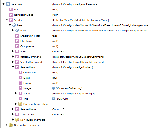
Also, If you put a breakpoint in the highlighted line above and inspect the NavigatedParameter, you can see from the shot below that it holds lots of information not only the SelectedItem but the whole CollectionViewModel.
You will use this neat trick to accomplish a lot of cool things using Crosslight, so don’t forget to save this favourite this blog for later uses. Okay, now let’s run our project!
Wait… should we also change the Android and iOS? No need at all using Crosslight you only need to change it in Core and it will be applied to each platform, very convenient! Here is the result:
Wrapping Up
With Crosslight, you will never have to worry about the code behind the scene. However, in this session, I want to emphasize the customizability of Crosslight, using minimal effort and codes we already successfully create a simple and gorgeous navigation menu. I believe the next steps for you is to discover more about Crosslight features and we still have more tutorials coming in the futures! So stay tuned with us and have fun!
You can find the source code for this post here: http://git.intersoftsolutions.com/projects/CT/repos/crosslightcollectionview/browse
See you in the next post,
Arief Handany

There are missing images from the early parts of this article. If those missing screens are significant, it might be worth the time updating. Otherwise, just remove it cause it’s kinda annoying looking into a blank space without any use. Plus it is uncomfortable scrolling up and down just to skip those parts. Thanks!