Creating Dockable View for iOS and Android
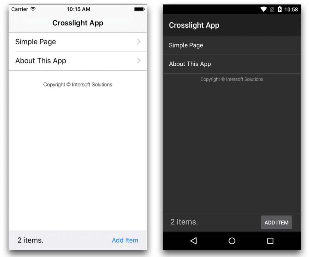
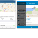
In my previous post, I’ve shown you how to use a header and footer with custom views in a list/table view. Now, what if I want to show a dockable view at the bottom of the screen? Let’s take the previous sample a bit further to look like the following.
Starting off
To start off, I’ll just copy off the previous sample. If you haven’t read the previous post on how to provide header and footer to your TableView / ListView, it is highly recommended for you to do so before continuing.
If you have done so, let’s move on.
Creating dockable view on iOS
To create the dockable view on iOS, you’ll need to do the following:
- Preparing custom table root view
- Modifying the View
- Modifying the View Controller
Preparing custom table root view
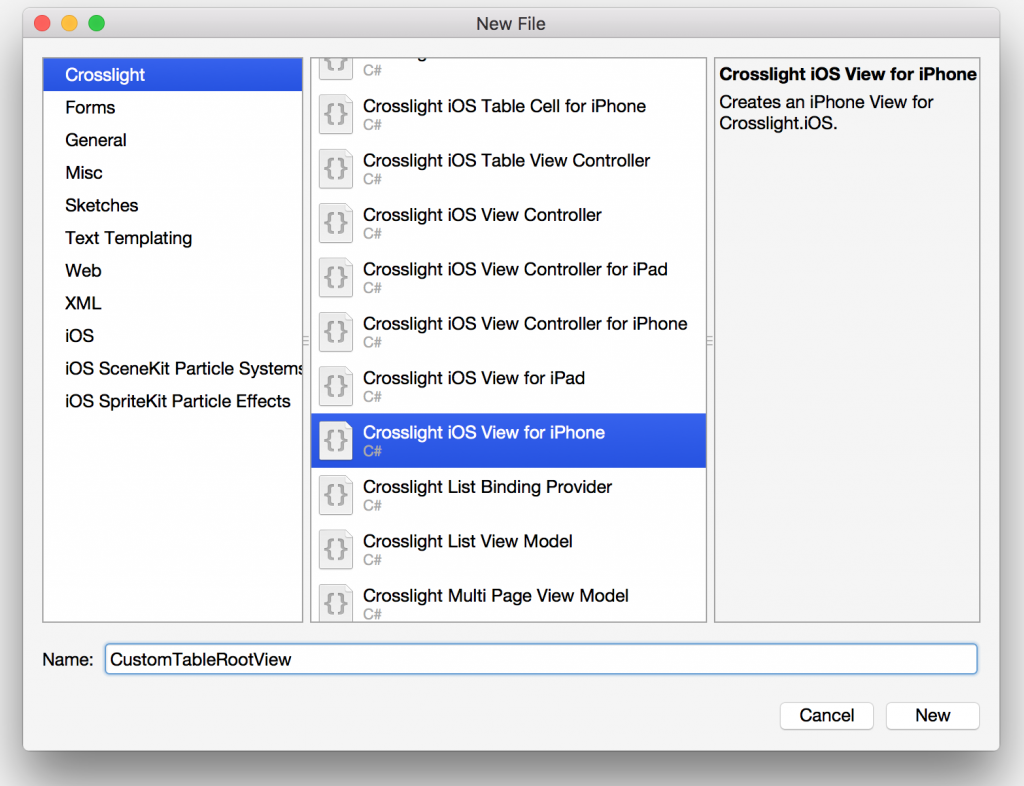
To provide the custom table root view, you’ll need to create a new Crosslight iOS View for iPhone, which is accessible from the Item Templates, available after you’ve successfully installed Crosslight.
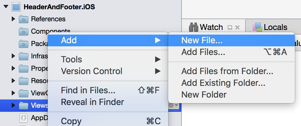
Right click on the Views in HeaderAndFooter.iOS/Views folder and select Add, New Item.
Then choose, Crosslight iOS View for iPhone. Give it a name of CustomTableRootView.
First, let’s try to create a the custom table root view. Open the CustomTableRootView.xib in Xcode Interface Builder.
Adding the Docked View
Drag a new View from the Object library, set the outlet as DockedView, and provide the following constraints:
- Horizontal Space Constraint: from Superview.Trailing equal to the View.Trailing with the following values.
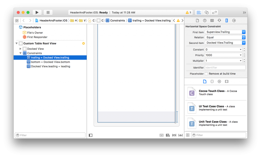
- Vertical Space Constraint: from Superview.Bottom equal to the View.Bottom with the following values.
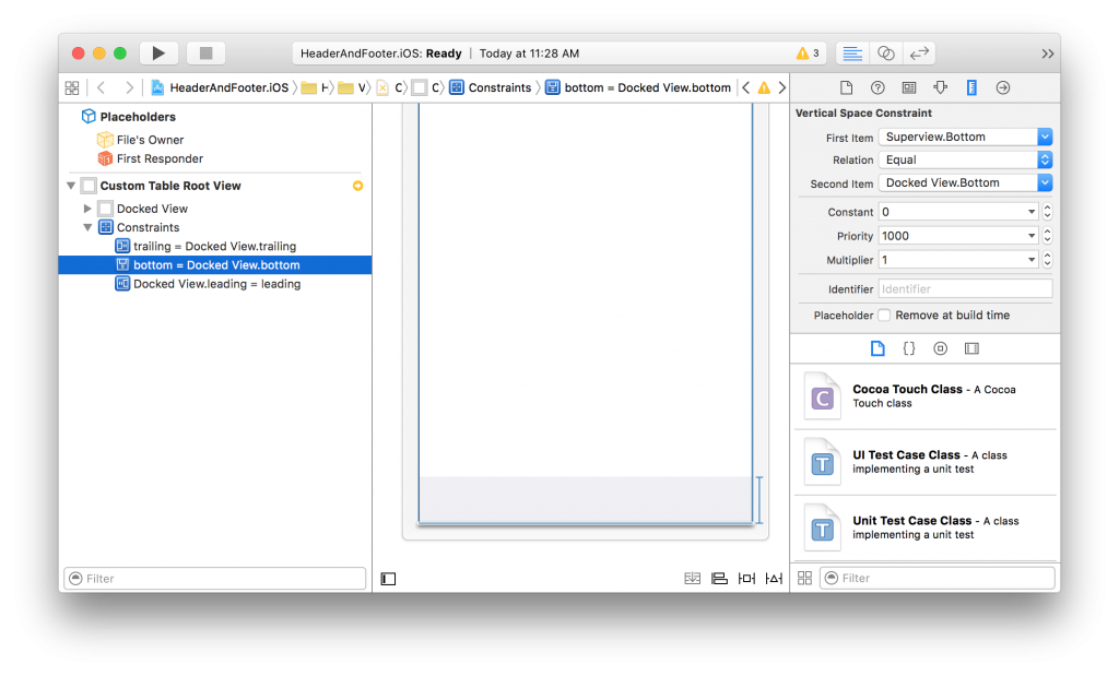
- Horizontal Space Constraint: from DockedView.Leading equal to the Superview.Leading with the following values.
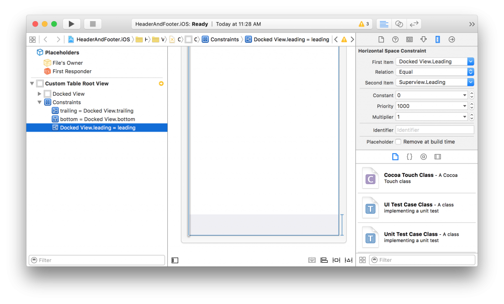
Now that the docked view is ready, let’s drag a Label, set the outlet as TxtHeader, and drag a button, set the outlet as BthHeader. Both of them are given the previous outlet names, so that no code changes will be required in the BindingProvider side. If you wish, you can set the following constraints:
- Give the DockedView a height of 45.
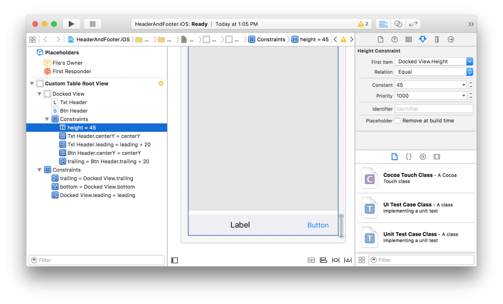
- Vertically align the label as well as the button.
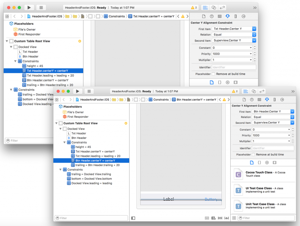
- Give an inner padding of 20.
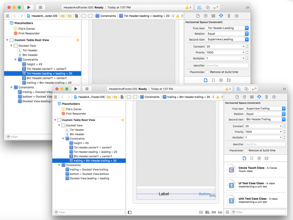
That’s pretty much it. Let’s modify the View a bit.
Modifying the View
Let’s open the CustomTableRootView.cs and modify that a bit by adding a new ResizeTableView method.
|
1 2 3 4 5 6 7 8 9 10 11 12 13 14 15 16 17 18 19 20 21 22 23 24 25 26 27 28 29 30 31 32 33 34 35 36 37 38 39 40 41 42 |
using System; using System.Drawing; using System.Linq; using CoreGraphics; using Foundation; using UIKit; namespace HeaderAndFooter.iOS { public partial class CustomTableRootView : UIView { #region Constructors public CustomTableRootView(IntPtr handle) : base(handle) { } #endregion #region Fields public static readonly UINib Nib = UINib.FromName("CustomTableRootView", NSBundle.MainBundle); #endregion #region Methods public static CustomTableRootView Create() { return (CustomTableRootView) Nib.Instantiate(null, null)[0]; } internal void ResizeTableView(nfloat top) { var tableView = this.Subviews.FirstOrDefault(o => o is UITableView); tableView.Frame = new CGRect(0, top, tableView.Bounds.Width, this.Bounds.Height - top - this.DockedView.Bounds.Height); } #endregion } } |
Here, we prepare a handy method to resize the table view when the view is used, called ResizeTableView. By calling this method, the TableView that contains this dock view will have its bounds re-adjusted. This is done so that the scrolling container in the TableView does not exceed the docked view. Take a closer a look at the contents of the method.
In line 36, we first search for the TableView that is added as a subview of the ViewController. In line 37, we set a new bounds for it, not changing the width at all, but just by adjusting the height by taking account the DockedView.Bounds.Height as well.
Modifying the View Controller
Next, open up the MainViewController.cs. Here’s the contents.
|
1 2 3 4 5 6 7 8 9 10 11 12 13 14 15 16 17 18 19 20 21 22 23 24 25 26 27 28 29 30 31 32 33 34 35 36 37 38 39 40 41 42 43 44 45 46 47 48 49 50 51 52 53 54 55 56 57 58 59 60 61 62 63 64 65 66 67 68 |
using CoreGraphics; using Foundation; using HeaderAndFooter.ViewModels; using Intersoft.Crosslight; using Intersoft.Crosslight.iOS; using UIKit; namespace HeaderAndFooter.iOS.ViewControllers { [Register("MainViewController")] [ImportBinding(typeof(MainBindingProvider))] public class MainViewController : UITableViewController<MainViewModel> { #region Properties public override UIViewTemplate FooterViewTemplate { get { return new UIViewTemplate(CustomFooter.Nib); } } public override TableViewInteraction InteractionMode { get { return TableViewInteraction.Navigation; } } public override bool ShowGroupHeader { get { return false; } } public override UITableViewStyle TableViewStyle { get { return UITableViewStyle.Plain; } } public override bool UseCustomRootView { get { return true; } } #endregion #region Methods protected override void InitializeView() { base.InitializeView(); // set navigation title this.NavigationItem.Title = "Crosslight App"; } protected override UIView GetCustomRootView() { return CustomTableRootView.Create(); } public override void ViewWillLayoutSubviews() { base.ViewWillLayoutSubviews(); // adjust tableview frame based on top layout guide ((CustomTableRootView)this.View).ResizeTableView(this.TopLayoutGuide.Length); } #endregion } } |
Here, we removed the overridden property for HeaderViewTemplate, since we’re going to use the new DockedView to replace the header. Therefore, we then override a new property called UseCustomRootView and return true.
After we’ve done that, we then override the GetCustomRootView() method to return the CustomTableRootView that we’ve just created by calling CustomTableRootView.Create();
The custom root view is one of the unique features introduced in Crosslight’s advanced UITableViewController. It allows you to easily replace the root view with a custom one with just a few property sets, while still retaining the developer experience and automatic binding feature. In the case above, when UseCustomRootView is returning a true value, the GetCustomRootView method will be automatically called when the controller is initializing.
Lastly, we override the ViewWillLayoutSubviews method. This method is called when a new subview is added to the ViewController, which can be done at any time, whether during ViewController creation or programmatically adding a subview at runtime, therefore, when the DockedView is added, we then call our handy method to resize the TableView so that the scrolling container wouldn’t “bleed” past the DockedView.
That’s it. Run the project and you should get the result similar to the following video.
Creating dockable view on Android
Now that we’ve finished the iOS version, let’s create the Android version. To create the docakble view on Android, you’ll need to complete the following:
- Preparing custom layout
- Replacing the content layout in Activity
Preparing custom layout
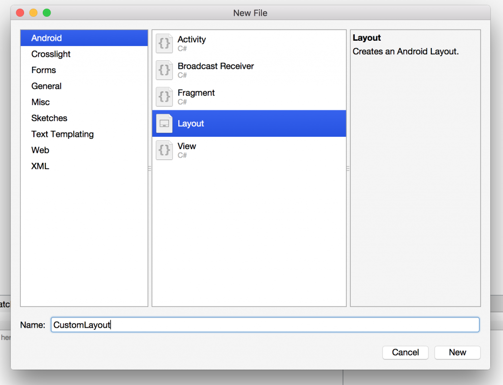
First things first, let’s create a new Android Layout, and let’s name it CustomLayout.axml. To do this, right click on the HeaderAndFooter.Android/Resources/layout folder.
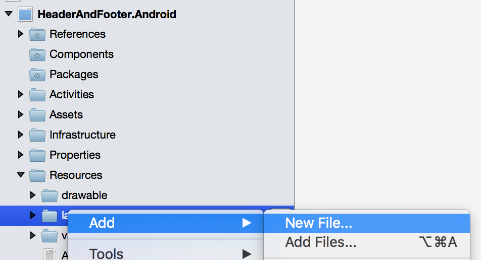
Select Add, New Item. Under Android, select Layout.
Provide the layout for the CustomLayout.axml as follows.
|
1 2 3 4 5 6 7 8 9 10 11 12 13 14 15 16 17 18 19 20 21 22 23 24 25 26 27 28 29 30 31 32 33 34 35 36 37 38 39 |
<?xml version="1.0" encoding="utf-8"?> <RelativeLayout xmlns:android="http://schemas.android.com/apk/res/android" android:layout_width="match_parent" android:layout_height="match_parent"> <LinearLayout android:id="@+id/Footer" android:layout_width="fill_parent" android:layout_height="wrap_content" android:layout_alignParentBottom="true" android:orientation="vertical"> <LinearLayout android:layout_width="fill_parent" android:layout_height="1px" android:background="#f2f2f2" /> <LinearLayout android:layout_width="fill_parent" android:layout_height="wrap_content" android:orientation="horizontal" android:paddingLeft="20dp" android:paddingRight="20dp"> <TextView android:id="@+id/TxtHeader" android:layout_width="fill_parent" android:layout_height="30dp" android:layout_weight="1" android:gravity="left" android:textSize="20sp" /> <Button android:id="@+id/BtnHeader" android:layout_width="wrap_content" android:layout_height="wrap_content" /> </LinearLayout> </LinearLayout> <ListView android:id="@android:id/list" android:layout_width="fill_parent" android:layout_height="fill_parent" android:layout_above="@id/Footer" /> </RelativeLayout> |
Let’s take a closer look. Here, we’ve used a RelativeLayout as the root ViewGroup and we’ve added 2 major elements to the RelativeLayout, which is a LinearLayout that will act as our DockedView and ListView.
At a glance, you might be wondering why the ListView is defined after the LinearLayout. This is purely for build purposes. The XML parser parses the text from top to bottom. Since in the ListView, we’ve defined android:layout_above=“@id/Footer”, the build will fail if the LinearLayout is not defined beforehand. Hence, the ListView is defined after the LinearLayout.
One important thing to notice that the ListView’s id is set to @android:id/list. This conforms the standard method to override the built-in ListActivity’s layout in native Android development itself. For more information on that topic, click here. This is done because in the ListActivity class, you can reference the ListView as simply as calling this.ListView, however since you’ve overridden the whole layout, then the ListView must be re-referenced this way so that the Android understands. Everything else is just standard Android layouting process.
Replacing the content layout in Activity
After the layout is prepared, let’s modify some codes in the Activity. Open up MainActivity.cs inside HeaderAndFooter.Android/Activities folder and see the contents as follows.
|
1 2 3 4 5 6 7 8 9 10 11 12 13 14 15 16 17 18 19 20 21 22 23 24 25 26 27 28 29 30 31 32 33 34 35 36 37 38 39 40 41 42 |
using Android.App; using HeaderAndFooter.ViewModels; using Intersoft.Crosslight; using Intersoft.Crosslight.Android; namespace HeaderAndFooter.Android { [Activity(Label = "Crosslight App", Icon = "@drawable/icon")] [ImportBinding(typeof(MainBindingProvider))] public class MainActivity : ListActivity<MainViewModel> { #region Properties protected override int ContentLayoutId { get { return Resource.Layout.CustomLayout; } } protected override int FooterLayoutId { get { return Resource.Layout.CustomFooter; } } public override ListViewInteraction InteractionMode { get { return ListViewInteraction.Navigation; } } #endregion #region Methods protected override void InitializeView() { base.InitializeView(); this.RegisterViewIdentifier("TableView", this.ListView); } #endregion } } |
In the ContentLayoutId property, we’ve replaced the old layout to the new CustomLayout that we’ve created earlier and we’ve also removed the HeaderLayoutId. You’ve completed the Android version. Let’s run this project and you should get the result similar to the following.
Wrapping Up
You’ve seen how easy and elegant it is to provide a dockable view to your table view on iOS as well as list view on Android. Achieving the same task without Crosslight would be really tedious and time consuming. The dockable view also comes with automatic binding support, so you can take advantage of native binding process with whatever layout you have. Nice and simple.
You can find the code to the sample here:
http://git.intersoftsolutions.com/projects/CT/repos/crosslightdockableview/browse. To use this sample, you’ll need at least Crosslight build 4.0.5000.323 and above.
See you in the next post,
Nicholas Lie
