UXGridView RC Adds MVVM Data Exporting, Multi Aggregates, Selectors, and more
After going through a series of technology preview releases, UXGridView is finally topping off with the complete feature sets. Today, I’m excited to announce the immediate availability of UXGridView Release Candidate.
In case you missed the stories, UXGridView is Intersoft’s brand-new data grid built to handle the most demanding line-of-business development requirements – from server-side paging and filtering support, data editing and validation, batch update to data aggregates and data exporting. Each feature is thoughtfully engineered to work best with MVVM pattern implementation. UXGridView runs on both Silverlight and WPF with single identical markups. Learn more about UXGridView here.
In this post, I will share the key highlights of the new features implemented in the UXGridView RC. As defined in the roadmap that I posted in my blog post, the RC milestone will include advanced data-centric features such as data exporting, row virtualization improvements, multi aggregates, custom grouping logics, and a bunch of style selectors and template selectors.
Data Exporting the MVVM-way
In the previous CTPs, you have learned how UXGridView handles real-world data access scenarios like paging, filtering, data validation and editing – all implemented entirely with MVVM design pattern. In this RC release, UXGridView adds data exporting capability which you can implement using the solid MVVM pattern. Unlike other grids, the data exporting in UXGridView supports both server-side and client-side mode. The most advanced mode is the server-side data exporting which allows you to export all rows in the data source even though the UXGridView is paged.
Just because UXGridView supports displaying millions of rows, that doesn’t mean you should. In real-world scenarios, most users browse and look only for a piece of data at a time. So in most cases, you would enable the server-side paging in the UXGridView so it loads only a subset of data at a time. For instances, a Grid with the page size set to 20 will load only 20 rows per page. The data exporting, quite the opposite, requires all data to be fetched before the exporting can execute. That’s one of the key challenges that we managed to address in UXGridView, enabling data exporting to work in harmony with the server paging and other features using the MVVM pattern implementation.
To handle the server-side data operation consistently, we built the data exporting upon the same key component that powers the server paging and filtering, the QueryDescriptor. Perhaps you still recall, QueryDescriptor encapsulates the query definitions which consisted of FilterDescriptors, SortDescriptors and PageDescriptor. That’s just perfect because we can simply use the existing instance of the QueryDescriptor in the ViewModel, and perform re-query that doesn’t include the paging descriptor. If you need a refresh on QueryDescriptor, please head to Data-access the MVVM-way.
The best way to handle the data exporting using MVVM is to implement a DelegateCommand in the ViewModel and bind it to the ExportCommand, a new command property introduced in the RC release. In the Executed handler, you call a server query that returns complete data, and finally pass it to the collection in the ViewModel which is bound to the ExportItems property of UXGridView. Take a look at the following code snippet to learn how it’s done.
|
1 2 3 4 5 6 7 8 9 10 11 12 13 14 15 16 17 18 19 20 21 22 23 24 25 26 27 28 29 30 31 32 33 34 35 36 37 38 39 40 |
public class ServerExportingViewModel : ServerSideOperationViewModel { public ServerExportingViewModel() : base() { this.CanUserExport = true; this.ExportCommand = new DelegateCommand(ExecuteExportCommand); } public void ExecuteExportCommand(object parameter) { QueryDescriptor <strong>exportQueryDescriptor</strong> = this.QueryDescriptor.<strong>CreateCopy</strong>(true, true, false); this.ProductsSource.GetData ( <strong>exportQueryDescriptor</strong>, (products) => { PagedCollectionView current = this.Products as PagedCollectionView; PagedCollectionView exportedItems = new PagedCollectionView(products); exportedItems.<strong>CopyDefinitionsFrom</strong>(current, true, false, false, false); this.ExportItems = <strong>exportedItems</strong>; }, (totalItemCount) => { }, (error) => { } ); } } |
Quite simple and straightforward, isn’t it? Also notice that the QueryDescriptor now has a CreateCopy, a new time-saving method that returns a clone based on the given source and options. The most important point here is the flexibility that UXGridView offered since it gives you full control over how the data retrieval is done in the ViewModel.
4 Built-in Exporting Data Format
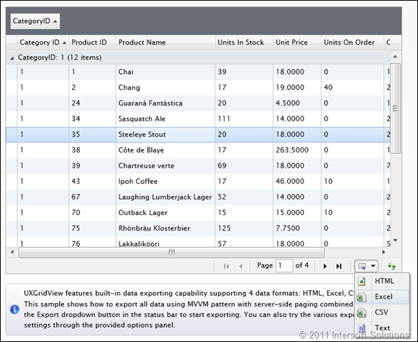
UXGridView allows you to export the data source into four data format – not only one, or two. Users have the choice to export data to HTML, Excel, CSV or just a plain text file. From the user interface perspective, all you need to do is to set the CanUserExport property to true. A tiny, stylish dropdown button will then appear in the status bar, next to the data pager. The available data format is listed in the menu when the dropdown button is clicked, such as shown below.
Although the user interface has been well predefined, they are fully customized thanks to the loosely-coupled UI architecture. For instances, you can change the dropdown button to a more stylish callout, or just a plain command button if you preferred.
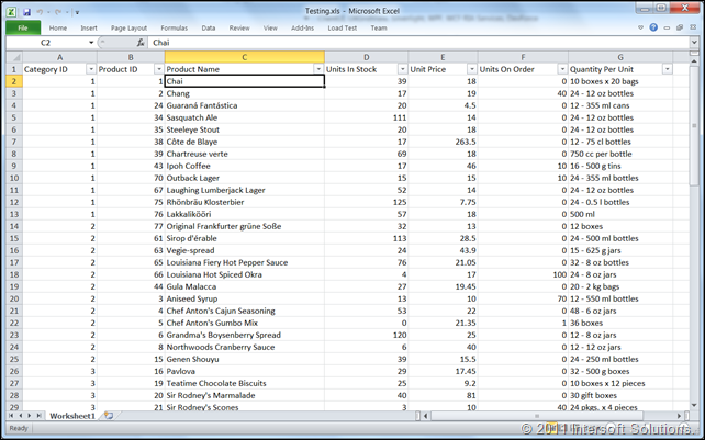
When the data exporting process completes, you’ll be prompted to save the results to your local computer. The following illustration shows the Excel spreadsheet that contains the exported results.
UXGridView also offers a number of exporting options such as whether to include column footers, column headers or the group footers in the exported results. For even more fine-grained HTML results, you can customize the style of each generated row and cell output through the ExportCssStyleSelector, another big plus for MVVM implementation!
Style and Template Selectors
UXGridView implements a wealth of style selectors and template selectors, giving the freedom you need to create rich data presentation the way you want. The selector pattern is a first-class MVVM citizen that enables you to write custom logics in a separate class instead of in the view level. You get two benefits immediately: greater reusability and cleaner implementation due to the view/code separation.
One of the most common scenarios, for instances, is to show discontinued products in a different background color, allowing users to quickly distinguish the useful information they need to work with. The following illustration shows the results of a RowStyleSelector implementation.
Another common scenario is to display different information based on specific conditions. For instances, showing a Reorder hyperlink button in the case that the products were out-of-stock. This can be done through an implementation of CellTemplateSelector, see the results below.
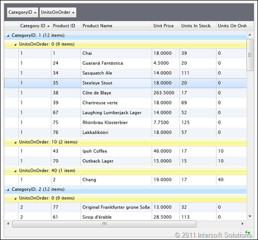
Or how about a more advanced scenario like applying a different background brush in the row header of each different group level? That’s also possible to be done through an implementation of RowGroupHeaderStyleSelector.
I hope the above illustrations give you a clear idea what the style and template selectors are all about.
To be more exact, UXGridView provides 13 selectors for the row, cell, column header, column footer and group elements. The complete list is as follows:
- Row Style Selector
- Row Template Selector
- Cell Style Selector
- Cell Template Selector
- Column Header Style Selector
- Column Header Template Selector
- Column Footer Style
- Column Footer Cell Style
- Column Footer Cell Template
- Row Details Template Selector
- Row Group Header Style Selector
- Row Group Footer Style
- Row Group Footer Cell Style
Note that the above selectors have not included the selectors of other elements such as editing and exporting.
Multi Aggregates
Another nice addition in the RC release is the support for multiple aggregates in both the column footer and group footer. It will be definitely useful for line-of-business applications, particularly in financial extensive applications. So here the feature is when you need it.
Custom Grouping
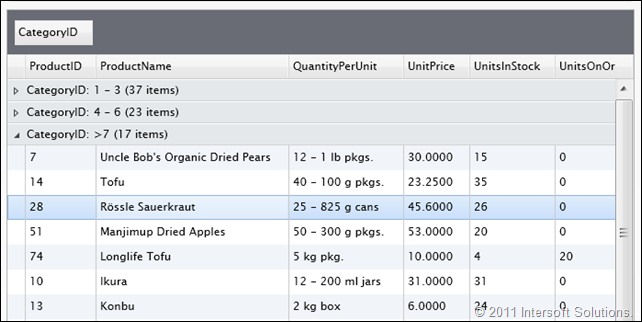
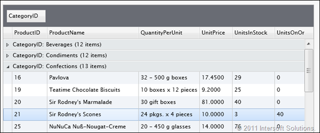
The RC release adds more powerful features allowing developers to fine-tuning the grouping results in UXGridView. While most competing grids used locked-down approaches, UXGridView is quite the opposite. You can now define your own custom groups by writing custom logics in a separate class which is then instantiated in the XAML and assigned to the GroupConverter property of the UXGridViewGroupDescriptor.
The sample in the following illustration groups the products data based on a range of CategoryID values.
Another popular scenario that can be achieved using the group converter is the value list capability where more meaningful information can be displayed in the group header instead of useless IDs, for instances, displaying the actual name of a category instead of the ID such as shown below.
Read-only Binding
Last but not least, among the top requested features is the read-only binding which we managed to ship in the RC release. With the read-only binding expression, you can write a custom logic that determines when a particular row or cell should be read-only (not editable).
UXGridView provides read-only binding at both the row and cell level. The read-only binding expression at row level, if returns true when evaluated, will supersede the read-only binding expression at the cell level. This means that if the read-only binding is specified at the row level and returns a true value, the entire row will no longer editable regardless of the value of the binding expression specified in the cells.
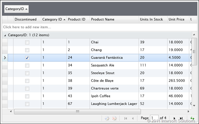
For examples, consider a scenario where discontinued products should be not editable. In such case, the IsReadOnlyBinding of the UXGridView is bound to the Discontinued property of the product entity. To prevent users to accidentally uncheck the Discontinued value, the same property can be bind to the IsReadOnlyBinding of the UXGridViewColumn. The binding expression at the UXGridView level applies to the rows, while the one at the UXGridViewColumn applies to the cells.
Luckily, the RC release shipped with an example based on the above scenarios. The following illustration shows the discontinued product which can no longer be edited.
WCF RIA SP1 Support
The UXGridView, UXDataPager and UXDataFilter controls in the RC release have been updated to support the recently released WCF RIA SP1. Most notable is the paging support for new data model returned in the children of the navigator properties. The data controls are also backward compatible with the previous WCF RIA.
Download the RC Bits
UXGridView Release Candidate includes complete feature sets and near-RTM quality, which means that you can start using UXGridView to build amazingly rich data-centric applications for the Silverlight and WPF platforms. As you have learned through the series of technology preview releases, each UXGridView feature is uniquely engineered to work best for many MVVM scenarios, making it the industry’s first and most advanced MVVM-ready data grid for the Silverlight and WPF development.
To summarize, the RC release adds a host of exciting new and essential features such as data exporting, style and template selectors, multi aggregates, and much more. We’ve also added many new samples that demonstrate real-world development scenarios such as using different sort member for value list and displaying an image in the cells. The RTM version will add a couple “extra” features, so stay tuned for the next announcement!
Click here to download the RC bits and test-drive the new UXGridView features today. The download package includes latest ClientUI assemblies as well as updated and new samples for both Silverlight and WPF platforms.
Please note that the UXGridView RC is the last public community release. The next milestone would be the UXGridView RTM release together with dozens of new members in ClientUI 5. For now, we’d love to hear what you think about the new features and enhancements available in the RC. Please post your feedback, questions or issues to our community forum.
Best,
Jimmy
Chief Software Architect






Would be excellent if grid also provides import from excel