UXGridView CTP3: Feature-complete Grid for Silverlight & WPF
I hope you’ve enjoyed the second CTP of our upcoming data controls released a couple weeks ago, which includes MVVM-ready data validation and data editing capabilities, as well as customizable editing control architecture. Make sure you also check out Andry’s blog posts covering the editing features in-depth here and here.
Today, I’m excited to announce the third CTP release of our forthcoming UXGridView control. The release includes the expected feature sets according to the CTP milestone described in my earlier post here, plus a handful of nice additions such as enhanced row details, new expander column, and a sophisticated Gmail-style column checker.
Some of the key highlights in this new CTP are discussed in the following.
QueryDescriptor Enhancement
The QueryDescriptor now includes RaiseQueryChanged() method, thanks to Werner Grift for the nice feedback in the LinkedIn group discussion. With the new method, you can programmatically raise the QueryChanged event in your ViewModel, such as when a related view has changed, or when the view needs to be refreshed due to user interaction like button click (called through the delegate command).
Improved Row Details and Hierarchical Grid
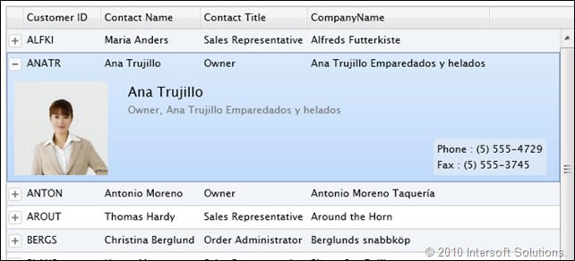
The row details feature receives major update in this new CTP release, which now works with the new expander column. The expander column contains a toggle button which is convenient for users to expand or collapse the row details at runtime, see the illustration below.
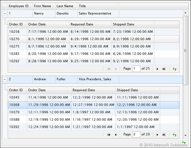
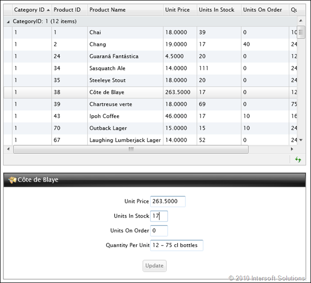
With the new expander column, it’s now possible to use the row details for more advanced business scenarios, for instances, implementing a hierarchical/nested grid such as in Customer-Orders scenario.
Another interesting scenario is the support to load the child data “on demand” based on the expanded item. UXGridView now includes a new property called ExpandedItem, making it possible for you to bind the child data on demand in the ViewModel. Both WCF RIA and DevForce samples are provided to demonstrate how to achieve such scenario.
Notice that the paging and other settings can be applied individually in the child grid for best performance and results.
New Select Column
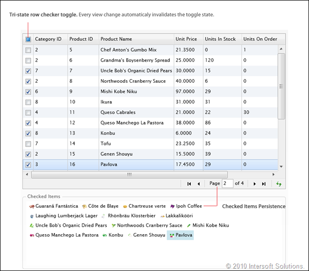
When I got the CTP build fresh from the lab, this particular new feature looks to be the most impressive. It’s one of my favorite features, and certainly deserves to be one of yours. Take a look at the screenshot below.
Although seems common, the select column feature is not available in any other Silverlight/WPF grids in the market – not the one with correct implementation.
The interesting point about this feature is its automatic checked items persistence capability. This means that if you check all the rows in page 1, then go to page 2, the previously checked items will remain persisted. This behavior also applies consistently in all the grid operations such as sorting and grouping. In the above example, we verified the persistence concept by binding the CheckedItems property to a list box which shows all the checked items regardless of the paged view scope.
With the feature correctly implemented along with the MVVM support, it will be useful in many scenarios in business applications – think of web-based mail applications such as Gmail or Hotmail for examples.
Deferred Scrolling Mode
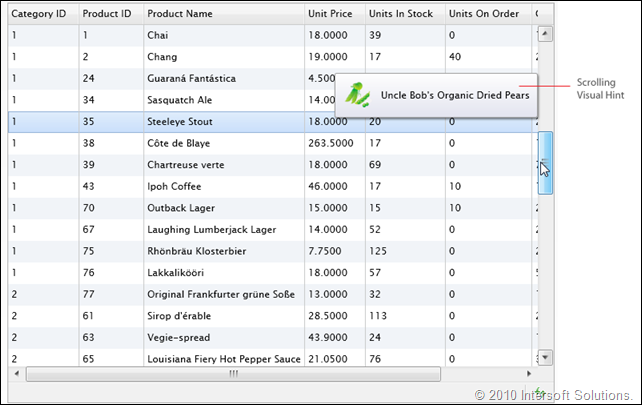
Another nice feature that we managed to include in this CTP release is the deferred scrolling mode. When enabled, dragging the thumb of the vertical scrollbar will not update the view immediately. Instead, an intuitive visual hint will appear near the scrollbar indicating the target row of the scroll position. See the screenshot below for details.
This scrolling mode is particularly useful when you have relatively large amount of rows, and also allowing users to quickly scan the information as they scroll through the viewport.
Standards-Compliant User Experiences
As in our good tradition of development, all Intersoft’s UI controls are designed with the best user experiences that conform to the ISO Standards 9241, including the focus and unfocused behavior, keyboard navigation using arrow keys, and many more.
In this new CTP release, the UXGridView now shows a dimmed focus visual style when the control doesn’t have focus. This enables users to intuitively responding to the user interface based on the visual state presented in the application. The following illustration shows the unfocused visual state of the UXGridView.
Download the CTP3 Bits
In summary, the CTP3 release includes nearly-complete feature sets of UXGridView planned for final release later this month. So far, the latest CTP includes full MVVM support for server data access, server paging and filtering, data validation, editing, customizable edit controls, row details, multiple selection, checker column, deferred scroll mode, flexible appearance and layout settings, and much more. The final release will include more advanced features such as data exporting, data virtualization, and an advanced column filter interface.
Click here to download the CTP3 bits and test-drive the new UXGridView features today. The download package includes latest ClientUI assemblies as well as updated and new samples for both Silverlight and WPF platforms.
Enjoy the new CTP bits! We’d love to hear what you think about the new features available in CTP3, please post your feedback, questions or issues to our community forum.
All the best,
Jimmy
