Create a Rich Silverlight Message Board using MVVM Pattern and WCF RIA Services
In the past several months, I’ve been actively blogging about our next-generation user interface library for the Silverlight and WPF development, which has just been RTM-ed three weeks ago. I hope you’ve enjoyed playing around with the new controls and exciting features that we delivered. In case you haven’t got your copy, click here to get started.
While we’ve shipped hundreds of great samples that you can learn, or experience directly online, you may have realized there wasn’t a single blog post yet that guides you through creating basic Silverlight application using the ClientUI controls from front-to-back. The reason for that is because we’re still in progress preparing a comprehensive set of learning resources for you. Eventually we will have around 40-50 new videos, walkthroughs, and how-to articles available by the next week or two at the latest. So, stay tuned for our announcement in this blog site.
Not too long after I posted my blog about Top 10 Must-See Samples last week, I received several emails from customers that asked for a quick walkthrough to use the ClientUI controls in a real-world scenario, that is, retrieving data from the server-side database via WCF RIA Services and apply MVVM pattern on the top of that!
At the same time, we were migrating the message board from an earlier version of our Silverlight demo (known as Sirius which is now discontinued and completely replaced with the new ClientUI Showcase) to the new ClientUI library. The new message board happened to use the MVVM pattern, and it connects to the database via WCF RIA Services too. Just perfect, that’s an ideal topic to be blogged about!
In this blog post, I will share the key techniques that we used to build a richer Silverlight message board using the ClientUI library. Instead of writing a lengthy walkthrough from the ground zero, this blog post will be more focused on the key challenges and common obstacles found while building rich user interface using MVVM pattern in the combination with WCF RIA Services, Entity Framework and Domain Service. So, to effectively follow this post, you’re required to have basic understanding in the MVVM pattern and WCF RIA Services at the minimum. To learn more about MVVM pattern, read my previous post MVVM Framework in Silverlight.
Setting The Goal
Before we delved deeper into the project discussion, it’s important to set the preliminary goals and objectives of the project – outlining the general features, modules, presentation pattern, data access and connectivity and the application pattern.
The message board project that we want to achieve using ClientUI was planned to have the following objectives:
- An elegant and clean user interface that emphasizes on ease-of-use and appealing experience.
- High performance and responsive UI. Load only initial chunk of data at first load, then allow users to load more data on demand.
- Customizable layout and appearance that is completely data-driven. I.e, callout style corresponds to the color that user selects.
- Data access and connectivity to server-side SQL database through WCF RIA Services.
- Use MVVM pattern for rapid and consistent application development.
- Use Entity Framework and Domain Service for data query and operation.
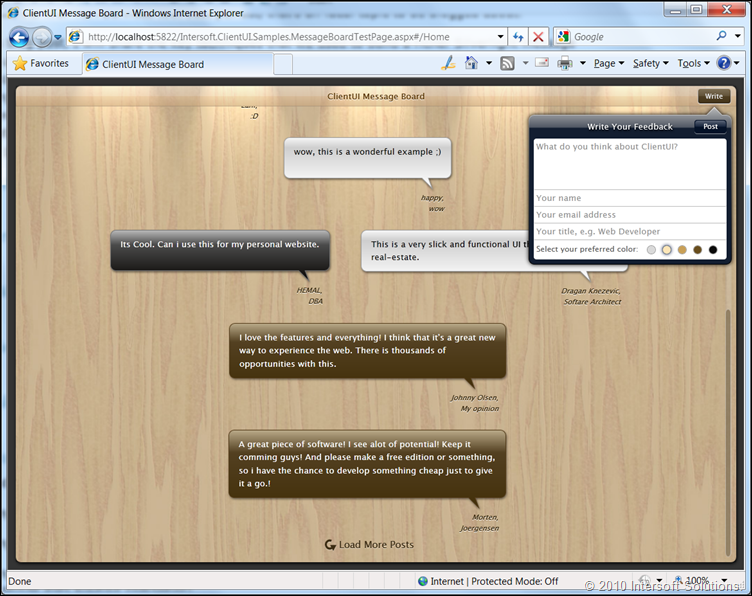
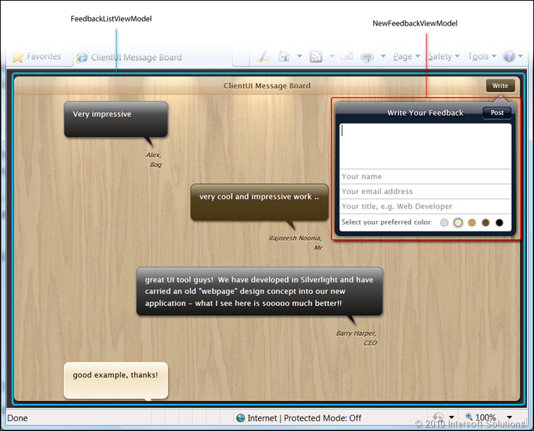
The following illustration shows the user interface and basic message board functionality that we want to achieve in this project.
Project Overview
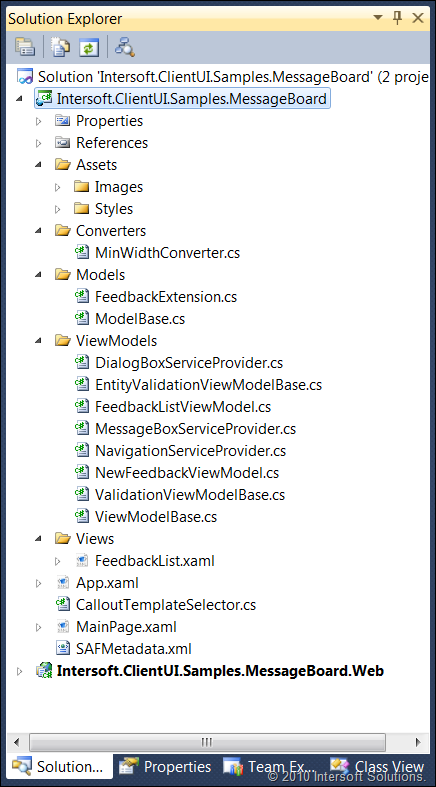
Our Silverlight message board project is consisted of two projects. The first is a Silverlight project that contains all the Silverlight assets, such as XAML, styles, converters, view models, and more. See the following illustration.
Some base classes such as the ModelBase, ViewModelBase and many of the ViewModels are already provided by the templates shipped in the ClientUI, thus makes it easier and faster for you to get started and work on the MVVM classes. This message board project itself is based on the Intersoft ClientUI MVVM Application Project Template.
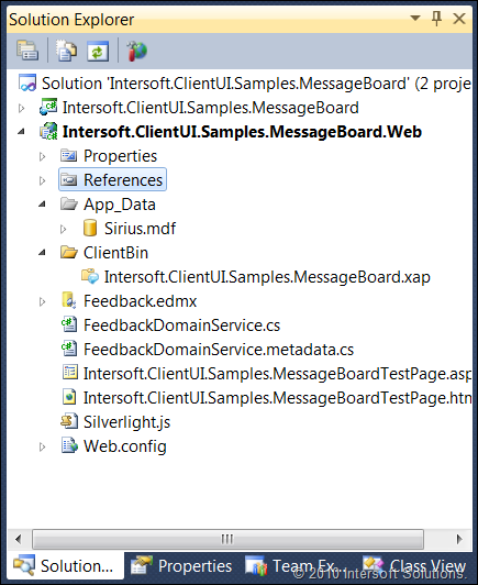
The other project is an ASP.NET Web Application project that contains server-side business object, entity framework, and data access layer to access the SQL database. The Web project is also used to host the Silverlight application which typically delivered in the form of XAP. See the following illustration.
UI (View) Challenges
One of the biggest advantages of modern client development – such as the Silverlight or WPF – is that it enables a complete separation on the application engineering process. Our team of designers and developers firstly agreed on the main layout, structure and the navigation part of the project – and then each division can work on the project in parallel, which means that designers can go on creating the styles and assets, while developers can go ahead with the codes, MVVM and other business requirements.
Many Silverlight projects that we built recently were significantly accelerated with the efficient collaboration process. Take this message board project as an example. When the designer team delivers the style assets, the overall UI can be dramatically transformed, from plain white to stunning wooden-warm look and feel, while did not affect any of the application features and behaviors being worked by the developers.
In this post, I won’t be covering the styling and beautifying process of the project. Let’s focus on the technical difficulties in the UI (View) part.
Building the Feedback Items List
In most app dev, you typically start with the data presentation part. In Silverlight, there are a number of presentation patterns that you can use to display a list of data, such as grid view, list box, items control and more. The items control is the most ideal presentation for this project as we wanted to show the list of messages in nicely arranged callouts which doesn’t require selection or other advanced features.
Using the user interface library that we have in ClientUI, we can quickly achieve our goal to display the feedback list using an UXItemsControl that contains a list of callouts. The ItemsPanel of the UXItemsControl can be flexibly changed to WrapPanel to provide automatic wrapping layout.
The implementation is quite straightforward, see the following XAML code snippet.
|
1 2 3 4 |
<span class="kwrd"><</span><span class="html">Intersoft:UXScrollViewer</span> <span class="attr">VerticalScrollBarVisibility</span><span class="kwrd">="Auto"</span><span class="kwrd">></span> <span class="kwrd"><</span><span class="html">Grid</span><span class="kwrd">></span> <span class="kwrd"><</span><span class="html">Intersoft:UXItemsControl</span> <span class="attr">HorizontalAlignment</span><span class="kwrd">="Center"</span> <span class="attr">MaxWidth</span><span class="kwrd">="1024"</span> <span class="attr">ItemsSource</span><span class="kwrd">="{Binding Path=Feedbacks}"</span><span class="kwrd">></span> |
|
1 2 3 4 5 |
<span class="kwrd"> </span> <span class="kwrd"><</span><span class="html">Intersoft:UXItemsControl.ItemsPanel</span><span class="kwrd">></span> <span class="kwrd"><</span><span class="html">ItemsPanelTemplate</span><span class="kwrd">></span> <span class="kwrd"><</span><span class="html">Intersoft:WrapPanel</span><span class="kwrd">/></span> <span class="kwrd"></</span><span class="html">ItemsPanelTemplate</span><span class="kwrd">></span> <span class="kwrd"></</span><span class="html">Intersoft:UXItemsControl.ItemsPanel</span><span class="kwrd">></span> |
|
1 |
<span class="kwrd"> </span> <span class="kwrd"><</span><span class="html">Intersoft:UXItemsControl.ItemTemplate</span><span class="kwrd">></span> |
|
1 2 |
<span class="kwrd"><</span><span class="html">StackPanel</span> <span class="attr">HorizontalAlignment</span><span class="kwrd">="Center"</span><span class="kwrd">></span> <span class="kwrd"><</span><span class="html">Intersoft:CallOut</span><span class="kwrd">></span> |
|
1 2 |
<span class="kwrd"><</span><span class="html">TextBlock</span> <span class="attr">Text</span><span class="kwrd">="{Binding Quote}"</span><span class="kwrd">/></span> <span class="kwrd"></</span><span class="html">Intersoft:CallOut</span><span class="kwrd">></span> |
|
1 2 |
<span class="kwrd"><</span><span class="html">TextBlock</span> <span class="attr">Name</span><span class="kwrd">="IdentityText"</span><span class="kwrd">></span> <span class="kwrd"><</span><span class="html">Run</span> <span class="attr">Text</span><span class="kwrd">="{Binding DisplayName}"</span><span class="kwrd">/></span> |
|
1 2 3 |
<span class="kwrd"><</span><span class="html">LineBreak</span><span class="kwrd">/><</span><span class="html">Run</span> <span class="attr">Text</span><span class="kwrd">="{Binding Title}"</span><span class="kwrd">/></span> <span class="kwrd"></</span><span class="html">TextBlock</span><span class="kwrd">></span> <span class="kwrd"></</span><span class="html">StackPanel</span><span class="kwrd">></span> |
|
1 |
<span class="kwrd"></</span><span class="html">Intersoft:UXItemsControl.ItemTemplate</span><span class="kwrd">></span> |
|
1 2 3 |
<span class="kwrd"></</span><span class="html">Intersoft:UXItemsControl</span><span class="kwrd">></span> <span class="kwrd"></</span><span class="html">Grid</span><span class="kwrd">></span> <span class="kwrd"></</span><span class="html">Intersoft:UXScrollViewer</span><span class="kwrd">></span> |
Now we’ve got the feedback items listed in plain callout that arranged using wrapping layout.
Using ItemTemplateSelector to Set Template Based on Data
Our next objective is to customize the callout style based on the color that user selected when posting a message. In ASP.NET, this process is normally handled in the codes by handling the OnDataBound or InitializeRow event, then check against the data and then set the desired properties or styles accordingly.
That’s not the case in WPF or Silverlight. Our approach would be using WPF-style data binding technique where the actual templating can be entirely defined in the XAML. Thanks to all our items control lineups, we provide the ItemTemplateSelector and ItemContainerStyleSelector to address this challenges elegantly. This also complies with the MVVM pattern where separation of concern is prioritized.
As the name implies, the ItemTemplateSelector enables the items control to select which item template to use based on the condition evaluated in the DataTemplateSelector class. We can create our own class that implement DataTemplateSelector class, and then overrides the SelectTemplate method to provide our own logic to determine the item template selection process.
The following C# code snippet shows the CalloutTemplateSelector class to process the callout template selection based on the data.
|
1 2 3 4 5 6 7 8 9 10 11 12 13 14 |
[ContentProperty(<span class="str">"CalloutTemplates"</span>)] <span class="kwrd">public</span> <span class="kwrd">class</span> CalloutTemplateSelector : DataTemplateSelector { <span class="kwrd">public</span> CalloutTemplates CalloutTemplates { get; set; } <span class="kwrd">public</span> CalloutTemplateSelector() { <span class="kwrd">this</span>.CalloutTemplates = <span class="kwrd">new</span> CalloutTemplates(); } <span class="kwrd">public</span> <span class="kwrd">override</span> DataTemplate SelectTemplate(<span class="kwrd">object</span> item, DependencyObject container) { Feedback data = item <span class="kwrd">as</span> Feedback; CalloutItemTemplate template = |
|
1 |
<span class="kwrd">this</span>.CalloutTemplates.SingleOrDefault( |
|
1 2 3 4 5 6 7 8 |
c => c.Color.ToLower() == data.FavoriteColor.ToLower()); <span class="kwrd">if</span> (template == <span class="kwrd">null</span>) template = <span class="kwrd">this</span>.CalloutTemplates[0]; <span class="kwrd">return</span> template.Template; } } |
The following XAML code snippet shows the ItemTemplateSelector implementation that uses the CalloutTemplateSelector class shown above to display different style of callout according to the data.
|
1 2 3 4 5 6 7 8 9 10 11 12 |
<span class="kwrd"><</span><span class="html">Intersoft:UXItemsControl</span> <span class="attr">ItemsSource</span><span class="kwrd">="{Binding Path=Feedbacks}"</span><span class="kwrd">></span> ... <span class="kwrd"><</span><span class="html">Intersoft:UXItemsControl.ItemTemplateSelector</span><span class="kwrd">></span> <span class="kwrd"><</span><span class="html">local:CalloutTemplateSelector</span><span class="kwrd">></span> <span class="kwrd"><</span><span class="html">local:CalloutItemTemplate</span> <span class="attr">Color</span><span class="kwrd">="Natural"</span> <span class="attr">Template</span><span class="kwrd">="{StaticResource Callout_Natural}"</span><span class="kwrd">/></span> <span class="kwrd"><</span><span class="html">local:CalloutItemTemplate</span> <span class="attr">Color</span><span class="kwrd">="Wood"</span> <span class="attr">Template</span><span class="kwrd">="{StaticResource Callout_Wood}"</span><span class="kwrd">/></span> <span class="kwrd"><</span><span class="html">local:CalloutItemTemplate</span> <span class="attr">Color</span><span class="kwrd">="DarkBrown"</span> <span class="attr">Template</span><span class="kwrd">="{StaticResource Callout_DarkBrown}"</span><span class="kwrd">/></span> <span class="kwrd"><</span><span class="html">local:CalloutItemTemplate</span> <span class="attr">Color</span><span class="kwrd">="Black"</span> <span class="attr">Template</span><span class="kwrd">="{StaticResource Callout_Black}"</span><span class="kwrd">/></span> <span class="kwrd"></</span><span class="html">local:CalloutTemplateSelector</span><span class="kwrd">></span> <span class="kwrd"></</span><span class="html">Intersoft:UXItemsControl.ItemTemplateSelector</span><span class="kwrd">></span> ... <span class="kwrd"></</span><span class="html">Intersoft:UXItemsControl</span><span class="kwrd">></span> |
The ItemTemplateSelector and ItemContainerStyleSelector are two of the most commonly used data binding techniques in WPF – which we bring to the Silverlight platform through ClientUI.
Setting the Callout Pointer Target
Since we’re using a nice Callout shape to represent a message in this project, we quickly realize that we wanted to show the callout pointer to target the user name element beneath it.
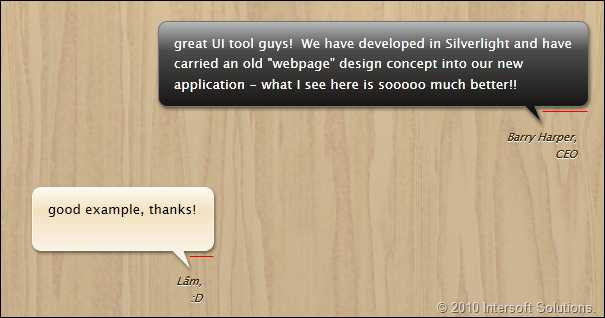
As you can see the “red lines” in the following illustration, each message has different pointer target location since each message has different length based on the text that users provide.
Although our UXCallout has complete customization over the pointer location – such as the PointerOffset, PointerPoint1, etc – it could be a tedious task to calculate the pointer offset manually. Furthermore, the manual calculation won’t be a perfect solution as we aren’t allowed to access the “UI element” from within the view model.
Fortunately, our UXCallout is equipped with a nice feature called TargetElement. By simply setting the TargetElement to the desired element, the pointer of the Callout will be automatically pointing to the center offset of the specified target element. And since TargetElement is a dependency property, that means you can easily specify it in your template or binding.
To achieve our UI objective such as shown in the above illustration, we can set the TargetElement of our callout to target the user name element through Binding. See the following XAML code snippet.
|
1 2 3 4 5 |
... <span class="kwrd"><</span><span class="html">Intersoft:CallOut</span> <span class="attr">Style</span><span class="kwrd">="{StaticResource CalloutStyle}"</span> <span class="attr">Background</span><span class="kwrd">="{StaticResource DarkBrownGradient}"</span> <span class="attr">BorderBrush</span><span class="kwrd">="{StaticResource DarkBrownBorder}"</span> <span class="attr">TargetElement</span><span class="kwrd">="{Binding ElementName=IdentityText}"</span> <span class="attr">Foreground</span><span class="kwrd">="White"</span><span class="kwrd">></span> |
|
1 |
... |
|
1 2 3 |
<span class="kwrd"></</span><span class="html">Intersoft:CallOut</span><span class="kwrd">></span> <span class="kwrd"><</span><span class="html">TextBlock</span> <span class="attr">Name</span><span class="kwrd">="IdentityText"</span> <span class="attr">Style</span><span class="kwrd">="{StaticResource IdentityStyle}"</span><span class="kwrd">></span> ... |
So far, we’ve addressed numerous key challenges related to the UI (View). Although we haven’t covered all view issues entirely in this topic, you should get sufficient ideas on how to solve the other UI challenges using similar pattern.
MVVM Challenges
As we’re building the project to be entirely based on the MVVM pattern, it becomes obvious that most challenges and issues would arise as you designed the user experiences for your application.
In this project, two of the major MVVM challenges are: calling asynchronous data retrieval from within the view model and how to deal with the view model separation for the “New Post”.
The following illustration shows the view models required in this project.
As seen in the above illustration, the message board project is mainly comprised of two view models, named FeedbackListViewModel and NewFeedbackViewModel.
The FeedbackListViewModel Overview
The FeedbackListViewModel encapsulates the logic for the feedback list, such as retrieving the feedback list, getting the total count of the feedback, loading more feedback and managing the busy state for the data operation.
The following illustration shows the overview of FeedbackListViewModel.
Binding the Feedback List to View Model
The data binding for the items control to the view model is quite straightforward. It can be achieved by defining the Binding expression to the Feedbacks property available in the view model. The FeedbackListViewModel itself is defined directly as the DataContext of the UXPage in the XAML.
The following code shows how the feedback view model and the items source is defined. When the data context is set, it will automatically become available to the children in the tree. That enables the UXItemsControl to be notified with the available data context, then take its Feedbacks collection as the items source.
|
1 2 3 4 5 6 7 8 9 |
<span class="kwrd"><</span><span class="html">Intersoft:UXPage</span><span class="kwrd">></span> ... <span class="kwrd"><</span><span class="html">Intersoft:UXPage.DataContext</span><span class="kwrd">></span> <span class="kwrd"><</span><span class="html">ViewModels:FeedbackListViewModel</span><span class="kwrd">/></span> <span class="kwrd"></</span><span class="html">Intersoft:UXPage.DataContext</span><span class="kwrd">></span> ... <span class="kwrd"><</span><span class="html">Intersoft:UXItemsControl</span> <span class="attr">ItemsSource</span><span class="kwrd">="{Binding Path=Feedbacks}"</span> <span class="kwrd">/></span> <span class="kwrd"></</span><span class="html">Intersoft:UXPage</span><span class="kwrd">></span> |
Load More Command
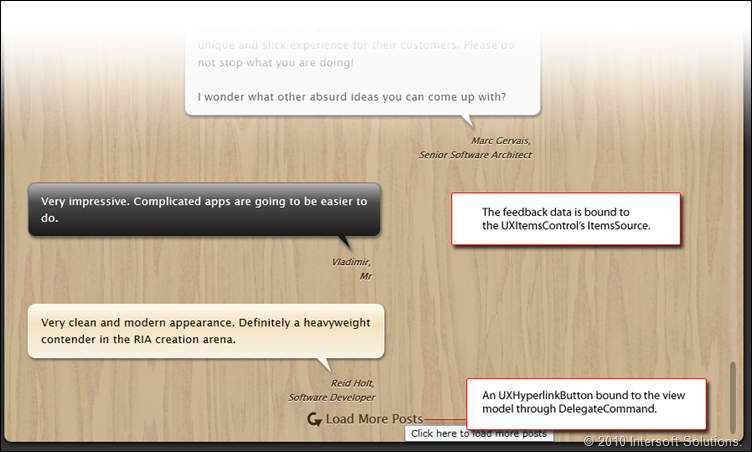
In the main view, we loaded only a chunk of initial records for highly responsive user experience. When you scroll down to the bottom edge of the list, you’ll notice the Load More Data button. This button will remain enabled when there’s more data to be loaded. To achieve this function, we’ll define the DelegateCommand in the view model, and then bind it to the hyperlink button through Command property.
The DelegateCommand, which is available in ClientUI Framework library, exposes CanExecute and Executed delegate which can be easily defined in the view model. The CanExecute result, interestingly, will automatically reflect the user interface elements that bound to it. In this case, the CanExecute result will automatically disable or enable the Load More button. This is an ideal solution for the MVVM pattern, all we need to do is to define the condition when the command can be executed, and the actual logic that will be processed when executed.
The following C# code shows the DelegateCommand initialization and the methods that handle its CanExecute and Executed delegate.
|
1 2 3 4 5 6 7 8 9 10 11 12 13 14 |
<span class="kwrd">public</span> FeedbackListViewModel() { LoadMoreCommand = <span class="kwrd">new</span> DelegateCommand(ExecuteLoadMore, CanLoadMore); } <span class="kwrd">private</span> <span class="kwrd">bool</span> CanLoadMore(<span class="kwrd">object</span> parameter) { <span class="kwrd">return</span> (<span class="kwrd">this</span>.LoadedPage < <span class="kwrd">this</span>.TotalPages); } <span class="kwrd">private</span> <span class="kwrd">void</span> ExecuteLoadMore(<span class="kwrd">object</span> parameter) { LoadFeedback(); } |
The following code shows how the delegate command is bound to the hyperlink button in the XAML.
|
1 2 3 4 5 6 7 |
<span class="kwrd"><</span><span class="html">Intersoft:UXHyperlinkButton</span> <span class="attr">VerticalAlignment</span><span class="kwrd">="Bottom"</span> <span class="attr">IsToggleButton</span><span class="kwrd">="False"</span> <span class="attr">Command</span><span class="kwrd">="{Binding LoadMoreCommand}"</span> <span class="attr">CommandCannotExecute</span><span class="kwrd">="Collapsed"</span><span class="kwrd">></span> ... <span class="kwrd"></</span><span class="html">Intersoft:UXHyperlinkButton</span><span class="kwrd">></span> |
Managing Busy State
In my previous blog post, I’ve briefly discussed about the busy management support in certain ClientUI controls, specifically in the navigation frame and page.
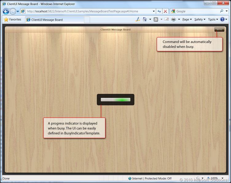
The busy state management is particularly useful in this project as we’re retrieving data from the server asynchronously. Fortunately, ClientUI already include built-in features to manage the busy state directly in the navigation frame level. This eliminates the needs to define busy indicator in every page which could be a tedious task.
The busy state management feature in navigation frame is beyond the “classic” busy indicator. In addition to showing the “busy” indicator, it will also block the entire screen from user interaction. Furthermore, all commands-nature elements such as hyperlinks and buttons, will be automatically disabled to prevent users to inadvertently execute the command. See the following illustration to get a clearer picture.
Now, let’s take a look how we can elegantly implement the feature in the view model to comply with our MVVM pattern architecture.
First, we define a property named IsBusy in the view model such as shown below:
|
1 2 3 4 5 6 7 8 9 10 11 12 13 14 15 |
<span class="kwrd">public</span> <span class="kwrd">bool</span> IsBusy { get { <span class="kwrd">return</span> _isBusy; } set { <span class="kwrd">if</span> (_isBusy != <span class="kwrd">value</span>) { _isBusy = <span class="kwrd">value</span>; OnPropertyChanged(<span class="str">"IsBusy"</span>); } } } |
Second, we can bind this property to the IsBusy property available in the UXPage. This property automatically notifies the navigation frame that hosted it to manage the busy state according to the given value.
|
1 2 3 4 5 6 |
<span class="kwrd"><</span><span class="html">Intersoft:UXPage</span> <span class="attr">Title</span><span class="kwrd">="ClientUI Message Board"</span> <span class="attr">BlockUIOnBusy</span><span class="kwrd">="True"</span> <span class="attr">IsBusy</span><span class="kwrd">="{Binding IsBusy}"</span><span class="kwrd">></span> ... <span class="kwrd"></</span><span class="html">Intersoft.UXPage</span><span class="kwrd">></span> |
Note that the UXPage has BlockUIOnBusy property, which indicates whether the UI (User Interface) should be blocked when IsBusy is true.
Finally, we can now easily control the busy state from by simply setting the IsBusy property in the view model. The following code snippet shows an example that sets the busy state when retrieving data.
|
1 2 3 4 5 6 7 8 9 10 11 12 13 14 15 16 17 18 |
<span class="kwrd">private</span> <span class="kwrd">void</span> LoadFeedback() { <span class="rem">// Indicates that the view model is processing something</span> <span class="rem">// It will automatically reflect the state in the UI (View)</span> IsBusy = <span class="kwrd">true</span>; _context.Load(_context.GetFeedbacksQuery(<span class="kwrd">this</span>.LoadedPage + 1), (o) => { <span class="kwrd">if</span> (o.IsComplete) { ... <span class="rem">// Sets the state back to normal</span> IsBusy = <span class="kwrd">false</span>; } } , <span class="kwrd">true</span>); } |
Pretty cool, isn’t it? Feel free to let me know if you’ve feedback or found other ways to implement the busy state management in your apps.
Showing the Status Window
When a data operation is completed, it’s nice to show a quick status that lets users aware of the request status. In this project, we’re going to use a lightweight window such as UXWindowChrome to show the status.
The challenge here is how we can efficiently control the status window (UI element) from the view model. There are a number of ways to implement this.
First, if you want to control the status window from within view model, you can dedicate a status window for each operation, then bind its IsClientVisible to your view model to control its visibility.
In our case, we would like to have only one instance of status window which is reused for multiple data operations, such as retrieving data, add new, and so on. In such scenario, the best practice is to handle this in the UI (View) level because all operations are mostly UI-related.
The good thing with this approach is that it shows the benefits of the view model that implements INotifyPropertyChanged which can be useful in a number of scenarios. Let’s take a look at the following example.
|
1 2 3 4 5 6 7 8 9 10 11 12 13 14 15 16 17 18 19 20 |
<span class="rem">// Executes when the user navigates to this page.</span> <span class="kwrd">protected</span> <span class="kwrd">override</span> <span class="kwrd">void</span> OnNavigatedTo(NavigationEventArgs e) { <span class="rem">// We can easily access to the view model from view through the DataContext</span> FeedbackListViewModel viewModel = <span class="kwrd">this</span>.DataContext <span class="kwrd">as</span> FeedbackListViewModel; <span class="rem">// Handle the view model's PropertyChanged </span> <span class="rem">// Remember to detach it in OnNavigatingFrom override to avoid memory leak.</span> viewModel.PropertyChanged += <span class="kwrd">new</span> PropertyChangedEventHandler(ViewModel_PropertyChanged); } <span class="kwrd">private</span> <span class="kwrd">void</span> ViewModel_PropertyChanged(<span class="kwrd">object</span> sender, PropertyChangedEventArgs e) { FeedbackListViewModel viewModel = <span class="kwrd">this</span>.DataContext <span class="kwrd">as</span> FeedbackListViewModel; <span class="kwrd">if</span> (e.PropertyName == <span class="str">"LoadedPage"</span>) { <span class="kwrd">if</span> (viewModel.LoadedPage > 1) { <span class="rem">// Set the required status, i.e, the label text and visibility. </span> |
|
1 2 |
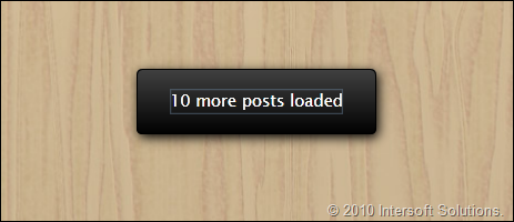
<span class="kwrd">this</span>.StatusLabel.Text = <span class="str">"10 more posts loaded"</span>; <span class="kwrd">this</span>.StatusWindow.IsClientVisible = <span class="kwrd">true</span>; |
|
1 2 3 4 5 6 7 8 9 |
<span class="rem">// Hide the status after 2 seconds. </span> Utility.ExecuteTimeOut(2, () => { <span class="kwrd">this</span>.StatusWindow.IsClientVisible = <span class="kwrd">false</span>; }); } } } |
Here’s what the result looks like:
The NewFeedbackViewModel Overview
The NewFeedbackViewModel implementation is unique in a way that it is actually a children UI control that reside in the FeedbackList page. To enable the Callout and its entire children to use a different view model, we can set the DataContext of the Callout to the NewFeedbackViewModel which can be directly defined in the XAML code.
See the following illustration for the view model overview.
Showing the Callout in View Model
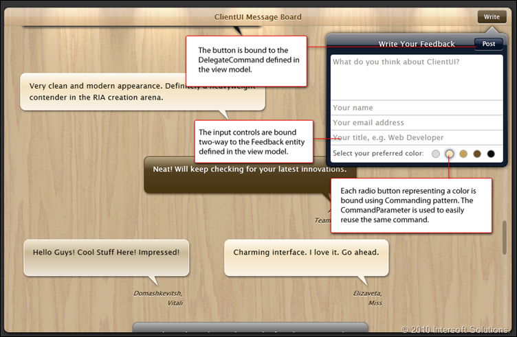
One of the most challenging difficulties in MVVM is how a modern user interface such as callout can be efficiently managed using the MVVM pattern. In this project, we’re using the UXCallout control to display an iPad-style ‘Pop Over’, allowing users to conveniently write a new message in compelling user experience.
Since the UXCallout is built using the ClientUI’s popup architecture that complies with ISO-standards in usability, we can easily control its visibility through the IsOpen property.
The following code shows how the two-way binding is done.
|
1 |
<span class="kwrd"><</span><span class="html">Intersoft:UXCallOut</span> <span class="attr">x:Name</span><span class="kwrd">="Write_Callout"</span> <span class="attr">HorizontalAlignment</span><span class="kwrd">="Right"</span> <span class="attr">Width</span><span class="kwrd">="0"</span> |
|
1 2 3 4 |
<span class="attr">PreferredPosition</span><span class="kwrd">="Bottom"</span> <span class="attr">IsOpen</span><span class="kwrd">="{Binding IsAdding, Mode=TwoWay}"</span><span class="kwrd">></span> ... <span class="kwrd"></</span><span class="html">Intersoft:UXCallOut</span><span class="kwrd">></span> |
While we’re now able to control the UXCallout’s visibility from the view model, the state is not synchronized with the “Write” button. Fortunately, all button lineups in ClientUI include toggle functionality. This way, we can make the button to use toggle behavior and bind its IsChecked to the IsOpen of the UXCallout using two-way binding.
See the code snippet below that shows the XAML definition for the toolbar button.
|
1 2 3 4 |
<span class="kwrd"><</span><span class="html">Intersoft:UXToolBarButton</span> <span class="attr">x:Name</span><span class="kwrd">="Button_Write"</span> <span class="attr">Content</span><span class="kwrd">="Write"</span> <span class="attr">IsToggleButton</span><span class="kwrd">="True"</span> <span class="attr">IsChecked</span><span class="kwrd">="{Binding IsOpen, ElementName=Write_Callout, Mode=TwoWay}"</span> <span class="attr">IsCheckedChanged</span><span class="kwrd">="Button_Write_IsCheckedChanged"</span> |
|
1 |
<span class="kwrd"> ...</span> |
|
1 2 |
<span class="kwrd">/></span> <strong></strong> |
Binding the Input Controls
Next, the input controls can be bound directly to the Feedback entity which we have defined in the view model. This process is quite basic and straightforward as we’ve covered it in previous posts.
The following XAML code shows the input controls binding.
|
1 2 3 4 |
<span class="kwrd"><</span><span class="html">Intersoft:UXItemsControl</span> <span class="attr">CornerRadius</span><span class="kwrd">="4"</span> <span class="attr">ItemContainerStyle</span><span class="kwrd">="{StaticResource CalloutInputStyle}"</span><span class="kwrd">></span> <span class="kwrd"><</span><span class="html">Intersoft:UXTextBox</span> <span class="attr">x:Name</span><span class="kwrd">="Quote_Input"</span> <span class="attr">Height</span><span class="kwrd">="80"</span> <span class="attr">WatermarkText</span><span class="kwrd">="What do you think about ClientUI?"</span> <span class="attr">Text</span><span class="kwrd">="{Binding Feedback.Quote, Mode=TwoWay}"</span> <span class="attr">AcceptsReturn</span><span class="kwrd">="True"</span> |
|
1 |
<span class="attr">VerticalScrollBarVisibility</span><span class="kwrd">="Auto"</span> <span class="kwrd">/></span> |
|
1 2 3 4 5 |
<span class="kwrd"><</span><span class="html">Intersoft:UXTextBox</span> <span class="attr">x:Name</span><span class="kwrd">="Name_Input"</span> <span class="attr">WatermarkText</span><span class="kwrd">="Your name"</span> <span class="attr">Text</span><span class="kwrd">="{Binding Feedback.Name, Mode=TwoWay, ValidatesOnDataErrors=True}"</span> <span class="attr">Intersoft:DataBinding</span>.<span class="attr">ClearErrorOnTextInput</span><span class="kwrd">="True"</span><span class="kwrd">/></span> ... <span class="kwrd"></</span><span class="html">Intersoft:UXItemsControl</span><span class="kwrd">></span> |
Using CommandParameter in Radio Button
One of the interesting scenarios in the UI for the new form is how we can design the user interface that allows users to select their preferred color. In our previous demo, this is done using view logic since the MVVM pattern has not existed yet at that time.
In this project, we’re migrating the color selection from the non-standard controls to button controls. The radio button is the most ideal user interface to achieve this objective.
However, since radio button is not a selection control, we can’t easily manage the selection in the same way as in UXListBox. Fortunately,we have the full-blown Commanding support in all button lineups. You got the idea, we can bind the radio button to a delegate command, then assign the CommandParameter in each radio button to be passed in the delegate command.
The following XAML snippet code shows how the binding is done in XAML.
|
1 2 3 4 5 6 7 |
<span class="kwrd"><</span><span class="html">Intersoft:UXItemsControl</span> <span class="attr">Orientation</span><span class="kwrd">="Horizontal"</span> <span class="attr">ItemContainerStyle</span><span class="kwrd">="{StaticResource ColorSelectionStyle}"</span><span class="kwrd">></span> <span class="kwrd"><</span><span class="html">Intersoft:UXRadioButton</span> <span class="attr">Background</span><span class="kwrd">="#FFD9D9D9"</span> <span class="attr">ToolTipService</span>.<span class="attr">ToolTip</span><span class="kwrd">="Silver"</span> <span class="attr">Command</span><span class="kwrd">="{Binding SelectColorCommand}"</span> <span class="attr">CommandParameter</span><span class="kwrd">="Silver"</span><span class="kwrd">/></span> <span class="kwrd"><</span><span class="html">Intersoft:UXRadioButton</span> <span class="attr">Name</span><span class="kwrd">="NaturalColor_Input"</span> <span class="attr">Background</span><span class="kwrd">="#FFFDE6B8"</span> <span class="attr">ToolTipService</span>.<span class="attr">ToolTip</span><span class="kwrd">="Natural"</span> <span class="attr">Command</span><span class="kwrd">="{Binding SelectColorCommand}"</span> <span class="attr">CommandParameter</span><span class="kwrd">="Natural"</span><span class="kwrd">/></span> ... <span class="kwrd"></</span><span class="html">Intersoft:UXItemsControl</span><span class="kwrd">></span> |
And the corresponding view model code in C# here.
|
1 2 3 4 5 6 7 8 9 10 |
<span class="kwrd">public</span> NewFeedbackViewModel() { <span class="kwrd">this</span>.SelectColorCommand = <span class="kwrd">new</span> DelegateCommand(ExecuteSelectColorCommand); ... } <span class="kwrd">private</span> <span class="kwrd">void</span> ExecuteSelectColorCommand(<span class="kwrd">object</span> parameter) { <span class="kwrd">this</span>.Feedback.FavoriteColor = parameter.ToString(); } |
As you become more familiar and fond with the MVVM pattern, you would be able to easily address numerous UI challenges in consistent manner. It also helps you to maintain the codes clean, readable and easy to extend.
Submitting Changes via Domain Context in View Model
Once we’re done with the UI, MVVM and binding, the final step is to perform the real database changes when the “Post” button is clicked. Again, this is done using the same MVVM pattern through Commanding.
Since the logic and data operation is encapsulated in the view model, we did not use the declarative DomainDataSource like in the old demo. Instead, the operation is called in the view model level through method call that automatically generated from the WCF domain service.
Consequently, the domain context is created only once at the FeedbackListViewModel level, which can be easily referenced through ParentViewModel in the NewFeedbackViewModel. This enables the new record operation to use the same domain context, which properly maintains the current state of the loaded data.
The following code snippet shows how the data operation is implemented.
|
1 2 3 4 5 6 7 8 9 10 11 12 |
<span class="kwrd">private</span> <span class="kwrd">void</span> ExecuteSaveCommand(<span class="kwrd">object</span> parameter) { <span class="kwrd">if</span> (ValidateInput()) { <span class="rem">// set busy to block user interaction</span> <span class="kwrd">this</span>.ParentViewModel.IsBusy = <span class="kwrd">true</span>; <span class="kwrd">this</span>.ParentViewModel.DomainContext.Feedbacks.Add(<span class="kwrd">this</span>.Feedback); <span class="rem">// process changes to server-side through WCF RIA Services</span> <span class="kwrd">this</span>.ParentViewModel.DomainContext.SubmitChanges( (o) => { |
|
1 2 3 4 |
... } } } |
Inserting the New Post to the Parent View Model
Finally, after the data is saved to the server-side, we’re going to reflect the changes to the UI (View). There are a couple of options to do this. You can either refresh the entire list again to show the latest data, or insert only the new record to the current list (delta approach).
We’re going to use the latter approach because it delivers more responsive user interface by eliminating the client-server round trip. Since we have the reference to the parent view model, we can easily access the Feedbacks collection and perform insertion to the collection. As the Feedbacks collection is using ObservableCollection type and bound to the ItemsSource (see the earlier point above), any changes to the Feedbacks collection will automatically reflect the user interface elements that bound to it. Pretty nice, don’t you agree?
The following code shows the complete process in ExecuteSaveCommand which demonstrates how the new Feedback insertion is implemented.
|
1 2 3 4 5 6 7 8 9 10 11 12 13 14 15 16 17 18 19 20 21 22 23 24 25 26 27 28 29 30 31 32 33 34 35 36 |
<span class="kwrd">private</span> <span class="kwrd">void</span> ExecuteSaveCommand(<span class="kwrd">object</span> parameter) { <span class="kwrd">if</span> (ValidateInput()) { <span class="rem">// set busy to block user interaction</span> <span class="kwrd">this</span>.ParentViewModel.IsBusy = <span class="kwrd">true</span>; <span class="kwrd">this</span>.ParentViewModel.DomainContext.Feedbacks.Add(<span class="kwrd">this</span>.Feedback); <span class="rem">// process changes to server-side through WCF RIA Services</span> <span class="kwrd">this</span>.ParentViewModel.DomainContext.SubmitChanges( (o) => { <span class="kwrd">this</span>.ParentViewModel.IsBusy = <span class="kwrd">false</span>; <span class="kwrd">if</span> (!o.HasError) { <span class="rem">// reflect the newly added post to the View</span> <span class="kwrd">this</span>.ParentViewModel.Feedbacks.Insert(0, <span class="kwrd">this</span>.Feedback); <span class="rem">// tell the View that we're done with the saving process</span> <span class="kwrd">this</span>.IsSaved = <span class="kwrd">true</span>; <span class="kwrd">this</span>.IsAdding = <span class="kwrd">false</span>; } <span class="kwrd">else</span> { MessageBoxServiceProvider.ShowError(…); o.MarkErrorAsHandled(); } } , <span class="kwrd">null</span>); } <span class="kwrd">else</span> { FocusErrorField(); } } |
Download the Solution
Want to create your own rich Silverlight message board? Go ahead, click here to download the C# project solution and modify it as you like. You can use this message board project as the base to quickly jump start your MVVM project.
The C# project solution includes all the codes mentioned in this blog such as the model, view models and converts, the XAML files, and a stripped-down SQL database to minimize download size. You can also find several nice design stuff in the solution such as the minimalist scroll viewer style, iPad callout style, glass button, a vector refresh symbol and much more.
Note that you will need SQL Server Express 2008 installed to run the sample. The latest version of ClientUI is required as well. If you’re still using build 8 (initial RTM build), I highly suggest you to upgrade to the latest version (build 9) for the best stability and performance. Click here to download the latest version, and here to read the installer change log.
Conclusion
So far, you already have some ideas and insights of the key challenges in building Silverlight application using MVVM pattern and WCF RIA Services. Often times, you will deal with the user interface requirements demanded by your users and how you apply the MVVM pattern to address the user interface challenges. Hopefully this message board case study can be useful for you to learn and jump start on using the ClientUI controls with MVVM.
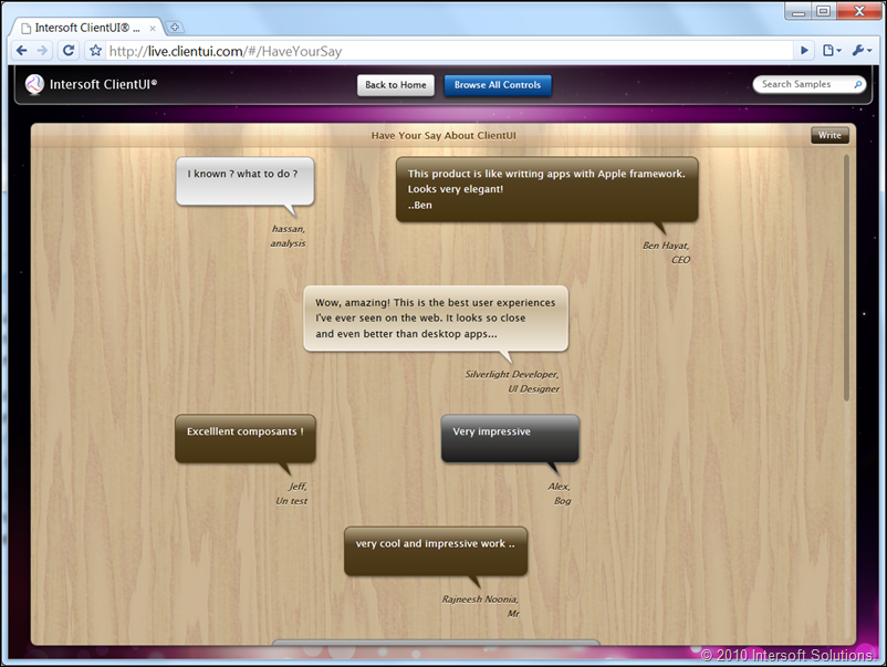
Click here to try the message board online. The following screenshot shows the message board sample that we studied in this post.
Although it may look prettier when integrated into our live showcase (done through SAF and on-demand loading), it’s actually the same project that made available for download.
In the next blog post, I’ll do a quick blog discussing how a ClientUI application can be easily loaded and reused in another ClientUI application domain. For instance, I could load this message board application in a navigation frame of a more complex application, or load it as the content of a window.
For now, I hope you enjoyed the Silverlight message board sample! Let me know if you have any questions or feedback.
All the best,
Jimmy
Chief Software & UX Architect

Just read your post and will have a look at others on your blog. There’s more great stuff here.
Thank you very much my friend, you are very kind in sharing this useful information with? others…. he details were such a blessing, thanks.
Thanks for the article. I was recently interested in this topic. Very interesting and informative. I wish more such articles on this portal.
Very nice article to learn about MVVM… Impressive controls!
hello,
it’s my first topic here
i hope to be happy with you
thank you
скачать там на неведомых, скачать песню игнат и, скачать латинско русский переводчик
Hi everybody! I am a student of English linguistics from Slovakia. I am currently working on my BC thesis. A part of my
thesis is a research on understanding and perception of English and Slovak verbs of thinking. I have already examined
Hungarians, Slovaks and Romas. The last group to be tested are English speakers. I mean those whose mother tongue is
English. Since I am from Slovakia, I have some difficulties in reaching them. Would you please help me fill out the form?
wow.. this is what i am searching for.. nice post, i need something like this 😀 thanks., Bookmarked your fantastic website. Really good work, unique writing style!…
You Have a Right for Privacy – OpenVPN, DoubleVPN, PPTP VPN Online Privacy and Anonymity Service Provider. VPN GUI for Windows, Mac OS X and Linux! openvpn client for windows 7
Pretty! This has been a really wonderful article.
Thank you for providing these details.
I love reading a post that will make men and women think.
Also, thank you for permitting me to comment!
Funny Or Die separates itself from other funny video clip hosting sites by the way it lets
people rank the videos, get enough funny votes and the video will be immortalized
get enough die votes and the video will be sent into the “crypt”.
The table top radio connects to the internet using Wi-Fi or Ethernet cable, and searches for stations by country, genre or call
letters. This powerful and versatile solution is also available
in three different versions, so you should have no trouble finding the perfect one for you.
I enjoy reading an article that can make people think.
Also, thank you for allowing me to comment!