WebEssentials, A Better Visual Presentation.
Let’s take a quick look back. A couple of years ago, website is quite boring and dull, at least by today’s standard, and it isn’t anywhere close to Desktop in terms of user experience and usability. As information grows rapidly, content management and layout has become a necessity to deliver a better web experience.
Most users, including me, will skip any sites with lengthy content and unattractive presentations. Take an online form filling scenario as an example. In the past, you need to scroll down to see the next fields, which is very inconvenience for users with lower screen resolutions. Another example is the navigation system in an online store. There is no way for users to directly jump to a specific sub-category.
WebEssentials is about improving the overall user experience of your Web applications with its 8 innovative controls, ranging from collapsible panels, a diverse set of input fields, rating system, progress indicator, and many more.
From Regular to Spectacular
If you have read my previous post, I believe you should have a quick insight on what the controls are and what they are capable of. In this blog, I want to share you several samples that we have prepared for WebEssentials.
We decided to go outside the box with more real-world scenarios that we encounter regularly for better demonstration on these new controls’ true capability.
Customer Address Locator with Google Maps

Utilizing the free and powerful Google Maps service, this WebExpander sample will show a customer’s address when it is clicked. The map area will be expanded in a very cool slide animation.
WebExpander’s rich support for inline content and IFrame content enables you to embed your content to this control immediately.
New Photo Session Registration
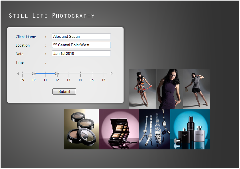
Rather than using two dropdowns, WebEssentials’ slider control is used for a time range selection in the new photo session scenario. Users simply glide the two handrails to select the duration. Using WebSlider, you can eliminate any invalid users’ input, such as: the start time is greater than the end time.
Complementing its dual handrails feature, WebSlider also provides two types of interaction modes when users glide a handrail towards the next one. The Locked mode disables any further movement when a handrail touches the other one. The Pushed mode enables the selected handrail to push the other one.
Online Product Satisfaction Survey
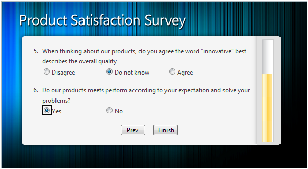
In an online survey scenario, WebProgressBar is used to indicate the overall questions users have answered. As users click on the next page, the progress will be filled and the color is changed.
With its selectable horizontal or vertical orientation and two types of progress modes, WebProgressBar lets you add a progress indicator to any of your Web applications.
Online Resume Creation

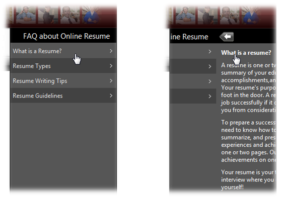
There are certain conditions when we need to place specific information in a very limited screen estate, like the FAQ section in the above screenshot.
Using WebSlidingMenu, the interactive FAQ section is added without cluttering the other layout. When users click on a question, the answer will be slide out in smooth animation.
Equipped with Load-on-Demand feature, the content will be fetched as soon as users select on an item for the best performance. It also features various built-in styles and mostly configurable elements.
This post only touches the surface of what WebEssentials is capable of. The practically unlimited implementation means your creativity is your only limit. In my next post, I’ll dive deeper into each control and its unique features.
Stay tuned and be prepared for WebEssentials in the upcoming WebUI Studio 2010.

Comments