ClientUI Part 2 – Advanced Presentation Model and Architectures Highlight
In my previous blog post, I’ve detailed the overviews of ClientUI, its key objectives and goals, and briefly on the architecture parts. In case you missed it, please click here to read the first series on ClientUI introduction.
In this second series of my ClientUI blog post, I’ll highlight some of the key features and UI components that will ship in our upcoming ClientUI 2010 release.
The ClientUI is strongly focused in application libraries and integrated UI toolset that enables rapid line-of-business development in Silverlight which includes full support for today’s application design pattern such as MVVM.
It has numerous key features related to the control’s presentation architecture such as explained in the following sections. Since most Silverlight and WPF controls are all about presentation, it’s very important for every serious developers to understand the basic of Silverlight content model which enables them to leverage the power of Silverlight to the fullest.
ClientUI-family components comply to many content architecture standards required in a Silverlight UI control. Some of them even matches those in WPF. The details are explained in the sections below.
Silverlight Best-Practice Control Development
All components in ClientUI-family are designed to use only the best-practice and proven development techniques that conform to the requirements required in Silverlight and WPF architecture.
The full compliance to the Silverlight/WPF control standards is crucial to allow developers to work with the controls the way it suppose to be. Our research also indicates that the failure in meeting this conformance will not only introduce more errors, but also increasing resources usage which dramatically slowing down the overall performance.
Several of the architecture standards that implemented in ClientUI-family UI components are:
- WPF Content Model Compliance
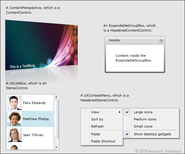
Silverlight is built upon the subset of WPF, and thus expose similar content model with WPF. However, Silverlight 3 includes only several basic content model in their core runtime. ClientUI includes complete content model that matches those in WPF such as explained below.- ContentControl. The control contains a single arbitrary object.
- HeaderedContentControl. The control contains a header and a single item, both of which are arbitrary objects.
- ItemsControl. The control can host a collection of arbitrary objects.
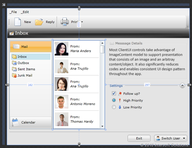
- HeaderedItemsControl. The control contains a header and a collection of items, all of which are arbitrary objects.See some examples of ClientUI content model implementation in the image below.
- ItemsControl and Paneling Compliance
ItemsControl is a special content control in Silverlight/WPF which arranges a collection of arbitrary objects in a predefined panel. Since Silverlight introduces a lot of ways to create custom controls, many developers or vendors did not aware of the fundamental of content model and thus ended up creating controls that are not compatible with SL/WPF architecture.All ClientUI-family components that support collection are now implementing either ItemsControl or HeaderedItemsControl content model based on the nature of the control. We’ve also managed to revamp UXCoverflow and UXDock, two of our flagship UI controls, to fully comply this standard.There are numerous benefits to comply with these standards such as explained below.
- Ability to change the way how items are arranged by customizing the panel template.
Consider a UXContextMenu control which normally arranges a collection of items in vertical direction. In certain UI scenario, you may want to arrange the items in horizontal direction and automatically wrap the excessive items to the next line. With the UXContextMenu conforms to this standard, we can achieve this task by simply redefining the menu’s ItemsTemplate to a wrap panel. (WrapPanel is also included in the ClientUI). See the following image for a better picture.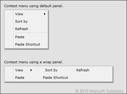
The loosely-coupled implementation of layout and content such as shown above is a very powerful feature in WPF presentation model, which enables a control to have a transformable layout without codes rewriting. The following XAML code gives you an idea how easy it is to customize the layout of an ItemsControl.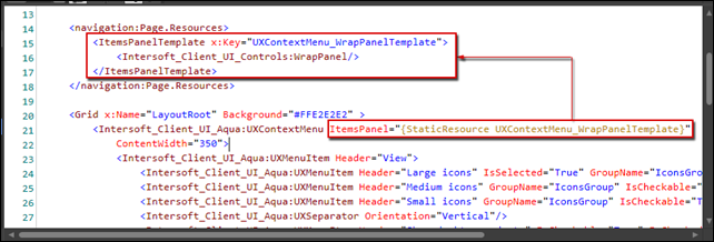
As seen in above code snippet, customizing the layout panel can be done as simple as assigning the desired panel template to the ItemsPanel property of the control. The item logic and function should work as it is.IMO, this capability alone already demonstrates one of many reasons why Silverlight should be considered as primary choice for RIA platform. If you’re ASP.NET or HTML web developer, I bet you don’t want to imagine how long it will take, or how many codes need to be rewritten just to have the layout transformed the way you desire such as shown in the above scenario

- Item selection and automatic naming scope in designer.In addition to the runtime features, ItemsControl does matter in the design-time as well. Development tools such as Expression Blend and Visual Studio 2010 includes several special behaviors for controls that correctly implement ItemsControl.
For instances, with UXDock now a full ItemsControl compliance control, you can select a button directly from within the designer surface. Even more, you can add and select stack items in the same WYSIWYG experience too. No collection editor needed, no special dialog boxes needed – just natural designing experience.
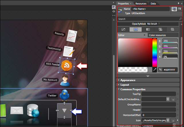
The above screenshot shows the completely redesigned UXDock control in the design-time environment. In the previous versions, the control requires you to work with collection editor to manipulate the items and stack items. Furthermore, you can not interact with the item nor showing the stack items in the designer.The new UXDock that will ship in the upcoming ClientUI 2010 includes a more sophisticated ItemsControl implementation, which introduces nested collection hierarchy concept. As seen in above screenshot, developers can select a dock button by clicking directly on the object in the design surface (see blue-arrow visual hint). When selected, you can expand the stack item by invoking the designer action from the context menu. You’ll also notice that the stack item will be opened with animation in the same way it’s opened in the runtime. Finally, you can then select any of the stack item that displayed in the designer (see red-arrow visual hint). The property window will also be refreshed with the new selection (see red-box visual hint), enabling you to intuitively work with the object – for instances, adding an icon, or changing the tooltip text.
There are dozens of new stuff that we’ve added in the UXDock that redefines the standards in UI/X. However, to keep our subject focused, I’ll rather hold and discuss it further in a dedicated UXDock blog post.
- Automatic container and object mapping to support databinding.Only controls that correctly implement ItemsControl can effectively support arbitrary UI element and objects for databinding scenario.
The UI container concept introduced in ItemsControl is crucial to determine how the control identifies its children and determine the correct behavior based on the children type. For instances, a toolbar can accept arbitrary UI elements in addition to toolbar button which is its main container type. Without the correct ItemsControl implementation, the toolbar would produce unexpected behavior when a textbox or a combobox is added into the collection. Obviously, to satisfy the SL/WPF requirements on control’s content model (see above point), we should support any arbitrary content in our toolbar without trading off the default toolbar behaviors.
The above image pictures a UXToolBar supporting various content types. In the runtime, the custom content such as textbox, radio button or checkbox will continue to work properly along with other toolbar features such as automatic overflow feature (the item will be hidden and moved to overflow panel which can be accessed in the options element of the toolbar).
- Ability to change the way how items are arranged by customizing the panel template.
- Templating Compliance
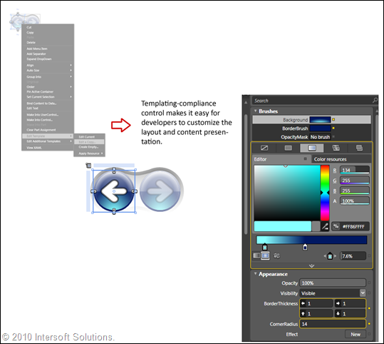
ClientUI-family UI components also satisfy Silverlight/WPF control templating guidelines allowing designers to harness the true power of WPF “lookless” presentation concept.For example, a button control normally contains a simple text string for its content presentation. With the compliance on WPF templating concept, you can completely customize the control’s layout without affecting the control’s behaviors and functionality.
The following sample perfectly illustrates the templating support in ClientUI. We used a UXToolBarButton control and further customize it to become a journal navigation button by changing its control template. The new button presentation with its shiny back arrow doesn’t just look beautiful, all button related behaviors and functionalities remain working as they suppose to be. - Styling Compliance
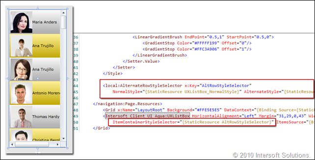
Styling is probably one of the most popular subjects in Silverlight and WPF development as they introduced “lookless” presentation concept. This means that every control should support styling as the way to change the base look and feel of the control.ClientUI-family components fully comply with design and styling aspects to support the most demanding styling requirements. These aspects include proper use of visual state and visual state group to handle activity in user interaction. On certain components, styled-type properties are also implemented to allow styling on only certain part of the control thus reducing the size of the generated template.In addition, ClientUI components brought two of the most powerful WPF styling techniques into Silverlight. The first is ItemContainerStyle, which is consistently implemented in all UI controls with collection content model to allow uniform styling that applied to all UI children of the control. The other is StyleSelector, which allows the control to automatically select the style to be applied to each item based on user-defined logic (function). Ultimately, these features provide a more solid and elegant solution for developers to style their controls in various scenarios.
The following image illustrates a UXListBox control that implements ItemContainerStyleSelector which applies item style based on alternating row condition. In this sample, the style selector logic is encapsulated in a separate class named AlternateRowStyleSelector. An instance of the class can be easily defined in the XAML Resource and then assigned to the provided ItemContainerStyleSelector property through a StaticResource markup.
With full compliance on the fundamental standards above, ClientUI ensures developers to have the best application infrastructure and investment in their mission-critical, line-of-business Silverlight/WPF applications. The compliance also significantly reduces development time and improves maintainability.
Enhanced Presentation Content Model
In addition to the fundamental compliance on Silverlight/WPF content model, ClientUI also includes several new content model with more advanced behaviors making Silverlight development even easier and more streamlined.
ImageContent Presentation Model
During our journey in Silverlight development, we found out that many of presentation scenarios are extensively using image type in addition to simple content (such as text). Since Silverlight/WPF allows only a single arbitrary content in all its built-in presentation model, it introduces difficulty and complexity for developers to achieve common scenarios in line-of-business (further abbreviated as LoB) Silverlight development.
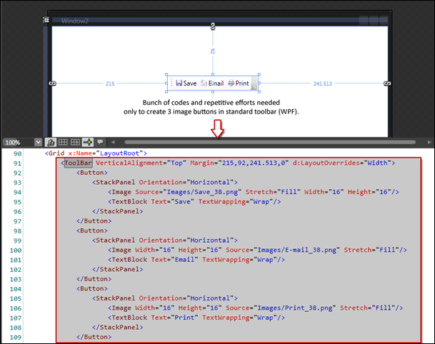
For example, having a toolbar with image button or image and text button is one of the most common LoB scenarios in an application. To achieve this simple scenario, you have to go through several repetitive steps such as dropping-in a panel, a separate Image and a Textblock. The following image shows the above illustration in WPF (since Silverlight doesn’t include toolbar).
Although the above approach is not absolutely wrong, developers may find it less-than-ideal when it comes to design pattern and code efficiency. It will also be problematic in databinding usage – such as retrieving button types dynamically from database – since you have to create different content based on the button type.
ClientUI includes a new content model called ImageContent presentation model to streamline presentation scenarios that use image and content. This enables developers to use a consistent development pattern throughout the entire applications. Using a control that supports ImageContent such as UXToolBar, achieving the above scenario is far more simpler and elegant compared to the traditional approach shown in above image.
See the following image for UXToolBar implementation. Notice that the codes needed to achieve the same task is slashed in half. The image can be easily defined through Icon property of the toolbar button. The other nice feature that I really like about this image-content is that I can easily change the image-content relation. Instead of messing up with the XAML, I can simply customize the TextImageRelation property of the button. See the “Print” button in the image below.
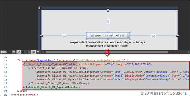
All controls that support ImageContent presentation model exposes several common properties such as DisplayMode, TextImageRelation, ImageWidth, ImageHeight and ImageStretch. Since these properties are bindable, it enables various databinding scenariso and MVVM design pattern to be effectively implemented.
This ImageContent model is extremely crucial in the ClientUI component itself since it affects the way a control is developed and how users suppose to use it. The ImageContent is a backbone fundamental that extensively used throughout ClientUI components. Several of the supporting UI components are illustrated below.
ContentItems Presentation Model
Similar to ImageContent, we also invented a new kind of content model that allows a control that can host a single arbitrary content and a collection of items. This new content model breakthroughs the limitation in Silverlight/WPF content model by enabling new type of controls that streamlines content-items presentation model.
Most first-time users would be surprised to find out that even WPF doesn’t have fundamental UI controls such as dropdown button and split button. So how do you suppose to have a simple Win7-style dropdown button in your application toolbar? The answer is obvious, you either spend sometime to create one yourself or google to find some helps.
My point in using the above illustration is that the content-items presentation model is easily applicable to certain button controls such as dropdown and split button. Similar to ImageContent, this new ContentItems content model is an essential fundamental in ClientUI architecture in order to deliver solid UI components with consistent design pattern, which ultimately supports various kind of LoB scenarios such as databinding and MVVM. More on commanding subject and button families will be detailed in my next post.
Easy Styling with Uniform Parent-Child Dependency Properties
In an effort to make Silverlight development even easier and more streamlined, we introduce a clear separation between behaviors and styles properties. Called uniform parent-child dependency property, we further take the basic dependency property to the next level by introducing the capability to bubble down a parent value to its children. This small yet useful feature makes it easy for developers to customize certain behavior properties of the control without have to deep dive into styling or templating.
With parent-child dependency property, applying a global property value is just one property set away, while the traditional approach would require you to either re-style the items or loop through each item to set the desired property.
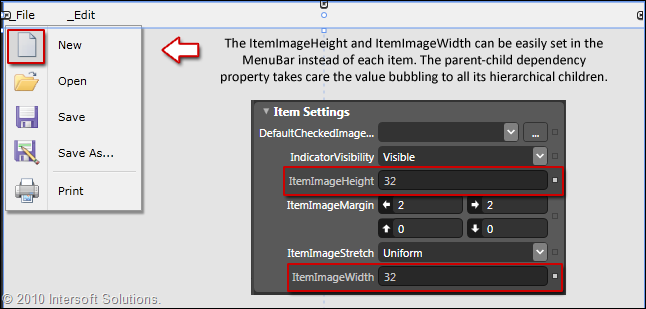
The above image illustrates the parent-child dependency property feature by showing one of the most common UI design scenarios – creating big-sized menu icon similar to those in Office. When the ItemImageHeight/Width property is set, the menubar automatically bubbles its values to all its hierarchical children. Interestingly, a child item automatically stops the property bubble when its property is explicitly set (non default). This covers both of the most common scenarios in application development, the universal and individual customization.
Summary
So far, I’ve detailed some of our key features related to key architecture, concepts and presentation model. You should now have insights about what you can expect from our upcoming ClientUI 2010 for Silverlight and WPF. To summarize, I would say that many of the features and infrastructure that we built are geared toward an objective: streamlining Silverlight application development and making it even easier and simpler than ever.
The first two series of my posts are very much focused on the overviews and fundamentals instead of UI-goodies so that you can get familiar with the real objectives and key goals that we want to push in our upcoming Silverlight lineups. One of my reasons is that creating shiny UI controls is fairly easy, but creating rich UI controls that completely follow best-development practice and fundamental architectures is not.
My next post will deep dive more on the user interface aspects of our ClientUI components and how it satisfies the ISO-standards for desktop user experiences. I would also like to add some unique UI scenarios for demonstration in the next posts. If you have any feedback, ideas or something you would like to see in our samples, please send them over and we’ll try our best to get it done.
All the best,
Jimmy.
Chief Software & User Experiences Architect.



Comments