Intersoft Website, Reimagined.
Out with the old, in with the new. That’s what we’ve done to Intersoft Website. While the old website provides lots of useful information about our products, but after countless reviews, we think it’s too much and does not provide the best user experience.
We feel it’s the right time to make a change for the better. In addition to new and exciting lineups for 2015, we’ve reimagined the website to a clean, modern, sleek layout to maximize the website’s appearance and usability.
Navigation Experience
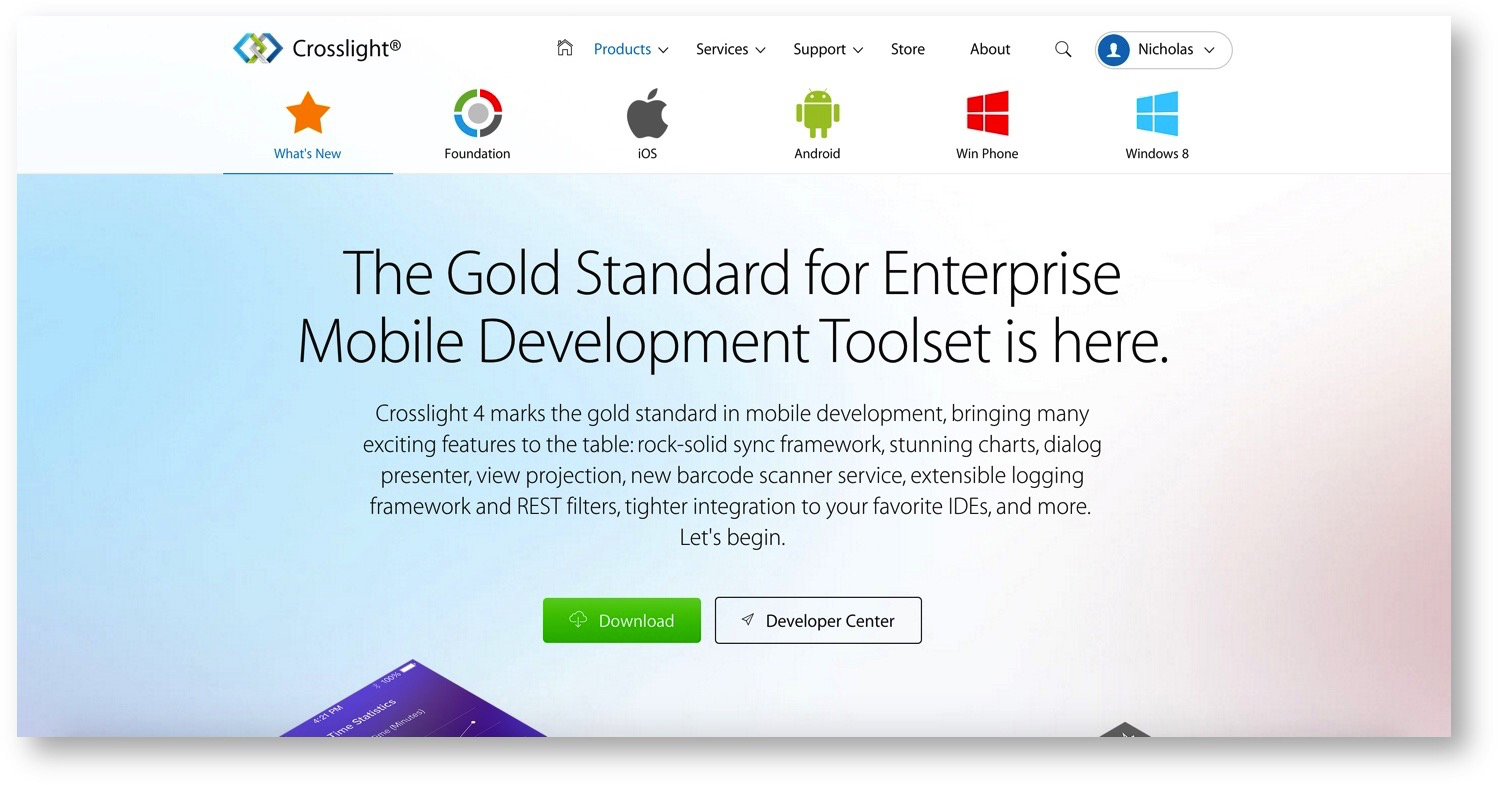
The navigation header. It’s the first thing that users will notice on a website and it plays a very prominent role in providing the overall navigation experience of a website. It determines whether a website is intuitive, usable and easy enough to find information — and often becomes one of the key indicators of a highly successful website.
Appearance
Let’s take a look on what’s changed from the old navigation header.

We’ve drastically slimmed down the navigation header to provide more concise, product-oriented approach to the navigation header, and removed all unnecessary clutter. In addition to being a full-width navigation header, the height of header is also reduced to give room for more content to shine.
We’ve also dropped the bulky, gradient-heavy header in favor of a more flat, modern aesthetics. Intersoft Solutions logo is also enhanced to use full SVG rendering, allowing the logo as sharp as possible on any devices. Not only that, the navigation header is now partially transparent, allowing background content to blend in with the navigation header, whilst providing the convenience of a global navigation menu.
Structure
In the navigation header, we’ve thoughtfully simplified and refined the menu structure to provide better usability.
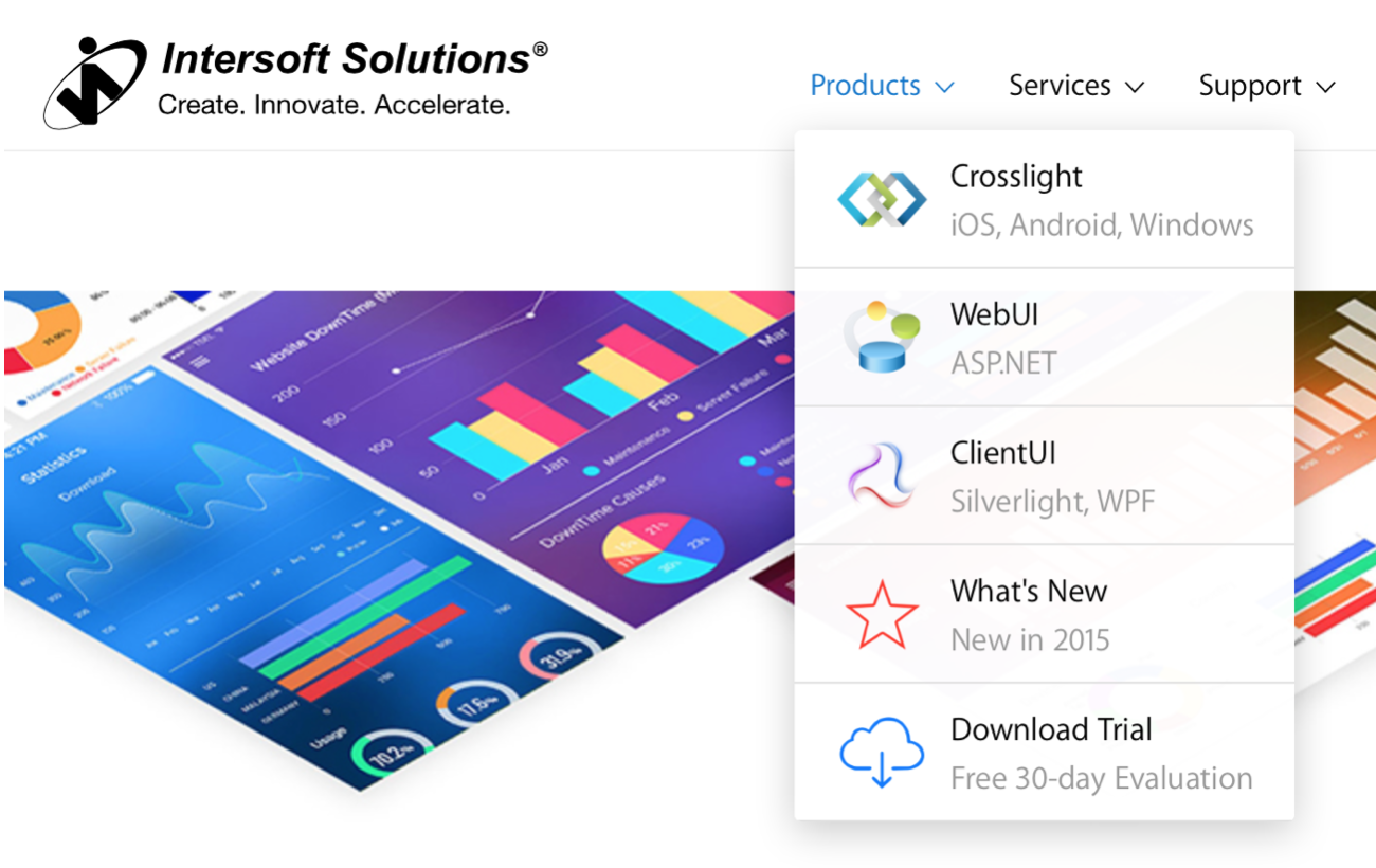
After several iterations and rethinking, we’ve revamped the structure of the navigation header. The navigation header now consists of only 5 main items:
- Products: provides information about Intersoft’s three main lineups, Crosslight, WebUI and ClientUI. Users can also find out the latest updates and even download a trial version of our products.
- Services: provides information on how Intersoft can help customers in learning our professional development services to cater their business needs.
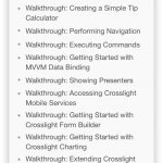
- Support: users can browse through our comprehensive support on all three main product lineups, including documentation, video tutorials, knowledge base, and more.
- Store: a one-stop shopping experience for the users, presented in a beautiful full-width layout.
- About: contains all the information about Intersoft Solutions, what we do, awards we’ve attained, vision and mission, and so on.
Additional menu includes the search and the sign-in function. By simplifying the navigation header menus, we believe this menu now represents the better structure for the new website and provides the best user experience and usability.
Second-level Navigation
When you navigate to any modules that has second navigation, for example, Crosslight, you will notice a second navigation header that pops up below the main navigation header.
This gives a visual cue to the user so that the user will know where they are in the website. Imagine GPS on your phone. As you can see, the other modules are now easily discoverable by default, and lets the user explore to deeper parts of the website. We’ve also added a subtle experience to collapse the navigation header when user scrolls past the first section.
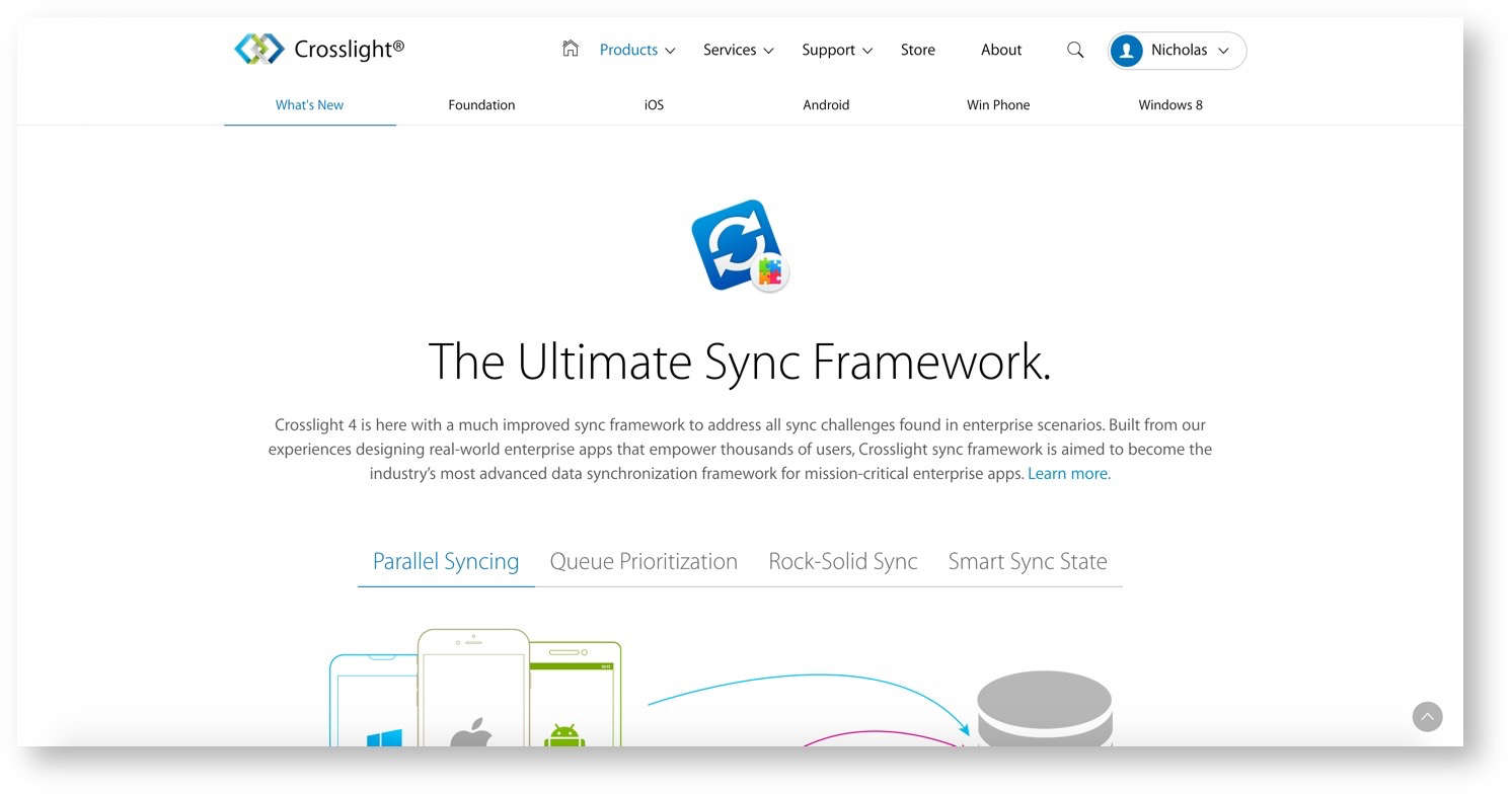
This gets the big bulky header out of the way, but still letting the user know where they are during the learning experience. One thing you’ll also notice that there’s a scroll to top button on the bottom right corner as you scroll.
Universal Menu
If you scrolled down all the way through, you’ll notice a hamburger icon next to the “scroll to top” button.

When you click the hamburger icon, the universal menu will be shown.
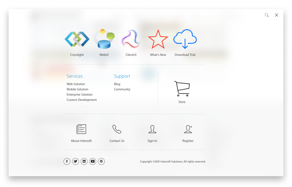
The universal menu aims to replicate the same hierarchical navigation structure of the navigation header, but presented in a gorgeous blurred background (we’re a great fan of this cool effect). As you can see, the first section is the Products, then followed by Services, Support, Store and About.
In addition to the Sign-in button, we’ve also added other features here as well, that is Contact Us and Register. You can invoke the search function by clicking on the magnifier button. To close the universal menu, simply click the close button on the top right.
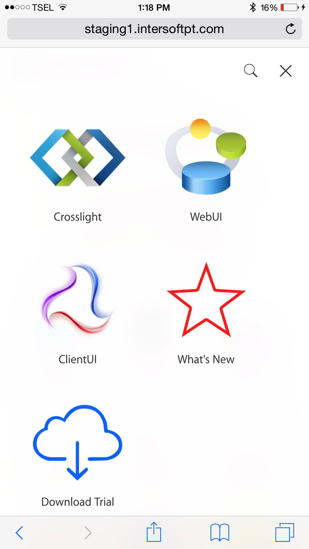
On mobile devices with smaller screen sizes, the navigation header would certainly take up a large amount of space, and will lead to a poor UX if the same navigation header is used. This is where universal menu excels at providing the main navigation function while not sacrificing good UX.
Sign-in Experience
Let’s see what happens if we click the sign-in button.
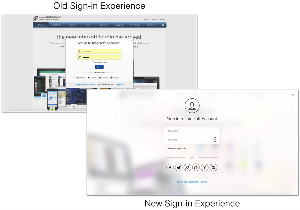
In the old website, you’ll find a modal dialog box floating on top of the existing content. This is an outdated design approach. When you click on the sign-in button in the new website, you’ll be immediately greeted with a blur overlay that displays the sign-in screen that covers the entire content.
You can also see that your existing content nicely fades and blurs in the background while the sign-in screen is shown. We’ve also moved all available sign-in options upfront, so you can be more flexible in choosing the authentication provider during the sign-in process.
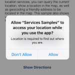
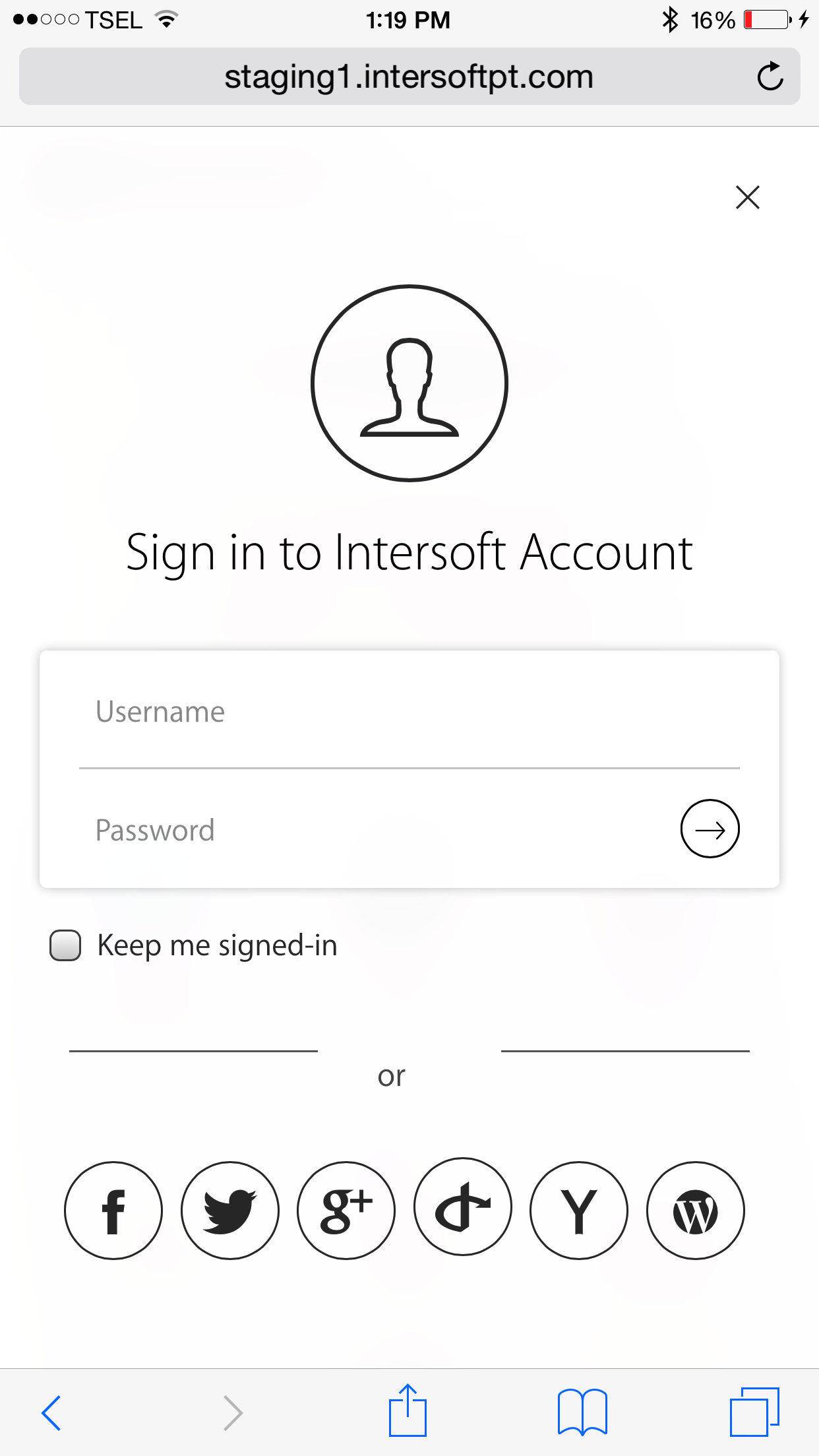
Here’s how it looks on an iPhone 6 Plus.
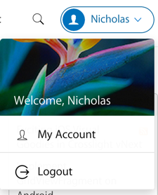
Once you’ve logged in, the sign in button will change to display your first name, and when you hover over the button, you’ll see a nice popup with a vivid colored background that allows you to edit your account and perform logout.
Search Experience
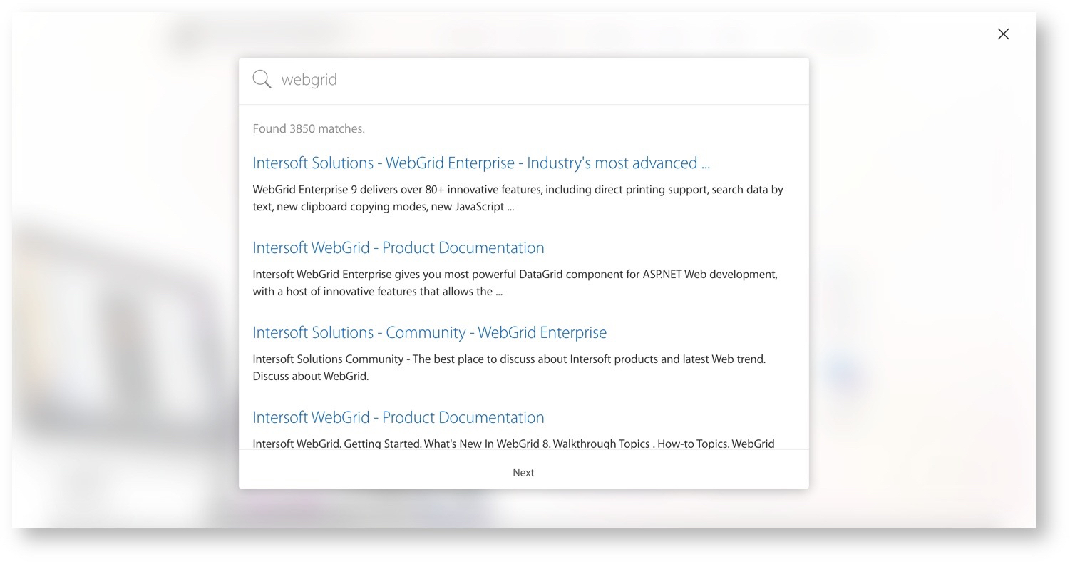
We’ve also added a little nifty function that allows you to search for things quickly and efficiently — in a whole new way.
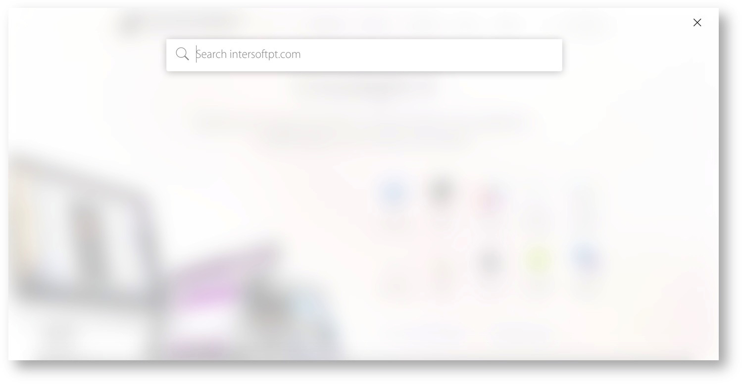
Powered by Google, you can now search for any content in our website. When you first click on the search icon, you’ll be greeted with a nice blur effect (you did see that coming, didn’t you?), with a Spotlight-like search experience, a white search box will appear at the center of the page.
Once you’ve decided what you want to search, hit Enter on your keyboard to get the search results slided-down in buttery-smooth animation. If you notice closely, we’ve opted for a buttonless search experience to reflect a modern search experience. Searching could never be easier!
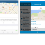
Store Experience
Here’s the brand new look to our Intersoft Store.

The store also gets a nice layout revamp which fits the overall website experience better. By removing the boxed layouts and opted for a more minimal, grid approach, we managed to give a fresh new look to it.
Interactions remained unchanged, but with simple style tweaks, the entire shopping experience becomes pleasant and more enjoyable. Studio products and individual products are now cleanly separated by distinctive sections with high definition product boxes catalogue.
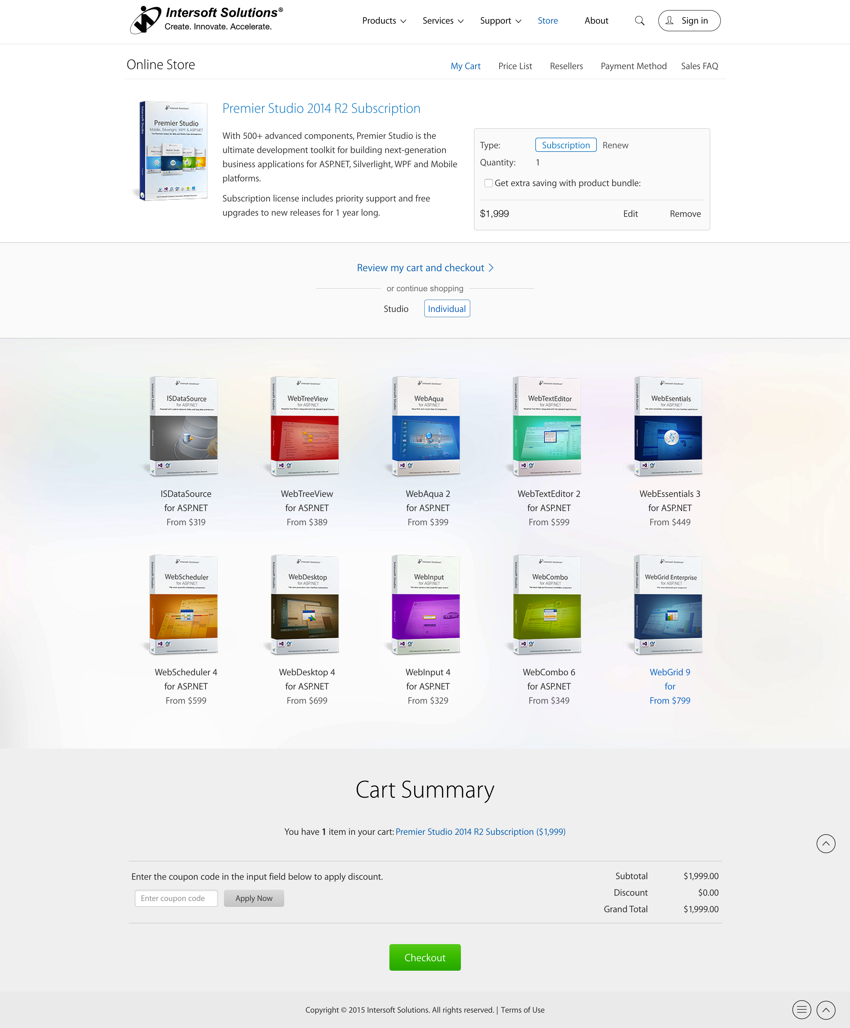
When adding products to the cart, the layout changes with the selected products being displayed on top. Cart Summary also gets a dedicated section of its own, making evaluating your products even easier before purchasing in using the Checkout button.
Support Experience
Upon landing on the Support site, you’ll be greeted with a bold, clean layout.
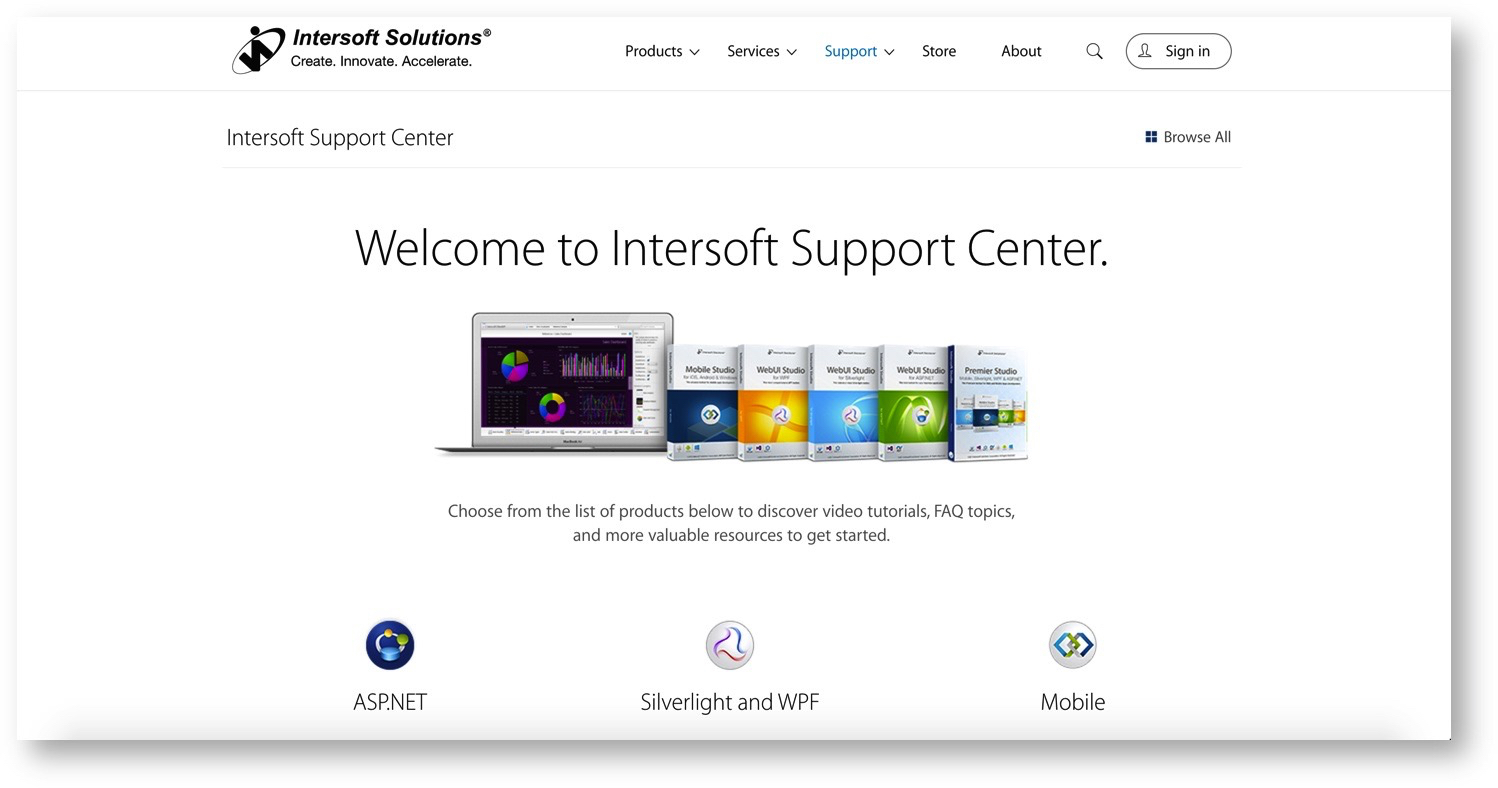
The hierarchy is clear, and it conveys the following message: “you need support on one of our products, and you’ve come to the right place.” It’s simple, and provides a very clear navigation experience for the users.
If this does not interest you, then we have a great wealth of resources, such as latest blog post entries, videos, tutorials, knowledge base, active discussions on community, latest builds, live samples and more. By proactively putting up helpful resources to the users, this will significantly increase the usability of the support site.
Community Experience
The community also feels like a new home.
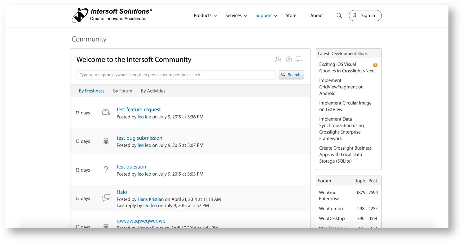
The first thing you’ll notice is the same modern look and feel used in Intersoft Store as well as the Intersoft Support. We’ve also moved the thread list section to the left, since it is considered as the core feature of the Intersoft Community, which is to browse forum threads.
By simply making the layout switch, we’ve reinforced the functionality of the Community. Additionally, we’ve also dropped gradient-heavy headers and replace them with a nice light gray tone give them a better look and feel.
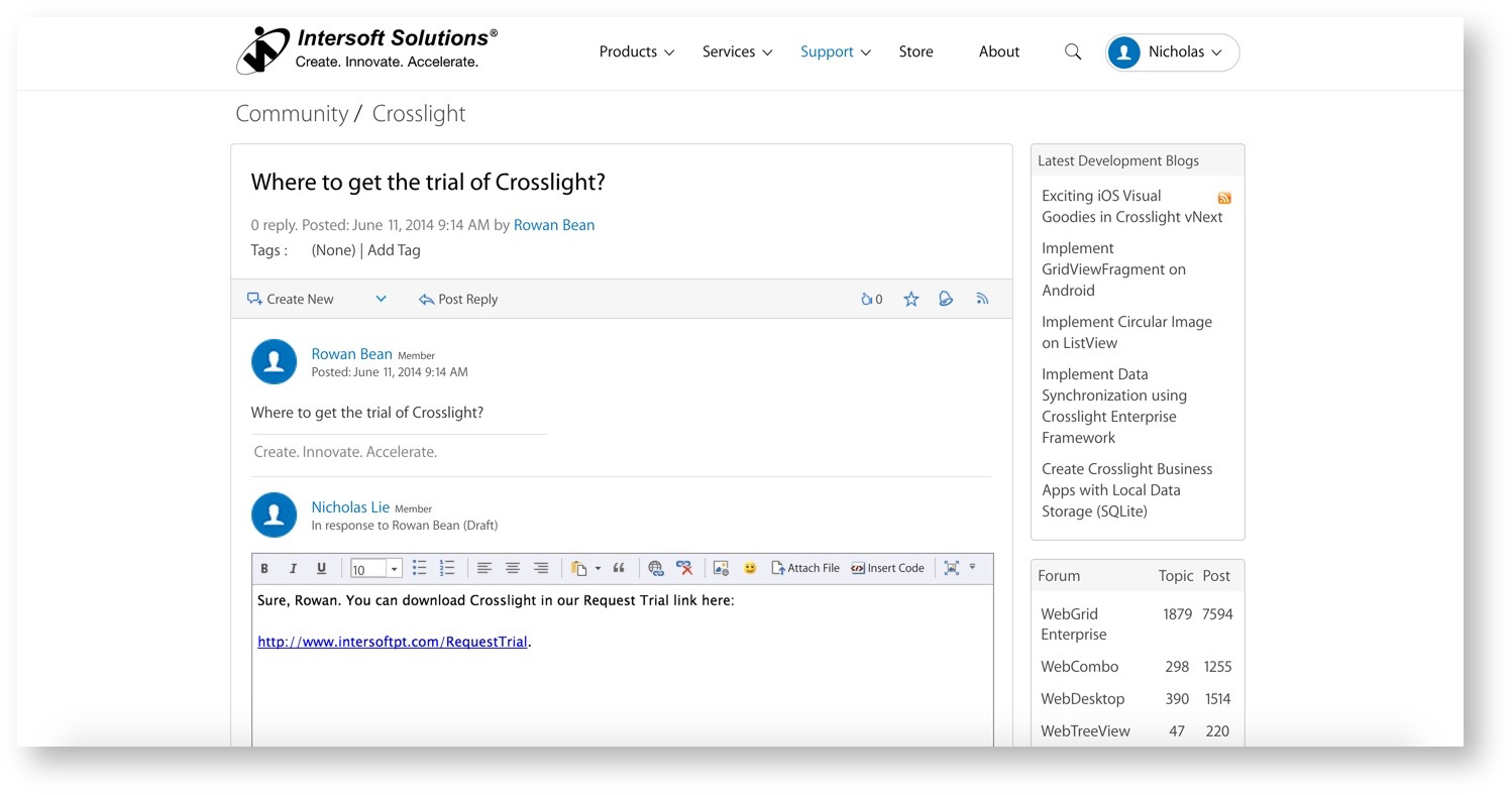
The thread detail also receives the same brand new look, and allows for unobtrusive editing experience. If you notice, we’ve also dropped the breadcrumb and integrate the navigation headers and breadcrumb into a unified component. So, instead of having two different modules, we combined them into one, allowing users to easily navigate between forums and understand the hierarchy of the forum.
Visit Us
You have only seen a glimpse of major redesign changes we’ve introduced. Head over to our site and give it a spin!
Till next time,
Nicholas Lie